
Prism 中的 DelegateCommand 和 CompositeCommand
4.96/5 (19投票s)
在本文中,我们将学习 Prism 框架提供的 DelegateCommand 和 CompositeCommand。为了掌握这些概念,我们将创建一个功能最简化的演示,以突出这些概念。
引言
在本文中,我们将学习 Prism 框架提供的 DelegateCommand 和 CompositeCommand。特别是 CompositeCommand 是一个非常简单的概念。但是,当我们开始学习 Prism 时,会发现它包含在有很多其他功能/特性的示例中(即 Prism 提供的标准 示例),因此很难快速掌握这个概念。在本文中,我们将创建一个功能最简化的演示,只突出这些概念,以便于理解。
Prism 框架经常在 WPF/Silverlight 应用程序中与 MVVM 模式一起使用。在深入本文的核心概念之前,我们先快速介绍一下 Prism 框架。然后,我们将创建演示应用程序并使用 DelegateCommand 和 CompositeCommand。
注意:对于本文,作为先决条件,我们必须对 WPF 和 ICommand 接口有基本了解。如果您是 ICommand 接口的新手,请参阅 本文。
目录
- 什么是 Prism 框架
- 演示应用程序概述
- 什么是 DelegateCommand
- DelegateCommand 的用法
- 什么是 CompositeCommand
- CompositeCommand 的用法
什么是 Prism 框架
Prism 是一个用于使用 WPF/Silverlight 构建“复合应用程序”的框架。Prism 框架提供了一套库,帮助我们构建模块化的企业应用程序。通过使用这些库,我们可以将应用程序划分为多个模块,根据需要加载它们,并轻松地编排它们。有关 Prism 的更多学习,请参阅 Prism 基本介绍 和 MSDN 上的 Prism 页面,以及 关于 Prism 的更多信息。
什么是 DelegateCommand
DelegateCommand 是 Prism 框架提供的一个类。它位于“Microsoft.Practices.Prism.Commands”命名空间下。DelegateCommand 类继承自抽象类 DelegateCommandBase。DelegateCommandBase 类实现了 ICommand 和 IActiveAware 接口。这样,通过使用 DelegateCommand,我们可以实现与我们在 上一篇文章 中使用 RelayCommand 实现的相同功能。并且 DelegateCommand 还提供了一些额外的可能性。因此,如果我们正在使用 Prism,则没有必要创建通用的命令类(如 RelayCommand),而是应该使用 DelegateCommand 类。现在,让我们创建一个使用 DelegateCommand 的演示应用程序。
演示应用程序概述
演示应用程序具有简单的布局,包含 3 个按钮和 8 个 TextBlock。2 个 TextBlock 用于显示数字,6 个 TextBlock 用于显示纯文本信息。单击按钮时,相应 TextBlock 中的数字会增加到某个上限。
当我们单击“Increment - First”按钮时,它会增加第一个 TextBlock 中的数字。对于第一个 TextBlock,数字最多可以增加到 5(作为最大数字),然后按钮将被禁用。
当我们单击“Increment - Second”按钮时,它会增加第二个 TextBlock 中的数字。对于第二个 TextBlock,数字最多可以增加到 10(作为最大数字),然后按钮将被禁用。
当我们单击“Increment - All”按钮时,它会增加两个 TextBlock 中的数字。
我们将看到 DelegateCommand 和 CompositeCommand 如何用于实现上述功能。演示应用程序的最终截图

让我们构建演示应用程序
现在打开 Visual Studio 来创建演示应用程序,请按照以下步骤操作
注意:构建任何基于 Prism 的应用程序时,我们需要注意匹配/兼容的 .NET 版本与给定 Prism 版本。在为本文创建演示时,我们目标是 .NET Framework 4 和 Prism 4。因此,附加的代码将适用于 Visual Studio 2010 及更高版本的 Visual Studio,而无需额外设置。DelegateCommand 和 CompositeCommand 的概念在所有 Prism 版本中都是相同的。
创建一个名为“CompositeDemoApp”的 WPF 应用程序,目标是 .NET 4.0。在此演示应用程序中,我们将使用 Prism 框架自带的 DelegateCommand 和 CompositeCommand 类。因此,要使用它们,我们需要下载 Prism 框架 4。此 Nuget 页面描述了如何下载 Prism 框架 4。
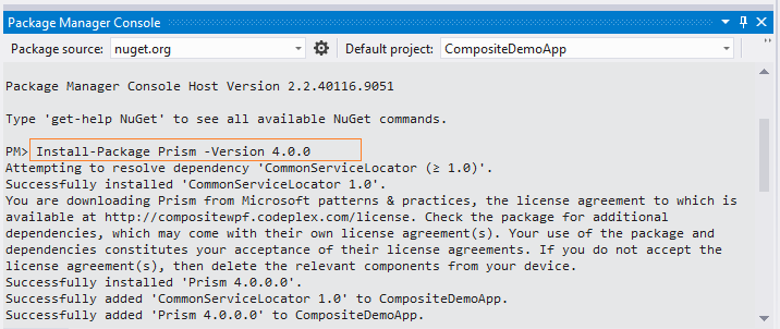
让我们通过“程序包管理器控制台”下载 prism 4.0,如下面的屏幕截图所示。

单击程序包管理器控制台选项上的回车键,程序包管理器控制台窗口将打开。现在,在程序包管理器控制台窗口中输入以下命令并按回车键。
Install-Package Prism -Version 4.0.0
所需的库将被下载,并显示类似“成功安装 Prism 4.0.0.0”的消息,如下所示。
如果转到“引用”文件夹,您会看到 Prism 相关的库会自动引用到此项目。
现在,在项目根目录添加 ViewModel 文件夹,然后添加一个名为 CalculationViewModel.cs 的文件,我们将在后续步骤中在该文件中编写代码。
在 MainWindow.xaml 文件中编写以下 XAML 代码,这将为我们创建 UI。代码非常简单,因此我们假设它是显而易见的。
<Grid DataContext="{StaticResource calculationVM}" Background="LightBlue">
        <Grid.RowDefinitions>
            <RowDefinition ></RowDefinition>
            <RowDefinition></RowDefinition>
            <RowDefinition></RowDefinition>
            <RowDefinition Height="80"></RowDefinition>
        </Grid.RowDefinitions>
        <Grid.ColumnDefinitions>
            <ColumnDefinition Width="200"></ColumnDefinition>
            <ColumnDefinition></ColumnDefinition>
            <ColumnDefinition></ColumnDefinition>
        </Grid.ColumnDefinitions>
        <Rectangle Grid.Column="1" Grid.RowSpan="5">
            <Rectangle.Fill>
                <LinearGradientBrush EndPoint="0.5,1" StartPoint="0.5,0">
                    <GradientStop Color="#FF83FF97" Offset="0" />
                    <GradientStop Color="White" Offset="1" />
                </LinearGradientBrush>
            </Rectangle.Fill>
        </Rectangle>
        <Rectangle Grid.Column="2" Grid.RowSpan="5">
            <Rectangle.Fill>
                <LinearGradientBrush EndPoint="0.5,1" StartPoint="0.5,0">
                    <GradientStop Color="Yellow"  Offset="0" />
                    <GradientStop Color="White" Offset="1" />
                </LinearGradientBrush>
            </Rectangle.Fill>
        </Rectangle>
        <TextBlock Grid.Row="0" FontSize="18"  Grid.Column="0" Margin="5" Height="30" Text="Values"></TextBlock>
        <TextBlock Grid.Row="0"  Grid.Column="1" FontSize="16"  Background="LightGreen" Margin="5"
                   HorizontalAlignment="Center" TextAlignment="Center" Width="120" Height="30"
                   Text="{Binding FirstInput, Mode=TwoWay}">
        </TextBlock>
        <TextBlock Grid.Row="0"  Grid.Column="2" FontSize="16"  Background="BlanchedAlmond"  Margin="5"
                   HorizontalAlignment="Center" TextAlignment="Center" Width="120" Height="30"
                   Text="{Binding SecondInput, Mode=TwoWay}">
        </TextBlock>

        <TextBlock Grid.Row="1" FontSize="18"  Grid.Column="0" Margin="5" Height="30" Text="Individual Commands"></TextBlock>
        <Button Grid.Row="1" Grid.Column="1" HorizontalAlignment="Center" Margin="5" Width="120" Height="30"
                Content="Increment - First" Command="{Binding FirstIncrementCommand}">
        </Button>
        <Button Grid.Row="1" Grid.Column="2"  HorizontalAlignment="Center"  Margin="5" Width="120" Height="30"
                Content="Increment - Second" Command="{Binding SecondIncrementCommand}">
        </Button>

        <TextBlock Grid.Row="2" FontSize="18"  Grid.Column="0" Margin="5" Height="30" Text="Composite Commands"></TextBlock>
        <Button Grid.Row="2" Grid.Column="1" FontSize="16" Grid.ColumnSpan="2" Margin="10,5,10,5"
                HorizontalAlignment="Center" Width="240"  Height="30" Content="Increment - All"
                Command="{Binding AllIncrementCommand}">
        </Button>

        <TextBlock Grid.Row="3" FontSize="18"  Grid.Column="0" Margin="5" Height="30" Text="Information"></TextBlock>
        <TextBlock Grid.Row="3" FontSize="16"  Grid.Column="1" Margin="5" Foreground="OrangeRed"
                   TextWrapping="Wrap" Text="First value can be increamented till 5.">
        </TextBlock>
        <TextBlock Grid.Row="3" FontSize="16"  Grid.Column="2" Margin="5" Foreground="OrangeRed"
                   TextWrapping="Wrap" Text="Second value can be increamented till 10.">
        </TextBlock>
    </Grid>
在 MainWindow.xaml 中提供 CalculationViewModel 的命名空间。
xmlns:vm ="clr-namespace:CompositeDemoApp.ViewModel"
     <Window.Resources>
        <vm:CalculationViewModel x:Key="calculationVM">
        </vm:CalculationViewModel>
        <Style TargetType="{x:Type Button}">
            <Setter Property="Foreground" Value="Blue"/>
            <Setter Property="IsEnabled" Value="True"/>
            <Style.Triggers>
                <Trigger Property="IsEnabled" Value="false">
                    <Setter Property="Foreground" Value="#FFADADAD"/>
                </Trigger>
            </Style.Triggers>
        </Style>
     </Window.Resources>
与我们在 上一篇文章 中所做的不同,我们将使用“NotificationObject”。此类由 Prism 框架在“Microsoft.Practices.Prism.ViewModel”命名空间下提供。它实现了 INotifyPropertyChanged 接口。这是一个标准接口,每当我们想通知对象(UI 或 ViewModel)属性值更新时,都必须实现它。现在,让 CalculationViewModel 继承自 NotificationObject 类。
在 MainWindow.xaml 文件中,我们将 UI 属性绑定到了 CalculationViewModel 的属性。CalculationViewModel 的“FirstInput”属性与第一个 TextBlock 的“Text”属性绑定,CalculationViewModel 的“SecondInput”属性与第二个 TextBlock 的“Text”属性绑定。现在,我们需要在 CalculationViewModel 中创建并实现这些属性。
        private int firstInput;
        private int secondInput;
        public int FirstInput
        {
            get
            {
                return firstInput;
            }
            set
            {
                firstInput = value;
                RaisePropertyChanged("FirstInput");
            }
        }
        public int SecondInput
        {
            get
            {
                return secondInput;
            }
            set
            {
                secondInput = value;
                RaisePropertyChanged("SecondInput");
            }
         }
现在,在单击“Increment - First”或“Increment - Second”按钮时,我们希望增加与“FirstInput”或“SecondInput” TextBlock 绑定的数字。为此,我们需要在按钮单击时使用命令,这将在下一节中使用 DelegateCommand 来完成。
DelegateCommand 的用法
要使用 DelegateCommand,我们首先需要为每个命令创建私有字段,类型为 DelegateCommand。在本例中,我们需要两个 DelegateCommand 来处理“Increment – First”和“Increment – Second”这两个按钮,如下所示。
       private DelegateCommand firstIncrementCommand;
       private DelegateCommand secondIncrementCommand;
       public DelegateCommand FirstIncrementCommand
       {
           get { return firstIncrementCommand; }
       }
       public DelegateCommand SecondIncrementCommand
       {
           get { return secondIncrementCommand; }
       }
在 CalculationViewModel 的构造函数中,我们需要实例化命令,因此编写以下代码行。
        firstIncrementCommand = new DelegateCommand(incrementFirstInput, canIncrementFirstInput);
        secondIncrementCommand = new DelegateCommand(incrementSecondInput, canIncrementSecondInput);
这里我们正在创建一个 DelegateCommand 类的实例。它接受两个方法名称作为委托参数。对于 firstIncrementCommand,我们将方法名称 incrementFirstInput 作为第一个参数传递,该方法包含我们在单击“Increment – First”按钮时要执行的实际逻辑。第二个参数是我们传递的 canIncrementFirstInput 方法的名称,它将决定命令是否应该启用或禁用。当执行和可执行时触发的方法将调用 respective 命令。现在实现这两个方法。
       private void incrementFirstInput()
       {
           FirstInput += 1;
           FirstIncrementCommand.RaiseCanExecuteChanged();
       }
       // Enable Increment - First button only if first value is less than 5
      private bool canIncrementFirstInput()
       {
           bool ifFirstInputLessThan5 = firstInput < 5;
           return ifFirstInputLessThan5;
       }
同样,我们需要实现两个方法来响应“Increment – Second”按钮命令 - SecondIncrementCommand。
       private void incrementSecondInput()
       {
            SecondInput += 1;
            SecondIncrementCommand.RaiseCanExecuteChanged();
       }
       // Enable Increment - Second button only if second value is less than 10
       private bool canIncrementSecondInput()
       {
            bool ifSecondInputLessThan10 = secondInput < 10;
            return ifSecondInputLessThan10;
       }
现在运行应用程序。单击“Increment – First”或“Increment – Second”按钮,我们将看到第一个 TextBlock 中的数字最多增加到 5,第二个 TextBlock 中的数字最多增加到 10。
到目前为止,在此演示应用程序中,当我们单击“Increment – First”按钮时,第一个 TextBlock 中的数字会增加;单击“Increment – Second”按钮时,第二个 TextBlock 中的数字会增加。
现在,我们希望通过重用我们已经为“Increment – First”和“Increment – Second”按钮单击实现的逻辑,在单击单个按钮时增加两个 TextBlock 中的数字。这种可重用性可以通过使用 CompositeCommand 来实现。让我们了解 CompositeCommand。
什么是 CompositeCommand
CompositeCommand 是一个可以包含多个子命令的类。它提供了执行所有关联方法(Execute 和 CanExecute)的功能。如果任何子命令的 CanExecute 方法返回 false,则不会执行任何子命令。
例如,如果 CompositeCommand 有 5 个子命令,其中任何一个关联的子命令的 CanExecute 方法返回 false,CompositeCommand 将不会被启用/执行。
CompositeCommand 的用法
要使用 CompositeCommand,首先创建一个 CompositeCommand 的私有字段。
private CompositeCommand allIncrementCommand;
在 CalculationViewModel 的构造函数中,创建 CompositeCommand 类的实例。然后将 firstIncrementCommand 和 secondIncrementCommand 注册到 CompositeCommand。这里 firstIncrementCommand 和 secondIncrementCommand 是子命令。
       allIncrementCommand = new CompositeCommand();
       allIncrementCommand.RegisterCommand(firstIncrementCommand);
       allIncrementCommand.RegisterCommand(secondIncrementCommand);
现在,在 CalculationViewModel 中创建另一个公共命令,以便我们可以在 UI 代码中绑定它,如下所示。
       public CompositeCommand AllIncrementCommand
       {
           get { return allIncrementCommand; }
       }
由于 AllIncrementCommand 命令已绑定到 UI 中的“Increment – All”按钮,因此当 AllIncrementCommand 被触发时,这两个子命令将自动与其关联的方法一起执行。
现在运行应用程序。单击“Increment – All”按钮,我们将看到两个 TextBlock 中的数字最多增加到 5。之后,“Increment – First”和“Increment – All”按钮将被禁用,但“Increment – Second”按钮仍然启用。
之所以发生这种情况,是因为第一个子命令(称为 firstIncrementCommand)的 canIncrementFirstInput 方法在 FirstInput 为 5 后返回 false。正如我们之前解释的,如果任何子命令的 CanExecute 方法返回 false,CompositeCommand 将不起作用。
结论
在本文中,我们学习了 Prism 应用程序中的 DelegateCommand 和 CompositeCommand,以及如何在 MVVM 模式下使用它们。非常欢迎您的评论/建议和疑问。谢谢。