
Silverlight 的俄罗斯方块游戏
4.92/5 (43投票s)
一篇探索在 Silverlight 4 游戏编程中使用 MVVM、样式和模板的文章

目录
- 引言
- Youtube 视频
- 系统要求
- Bricks 解决方案
- 介绍菜单
- MVVM 模式
- 样式和模板的力量
- Bricks 图案背景
- 游戏逻辑
- 附赠:制作有趣的 Bricks 动画
- 附赠:制作有趣的按钮模板
- 最终思考
引言
正如在此呈现的,Bricks! 向这款传奇游戏致敬,但并未对其原始游戏逻辑进行任何重大修改。
除了这是又一个 Silverlight 游戏之外,我试图为 Code Project 的读者提供一些(希望)有用的技巧,教他们如何在 Silverlight 4 中编程此类游戏。我的第一个目标是激发大家对这款游戏的好奇心,然后(希望)在不久的将来激励一些读者提出新的项目和文章。因此,如果在阅读完文章并玩过应用程序后,您感到愿意写点什么、编程点什么,甚至思考一下,我的工作将不虚此行。
Youtube 视频
您可以通过观看我在下面链接中上传的 YouTube 视频来节省一些时间。

系统要求
如果您已经拥有 Visual Studio 2010,这足以运行应用程序。如果您没有,可以直接从 Microsoft 下载以下 100% 免费的开发工具。
重要提示:请不要尝试使用 Visual Studio 2008 打开此解决方案,因为它将无法正常工作。如果您没有 VS2010,请下载上面链接中的 Visual Web Developer 2010。我向您保证,您不会失望的。
Bricks 解决方案

图 1:解决方案结构
Visual Studio 2010 解决方案由三个项目组成:Bricks.Silverlight、Bricks.Silverlight.Core 和 Bricks.Silverlight.Web,如下表所示:
| 项目 | 描述 |
| Bricks.Silverlight | 这是 Silverlight 项目本身,包含 UI 和 Model-View-ViewModel 逻辑。 |
| Bricks.Silverlight.Core | 这个 Silverlight 类库项目包含了 Bricks! 功能的核心。 |
| Bricks.Silverlight.Web | 此项目是启动项目,包含应用程序的入口页面以及一些资源文件。 |
介绍菜单
介绍菜单包含 Bricks 的“Logo”和一些游戏说明。

图 2:介绍菜单
MVVM 模式
在此项目中,我使用了 Model-View-ViewModel (MVVM) 模式。正如一些读者可能知道的那样,这种模式起源于 WPF 和 Silverlight 技术,简单来说,在 MVVM 中,用户界面(由 .XAML/.XAML.cs 文件中的“视图”组成)将控制权“交给”一组通用类,称为“视图模型 (ViewModels)”,以便用户在视图方面的任何交互都会反映到底层的视图模型类,反之亦然。
正如我们在下面的 图 3 中看到的,视图不直接访问数据,而是依赖于其对应的视图模型提供的绑定。绑定是连接视图和视图模型的“胶水”。例如,代表分数 Score 值的 TextBlock,在视图中名为 "txtScore",它绑定到视图模型中名为 "Score" 的 Int32 属性。对 "Score" 属性的任何更改都会反映回视图端的 txtScore 元素。另一方面,名为 "Start" 的 Button 元素绑定到视图模型中名为 "StartCommand" 的 ICommand 属性,因此用户每次单击按钮时都会自动调用视图模型端的 DoStart() 方法。

图 3:MVVM 模式的基本结构
完整的绑定映射如下表所示:
| 视图 (BricksView) | 视图模型 (BricksViewModel) | ||||
| 视觉元素 | 类型 | 属性 | 绑定属性 | 类型 | 转换器 |
| pnlIntro | StackPanel | Visibility | IsIntroVisible | bool | BooleanToVisibilityConverter |
| pnlGameOver | StackPanel | Visibility | IsGameOverVisible | bool | BooleanToVisibilityConverter |
| pnlGamePaused | StackPanel | Visibility | IsGamePausedVisible | bool | BooleanToVisibilityConverter |
| txtScore | TextBlock | 文本 | 分数 | int | (无) |
| txtHiScore | TextBlock | 文本 | HiScore | int | (无) |
| txtLines | TextBlock | 文本 | Lines | int | (无) |
| txtLevel | TextBlock | 文本 | 信号强度 | int | (无) |
| lstBoard | ListBox | ItemsSource | Bricks | ObservableNotifiableCollection<IBrick> | (无) |
| lstNext | ListBox | ItemsSource | 信号强度 | ObservableNotifiableCollection<IBrick> | (无) |
| btnStart | Button | ButtonService.Command | StartCommand | ICommand | (无) |
| btnStart | Button | IsEnabled | StartCanExecute | bool | (无) |
| btnPause | Button | ButtonService.Command | PauseCommand | ICommand | (无) |
| btnPause | Button | IsEnabled | PauseCanExecute | bool | (无) |
| btnStop | Button | ButtonService.Command | StopCommand | ICommand | (无) |
| btnStop | Button | IsEnabled | StopCanExecute | bool | (无) |
关于上述绑定的几点重要说明:
- 面板可见性绑定:有 3 个面板,
pnlIntro、pnlGameOver和pnlGamePaused,它们可以根据视图模型中相应bool属性的值可见或不可见。问题在于Visibility属性不是布尔值,而是枚举,可以是Visible或Collapsed,并且bool和Visibility之间没有自动转换。这就是为什么我们使用BooleanToVisibilityConverter来正确映射值。BooleanToVisibilityConverter辅助类在此发挥了主要作用。public object Convert(object value, Type targetType, object parameter, System.Globalization.CultureInfo culture) { Visibility rv = Visibility.Visible; try { var x = bool.Parse(value.ToString()); if (x) { rv = Visibility.Visible; } else { rv = Visibility.Collapsed; } } catch (Exception) { } return rv; } - 整数绑定:在这种情况下,将整数值转换为 txtScore、txtHiScore、txtLines、txtLevel 视觉元素的 Text 属性是自动完成的。请注意,在下面的 setter 中,我们必须使用 OnPropertyChanged("Score") 调用,以便视图知道属性已更新,然后相应地更新自身。
public int Score { get { return score; } set { score = value; OnPropertyChanged("Score"); } } - 列表框绑定:
Listbox类有一个 ItemsSource 属性,可以绑定到Collection属性。但相反,我们将其绑定到ObservableNotifiableCollection属性,以便列表框可以同时监听集合项列表中的更改以及列表中项属性的更改。下面的代码片段显示了视图模型端的实现非常简单。public ObservableNotifiableCollection<IBrick>> Bricks { get { return bricks; } set { bricks = value; } } - 按钮绑定:在这种情况下,我们绑定了 2 个属性:其中一个绑定到视图模型中简单的
bool属性的IsEnabled属性,第二个是ButtonService.Command附加属性。如一些读者可能知道的那样,有几种技术可以用来绑定命令,但我更喜欢使用 Patrick Cauldwell 在 他的博客 中最初提出的ButtonService辅助类。我特别喜欢它,因为它很简单,正如我们在下面的示例中看到的。public ICommand StartCommand { get { return new RelayCommand(() => DoStart()); } } public bool StartCanExecute { get { return startCanExecute; } set { startCanExecute = value; OnPropertyChanged("StartCanExecute"); } }
下面的 图 4 说明了 View 和 ViewModel 的某些元素如何相互交互:View 中的一些视觉元素在 ViewModel 端具有绑定的属性。

图 4:视图和视图模型对应元素如何相互交互。
但等等!您注意到那两个棋盘实际上是两个列表框吗?您还注意到这些列表框被映射到集合了吗?更具体地说,它们被绑定到视图模型中类型为 ObservableNotifiableCollection<IBrick> 的属性。
样式和模板的力量
游戏 UI 引擎的核心是 MVVM 模式和所有绑定机制。但真正启用这款游戏 MVVM 功能的是能够将普通的 Listbox 转换为一个 10x16 的矩形棋盘来容纳我们的 Bricks。
我在这里使用的模板灵感来自 Beatriz Stollnitz 非常酷的例子,她将一个简单的 Listbox 转换成了太阳系。

图 5:Beatriz Stollnitz 如何通过样式和模板将 WPF Listbox 转换为太阳系。
看到这一点后,我意识到使用 MVVM(通过绑定)编程游戏比使用传统的 UI 元素操作要容易得多。简单地说:我不需要关心定位代表 Bricks 的视觉元素(在视图部分)。我只需要关心 Bricks 的底层抽象模型表示。然后 MVVM 会自动完成其余的工作,更新视图(从而更新 Listbox)。
真正的问题是 Bea Stollnitz 最初是为 WPF 编写的,而我想在 Silverlight 中使用相同的技术。我达到了一个点,无法确定它是否可行。于是我着手尝试。在将 Bea 的 XAML 示例移植到 Silverlight 时遇到的主要问题是这部分:
    <Style TargetType="ListBoxItem">
        <Setter Property="Canvas.Left" Value="{Binding Path=Orbit, Converter={StaticResource convertOrbit}, ConverterParameter=0.707}"/>
        <Setter Property="Canvas.Bottom" Value="{Binding Path=Orbit, Converter={StaticResource convertOrbit}, ConverterParameter=0.707}"/>
        (…)
    </Style>
上面的 XAML 描述了 Bea 的太阳系中每个 Planet 的样式/模板。我所要做的就是为 Bricks! 游戏做同样的事情,所以代替 Planet 的定位,我将有 Bricks 的定位,而 Bricks 将绑定到视图模型端的 Left 和 Top 属性,如下所示:
    <Style TargetType="ListBoxItem">
        <Setter Property="Canvas.Left" Value="{Binding Path=Left}"/>
        <Setter Property="Canvas.Top" Value="{Binding Path=Top}"/>
        (…)
    </Style>
但是您注意到 ListBoxItem 标签中的 "Canvas.Left" 和 "Canvas.Top" 属性了吗?虽然这些属性位于 ListBoxItem 元素内部,但它们是所谓的附加属性:实际上它们定义在父元素(即 Canvas 元素)中。坏消息是,正如我发现的那样,这种使用附加属性的模板方式根本不适用于 Silverlight 4。但幸运的是,在花了一些小时研究这个问题后,我找到了 Microsoft 的 David Anson 写的一篇非常好的博文,其中描述了一个使用 SetterValueBindingHelper 的解决方法,这确实解决了问题!
现在我有了解决方法,上述问题的解决方案如下面的代码片段所示:
        <Style TargetType="ListBoxItem">
            <Setter Property="local:SetterValueBindingHelper.PropertyBinding">
                <Setter.Value>
                    <local:SetterValueBindingHelper>
                        <local:SetterValueBindingHelper
                                Type="System.Windows.Controls.Canvas, System.Windows, Version=2.0.5.0, Culture=neutral, PublicKeyToken=7cec85d7bea7798e"
                                Property="Left"
                                Binding="{Binding Path=Left, Mode=TwoWay}"/>
                        <local:SetterValueBindingHelper
                                Type="Canvas"
                                Property="Top"
                                Binding="{Binding Path=Top, Mode=TwoWay}"/>
                    </local:SetterValueBindingHelper>
                </Setter.Value>
            </Setter>
        </Style>
现在请注意,模板和样式如何将一个枯燥的 Listbox 变成一个令人兴奋、色彩斑斓的游戏棋盘。

图 6:通过样式和模板,我如何将 Silverlight Listbox 转换为游戏棋盘。
再次感谢 Bea Stollnitz 和 David Anson!
Bricks 图案背景
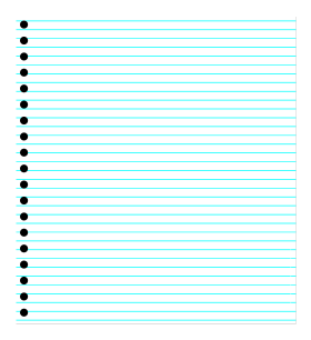
图 7:Bricks 图案背景
在这里您可以看到我们游戏的美丽背景。使用 Visual Studio 2010 和 XAML 可以非常轻松地做到这一点。事实上,如此简单,以至于我在这项目中没有觉得需要使用 Expression Blend。您在 XAML 上练习得越多,您就会越自然地用 XAML 创建您的设计,并且您的效率会越高。
每个纸张的打孔都由一个 Ellipse 元素表示,每条纸张线由一个没有定义高度的青色 Border 元素构成。
            <StackPanel Width="400" Background="White" HorizontalAlignment="Left" Margin="0,20,0,0">
                <Border BorderBrush="Cyan" BorderThickness="0.5" Margin="0,5"/>
                <Border BorderBrush="Cyan" BorderThickness="0.5" Margin="0,5"/>
                <Border BorderBrush="Cyan" BorderThickness="0.5" Margin="0,5"/>
				.
				.(some lines removed for the sake of readability)
				.
            </StackPanel>
            <StackPanel  Width="400" HorizontalAlignment="Left" Margin="0,20,0,0">
                <Ellipse Width="10" Height="10" HorizontalAlignment="Left" Fill="Black" Margin="5,5"/>
                <Ellipse Width="10" Height="10" HorizontalAlignment="Left" Fill="Black" Margin="5,5"/>
                <Ellipse Width="10" Height="10" HorizontalAlignment="Left" Fill="Black" Margin="5,5"/>
				.
				.(some lines removed for the sake of readability)
				.
		</StackPanel>
游戏逻辑
应用程序逻辑的核心在于 BricksBoard 类。您可以在下面看到一个简单的图,展示了核心类与 BricksBoard 类之间的关系。

图 8:核心类图
为了简洁起见,我们可以通过描述 BricksBoard 的一些成员来解释大部分游戏逻辑。

图 9:BricksBoard 类
- BricksBoard 构造函数:请注意下面的构造函数接收一个
IPresenter类的实例。这是因为 控制反转 (IoC) 模式,有时也称为 依赖注入 (DI) 模式。public BricksBoard(IPresenter presenter) { this.presenter = presenter; this.width = 10; this.height = 16; InitializeArray(); next = GetRandomShape(); }一旦
BricksBoard被实例化,一个外部的IPresenter依赖项就会被“注入”,然后它将“控制”新的BricksBoard实例(因此得名“控制反转”)。棋盘尺寸被硬编码为 10x16,棋盘数组被初始化。在构造函数结束时,会生成一个新的“下一个”形状(“下一个”形状定义了在当前形状卡在堆栈顶部时将从棋盘顶部落下的形状)。 - InitializeArray 方法:此方法负责“清理”棋盘和游戏状态。也就是说,分数被清除,棋盘被初始化。
        public override void InitializeArray()
        {
            score = 0;
            level = 1;
            lines = 0;
            if (shape != null)
            {
                shape.Y = 0;
            }
            next = GetRandomShape();
            presenter.UpdateScoreView(score, hiScore, lines, level, next);
            base.InitializeArray();
        }
基类 InitializeArray() 方法通过创建一个空的IBrick二维数组来清除棋盘。public virtual void InitializeArray() { shapeArray = new IBrick[width, height]; for (int row = 0; row < height; row++) { for (int column = 0; column < width; column++) { shapeArray[column, row] = null; } } } - GetRandomShape 方法:此方法随机生成将从棋盘顶部掉落的下一个 Tetromino。这有助于玩家在处理当前移动时提前思考下一步。
private IShape GetRandomShape() { IShape newShape = null; Random randomClass = new Random(); int randomCode = randomClass.Next((int)ShapeCodes.I, (int)ShapeCodes.Z + 1); switch (randomCode) { case (int)ShapeCodes.I: newShape = new StickShape(); newShape.Color = Colors.Cyan; break; case (int)ShapeCodes.J: newShape = new JShape(); newShape.Color = Colors.Blue; break; case (int)ShapeCodes.L: newShape = new LShape(); newShape.Color = Colors.Orange; break; case (int)ShapeCodes.O: newShape = new OShape(); newShape.Color = Colors.Yellow; break; case (int)ShapeCodes.S: newShape = new SShape(); newShape.Color = Colors.Green; break; case (int)ShapeCodes.T: newShape = new TShape(); newShape.Color = Colors.Purple; break; case (int)ShapeCodes.Z: newShape = new ZShape(); newShape.Color = Colors.Red; break; } ((BaseShape)newShape).Presenter = presenter; presenter.UpdateScoreView(score, hiScore, lines, level, newShape); return newShape; } - ProcessNextMove 方法:此方法由
BricksViewModel类按时间顺序调用,具体取决于游戏速度。这是通过BricksViewModel类中计时器的Tick事件完成的。void timer_Tick(object sender, EventArgs e) { foreach (var b in bricks) { b.X = b.X; b.Y = b.Y; } presenter.Tick(); }然后
BricksPresenter类中的 Tick 方法调用ProcessNextMove方法。public void Tick() { BricksBoard.ProcessNextMove(); }ProcessNextMove 方法本身会更新棋盘,如果需要则放置一个新的随机块,如果可能则向下移动当前的四联体,移除已完成的行并更新视图端的分数,如果棋盘已满则结束当前游戏。
public void ProcessNextMove() { if (shape == null) { StartRandomShape(); } bool couldMoveDown = true; if (!shape.Anchored) { RemovePieceFromCurrentPosition(shape); couldMoveDown = shape.MoveDown(); } else { bool full = !StartRandomShape(); if (full) { InitializeArray(); GameOver(); return; } else { couldMoveDown = shape.MoveDown(); } } if (!couldMoveDown) { RemoveCompletedRows(); } if (presenter != null) { presenter.UpdateBoardView(GetStringFromShapeArray(), shapeArray, width, height); } } - StartRandomShape 函数:此函数用于实例化一个新的随机四联体,将其放置在棋盘的顶部和中间。如果棋盘有空间容纳一个新的四联体,则该函数返回 true,否则返回 false,表示棋盘已满且游戏已结束。
public bool StartRandomShape() { if (shape != null && !shape.Anchored) { this.RemovePieceFromCurrentPosition(shape); } shape = next; next = GetRandomShape(); shape.ContainerBoard = this; int x = (this.Width - shape.Width) / 2; bool ret = this.TestPieceOnPosition(shape, x, 0); if (ret) { this.PutPieceOnPosition(shape, x, 0); } return ret; } - RemovePieceFromCurrentPosition 方法:此方法将下落的四联体“从其位置分离”,清除其下方的棋盘位置。
public void RemovePieceFromCurrentPosition(IShape shape) { for (int row = 0; row < shape.Height; row++) { for (int column = 0; column < shape.Width; column++) { if (shape.ShapeArray[column, row] != null) { shapeArray[column + shape.X, row + shape.Y] = null; } } } } - TestPieceOnPosition 函数:此函数测试一个给定的四联体是否可以放置在指定位置,即:1) 每个四联体块都必须落在棋盘尺寸内的某个位置,并且 2) 每个四联体都必须落在空位上。
public bool TestPieceOnPosition(IShape shape, int x, int y) { for (int row = 0; row < shape.Height; row++) { for (int column = 0; column < shape.Width; column++) { //is the position out of range? if (column + x < 0) return false; if (row + y < 0) return false; if (column + x >= width) return false; if (row + y >= height) return false; //will the shape collide in the board? if ( shapeArray[column + x, row + y] != null && shape.ShapeArray[column, row] != null) { return false; } } } return true; } - PutPieceOnPosition 方法:使用当前的四联体形状更新棋盘。最后,
BricksPresenter会收到通知来更新分数和棋盘。public void PutPieceOnPosition(IShape shape, int x, int y) { if (!TestPieceOnPosition(shape, x, y)) throw new CantSetShapePosition(); for (int row = 0; row < shape.Height; row++) { for (int column = 0; column < shape.Width; column++) { if (shape.ShapeArray[column, row] != null) { shapeArray[column + x, row + y] = shape.ShapeArray[column, row]; } } } shape.X = x; shape.Y = y; if (presenter != null) { presenter.UpdateBoardView(GetStringFromShapeArray(), shapeArray, width, height); } } - RemoveCompletedRows 方法:在玩家的每次移动时,游戏都必须测试是否有水平线被砖块填满。如果是这种情况,则清除棋盘中的该行,并更新
BricksPresenter以反映新的棋盘配置。每完成一行,分数增加 10 分。每完成 10 行,关卡增加 1。private bool RemoveCompletedRows() { bool completed = false; int row = height - 1; while (row >= 0) { completed = true; for (int column = 0; column < width; column++) { if (shapeArray[column, row] == null) { completed = false; break; } } if (completed) { IBrick[] removedBricks = new IBrick[width]; for (int column = 0; column < width; column++) { removedBricks[column] = shapeArray[column, row]; } shape = null; for (int innerRow = row; innerRow > 0; innerRow--) { for (int innerColumn = 0; innerColumn < width; innerColumn++) { shapeArray[innerColumn, innerRow] = shapeArray[innerColumn, innerRow - 1]; shapeArray[innerColumn, innerRow - 1] = null; } } score += 10 * level; if (score > hiScore) { hiScore = score; } lines++; level = 1 + (lines / 10); presenter.UpdateScoreView(score, hiScore, lines, level, next); } else { row--; } } if (presenter != null) { presenter.UpdateBoardView(GetStringFromShapeArray(), shapeArray, width, height); } if (completed) { RemoveCompletedRows(); } return completed; } - MoveLeft, MoveRight, MoveDown, Rotate90 和 Rotate270 函数:这些函数只是将移动传播给下落的四联体,因此我们来看一下
BaseShape对象中的相应方法。请注意,这些方法只是执行其名称所示的操作,将四联体向左、向右、向下(如果可能的话!)移动,并进行旋转,即以有序的方式转置列和行。public bool MoveLeft() { bool test = false; if (!anchored) { if (containerBoard == null) throw new NullContainerBoardException(); containerBoard.RemovePieceFromCurrentPosition(this); test = containerBoard.TestPieceOnPosition(this, this.X - 1, this.Y); if (test) { containerBoard.RemovePieceFromCurrentPosition(this); containerBoard.PutPieceOnPosition(this, this.X - 1, this.Y); } } return test; } public bool MoveRight() { bool test = false; if (!anchored) { if (containerBoard == null) throw new NullContainerBoardException(); containerBoard.RemovePieceFromCurrentPosition(this); test = containerBoard.TestPieceOnPosition(this, this.X + 1, this.Y); if (test) { containerBoard.PutPieceOnPosition(this, this.X + 1, this.Y); } } return test; } public bool MoveDown() { bool test = false; if (!anchored) { containerBoard.RemovePieceFromCurrentPosition(this); //should anchor if shape can't move down from current position if (!containerBoard.TestPieceOnPosition(this, this.X, this.Y + 1)) { containerBoard.PutPieceOnPosition(this, this.X, this.Y); this.Anchor(); } else { if (containerBoard == null) throw new NullContainerBoardException(); test = containerBoard.TestPieceOnPosition(this, this.X, this.Y + 1); if (test) { containerBoard.PutPieceOnPosition(this, this.X, this.Y + 1); } } } return test; } public bool Rotate90() { bool test = false; if (!anchored) { if (containerBoard == null) throw new NullContainerBoardException(); IBrick[,] newShapeArray = new IBrick[height, width]; IBrick[,] oldShapeArray = new IBrick[width, height]; for (int row = 0; row < height; row++) { for (int column = 0; column < width; column++) { newShapeArray[height - row - 1, column] = shapeArray[column, row]; oldShapeArray[column, row] = shapeArray[column, row]; } } containerBoard.RemovePieceFromCurrentPosition(this); int w = width; int h = height; this.width = h; this.height = w; this.shapeArray = newShapeArray; if (containerBoard.TestPieceOnPosition(this, this.X, this.Y)) { containerBoard.PutPieceOnPosition(this, this.X, this.Y); } else { this.width = w; this.height = h; this.shapeArray = oldShapeArray; containerBoard.PutPieceOnPosition(this, this.X, this.Y); } } return test; } public bool Rotate270() { bool test = false; if (!anchored) { if (containerBoard == null) throw new NullContainerBoardException(); containerBoard.RemovePieceFromCurrentPosition(this); IBrick[,] newShapeArray = new IBrick[height, width]; IBrick[,] oldShapeArray = new IBrick[width, height]; for (int row = 0; row < height; row++) { for (int column = 0; column < width; column++) { newShapeArray[row, width - column - 1] = shapeArray[column, row]; oldShapeArray[column, row] = shapeArray[column, row]; } } int w = width; int h = height; this.width = h; this.height = w; this.shapeArray = newShapeArray; if (containerBoard.TestPieceOnPosition(this, this.X, this.Y)) { containerBoard.PutPieceOnPosition(this, this.X, this.Y); } else { this.width = w; this.height = h; this.shapeArray = oldShapeArray; containerBoard.PutPieceOnPosition(this, this.X, this.Y); } } return test; }
附赠:制作有趣的 Bricks 动画
这部分对于游戏来说并非真正必要,但我认为它会增加游戏的视觉效果和感觉。起初,我对方形、静态的 Bricks 不够满意,所以我想创建一些动画,让 Bricks 看起来像在“摇晃”。
我通过创建一个名为 ctlBrick 的自定义类来实现这一点,该类继承自 Grid 类。每个 ctlBrick 实例代表屏幕上的一个不同 Bricks。
        public void GenerateRandomPoints()
        {
            this.Children.Remove(path);
            if (color != Colors.Transparent)
            {
                double h = this.Height;
                double w = this.Width;

                Random rnd = new Random();

                p00 = new Point(2 + rnd.Next(-amplitude, amplitude), 2 + rnd.Next(-amplitude, amplitude));
                p01 = new Point(2 + rnd.Next(-amplitude, amplitude), 1 * h / 4 + rnd.Next(-amplitude, amplitude));
                p02 = new Point(2 + rnd.Next(-amplitude, amplitude), 3 * h / 4 + rnd.Next(-amplitude, amplitude));
                p03 = new Point(2 + rnd.Next(-amplitude, amplitude), -2 + h + rnd.Next(-amplitude, amplitude));

                p30 = new Point(-2 + w + rnd.Next(-amplitude, amplitude), 2 + rnd.Next(-amplitude, amplitude));
                p31 = new Point(-2 + w + rnd.Next(-amplitude, amplitude), 1 * h / 4 + rnd.Next(-amplitude, amplitude));
                p32 = new Point(-2 + w + rnd.Next(-amplitude, amplitude), 3 * h / 4 + rnd.Next(-amplitude, amplitude));
                p33 = new Point(-2 + w + rnd.Next(-amplitude, amplitude), -2 + h + rnd.Next(-amplitude, amplitude));

                p10 = new Point(1 * w / 4 + rnd.Next(-amplitude, amplitude), 2 + rnd.Next(-amplitude, amplitude));
                p20 = new Point(3 * w / 4 + rnd.Next(-amplitude, amplitude), 2 + rnd.Next(-amplitude, amplitude));

                p13 = new Point(1 * w / 4 + rnd.Next(-amplitude, amplitude), -2 + h + rnd.Next(-amplitude, amplitude));
                p23 = new Point(3 * w / 4 + rnd.Next(-amplitude, amplitude), -2 + h + rnd.Next(-amplitude, amplitude));

                var figures = new PathFigureCollection();

                var pathSegmentCollection1 = new PathSegmentCollection();
                var pathSegmentCollection2 = new PathSegmentCollection();
                var pathSegmentCollection3 = new PathSegmentCollection();
                var pathSegmentCollection4 = new PathSegmentCollection();

                PointCollection pointCollection = new PointCollection();
                pointCollection.Add(p10);
                pointCollection.Add(p20);
                pointCollection.Add(p30);
                pointCollection.Add(p31);
                pointCollection.Add(p32);
                pointCollection.Add(p33);
                pointCollection.Add(p23);
                pointCollection.Add(p13);
                pointCollection.Add(p03);
                pointCollection.Add(p02);
                pointCollection.Add(p01);
                pointCollection.Add(p00);

                pathSegmentCollection4.Add(new PolyBezierSegment() { Points = pointCollection });
                figures.Add(new PathFigure() { StartPoint = p00, Segments = pathSegmentCollection4, IsClosed = true });

                path = new Path()
                {
                    Data = new PathGeometry()
                    {
                        Figures = figures
                    },
                    Stroke = new SolidColorBrush(Colors.Black),
                    StrokeThickness = 2,
                    Fill = new SolidColorBrush(color)
                };

                this.Children.Add(path);
            }
        }
上面的代码赋予了每个 Bricks 一种“摇晃”的外观。“摇晃”的方形实际上由一个 Path 元素组成,该元素包含一个 PolyBezierSegment 类,该类涉及 Grid 元素。如上所示,PolyBezierSegment 定义了一组随机点,这些点大致模仿一个方形,但会轻微地向左、向右、向上和向下移动,从而产生“摇晃方形”的印象。
附赠:制作有趣的按钮模板
Silverlight 的另一个强大功能是允许您为标准视觉元素(如按钮)创建模板。
在我们的例子中,标准的按钮元素对于屏幕上的其他元素来说不够美观。我们有色彩鲜艳的 Bricks 和有趣的 Comic Sans 字体,所以标准的 Silverlight 按钮根本不搭。但幸运的是,我们可以处理模板,使常规按钮能够共享应用程序其余部分的相同外观和感觉。下面是它的工作原理:
- 首先,我们必须为常规按钮属性定义 setter。
<Style TargetType="Button"> <Setter Property="FontFamily" Value="Comic Sans MS"/> <Setter Property="FontSize" Value="12"/> <Setter Property="FontWeight" Value="Bold"/> <Setter Property="Foreground" Value="#FF000000"/> <Setter Property="Padding" Value="3"/> <Setter Property="BorderThickness" Value="0"/> <Setter Property="BorderBrush"> <Setter.Value> <LinearGradientBrush EndPoint="0.5,1" StartPoint="0.5,0"> <GradientStop Color="#FFA3AEB9" Offset="0"/> <GradientStop Color="#FF8399A9" Offset="0.375"/> <GradientStop Color="#FF718597" Offset="0.375"/> <GradientStop Color="#FF617584" Offset="1"/> </LinearGradientBrush> </Setter.Value> </Setter> - 然后,我们必须为
Template属性定义一个 setter。<Setter Property="Template"> <Setter.Value> <ControlTemplate TargetType="Button"> <Grid ShowGridLines="False"> <VisualStateManager.VisualStateGroups> <VisualStateGroup x:Name="CommonStates"> <VisualState x:Name="Normal"/> <!--When the mouse is over the button, the button background is highlighted. --> <VisualState x:Name="MouseOver"> <Storyboard> <ColorAnimation Duration="0" Storyboard.TargetName="BackgroundGradient" Storyboard.TargetProperty="(Rectangle.Fill).(GradientBrush.GradientStops)[0].(GradientStop.Color)" To="#FFF0F0F0"/> <ColorAnimation Duration="0" Storyboard.TargetName="BackgroundGradient" Storyboard.TargetProperty="(Rectangle.Fill).(GradientBrush.GradientStops)[1].(GradientStop.Color)" To="#FFF0F0F0"/> <ColorAnimation Duration="0" Storyboard.TargetName="BackgroundGradient" Storyboard.TargetProperty="(Rectangle.Fill).(GradientBrush.GradientStops)[2].(GradientStop.Color)" To="#FFF0F000"/> <ColorAnimation Duration="0" Storyboard.TargetName="BackgroundGradient" Storyboard.TargetProperty="(Rectangle.Fill).(GradientBrush.GradientStops)[3].(GradientStop.Color)" To="#FFF0F000"/> </Storyboard> </VisualState> <!--When the button is pressed, the button gets a blue bold border. --> <VisualState x:Name="Pressed"> <Storyboard> <ColorAnimation Duration="0" Storyboard.TargetName="BackgroundGradient" Storyboard.TargetProperty="(Rectangle.Fill).(GradientBrush.GradientStops)[0].(GradientStop.Color)" To="#FFFFFFFF"/> <ColorAnimation Duration="0" Storyboard.TargetName="BackgroundGradient" Storyboard.TargetProperty="(Rectangle.Fill).(GradientBrush.GradientStops)[1].(GradientStop.Color)" To="#FFF0F0F0"/> <ColorAnimation Duration="0" Storyboard.TargetName="BackgroundGradient" Storyboard.TargetProperty="(Rectangle.Fill).(GradientBrush.GradientStops)[2].(GradientStop.Color)" To="#FFE0E000"/> <ColorAnimation Duration="0" Storyboard.TargetName="BackgroundGradient" Storyboard.TargetProperty="(Rectangle.Fill).(GradientBrush.GradientStops)[3].(GradientStop.Color)" To="#FFFFFFFF"/> </Storyboard> </VisualState> <!--When the button is disabled, the button's opacity is lowered to a bit more than 50%. --> <VisualState x:Name="Disabled"> <Storyboard> <DoubleAnimation Duration="0" Storyboard.TargetName="DisabledVisualElement" Storyboard.TargetProperty="Opacity" To=".55"/> </Storyboard> </VisualState> </VisualStateGroup> <!--When the button is focused, the button's FocusVisualElement's opacity is set to 100%. --> <VisualStateGroup x:Name="FocusStates"> <VisualState x:Name="Focused"> <Storyboard> <DoubleAnimation Duration="0" Storyboard.TargetName="FocusVisualElement" Storyboard.TargetProperty="Opacity" To="1"/> </Storyboard> </VisualState> <VisualState x:Name="Unfocused" /> </VisualStateGroup> </VisualStateManager.VisualStateGroups> <Grid> <Grid.ColumnDefinitions> <ColumnDefinition Width="*"/> <ColumnDefinition Width="*"/> <ColumnDefinition Width="*"/> </Grid.ColumnDefinitions> <Border x:Name="Background" Grid.Column="1" Margin="0,5,0,0" CornerRadius="0" BorderThickness="{TemplateBinding BorderThickness}" BorderBrush="{TemplateBinding BorderBrush}"> <Grid Margin="1" ShowGridLines="False"> <Path Stroke="Blue" StrokeThickness="2" x:Name="BackgroundGradient"> <Path.Data> <PathGeometry> <PathFigureCollection> <PathFigure StartPoint="10,0" IsClosed="True"> <PathFigure.Segments> <PolyBezierSegment Points=" 30,5 50,-5 75,0 80,10 80,20 75,30 50,25 30,35 10,30 5,20 5,10 10,0"/> </PathFigure.Segments> </PathFigure> </PathFigureCollection> </PathGeometry> </Path.Data> <Path.Fill> <LinearGradientBrush x:Name="BackgroundAnimation" StartPoint=".7,0" EndPoint=".7,1" Opacity="1" > <GradientStop Color="#FFF0F0F0" Offset="0"/> <GradientStop Color="#FFF0F0F0" Offset="0.5"/> <GradientStop Color="#FFC0C000" Offset="0.5"/> <GradientStop Color="#FFC0C000" Offset="1"/> </LinearGradientBrush> </Path.Fill> </Path> </Grid> </Border> <ContentPresenter x:Name="contentPresenter" Content="{TemplateBinding Content}" ContentTemplate="{TemplateBinding ContentTemplate}" VerticalAlignment="{TemplateBinding VerticalContentAlignment}" HorizontalAlignment="{TemplateBinding HorizontalContentAlignment}" Margin="{TemplateBinding Padding}" Grid.Column="1" /> <Rectangle x:Name="DisabledVisualElement" Grid.Column="1" RadiusX="0" RadiusY="3" Fill="#FFFFFFFF" Opacity="0" IsHitTestVisible="false" /> <Path Grid.Column="1" StrokeThickness="3" x:Name="FocusVisualElement" Margin="0,5,0,0" Opacity="0" IsHitTestVisible="false"> <Path.Stroke> <LinearGradientBrush> <GradientStop Color="Blue" Offset="0"/> <GradientStop Color="Blue" Offset="1"/> </LinearGradientBrush> </Path.Stroke> <Path.Data> <PathGeometry> <PathFigureCollection> <PathFigure StartPoint="10,0" IsClosed="True"> <PathFigure.Segments> <PolyBezierSegment Points="30,5 50,-5 75,0 80,10 80,20 75,30 50,25 30,35 10,30 5,20 5,10 10,0"/> </PathFigure.Segments> </PathFigure> </PathFigureCollection> </PathGeometry> </Path.Data> </Path> </Grid> </Grid> </ControlTemplate> </Setter.Value>
 |
在 Normal 状态下,按钮的边框由一个 Path 元素定义,该元素由一个 PolyBezierSegment 定义,该 PolyBezierSegment 由您在此处看到的弯曲线条组成。 |
 |
在 Focused 状态下,按钮会获得一个蓝色粗边框,以便您可以看到哪个按钮处于焦点状态。 |
 |
在 MouseOver 状态下,按钮的背景会高亮显示。 |
 |
在 Disabled 状态下,按钮的不透明度会降低。 |
最终思考
就是这样。我花了过去两周的时间来完成它,学到了很多东西,而且对我来说非常有趣。我希望它对您来说也同样有用和有趣。
如果您对文章或游戏有任何评论、建议或投诉,请告诉我!您的反馈将非常感激。
历史
- 2010-08-29:初始版本。
- 2010-09-07:添加了按钮模板。