
使用 Bootstrap 创建响应式网站
4.95/5 (12投票s)
为不同设备尺寸(例如大型桌面设备、笔记本电脑、平板电脑和移动设备)创建单个响应式网站。本文介绍了使用 Bootstrap 创建响应式网站的基本概念。
引言
作为一名 Web 开发人员,您可能已经注意到,过去我们为桌面和移动设备提供了不同的网站,这需要额外的开发工作和管理。响应式网站设计允许我们创建一个可以响应不同设备尺寸的单个网站。
本文介绍了如何使用 Twitter Bootstrap 创建响应式网站。
响应式设计
响应式设计是指创建一个单个响应式网站,该网站可以在多种设备尺寸上良好地呈现。一个网站可以在不同设备尺寸上运行,例如大型桌面设备、笔记本电脑、平板电脑和移动设备。因此,响应式设计理念使我们能够创建一个单一的响应式网站,而不是为不同的设备创建多个布局。
Bootstrap
Bootstrap 是一个完整的 HTML、CSS 和 JavaScript 框架,用于创建响应式网站。Bootstrap 提供响应式 CSS 类、CSS 组件和 JavaScript 组件。
Bootstrap 使用 移动优先方法 来创建响应式网站。根据移动优先方法,Bootstrap 强调首先为移动设备创建网站,然后对其进行增强和丰富,使其也能在其他大型设备上呈现。
视觉断点
Bootstrap 根据设备宽度将不同设备分为 4 类:超小屏幕设备、小屏幕设备、中等屏幕设备和大屏幕设备。Bootstrap 根据这些类别提供不同的表示法,并在此基础上定义 CSS 类。

- 宽度小于
768px的所有设备都属于超小屏幕设备类别,例如移动设备。Bootstrap 提供 "xs" 来表示这些设备。 - 宽度大于等于
768px且小于992px的所有设备都属于小屏幕设备类别,例如平板电脑。Bootstrap 提供 "sm" 来表示这些设备。 - 宽度大于等于
992px且小于1200px的所有设备都属于中等屏幕设备类别,例如笔记本电脑。Bootstrap 提供 "md" 来表示这些设备。 - 宽度大于等于
1200px的所有设备都属于大屏幕设备类别,例如大型桌面设备。Bootstrap 提供 "lg" 符号来表示这些设备。
12 列网格布局结构
Bootstrap 提供 12 列网格布局结构来使布局具有响应性。Bootstrap 将设备的完整宽度分为 12 列。类名后指定的数字表示具有该类的元素将占用总共 12 列中的指定列数。
示例: 如果我们为 <div> 元素定义一个 '.col-sm-6' 类,那么这意味着该 <div> 元素将在小、中和大屏幕设备上占用总共 12 列中的 6 列空间,而在超小屏幕设备上占用全部 12 列。

将 Bootstrap 添加到项目中
使用 Visual Studio 创建一个新网站。如果您没有 Visual Studio,可以选择任何您喜欢的编辑器。
从 Nuget 包管理器安装 Bootstrap Nuget 包。如果您使用的是不同的 IDE,请从 https://bootstrap.ac.cn/getting-started/#download 下载 Bootstrap 的已编译版本,方法是单击下载 Bootstrap 按钮。
成功安装后,网站将包含以下文件夹。
Content- 包含 bootstrap.cssScripts- 包含 bootstrap.js 和 jquery.js。安装 jQuery 是因为 bootstrap.js 依赖于 jQuery 库。- fonts

创建基本布局
添加一个 HTML 页面 Home.html 并添加以下代码。
在页面的 head 中添加 bootstrap.css 的引用
在 body 标签的底部添加 jQuery-1.9.1.js 和 bootstrap.js 的引用。我们通常在页面底部加载脚本,以提高页面加载时间,因为我们希望首先加载 HTML 和 CSS。
<!DOCTYPE html>
<html>
<head>
    <title>Home</title>
	<meta charset="utf-8" />
    <meta name="viewport" content="width=device-width,
    initial-scale=1, maximum-scale=1, user-scalable=no">
    <link href="Content/bootstrap.css" rel="stylesheet" />
    <link href="Content/Site.css" rel="stylesheet" />
</head>
<body>
    <header class="container">
       <h2>Header</h2>
    </header>
    <section class="container" >
        <div class="row">
            <div class="col-md-3 leftNav">
                Left Navigation
            </div>
            <div class="col-md-6 content">
                Content Area
            </div>
            <div class="col-md-3 reletedContent">
                Relate content
            </div>
        </div>
    </section>
    <footer class="container">
        <h2>Footer</h2>
    </footer>
    <script src="Scripts/jquery-1.9.1.js"></script>
    <script src="Scripts/bootstrap.js"></script>
</body>
</html>
注意以下代码,它确保了网页在移动设备上的正确呈现。user-scalable=no 定义不允许用户在移动设备上缩放页面。
<meta name="viewport" content="width=device-width,
initial-scale=1, maximum-scale=1, user-scalable=no">
这将创建 <header> <footer> 和主容器部分。在 header、footer 和 section 元素上添加 .container 类。
在 section 中添加一个具有 .row 类的 <div>。
在 .row 类中添加 3 个列类,分别用于左侧导航、主内容和其他相关内容。分别定义 .col-md-3、col-md-6、col-md-3 类。这些类将总共 12 列的结构按 3:6:3 的比例划分。
因此,左侧导航将占用前 3 列,主内容区域将占用接下来的 6 列,其他相关内容将占用最后 3 列空间。
添加导航项
Bootstrap 提供了 Navbar 组件来显示导航项。Bootstrap 导航栏组件提供了切换按钮(右侧的 3 条小横线)来显示和隐藏导航项。
在 header 部分下方添加以下代码。
<nav class="navbar navbar-inverse container-fluid navbar-fixed-top">
        <div>
            <!-- Brand and toggle get grouped for better mobile display -->
            <div class="navbar-header">
                <button type="button" class="navbar-toggle collapsed"
                data-toggle="collapse" data-target="#bs-example-navbar-collapse-1"
                aria-expanded="false">
                    <span class="sr-only">Toggle navigation</span>
                    <span class="icon-bar"></span>
                    <span class="icon-bar"></span>
                    <span class="icon-bar"></span>
                </button>
                <a class="navbar-brand"
                href="http://modernpathshala.com">Bootstrap Demo</a>
            </div>
            <!-- Collect the nav links, forms, and other content for toggling -->
            <div class="collapse navbar-collapse" id="bs-example-navbar-collapse-1">
                <ul class="nav navbar-nav">
                    <li class="active"><a href="Home.html">
                    <span class="glyphicon glyphicon-home"></span>
                    Home</a></li>
                    <li><a href="#">
                    <span class="glyphicon glyphicon-king"></span>
                    About</a></li>

                </ul>
                <form class="navbar-form navbar-left" role="search">
                    <div class="form-group-sm">
                        <div class="input-group">
                            <input type="text"
                            class="form-control" placeholder="Search">
                            <span class="input-group-btn">
                                <button class="btn btn-success btn-sm">Go!</button>
                            </span>
                        </div>
                    </div>

                </form>
                <ul class="nav navbar-nav navbar-right">
                    <li><a href="#"><span class="glyphicon
                    glyphicon-log-in"></span> Login</a></li>
                    <li><a href="#"><span class="glyphicon
                    glyphicon-user"></span> Register</a></li>

                </ul>
            </div><!-- /.navbar-collapse -->
        </div><!-- /.container-fluid -->
    </nav>
Bootstrap Navbar 组件包含 2 个主要部分
- 具有 .
navbar-header的<div>元素,在移动设备上显示,它包含切换按钮以及品牌名称和 Logo 信息。 - 具有 .
navbar-collapse的<div>元素,包含链接和用于搜索功能的表单控件。
.navbar-fixed-top 类用于在页面滚动时将导航栏固定在顶部。类似地,我们有 .navbar-fixed-bottom 类用于将导航栏固定在页面底部。
下面是导航栏的桌面和移动视图。
桌面视图

移动视图

添加 Glyphicons
Glyphicon 是一个图标库,它使用 Unicode 字符来显示图标。Glyphicons 提供不同的类来表示不同的图标。类名以 .glyphicon-*. 开头。Glyphicons 的官方网站是 http://glyphicons.com/。并非所有 Glyphicons 都是免费的,但使用 Bootstrap,我们可以免费使用其中一些。
要创建图标,我们只需要添加一个 <span> 元素,并提供 2 个类。一个是 .glyphicon ,另一个是 .glyphicon-* 图标特定的类。
<span class="glyphicon glyphicon-home">
上面的行将创建主页图标。我在“添加导航项”部分上方添加了一些图标。完整的图标类列表可在 https://bootstrap.ac.cn/components/#glyphicons 找到。
添加面板
面板是容器元素,用于包含其他内容。有时我们需要将某些内容显示在一个框内,这时就可以使用面板。Bootstrap 提供响应式面板。
一个面板包含 3 个子部分
- 面板头
- 面板体
- 面板脚
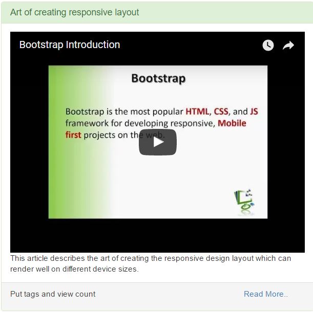
<div class="panel panel-primary">
    <div class="panel-heading">
        <h2 class="panel-title">Column Offset using Bootstrap</h2>
    </div>

    <div class="panel-body">
        This article describes the art of creating the responsive design
        layout which can render well on different device sizes.
    </div>

    <div class="panel-footer">
        <div class="row">
            <div class="col-xs-9">
                <p>Put tags and view count</p>
            </div>
            <div class="col-xs-3">
                <a href="#">Read More..</a>
            </div>
        </div>
    </div>

</div>
要创建一个面板,我们需要添加 .panel 类。我们可以使用其他上下文类,例如 .panel-default, .panel-success, .panel-error, .panel-info, .panel-warning,以及 .panel 类来创建不同类型的面板。
- 使用
.panle-header类创建面板头,使用.panel-title类创建面板标题。 - 使用
.panel-body类创建面板体。 - 使用
.panle-footer类创建面板脚。

添加 Jumbotron
Jumbotron 用于在网页上显示引导性文本。我们可以使用 Jumbotron 来突出页面上的某些信息。Bootstrap 提供 .jumbotron 类来创建 Jumbotron 组件。
<div class="jumbotron">
    <h2>Bootstrap</h2>
    <img class="img-responsive img-thumbnail"
    src="Content/Images/article1.png" />
    <p class="text-justify">Bootstrap is HTML,
    CSS and JavaScript framework for developing responsive,
      mobile first websites. Bootstrap makes front-end web development faster and easier.
     It's made for folks of all skill levels, devices of all shapes,
     and projects of all sizes.</p>
    <p><a class="btn btn-success btn-default"
    href="#">Start Learning</a></p>
</div>
下图显示了 Jumbotron。

添加响应式图片
通常,图片在浏览器中显示为内联元素。因此,Bootstrap 提供 .img-responsive 类来创建响应式图片。此类将图片显示为块级元素,并使其能够响应不同的设备尺寸。因此,只需在 <img> 元素上添加 .img-responsive 类即可创建响应式图片。我在上面的 Jumbotron 组件中添加了一张响应式图片。
Bootstrap 还为图片提供了其他类。
img-rounded- 创建圆角图片img-thumbnail- 创建缩略图img-circle- 将图片裁剪成圆形。
<img class="img-responsive img-thumbnail" src="Content/Images/article1.png" />
添加响应式表格
表格用于以行和列的形式显示结构化数据。Bootstrap 提供 .table 类来创建响应式表格。.table 类将定义表格的布局并设置边框。添加 .table-responsive 类来使 table 具有响应性。
Bootstrap 提供下面提到的其他表格类
.table-striped -使交替行的颜色不同,使表格行看起来像条纹。.table-condensed -减小表格行高,使表格更紧凑。.table-hover -在悬停事件时提供悬停效果。
<table class="table table-responsive table-striped table-condensed table-hover">
    <tbody>
        <tr class="success">
            <td>Class name</td>
            <td>Description</td>
        </tr>
        <tr>
            <td>table</td>
            <td>Define a table</td>
        </tr>
        <tr>
            <td>table-responsive</td>
            <td>Class to make a table responsive</td>
        </tr>
        <tr>
            <td>table-striped</td>
            <td>Make a table like as stripe</td>
        </tr>
        <tr>
            <td>table-hover</td>
            <td>Create hover effect</td>
        </tr>
    </tbody>
</table>
预览显示在 Panel 部分的图片中。
嵌入响应式视频
Bootstrap 提供类来使嵌入具有响应性。大多数时候,我们需要在网页中显示第三方应用程序。因此,我们可以使用 <embed>, <iframe>, <video> 或 <object> 标签来嵌入这些第三方应用程序。
Bootstrap 提供 .embed-responsive 类来创建响应式嵌入。我们还可以提供纵横比来显示不同的纵横比。
.embed-responsive-16by9- 以 16:9 的宽高比显示嵌入或视频.embed-responsive-4by3- 以 4:3 的宽高比显示嵌入或视频
<div class="embed-responsive embed-responsive-4by3">
    <iframe src="https://www.youtube.com/embed/afsdfsdSg5l_Eo" width="425" height="350"></iframe>
</div>
因此,这将从 YouTube 嵌入适用于桌面、平板电脑和移动设备的响应式视频。
结论
因此,我们使用了几个 Bootstrap 组件来创建一个响应式网站,该网站的外观如下。您可以从附件中下载应用程序的完整代码。
桌面视图

移动视图

有关如何分步创建本文所示网站的更详细信息,请参阅完整的视频 教程系列。