
灵活的 WPF ToggleSwitch 无外观控件, 支持 C# & VB
5.00/5 (35投票s)
现代切换开关 - 从概念模型到可以插入您自己应用程序的完整自定义 WPF 控件
目录
背景
我一直在努力保持我所处理的应用程序的现代外观和感觉。微软的重点是 UWP,而 WPF(以及 WinForms)仍然是当前平台,这些 UI 框架的通用控件并未获得应有的充分关注来保持外观的清新和现代化。

切换开关(Toggle switches)存在于大多数现代桌面、移动和游戏操作系统中,包括 Windows 10、iOS 和 Android 等。我需要在我的 WPF 应用程序中使用一个灵活且可重用的切换开关。我找不到完全符合我要求的,于是我自己构建了一个。默认样式模仿了 Windows 10 中的切换开关,然而控件的设计允许在不接触控件代码的情况下完全控制外观。
先决条件
本文的项目是基于以下考虑构建的:
- C#6 最低版本(**在属性** > **生成** > **高级** > **常规** > **语言版本** > **C#6** 中设置)
- 使用 VS2017 构建(VS2015 也可以加载、构建和运行)
- 首次加载代码时,需要还原 Nuget 包
概念
在重新设计、改造或构建新的 WPF 控件时,我喜欢在深入开发自定义控件之前先创建模型/原型。这是我使用的模型

在上图截屏中,我们可以看到两种不同的布局
- 标题内容在开关上方,开关设置在左侧,开关标签在开关右侧
- 自定义标题在左侧,开关在右侧,开关标签在开关左侧
标题和带有状态标签的开关可以是两个完全独立的控件,但将它们合并成一个控件可以为鼠标悬停、点击等提供更大的触控区域。
我不会深入介绍 Mock 项目的 XAML(未使用 C#/VB 代码),因为这并不重要。您可以下载解决方案并查看截图中的 XAML,然后运行它来确切了解它是如何模仿 Windows 10 的。
设计

该控件可以是在 `UserControl` 中重新设计的 `CheckBox` 或 `ToggleButton`,或者我们可以使用 `Control` 基类并从头开始构建所有功能。`CheckBox` 和 `ToggleButton` 都包含了大部分核心功能,何必重复造轮子呢?
相对于 `CheckBox`,使用 `ToggleButton` 作为 `ToggleSwitch` 控件的基础是最佳选择。如果我们查看 `CheckBox` 控件的定义,可以看到它派生自 `ToggleButton`。

该控件可以仅仅是开关机制和切换状态标签,但是,就像 `CheckBox` 控件一样,将标题内容作为控件的一部分可以使使用快速、简单和整洁。
设计目标
看看各种设备和应用程序中的切换开关的使用方式,例如上面 Windows 10 通知设置的截屏,我的目标是实现以下几点:
- 开关机制模仿 Windows 10 外观,可拉伸,可重新着色
- 开关标签可以放在开关机制的左侧或右侧
- 可选的标题可以包含内容,而不仅仅是文本
- 标题位置可选:开关机制的左侧、右侧、上方、下方
- 标题内容可以放在开关机制的左侧或右侧
- 标题内容具有水平对齐方式:左对齐、居中、右对齐和拉伸
- 标题、开关和开关标签之间的内部间距可调
- 用于设置标题、开关和开关标签画笔的属性
- 标签热键支持,例如:ALT+[字母]
快速了解无样式控件
对于那些熟悉 WPF 但从未开发过无样式自定义控件的人来说,这是一个快速入门介绍。如果您需要更深入的介绍,请查阅 Microsoft 关于WPF 控件创作的文档[^]。
依赖属性
引用表示一个可以通过样式、数据绑定、动画和继承等方法设置的属性。 - Microsoft Docs[^]
因此,依赖属性不仅仅是简单的 C# 属性,它们还包含了对样式、数据绑定、动画系统等的底层支持,这些对开发者来说是透明的。
public static readonly DependencyProperty CheckedTextProperty =
    DependencyProperty.Register(nameof(CheckedText),
                                typeof(string),
                                typeof(ToggleSwitch),
                                new PropertyMetadata("On",
                                    new PropertyChangedCallback(OnCheckTextChanged)));

public string CheckedText
{
    get { return (string)GetValue(CheckedTextProperty); }
    set { SetValue(CheckedTextProperty, value); }
}
Public Shared ReadOnly CheckedTextProperty As DependencyProperty = _
    DependencyProperty.Register(NameOf(CheckedText), _
                                GetType(String), _
                                GetType(ToggleSwitch), _
                                New PropertyMetadata("On", _
                                    New PropertyChangedCallback(AddressOf OnCheckTextChanged)))

Public Property CheckedText() As String
	Get
		Return DirectCast(GetValue(CheckedTextProperty), String)
	End Get
	Set
		SetValue(CheckedTextProperty, Value)
	End Set
End Property
使用依赖属性看起来可能有点麻烦,比标准属性更复杂,但借助 Visual Studio (VS) 内置的代码片段 `propdb`(适用于 C#)或 VB 的 *CTRL-K, CTRL-X > WPF > "添加依赖属性注册"*,代码框架会自动为您插入。下面是 VS 代码片段自动生成的代码示例。
        public int MyProperty
        {
            get { return (int)GetValue(MyPropertyProperty); }
            set { SetValue(MyPropertyProperty, value); }
        }

        // Using a DependencyProperty as the backing store for MyProperty.
        // This enables animation, styling, binding, etc...
        public static readonly DependencyProperty MyPropertyProperty =
            DependencyProperty.Register("MyProperty",
                                        typeof(int),
                                        typeof(ownerclass),
                                        new PropertyMetadata(0));
    Public Property Prop1 As String
        Get
            Return GetValue(Prop1Property)
        End Get

        Set(ByVal value As String)
            SetValue(Prop1Property, value)
        End Set
    End Property

    Public Shared ReadOnly Prop1Property As DependencyProperty =
                           DependencyProperty.Register("Prop1",
                           GetType(String), GetType(),
                           New PropertyMetadata(Nothing))
通用(默认)模板
在开发自定义控件时,包含一个通用主题模板总是很受欢迎的。通用主题模板应包含无样式控件的默认外观。控件会自动关联一个外观。这意味着您或其他使用该控件的开发者不必手动引用控件的模板。您可以在 Microsoft 文档中阅读更多关于控件创作基础[^] 的内容。
`Generic.Xaml` 模板是一个资源字典文件,必须放置在项目根文件夹的 `\Themes` 文件夹中。如果放置在其他任何地方,或文件类型不同,则找不到控件模板。
要让控件使用默认的通用模板,您需要让控件知道它有一个。我通常在控件的构造函数中完成此操作。
static ToggleSwitch()
{
    DefaultStyleKeyProperty
        .OverrideMetadata(typeof(ToggleSwitch),
                          new FrameworkPropertyMetadata(typeof(ToggleSwitch)));
}
Shared Sub New()
    DefaultStyleKeyProperty _
        .OverrideMetadata(GetType(ToggleSwitch), _
                          New FrameworkPropertyMetadata(GetType(ToggleSwitch)))
End Sub
视觉状态
引用表示控件在特定状态下的视觉外观。 - Microsoft Docs[^]
与其在单个控件上直接设置样式触发器[^],不如在控件模板中设置视觉状态[^],其中包含故事板[^] 和动画[^],用于更改多个属性和控件的一组属性。
<VisualState x:Name="MouseOver">
    <Storyboard>
        <DoubleAnimation To="0" Duration="0:0:0.2"
                         Storyboard.TargetName="normalBorder"
                         Storyboard.TargetProperty="(UIElement.Opacity)"/>
        <DoubleAnimation To="1" Duration="0:0:0.2"
                         Storyboard.TargetName="hoverBorder"
                         Storyboard.TargetProperty="(UIElement.Opacity)"/>
        <ObjectAnimationUsingKeyFrames Duration="0:0:0.2"
                                       Storyboard.TargetName="optionMark"
                                       Storyboard.TargetProperty="Fill">
            <DiscreteObjectKeyFrame KeyTime="0"
                                    Value="{StaticResource ToggleSwitch.MouseOver.Glyph}"/>
        </ObjectAnimationUsingKeyFrames>
        <ObjectAnimationUsingKeyFrames Duration="0:0:0.2"
                                       Storyboard.TargetName="optionMarkOn"
                                       Storyboard.TargetProperty="Fill">
            <DiscreteObjectKeyFrame KeyTime="0"
                                    Value="{StaticResource ToggleSwitch.MouseOver.On.Glyph}"/>
        </ObjectAnimationUsingKeyFrames>
    </Storyboard>
</VisualState>
注意:视觉状态不支持模板或数据绑定,只支持静态值和 `StaticResources`。然而,对于这种情况有一个变通方法,将在本文后面讨论。
布局控件部件:放置、对齐和共享分组
下一节将介绍 `ToggleSwitch` 控件如何通过属性实现控件元素的可选布局。
放置
`ToggleSwitch` 控件由两个关键部分组成:
- 标题内容(可选)
- 开关 + 状态标签
我将把“标题内容”称为“`Content`”,把“开关 + 状态标签”称为 `ToggleButton`。
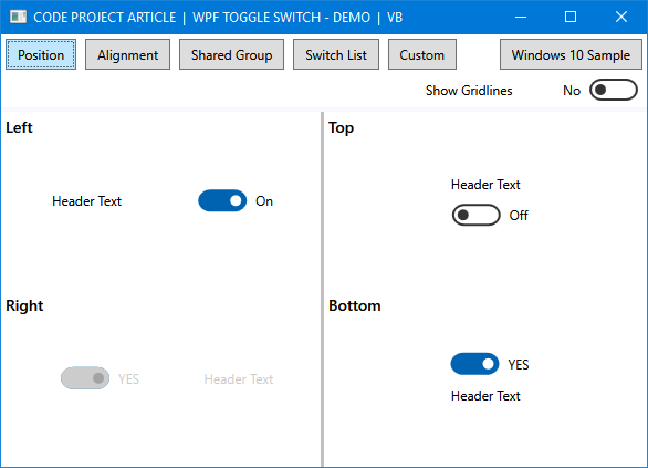
对于标题相对于开关的放置,其中一个部分需要固定或锚定。在这种情况下,我将锚定 `ToggleButton` 并将其 `Content` 围绕在其周围。下面的截屏显示了这将如何工作。

(`ShowGridlines = true` 以查看部件布局)
将此截屏转换为代码,有三个部分:
- 放置属性
- 网格布局
- 视觉状态以修改网格布局属性
通用模板
首先,我们需要将默认的通用模板与控件相关联。
private static readonly Type ctrlType = typeof(TestPositioning);

static TestPositioning()
{
	DefaultStyleKeyProperty.OverrideMetadata
    (ctrlType, new FrameworkPropertyMetadata(ctrlType));
}

public override void OnApplyTemplate()
{
	base.OnApplyTemplate();
	// set our initial VisualState here
}
Private Shared ReadOnly ctrlType As Type = GetType(TestPositioning)

Shared Sub New()
	DefaultStyleKeyProperty.OverrideMetadata
           (ctrlType, New FrameworkPropertyMetadata(ctrlType))
End Sub

Public Overrides Sub OnApplyTemplate()
	MyBase.OnApplyTemplate()
	' set our initial VisualState here
End Sub
Control 类
下面的代码用于管理放置依赖属性(DP)。我们跟踪 `PropertyChanged` 事件并根据新的 DP 值更改 `VisualState`。
private const Dock DefaultContentPlacementValue = Dock.Left;

private static readonly Type ctrlType = typeof(TestPositioning);

public static readonly DependencyProperty ContentPlacementProperty =
    DependencyProperty.Register(nameof(ContentPlacement),
                                typeof(Dock), ctrlType,
                                new PropertyMetadata(DefaultContentPlacementValue,
                                                     OnContentPlacementPropertyChanged));

[Bindable(true)]
public Dock ContentPlacement
{
    get { return (Dock)GetValue(ContentPlacementProperty); }
    set { SetValue(ContentPlacementProperty, value); }
}
Private Const DefaultContentPlacementValue As Dock = Dock.Left

Private Shared ReadOnly ctrlType As Type = GetType(TestPositioning)

Public Shared ReadOnly ContentPlacementProperty As DependencyProperty _
    = DependencyProperty.Register(NameOf(ContentPlacement), _
                                  GetType(Dock), ctrlType, _
                                  New PropertyMetadata(DefaultContentPlacementValue, _
                                      AddressOf OnContentPlacementPropertyChanged))

<Bindable(True)>
Public Property ContentPlacement() As Dock
    Get
        Return GetValue(ContentPlacementProperty)
    End Get
    Set
        SetValue(ContentPlacementProperty, Value)
    End Set
End Property
当 `PropertyChanged` 事件发生时,我们需要通知 `Content` 的 `VisualState` 放置已更改。
public override void OnApplyTemplate()
{
    base.OnApplyTemplate();
    UpdatePlacementVisualState(ContentPlacement);
}

private static void OnContentPlacementPropertyChanged(DependencyObject d,
                                                      DependencyPropertyChangedEventArgs e)
{
    var ctrl = d as TestPositioning;
    if (ctrl != null)
        ctrl.OnContentPlacementChanged((Dock)e.NewValue, (Dock)e.NewValue);
}

protected virtual void OnContentPlacementChanged(Dock newValue, Dock oldValue)
{
    UpdatePlacementVisualState(newValue);
}

private void UpdatePlacementVisualState(Dock newPlacement)
{
    GoToState(PlacementVisualState + newPlacement.ToString(), false);
}

internal bool GoToState(string stateName, bool useTransitions)
{
    return VisualStateManager.GoToState(this, stateName, useTransitions);
}
Public Overrides Sub OnApplyTemplate()
    MyBase.OnApplyTemplate()
    UpdatePlacementVisualState(ContentPlacement)
End Sub

Private Shared Sub OnContentPlacementPropertyChanged(d As DependencyObject, _
                                                     e As DependencyPropertyChangedEventArgs)
    Dim ctrl = TryCast(d, TestPositioning)
    If ctrl IsNot Nothing Then
        ctrl.OnContentPlacementChanged(e.NewValue, e.NewValue)
    End If
End Sub

Protected Overridable Sub OnContentPlacementChanged(newValue As Dock, oldValue As Dock)
    UpdatePlacementVisualState(newValue)
End Sub

Private Sub UpdatePlacementVisualState(newPlacement As Dock)
    GoToState(PlacementVisualState + newPlacement.ToString(), False)
End Sub

Friend Function GoToState(stateName As String, useTransitions As Boolean) As Boolean
    Return VisualStateManager.GoToState(Me, stateName, useTransitions)
End Function
注意:当有多个值时,最好使用静态或只读变量以提高可维护性。
XAML 网格(控件模板)
为了将内容放置在固定的状态 `ToggleButton` 周围,我们需要一个 3x3 的网格,并将固定的状态 `ToggleButton` 放在中间(`Grid.Row="1"`, `Grid.Column="1"`)。这为我们提供了放置 `Content` 的四个位置:
- 左侧(`Grid.Row="1"`, `Grid.Column="0"`)
- 右侧(`Grid.Row="1"`, `Grid.Column="2"`)
- 顶部(`Grid.Row="0"`, `Grid.Column="1"`)
- 底部(`Grid.Row="2"`, `Grid.Column="1"`)
下面的 XAML 显示了 Content 设置为默认位置 Bottom。
<Grid>
    <Grid.ColumnDefinitions>
        <ColumnDefinition Width="Auto"/>
        <ColumnDefinition />
        <ColumnDefinition Width="Auto"/>
    </Grid.ColumnDefinitions>
    <Grid.RowDefinitions>
        <RowDefinition Height="Auto"/>
        <RowDefinition />
        <RowDefinition Height="Auto"/>
    </Grid.RowDefinitions>
    <ToggleButton Grid.Column="1" Grid.Row="1"
                    Margin="4 0" Content="Fixed"
                    Foreground="White" Background="Red"
                    VerticalAlignment="{TemplateBinding VerticalContentAlignment}"
                    HorizontalAlignment="{TemplateBinding HorizontalContentAlignment}"/>
    <Border x:Name="ContentHost" Grid.Column="1" Grid.Row="2"
            Background="Green"
            VerticalAlignment="{TemplateBinding VerticalContentAlignment}"
            HorizontalAlignment="{TemplateBinding HorizontalContentAlignment}">
        <TextBlock Text="Content" Foreground="White"/>
    </Border>
</Grid>
视觉状态 - 放置和尺寸
现在我们有了 DP 和网格布局,最后要做的是为每个位置设置一个 `VisualState`,目标是 Content 的网格位置 - `Column`、`Row` 和 `Margin`(间距)。
<VisualStateManager.VisualStateGroups>
    <VisualStateGroup x:Name="ContentPlacement">
        <VisualState x:Name="ContentPlacementAtLeft">
            <Storyboard>
                <ObjectAnimationUsingKeyFrames Storyboard.TargetName="ContentHost"
                                               Storyboard.TargetProperty="(Grid.Column)">
                    <DiscreteObjectKeyFrame KeyTime="0">
                        <DiscreteObjectKeyFrame.Value>
                            <sys:Int32>0</sys:Int32>
                        </DiscreteObjectKeyFrame.Value>
                    </DiscreteObjectKeyFrame>
                </ObjectAnimationUsingKeyFrames>
                <ObjectAnimationUsingKeyFrames Storyboard.TargetName="ContentHost"
                                               Storyboard.TargetProperty="(Grid.Row)">
                    <DiscreteObjectKeyFrame KeyTime="0">
                        <DiscreteObjectKeyFrame.Value>
                            <sys:Int32>1</sys:Int32>
                        </DiscreteObjectKeyFrame.Value>
                    </DiscreteObjectKeyFrame>
                </ObjectAnimationUsingKeyFrames>
                <ObjectAnimationUsingKeyFrames Duration="0"
                                               Storyboard.TargetName="ContentHost"
                                               Storyboard.TargetProperty="Margin">
                    <DiscreteObjectKeyFrame KeyTime="0">
                        <DiscreteObjectKeyFrame.Value>
                            <Thickness>0 0 3 0</Thickness>
                        </DiscreteObjectKeyFrame.Value>
                    </DiscreteObjectKeyFrame>
                </ObjectAnimationUsingKeyFrames>
            </Storyboard>
        </VisualState>
        <VisualState x:Name="ContentPlacementAtTop">
		    <!-- top placement storyboard [..trimmed...] -->
        </VisualState>
        <VisualState x:Name="ContentPlacementAtRight">
		    <!-- right placement storyboard [..trimmed...] -->
        </VisualState>
        <VisualState x:Name="ContentPlacementAtBottom">
		    <!-- bottom placement storyboard [..trimmed...] -->
        </VisualState>
    </VisualStateGroup>
</VisualStateManager.VisualStateGroups>
用法
现在控件和模板都已完成,我们来使用它们。下面是一个示例应用程序的 XAML,它显示了四个控件,每个控件的 `ContentPlacement` 属性都设置为不同的位置。中间有一个 `GridSplitter`,您可以拖动它左右以查看控件在调整大小时的反应。
<Window
    x:Class="Positioning.MainWindow"
    xmlns="http://schemas.microsoft.com/winfx/2006/xaml/presentation"
    xmlns:x="http://schemas.microsoft.com/winfx/2006/xaml"
    mc:Ignorable="d"
    xmlns:d="http://schemas.microsoft.com/expression/blend/2008"
    xmlns:mc="http://schemas.openxmlformats.org/markup-compatibility/2006"
    xmlns:cc="clr-namespace:Positioning"
    Title="Positioning Content  |  C#"
    Height="300" Width="300" WindowStartupLocation="CenterScreen">

    <Grid ShowGridLines="True">
        <Grid.ColumnDefinitions>
            <ColumnDefinition/>
            <ColumnDefinition/>
        </Grid.ColumnDefinitions>
        <Grid.RowDefinitions>
            <RowDefinition/>
            <RowDefinition/>
        </Grid.RowDefinitions>
        <Grid.Resources>
            <Style TargetType="{x:Type TextBlock}">
                <Setter Property="Margin" Value="4"/>
                <Setter Property="FontSize" Value="14"/>
                <Setter Property="FontWeight" Value="SemiBold"/>
            </Style>
            <Style TargetType="{x:Type cc:TestPositioning}">
                <Setter Property="HorizontalAlignment" Value="Stretch"/>
                <Setter Property="VerticalAlignment" Value="Center"/>
                <Setter Property="Margin" Value="10 0"/>
            </Style>
        </Grid.Resources>

        <TextBlock Text="Left"/>
        <cc:TestPositioning /> <!-- DEFAULT -->

        <TextBlock Text="Right" Grid.Row="1"/>
        <cc:TestPositioning ContentPlacement="Right" Grid.Row="1"/>

        <TextBlock Text="Top" Grid.Column="1"/>
            <cc:TestPositioning ContentPlacement="Top" Grid.Column="1"/>

        <TextBlock Text="Bottom" Grid.Row="1" Grid.Column="1"/>
        <cc:TestPositioning ContentPlacement="Bottom" Grid.Row="1" Grid.Column="1"/>

        <GridSplitter ResizeDirection="Columns" ShowsPreview="True"
                      HorizontalAlignment="Right" Width="3"
                      Background="Silver" Grid.RowSpan="2"/>
    </Grid>

</Window>
内容对齐

(`ShowGridlines = true` 以查看部件布局)
接下来,我们需要控制控件两部分内容的水平对齐。实现此目的的代码和 XAML 仅仅是添加一个依赖属性并将其绑定。
Control 类
我们需要能够跟踪 Content 的水平对齐。
public static readonly DependencyProperty ContentHorizontalAlignmentProperty =
    DependencyProperty.Register(nameof(ContentHorizontalAlignment),
                                typeof(HorizontalAlignment),
                                ctrlType,
                                new PropertyMetadata(DefaultContentHorizontalValue,
                                                     OnContentHorizontalAlignmentChanged));

[Bindable(true)]
public HorizontalAlignment ContentHorizontalAlignment
{
    get { return (HorizontalAlignment)GetValue(ContentHorizontalAlignmentProperty); }
    set { SetValue(ContentHorizontalAlignmentProperty, value); }
}
Public Shared ReadOnly ContentHorizontalAlignmentProperty As DependencyProperty = _
    DependencyProperty.Register(NameOf(ContentHorizontalAlignment),
                                GetType(HorizontalAlignment),
                                ctrlType,
                                New PropertyMetadata(DefaultContentHorizontalValue,
                                    AddressOf OnContentHorizontalAlignmentChanged))

<Bindable(True)>
Public Property ContentHorizontalAlignment() As HorizontalAlignment
    Get
        Return GetValue(ContentHorizontalAlignmentProperty)
    End Get
    Set
        SetValue(ContentHorizontalAlignmentProperty, Value)
    End Set
End Property
现在我们可以设置 `Content` 的 `Placement` 和/或 `Alignment`。为了使 `Alignment` 生效,我们还需要在内部调整包含控件两部分的列的宽度。为此,我们需要添加一个内部依赖属性来跟踪 `Content` 何时在左侧或右侧,然后我们需要设置 `Column.Width = "*"`(填充)。
[Browsable(false)]
[EditorBrowsable(EditorBrowsableState.Never)]
public static readonly DependencyProperty IsColumnStretchProperty =
    DependencyProperty.Register(nameof(IsColumnStretch), typeof(bool), ctrlType, null);

[Browsable(false)]
[EditorBrowsable(EditorBrowsableState.Never)]
public bool IsColumnStretch
{
    get { return (bool)GetValue(IsColumnStretchProperty); }
    set { SetValue(IsColumnStretchProperty, value); }
}
<Browsable(False)>
<EditorBrowsable(EditorBrowsableState.Never)>
Public Shared ReadOnly IsColumnStretchProperty As DependencyProperty =
    DependencyProperty.Register(NameOf(IsColumnStretch), GetType(Boolean), ctrlType, Nothing)

<Browsable(False)>
<EditorBrowsable(EditorBrowsableState.Never)>
Public Property IsColumnStretch() As Boolean
    Get
        Return GetValue(IsColumnStretchProperty)
    End Get
    Set
        SetValue(IsColumnStretchProperty, Value)
    End Set
End Property
当 `ContentPlacement` 和 `ContentHorizontalAlignment` 的 `PropertyChanged` 事件发生时,我们需要通知 `Content` 的 `VisualState` 放置已更改。
private const string StretchVisualState = "ContentStretchAt";

public override void OnApplyTemplate()
{
    base.OnApplyTemplate();
    CoerceColumnSizeChange();
    UpdatePlacementVisualState(ContentPlacement);
}

private static void OnContentPlacementPropertyChanged(DependencyObject d,
                                                      DependencyPropertyChangedEventArgs e)
{
    var ctrl = d as TestPositionSizing;
    if (ctrl != null)
        ctrl.OnContentPlacementChanged((Dock)e.NewValue, (Dock)e.NewValue);
}

protected virtual void OnContentPlacementChanged(Dock newValue, Dock oldValue)
{
    CoerceColumnSizeChange();
    UpdatePlacementVisualState(newValue);
}

private static void OnContentHorizontalAlignmentChanged(DependencyObject d,
                                                        DependencyPropertyChangedEventArgs e)
{
    var ctrl = d as TestPositionSizing;
    if (ctrl != null)
        ctrl.CoerceColumnSizeChange();
}

private void CoerceColumnSizeChange()
{
    SetValue(IsColumnStretchProperty, ContentPlacement == Dock.Left ||
                                      ContentPlacement == Dock.Right);
}

private void UpdatePlacementVisualState(Dock newPlacement)
{
    if (IsColumnStretch)
    {
        switch (newPlacement)
        {
            case Dock.Right:
            case Dock.Left:
                GoToState($"{StretchVisualState}{newPlacement.ToString()}", false);
                break;
            case Dock.Top:
            case Dock.Bottom:
                GoToState($"{StretchVisualState}Middle", false);
                break;
        }
    }
    else
    {
        GoToState($"{StretchVisualState}Middle", false);
    }

    GoToState(PlacementVisualState + newPlacement.ToString(), false);
}

internal bool GoToState(string stateName, bool useTransitions)
{
    return VisualStateManager.GoToState(this, stateName, useTransitions);
}
Private Const StretchVisualState As String = "ContentStretchAt"

Public Overrides Sub OnApplyTemplate()
    MyBase.OnApplyTemplate()
    CoerceColumnSizing()
    UpdatePlacementVisualState(ContentPlacement)
End Sub

Private Shared Sub OnContentPlacementPropertyChanged(d As DependencyObject, _
                                                     e As DependencyPropertyChangedEventArgs)
    Dim ctrl = TryCast(d, TestPositionSizing)
    If ctrl IsNot Nothing Then
        ctrl.OnContentPlacementChanged(e.NewValue, e.NewValue)
    End If
End Sub

Protected Overridable Sub OnContentPlacementChanged(newValue As Dock, oldValue As Dock)
    CoerceColumnSizing()
    UpdatePlacementVisualState(newValue)
End Sub

Private Shared Sub OnContentHorizontalAlignmentChanged(d As DependencyObject, _
                                                       e As DependencyPropertyChangedEventArgs)
    Dim ctrl = TryCast(d, TestPositionSizing)
    If ctrl IsNot Nothing Then
        ctrl.CoerceColumnSizing()
    End If
End Sub

Private Sub CoerceColumnSizing()
    SetValue(IsColumnStretchProperty, ContentPlacement = Dock.Left OrElse _
                                      ContentPlacement = Dock.Right)
End Sub

Private Sub UpdatePlacementVisualState(newPlacement As Dock)
    If IsColumnStretch Then
        Select Case newPlacement
            Case Dock.Right, Dock.Left
                GoToState(String.Format("{0}{1}", StretchVisualState,
                                        newPlacement.ToString()), False)
                Exit Select
            Case Dock.Top, Dock.Bottom
                GoToState(String.Format("{0}Middle", StretchVisualState), False)
                Exit Select
        End Select
    Else
        GoToState(String.Format("{0}Middle", StretchVisualState), False)
    End If

    GoToState(PlacementVisualState & newPlacement.ToString(), False)
End Sub

Friend Function GoToState(stateName As String, useTransitions As Boolean) As Boolean
    Return VisualStateManager.GoToState(Me, stateName, useTransitions)
End Function
XAML 网格(控件模板)
唯一需要修改的是,我们需要将 `Content` 的水平对齐设置为使用新的控件属性 `ContentHorizontalAlignment`。
<Grid ShowGridLines="True">
    <Grid.ColumnDefinitions>
        <ColumnDefinition x:Name="col0" Width="Auto"/>
        <ColumnDefinition x:Name="col1" />
        <ColumnDefinition x:Name="col2" Width="Auto"/>
    </Grid.ColumnDefinitions>
    <Grid.RowDefinitions>
        <RowDefinition Height="Auto"/>
        <RowDefinition />
        <RowDefinition Height="Auto"/>
    </Grid.RowDefinitions>
    <ToggleButton Grid.Column="1" Grid.Row="1"
                    Margin="4 0" Content="Fixed"
                    Foreground="White" Background="Red"
                    VerticalAlignment="{TemplateBinding VerticalContentAlignment}"
                    HorizontalAlignment="{TemplateBinding HorizontalContentAlignment}"/>
    <Border x:Name="ContentHost" Grid.Column="1" Grid.Row="2"
            Background="Green"
            VerticalAlignment="{TemplateBinding VerticalContentAlignment}"
            HorizontalAlignment="{TemplateBinding ContentHorizontalAlignment}">
        <TextBlock Text="Content" Foreground="White"/>
    </Border>
</Grid>
用法
现在控件和模板都已完成,我们来使用它们。下面是一个示例应用程序的 XAML,它扩展了之前的示例,并显示了四种放置方式的 `Content` 的 `Left`、`Center`、`Right` 和 `Stretch` 水平对齐方式。
<Grid ShowGridLines="True">
	<Grid.Resources>
		<Style x:Key="CustomControlStyle" TargetType="{x:Type cc:TestPositionSizing}">
			<Setter Property="HorizontalAlignment" Value="Stretch"/>
			<Setter Property="VerticalAlignment" Value="Center"/>
			<Setter Property="ContentHorizontalAlignment" Value="Left"/>
			<Setter Property="Margin" Value="50 0"/>
		</Style>
		<Style TargetType="{x:Type cc:TestPositionSizing}"
               BasedOn="{StaticResource CustomControlStyle}"/>
	</Grid.Resources>

	<Grid Style="{StaticResource GridStyle}">
		<Grid.RowDefinitions>
			<RowDefinition/>
			<RowDefinition/>
			<RowDefinition/>
		</Grid.RowDefinitions>
		<Grid.Resources>
			<Style TargetType="{x:Type TextBlock}"
                   BasedOn="{StaticResource SubHeaderStyle}"/>
		</Grid.Resources>

		<cc:TestPositionSizing /> <!-- DEFAULT -->
		<TextBlock Text="Left"/>

		<cc:TestPositionSizing ContentHorizontalAlignment="Center" Grid.Row="1"/>
		<TextBlock Text="Center" Grid.Row="1"/>

		<cc:TestPositionSizing ContentHorizontalAlignment="Right" Grid.Row="2"/>
		<TextBlock Text="Right" Grid.Row="2"/>
	</Grid>

	<TextBlock Text="ContentPlacement: Right" Grid.Row="1"/>
	<Grid Style="{StaticResource GridStyle}" Grid.Row="1">
		<Grid.RowDefinitions>
			<RowDefinition/>
			<RowDefinition/>
			<RowDefinition/>
		</Grid.RowDefinitions>
		<Grid.Resources>
			<Style TargetType="{x:Type TextBlock}"
                   BasedOn="{StaticResource SubHeaderStyle}"/>
			<Style TargetType="{x:Type cc:TestPositionSizing}"
                   BasedOn="{StaticResource CustomControlStyle}">
				<Setter Property="ContentPlacement" Value="Right"/>
			</Style>
		</Grid.Resources>

		<cc:TestPositionSizing  ContentHorizontalAlignment="Left"/>
		<TextBlock Text="Left"/>

		<cc:TestPositionSizing  ContentHorizontalAlignment="Center" Grid.Row="1"/>
		<TextBlock Text="Center" Grid.Row="1"/>

		<cc:TestPositionSizing  ContentHorizontalAlignment="Right" Grid.Row="2"/>
		<TextBlock Text="Right" Grid.Row="2"/>
	</Grid>

</Grid>
SharedSizeGroup
如果您不熟悉 `SharedSizeGroup`,它的定义是:
引用获取或设置一个值,该值标识 ColumnDefinition 或 RowDefinition 作为一个共享大小属性的已定义组的成员。 - Microsoft Docs[^]
`SharedSizeGroup` 在对齐数据录入表单的标签和控件时非常有用。下面是一个模型示例:

(`ShowGridlines = true` 以查看部件布局)
属性
首先,我们需要一个用于设置 `SharedGroupName` 的依赖属性。
private static readonly string DefaultSharedSizeGroupName = string.Empty;

public static readonly DependencyProperty SharedSizeGroupNameProperty =
    DependencyProperty.Register(nameof(SharedSizeGroupName),
                                typeof(string),
                                ctrlType,
                                null);

[Bindable(true)]
public string SharedSizeGroupName
{
    get { return (string)GetValue(SharedSizeGroupNameProperty); }
    set { SetValue(SharedSizeGroupNameProperty, value); }
}
Private Shared ReadOnly DefaultSharedSizeGroupName As String = String.Empty

Public Shared ReadOnly SharedSizeGroupNameProperty As DependencyProperty =
    DependencyProperty.Register(NameOf(SharedSizeGroupName), _
                                GetType(String), _
                                ctrlType, _
                                Nothing)

<Bindable(True)>
Public Property SharedSizeGroupName() As String
    Get
        Return DirectCast(GetValue(SharedSizeGroupNameProperty), String)
    End Get
    Set
        SetValue(SharedSizeGroupNameProperty, Value)
    End Set
End Property
前面的部分已经设置好了 `Grid`,接下来我们需要设置 `VisualState` 来启用 `SharedGroup` 布局。
最后一个比前两个要棘手一些,因为视觉状态不支持模板或数据绑定,只支持静态值和 `StaticResources`。
变通方法是为 `VisualState` 故事板的动画命名,并在自定义控件的代码中手动设置。我们通过搜索控件模板中具有匹配名称的对象来做到这一点。
private const string SharedGroupStateName = "PART_SharedGroupSize";

private static void SharedGroupStateValue(TestPositionSizeSharedGroup ctrl,
                                          Dock placement, bool IsBound = true)
{
    var field = (DiscreteObjectKeyFrame)ctrl.Template?
                    .FindName(SharedGroupStateName + placement.ToString(), ctrl);
    if (field != null)
    {
        var binding = new Binding(nameof(SharedSizeGroupName)) { Source = ctrl };
        BindingOperations.SetBinding(field, ObjectKeyFrame.ValueProperty,
                                     IsBound ? binding : new Binding());
    }
}

public override void OnApplyTemplate()
{
    base.OnApplyTemplate();
    SharedGroupStateValue(this, ContentPlacement);
    CoerceContentSizing();
    UpdatePlacementVisualState(ContentPlacement);
}

private static void OnContentPlacementPropertyChanged(DependencyObject d,
                                                      DependencyPropertyChangedEventArgs e)
{
    var ctrl = d as TestPositionSizeSharedGroup;
    if (ctrl != null)
    {
        var oldValue = (Dock)e.OldValue;
        var newValue = (Dock)e.NewValue;

        ChangeSharedGroupStateValue(ctrl, newValue, oldValue);
        ctrl.OnContentPlacementChanged(newValue, oldValue);
    }
}

private static void ChangeSharedGroupStateValue(TestPositionSizeSharedGroup ctrl,
                                                Dock newValue, Dock oldValue)
{
    SharedGroupStateValue(ctrl, oldValue, false);
    SharedGroupStateValue(ctrl, newValue);
}
Private Const SharedGroupStateName As String = "PART_SharedGroupSize"

Private Shared Sub SharedGroupStateValue(ctrl As TestPositionSizeSharedGroup, _
                                         placement As Dock, Optional IsBound As Boolean = True)
    If ctrl.Template IsNot Nothing Then
        Dim field = DirectCast(ctrl.Template _
                               .FindName(SharedGroupStateName & placement.ToString(), ctrl), _
                               DiscreteObjectKeyFrame)
        If field IsNot Nothing Then
            Dim binding = New Binding(NameOf(SharedSizeGroupName)) With {.Source = ctrl}
            BindingOperations.SetBinding(field, ObjectKeyFrame.ValueProperty, _
                                         If(IsBound, binding, New Binding()))

        End If
    End If
End Sub

Public Overrides Sub OnApplyTemplate()
    MyBase.OnApplyTemplate()
    SharedGroupStateValue(Me, ContentPlacement)
    CoerceContentSizing()
    UpdatePlacementVisualState(ContentPlacement)
End Sub

Private Shared Sub OnContentPlacementPropertyChanged(d As DependencyObject, _
                                                     e As DependencyPropertyChangedEventArgs)
    Dim ctrl = TryCast(d, TestPositionSizeSharedGroup)
    If ctrl IsNot Nothing Then
        Dim oldValue = DirectCast(e.OldValue, Dock)
        Dim newValue = DirectCast(e.NewValue, Dock)

        ChangeSharedGroupStateValue(ctrl, newValue, oldValue)
        ctrl.OnContentPlacementChanged(newValue, oldValue)
    End If
End Sub

Private Shared Sub ChangeSharedGroupStateValue(ctrl As TestPositionSizeSharedGroup, _
                                               newValue As Dock, oldValue As Dock)
    SharedGroupStateValue(ctrl, oldValue, False)
    SharedGroupStateValue(ctrl, newValue)
End Sub
视觉状态 - SharedGroup
我们需要通过 `VisualState` 故事板的命名动画来设置正确列的 `SharedSizeGroup` 属性。每个放置位置都需要一个。
<VisualStateGroup x:Name="ContentPlacement">
    <VisualState x:Name="ContentPlacementAtLeft">
        <Storyboard>
            <!-- trimmed to focus on named animation -->
            <ObjectAnimationUsingKeyFrames Storyboard.TargetName="col0"
                                           Storyboard.TargetProperty="SharedSizeGroup">
                <DiscreteObjectKeyFrame x:Name="PART_SharedGroupSizeLeft"/>
            </ObjectAnimationUsingKeyFrames>
        </Storyboard>
    </VisualState>
    <VisualState x:Name="ContentPlacementAtTop">
        <Storyboard>
            <!-- trimmed to focus on named animation -->
            <ObjectAnimationUsingKeyFrames Storyboard.TargetName="col1"
                                           Storyboard.TargetProperty="SharedSizeGroup">
                <DiscreteObjectKeyFrame x:Name="PART_SharedGroupSizeTop"/>
            </ObjectAnimationUsingKeyFrames>
        </Storyboard>
    </VisualState>
    <VisualState x:Name="ContentPlacementAtRight">
        <Storyboard>
            <!-- trimmed to focus on named animation -->
            <ObjectAnimationUsingKeyFrames Duration="0" Storyboard.TargetName="col1"
                                           Storyboard.TargetProperty="SharedSizeGroup">
                <DiscreteObjectKeyFrame x:Name="PART_SharedGroupSizeRight"/>
            </ObjectAnimationUsingKeyFrames>
        </Storyboard>
    </VisualState>
    <VisualState x:Name="ContentPlacementAtBottom">
        <Storyboard>
            <!-- trimmed to focus on named animation -->
            <ObjectAnimationUsingKeyFrames Storyboard.TargetName="col1"
                                           Storyboard.TargetProperty="SharedSizeGroup">
                <DiscreteObjectKeyFrame x:Name="PART_SharedGroupSizeBottom"/>
            </ObjectAnimationUsingKeyFrames>
        </Storyboard>
    </VisualState>
</VisualStateGroup>
用法
这个示例与前两个略有不同。下面是显示如何使用 `SharedGroup` 的代码片段。
<Window.Resources>
    <sys:String x:Key="SharedSizeCol1">SharedGroup1</sys:String>
</Window.Resources>

<Grid ShowGridLines="True" Grid.IsSharedSizeScope="True">
    <Grid.ColumnDefinitions>
        <ColumnDefinition/>
        <ColumnDefinition/>
    </Grid.ColumnDefinitions>
    <Grid.Resources>
        <Style x:Key="GridStyle" TargetType="{x:Type Grid}">
            <Setter Property="ShowGridLines" Value="True"/>
            <Setter Property="Margin" Value="10 30 10 0"/>
        </Style>
        <Style TargetType="{x:Type TextBlock}">
            <Setter Property="Margin" Value="4"/>
            <Setter Property="FontSize" Value="14"/>
            <Setter Property="FontWeight" Value="SemiBold"/>
        </Style>
        <Style TargetType="Label">
            <Setter Property="Margin" Value="0 5"/>
            <Setter Property="Padding" Value="0 0 5 0"/>
            <Setter Property="VerticalAlignment" Value="Center"/>
            <Setter Property="HorizontalAlignment" Value="Right"/>
        </Style>
        <Style TargetType="TextBox">
            <Setter Property="Grid.Column" Value="1"/>
            <Setter Property="Margin" Value="0 5"/>
            <Setter Property="Padding" Value="4"/>
            <Setter Property="VerticalAlignment" Value="Center"/>
            <Setter Property="HorizontalAlignment" Value="Stretch"/>
        </Style>
        <Style x:Key="CustomControlStyle" TargetType="{x:Type cc:TestPositionSizeSharedGroup}">
            <Setter Property="VerticalAlignment" Value="Center"/>
            <Setter Property="Grid.ColumnSpan" Value="2"/>
            <Setter Property="Margin" Value="0 5"/>
        </Style>
        <Style TargetType="{x:Type cc:TestPositionSizeSharedGroup}"
               BasedOn="{StaticResource CustomControlStyle}"/>
    </Grid.Resources>

    <TextBlock Text="SharedSizeGroup: Set" Grid.Column="1"/>
    <Grid Style="{StaticResource GridStyle}" Grid.Column="1">
        <Grid.ColumnDefinitions>
            <ColumnDefinition Width="100" SharedSizeGroup="{StaticResource SharedSizeCol1}"/>
            <ColumnDefinition/>
        </Grid.ColumnDefinitions>
        <Grid.RowDefinitions>
            <RowDefinition Height="Auto"/>
            <RowDefinition Height="Auto"/>
            <RowDefinition Height="Auto"/>
            <RowDefinition Height="Auto"/>
            <RowDefinition Height="Auto"/>
            <RowDefinition Height="Auto"/>
            <RowDefinition/>
        </Grid.RowDefinitions>
        <Grid.Resources>
            <Style TargetType="{x:Type cc:TestPositionSizeSharedGroup}"
                   BasedOn="{StaticResource CustomControlStyle}">
                <Setter Property="SharedSizeGroupName"
                        Value="{StaticResource SharedSizeCol1}"/>
            </Style>
        </Grid.Resources>

        <Label Content="Field _1" Target="{Binding ElementName=Value21}"/>
        <TextBox x:Name="Value21" Text="Value 1"/>

        <cc:TestPositionSizeSharedGroup Grid.Row="1"/> <!-- DEFAULT -->

        <cc:TestPositionSizeSharedGroup ContentHorizontalAlignment="Center" Grid.Row="2"/>

        <cc:TestPositionSizeSharedGroup ContentHorizontalAlignment="Right" Grid.Row="3"/>

        <Label Content="Field _5" Target="{Binding ElementName=Value25}" Grid.Row="4"/>
        <TextBox x:Name="Value25" Text="Value 5" Grid.Row="4"/>

        <Label Content="Field _6" Target="{Binding ElementName=Value26}" Grid.Row="5"/>
        <TextBox x:Name="Value26" Text="Value 6" Grid.Row="5"/>

        <GridSplitter ResizeDirection="Columns" ShowsPreview="True"
                      HorizontalAlignment="Right" Width="3"
                      Background="Silver" Grid.RowSpan="7"/>
    </Grid>

    <GridSplitter ResizeDirection="Columns" ShowsPreview="True"
                  HorizontalAlignment="Right" Width="3"
                  Background="Silver" Grid.RowSpan="2"/>
</Grid>
属性浏览器
`ToggleSwitch` 控件公开了属性,以允许完全控制标题内容和开关及标签。这些可以在 XAML 属性浏览器中查看。
为了使属性更容易查找,我们可以使用CategoryAttribute[^] 将依赖属性分配到类别,并使用DescriptionAttribute[^] 提供提示。当鼠标悬停在 XAML 属性浏览器中的属性上时,会显示说明。
[Bindable(true)]
[Description("Gets or sets the graphical switch checked background brush."),
 Category(ctrlName)]
public Brush CheckedBackground
{
    get { return (Brush)GetValue(CheckedBackgroundProperty); }
    set { SetValue(CheckedBackgroundProperty, value); }
}
<Bindable(True)>
<Description("Gets or sets the graphical switch checked background brush."),
 Category(ctrlName)>
Public Property CheckedBackground() As Brush
    Get
        Return DirectCast(GetValue(CheckedBackgroundProperty), Brush)
    End Get
    Set
        SetValue(CheckedBackgroundProperty, Value)
    End Set
End Property
在这里,我们可以看到 XAML 属性浏览器中可用重要属性的完整分组列表。

使用 ToggleSwitch 控件
我包含了一个演示项目,其中有 6 个 C#/VB 示例,演示了如何使用该控件,重点关注特定的关键功能。
- 前三个是上面布局示例的重复,带有 `ToggleSwitch`:`Positioning`、`Alignment` 和 `SharedSizeGroup`。
- 集合 - 控件绑定到 `ViewModel` 中的 `SettingModel` 集合。
- 样式/皮肤 - 一个自定义外观的 `ToggleSwitch`。
- 复制 Windows 10 通知设置。
请下载解决方案并查看代码,了解控件在每个示例中是如何实现的。
定位
这在上面的“布局控件部件:放置”部分已经涵盖。
定位与对齐

这在上面的“布局控件部件:对齐”部分已经涵盖。
定位、对齐和 SharedSizeGroup

这在上面的“布局控件部件:SharedSizeGroup”部分已经涵盖。
Toggle Switches 的集合

此示例绑定到 `ViewModel` 中的 `SettingModel` 集合,XAML 使用 `DataTemplate` 来布局 `ToggleSwitch`。
SettingModel
public class SettingModel : ObservableObject
{
    private string title;
    public string Title
    {
        get { return title; }
        set { Set(ref title, value); }
    }

    private string yesChoice;
    public string YesChoice
    {
        get { return yesChoice; }
        set { Set(ref yesChoice, value); }
    }

    private string noChoice;
    public string NoChoice
    {
        get { return noChoice; }
        set { Set(ref noChoice, value); }
    }

    private bool isChecked = true;
    public bool IsChecked
    {
        get { return isChecked; }
        set { Set(ref isChecked, value); }
    }
}
Public Class SettingModel : Inherits ObservableObject

    Private mTitle As String
    Public Property Title() As String
        Get
            Return mTitle
        End Get

        Set
            [Set](mTitle, Value)
        End Set
    End Property

    Private mYesChoice As String
    Public Property YesChoice() As String
        Get
            Return mYesChoice
        End Get

        Set
            [Set](mYesChoice, Value)
        End Set
    End Property

    Private mNoChoice As String
    Public Property NoChoice() As String
        Get
            Return mNoChoice
        End Get

        Set
            [Set](mNoChoice, Value)
        End Set
    End Property

    Private mIsChecked As Boolean = True
    Public Property IsChecked() As Boolean
        Get
            Return mIsChecked
        End Get

        Set
            [Set](mIsChecked, Value)
        End Set
    End Property
End Class
ViewModel
public class ListPageViewModel
{
    public ObservableCollection<SettingModel> Settings { get; } =
                                              new ObservableCollection<SettingModel>
    {
        new SettingModel
        {
            Title = "Setting 1", IsChecked = false, NoChoice = "No", YesChoice = "Yes"
        },
        new SettingModel {
            Title = "Setting 2", IsChecked = false, NoChoice = "Up", YesChoice = "Down"
        }
    };
}
Public Class ListPageViewModel

    Public Sub New()
        Settings = New ObservableCollection(Of SettingModel)() From {
            New SettingModel() With {
                .Title = "Setting 1", .IsChecked = False,
                .NoChoice = "No", .YesChoice = "Yes"},
            New SettingModel() With {
                .Title = "Setting 2", .IsChecked = False,
                .NoChoice = "Up", .YesChoice = "Down"}
            ' trimmed for briefity
        }
    End Sub

    Public ReadOnly Property Settings() As ObservableCollection(Of SettingModel)

End Class
XAML
<Page.DataContext>
    <vm:ListPageViewModel/>
</Page.DataContext>

<Page.Resources>

    <sys:String x:Key="SharedSizeCol3">listCol</sys:String>

    <DataTemplate x:Key="LeftSettingsTemplate">
        <cc:ToggleSwitch Grid.ColumnSpan="2"
                         Content="{Binding Title}"
                         HeaderHorizontalAlignment="Stretch"
                         HeaderContentPlacement="Left"
                         IsChecked="{Binding IsChecked}"
                         SwitchContentPlacement="Right"
                         CheckedText="{Binding YesChoice}"
                         UncheckedText="{Binding NoChoice}" />
    </DataTemplate>

    <DataTemplate x:Key="RightSettingsTemplate">
        <Grid>
            <Grid.ColumnDefinitions>
                <ColumnDefinition Width="Auto"
                                  SharedSizeGroup="{StaticResource SharedSizeCol3}"/>
                <ColumnDefinition/>
            </Grid.ColumnDefinitions>
            <cc:ToggleSwitch Grid.ColumnSpan="2"
                             Content="{Binding Title}"
                             TextBlock.TextAlignment="Right"
                             HeaderHorizontalAlignment="Stretch"
                             HeaderContentPlacement="Right"
                             HeaderPadding="0 0 10 0"
                             IsChecked="{Binding IsChecked}"
                             SwitchContentPlacement="Left"
                             CheckedText="{Binding YesChoice}"
                             UncheckedText="{Binding NoChoice}"
                             SharedSizeGroupName="{StaticResource SharedSizeCol3}"/>
        </Grid>
    </DataTemplate>

</Page.Resources>

<Grid Margin="10 0 10 10">
    <Grid.ColumnDefinitions>
        <ColumnDefinition/>
        <ColumnDefinition/>
    </Grid.ColumnDefinitions>

    <ScrollViewer Margin="0 0 5 0" HorizontalScrollBarVisibility="Disabled">
        <ItemsControl ItemsSource="{Binding Settings}"
                      ItemTemplate="{StaticResource LeftSettingsTemplate}"/>
    </ScrollViewer>

    <ScrollViewer Grid.Column="1" Grid.Row="1" Grid.RowSpan="8"
                  Cursor="Hand"
                  HorizontalScrollBarVisibility="Disabled">
        <ItemsControl ItemsSource="{Binding Settings}"
                      ItemTemplate="{StaticResource RightSettingsTemplate}"/>
    </ScrollViewer>
</Grid>
自定义样式/皮肤

在此示例中,我试图让 `ToggleSwitch` 控件看起来与众不同,而无需修改默认模板 + 使用模板画笔根据控件在两种状态下的画笔来更改画笔。
<Grid.Resources>
    <Style TargetType="{x:Type TextBlock}">
        <Setter Property="Margin" Value="4"/>
        <Setter Property="FontSize" Value="14"/>
        <Setter Property="FontWeight" Value="SemiBold"/>
    </Style>

    <Style x:Key="TextBlockStyle" TargetType="{x:Type TextBlock}">
        <Setter Property="HorizontalAlignment" Value="Center"/>
        <Setter Property="FontSize" Value="16"/>
        <Setter Property="FontWeight" Value="Light"/>
        <Setter Property="FontStyle" Value="Italic"/>
        <Setter Property="Foreground"
                Value="{Binding RelativeSource={RelativeSource
                        AncestorType=cc:ToggleSwitch},
                        Path=UncheckedForeground}"/>
        <Style.Triggers>
            <DataTrigger Binding="{Binding RelativeSource={RelativeSource
                                   AncestorType=cc:ToggleSwitch},
                                   Path=IsChecked}"
                         Value="True">
                <Setter Property="Foreground"
                        Value="{Binding RelativeSource={RelativeSource
                                AncestorType=cc:ToggleSwitch},
                                Path=CheckedForeground}"/>
            </DataTrigger>
        </Style.Triggers>
    </Style>

    <Style x:Key="PathStyle" TargetType="{x:Type Path}">
        <Setter Property="Fill"
                Value="{Binding RelativeSource={RelativeSource
                        AncestorType=cc:ToggleSwitch},
                        Path=UncheckedForeground}"/>
        <Style.Triggers>
            <DataTrigger Binding="{Binding RelativeSource={RelativeSource
                                   AncestorType=cc:ToggleSwitch},
                                   Path=IsChecked}"
                         Value="True">
                <Setter Property="Fill"
                        Value="{Binding RelativeSource={RelativeSource
                                AncestorType=cc:ToggleSwitch},
                                Path=CheckedForeground}"/>
            </DataTrigger>
        </Style.Triggers>
    </Style>

    <Style x:Key="GridStyle" TargetType="{x:Type Grid}">
        <Setter Property="Background"
                Value="{Binding RelativeSource={RelativeSource
                        AncestorType=cc:ToggleSwitch},
                        Path=UncheckedBackground}"/>
        <Style.Triggers>
            <DataTrigger Binding="{Binding RelativeSource={RelativeSource
                                   AncestorType=cc:ToggleSwitch},
                                   Path=IsChecked}"
                         Value="True">
                <Setter Property="Background"
                        Value="{Binding RelativeSource={RelativeSource
                                AncestorType=cc:ToggleSwitch},
                                Path=CheckedBackground}"/>
            </DataTrigger>
        </Style.Triggers>
    </Style>

    <Style TargetType="{x:Type cc:ToggleSwitch}">
        <Setter Property="SnapsToDevicePixels" Value="True"/>
        <Setter Property="HeaderHorizontalAlignment" Value="Stretch"/>
        <Setter Property="HeaderContentPlacement" Value="Top"/>
        <Setter Property="HeaderPadding" Value="0 0 0 4"/>
        <Setter Property="SwitchHorizontalAlignment" Value="Center"/>
        <Setter Property="SwitchContentPlacement" Value="Right"/>
        <Setter Property="SwitchPadding" Value="8 0 0 0"/>
        <Setter Property="SwitchWidth" Value="100"/>
        <Setter Property="CheckHorizontalAlignment" Value="Right"/>
        <Setter Property="CheckedBackground" Value="Red"/>
        <Setter Property="CheckedForeground" Value="Yellow"/>
        <Setter Property="CheckedBorderBrush" Value="Yellow"/>
        <Setter Property="UncheckedBackground" Value="Yellow"/>
        <Setter Property="UncheckedForeground" Value="Red"/>
        <Setter Property="UncheckedBorderBrush" Value="Red"/>
        <Setter Property="VerticalAlignment" Value="Top"/>
        <Setter Property="Foreground" Value="MediumPurple"/>
        <Setter Property="FontWeight" Value="SemiBold"/>
        <Setter Property="CheckedText" Value="Yes"/>
        <Setter Property="UncheckedText" Value="No"/>
    </Style>

</Grid.Resources>

<cc:ToggleSwitch x:Name="CheckedSwitch" IsChecked="True">
    <cc:ToggleSwitch.Content>
        <Grid Style="{StaticResource GridStyle}">
            <Grid.ColumnDefinitions>
                <ColumnDefinition Width="Auto"/>
                <ColumnDefinition />
            </Grid.ColumnDefinitions>
            <Viewbox Width="32" Height="32" Margin="4">
                <Grid>
                    <Path Style="{StaticResource PathStyle}"
                          Data ="[trimmed for briefity]"/>
                </Grid>
            </Viewbox>
            <TextBlock Style="{StaticResource TextBlockStyle}" Grid.Column="1">
                Custom<LineBreak/>Header
            </TextBlock>
        </Grid>
    </cc:ToggleSwitch.Content>
</cc:ToggleSwitch>
复制 Windows 10 通知设置屏幕

此示例需要为 `ToggleSwitch` 添加鼠标悬停背景。由于 `ToggleSwitch` 不支持鼠标悬停时的突出显示,因此我使用 `ListItem` `DataTemplate` 中的 `Triggers` 来实现此功能。
<SolidColorBrush x:Key="Hover.Enter.Brush" Color="#FFF2F2F2" />
<SolidColorBrush x:Key="Hover.Exit.Brush" Color="#01FFFFFF" />

<Storyboard x:Key="Hover.Enter.Storyboard">
    <ObjectAnimationUsingKeyFrames Storyboard.TargetProperty="Background">
        <DiscreteObjectKeyFrame KeyTime="0:0:0"
                                Value="{StaticResource Hover.Enter.Brush}" />
    </ObjectAnimationUsingKeyFrames>
</Storyboard>

<Storyboard x:Key="Hover.Exit.Storyboard">
    <ObjectAnimationUsingKeyFrames Storyboard.TargetProperty="Background">
        <DiscreteObjectKeyFrame KeyTime="0:0:0"
                                Value="{StaticResource Hover.Exit.Brush}" />
    </ObjectAnimationUsingKeyFrames>
</Storyboard>

<Style x:Key="HoverBorder" TargetType="Border">
    <Setter Property="BorderThickness" Value="0"/>
    <Setter Property="Margin" Value="0 4"/>
    <Setter Property="Padding" Value="10 2"/>
    <Style.Triggers>
        <EventTrigger RoutedEvent="Mouse.MouseEnter">
            <BeginStoryboard Storyboard="{StaticResource Hover.Enter.Storyboard}" />
        </EventTrigger>
        <EventTrigger RoutedEvent="Mouse.MouseLeave">
            <BeginStoryboard Storyboard="{StaticResource Hover.Exit.Storyboard}" />
        </EventTrigger>
    </Style.Triggers>
</Style>

<DataTemplate DataType="{x:Type m:AppSettingModel}">
    <Border Style="{StaticResource HoverBorder}">
        <cc:ToggleSwitch IsChecked="{Binding IsChecked}">
            <cc:ToggleSwitch.Content>
                <!-- [trimmed for briefity] -->
            </cc:ToggleSwitch.Content>
        </cc:ToggleSwitch>
    </Border>
</DataTemplate>
总结
我已尽力将文章中的代码量控制在最低限度。还有一些内容未在此讨论,但都非常直接。我建议下载解决方案并查看源代码 - 我留下了一些宝藏等待发现。
`ToggleSwitch` 控件是一个完整的控件,您可以将其包含在自己的项目中。它也是一个示例,展示了如何通过几个依赖属性和一个自定义样式,轻松地将现有的 WPF 控件重新设计成新的、专业的控件。
尽情享用!
历史
- v1.0 - 2017年11月14日 - 初始发布