
Angular 自定义验证组件
5.00/5 (6投票s)
本文档是关于 Angular 2 应用程序中的验证,这意味着它是关于客户端验证,而不是关于服务器端验证。
验证是应用程序的一项非常重要的功能,它允许数据输入(允许在应用程序中输入数据),因为无效数据可能会导致应用程序处于不一致状态,无效日期输入会导致应用程序崩溃,如果不进行数据验证,可能会允许对应用程序进行注入攻击。在 Web 应用程序中,验证可以在服务器端完成(即,在服务器端,如 IIS、Apache,使用 C#、PHP 等语言),也可以在客户端完成(即,在浏览器窗口中使用 JavaScript)。
本文档是关于 Angular 2 应用程序中的验证,这意味着它是关于客户端验证,而不是关于服务器端验证。Angular 框架允许通过以下两种方式进行验证:
- 模板驱动表单
- 响应式表单
可以在应用程序中使用这两种方法中的一种或两者的组合进行验证。我将不详细讨论,因为在这里已经提供了详细的说明:表单与验证。但接下来的内容将讨论自定义组件,该组件可与 Angular 2 框架提供的两种验证方法配合使用,并将验证代码封装其中。
自定义验证组件
首先,让我们创建一个验证组件并在应用程序中使用它。要开始一个全新的应用程序,请遵循本文档:我的第一个 Angular 2 应用 - 教程。创建应用程序后,通过在 Visual Studio Code 的集成终端中运行以下命令来创建共享模块:
ng g module shared.
共享模块是自定义验证组件的存放位置,因为自定义验证组件是“哑巴”的,它将被应用程序中的多个功能使用。在集成终端中运行命令会创建...
ng g component shared/custom-input
...自定义验证组件。
custom-input.component.html
<div class="form-group" >
 <label class="control-label">{{label}}</label>
    <ng-content></ng-content>
    <ng-container *ngIf='isError'>
      <span class="text-danger" *ngFor="let msg of errorMessages"> {{msg}}</span>
    </ng-container>
  </div>
</div>
以上是组件 HTML 的修改,HTML 中的一些要点如下:
ng-content- 这是 HTML 中一个非常重要的标签,对验证组件很重要。这个 Angular 2 框架标签允许我们在组件加载时将任何内容推送到 HTML 中。例如:<custom-input> <input inputRef class="form-control" type="text" /> </custom-input>当上面的代码写在组件中时,它将变成这样:

因此,在组件加载到 HTML 页面时,输入元素会被放在
ng-content中。inputRef是与输入元素关联的指令,它允许在组件 TypeScript 中访问输入元素(下面将详细讨论)。- 当自定义组件在浏览器中渲染时,其外观如下:

因此,组件中的 HTML 标签将创建上面图像所示的结构:
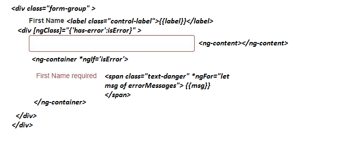
上图解释了构成组件模板的所有标签。仅举几点:
- 文本框控件周围的边框会在文本框无效时出现。文本框的边框通过 '
has-error' 类应用,当isError变为true时(在这种情况下,由下方 TypeScript 文件中的代码定义,它会变为true),该类会被应用。 - "First Name Required" - 此消息会在出现错误时显示。例如,在下图中,这是与必填验证相关的错误。这是作为输入传递给下面描述的组件的。
- label, (First Name) - 将来自与组件模板关联的 TypeScript。这是作为输入传递给下面描述的组件的。
custom-input.component.ts
@Component({
  selector: 'custom-input',
  templateUrl: './custom-input.component.html',
  styleUrls: ['./custom-input.component.css']
})
export class CustomInputComponent implements OnInit {
  @Input() label: string;
  @Input() validations:  { [index: string]: string};
  @Input() info: string;

  @ContentChild(InputRefDirective) input: InputRefDirective;

  get isError() {
    return this.input.hasError;
  }

   get errorMessages() {
    const errors = this.input.errors;
    const messages = [];
    const keys = Object.keys(this.validations);

    keys.forEach(key => {
        if (errors[key]) {
          messages.push(this.validations[key]);
        }
      });
    return messages;
  }

  ngOnInit() { }

  constructor() { }
}
以上是组件 TypeScript 文件。文件中的代码处理所有后端逻辑,以控制组件的无效/有效状态,在出现错误时在控件周围添加红色边框,并在控件处于无效状态时显示错误消息。
| 类型 | 名称 | 描述 |
| 输入 | ||
label | 显示控件的标签文本,例如,上图中的“First Name”。 | |
validations | 它的索引对象保存与组件的输入标签关联的验证信息。 例如:{'required' : 'First Name required', 'minlength': 'Minimum length is 3 char'} 注意:索引属性名称必须与验证类型匹配,例如,“required”键与必填验证匹配。 | |
信息 | WIP (Work in progress) | |
| variable | ||
input | 这个组件变量允许访问与组件关联的输入控件(它会替换组件模板中的 ng-content),例如,在上面的图像中,在这种情况下是“input textbox”。 | |
| 属性 | ||
isError | 组件属性,它(借助输入指令)查找输入元素并判断元素是否有错误,这反过来有助于在输入控件周围添加红色边框。 | |
errorMessages | 组件属性,它(借助输入指令)访问与输入元素关联的错误,并借助输入属性 validations,对象找到正确的错误消息并返回显示所有消息。 |
这里重要的是 InputRefDirective,它访问输入控件。下面是 input-ref 指令的代码。
input-ref.directive.ts (由 ng g directive directive/InputRef 创建)
import { Directive } from '@angular/core';
import { NgControl } from '@angular/forms';

@Directive({
  selector: '[inputRef]'
})
export class InputRefDirective {

  constructor(private formControl: NgControl) {
  }

  get hasError() {
    return this.formControl.dirty && this.formControl.invalid;
  }

  get errors() {
    if (this.hasError && this.formControl.errors) {
      return this.formControl.errors;
    }
    return '';
  }
}
input-ref 指令的重要部分是,通过构造函数注入(使用 Angular 框架注入),NgControl 会被注入到 input-ref 指令中。通过这样做,指令类就可以访问输入控件。
| 类型 | 名称 | 描述 |
| 属性 | ||
hasError | 属性返回 true(当控件被触碰且处于无效状态时)或 false,以指示是否存在错误。 | |
errors | 属性返回与输入控件关联的错误列表。 |
至此,验证组件及其相关指令的创建就结束了。现在让我们看看如何在应用程序中使用它。
app.component.html
响应式表单
<form class="needs-validation" [formGroup]="detailForm" novalidate>
    <custom-input [label]="'First Name'" [validations]="{required:'First Name required'}">
      <input inputRef class="form-control" formControlName="firstName" type="text" />
    </custom-input>
    <custom-input [label]="'Last Name'" [validations]="{required:'Last Name required'}">
      <input inputRef class="form-control" formControlName="lastName" type="text" />
    </custom-input>
    <div>
      <button [disabled]="detailForm.invalid" type="button" class="btn btn-primary">Primary</button>
    </div>
</form>
仅用于响应式表单的 Component.ts
下面的代码以响应式方式创建表单。这里需要注意的一点是,没有太多代码用于访问控件和显示错误(下面将讨论其优点)。
export class AppComponent implements OnInit {
  title = 'app';
  detailForm: FormGroup;

  constructor(private fb: FormBuilder) {
    this.createForm();
  }

  ngOnInit() {
  }

  private createForm() {
    this.detailForm = this.fb.group({
      firstName: new FormControl('', [Validators.required]),
      lastName: new FormControl('', [Validators.required]),
    });
  }
}
模板驱动表单
<form class="needs-validation" #detailForm="ngForm" novalidate>
    <custom-input [label]="'First Name'" [validations]="{required:'First Name required'}">
      <input inputRef class="form-control" [(ngModel)]="firstName" name="firstName" type="text" />
    </custom-input>
    <custom-input [label]="'Last Name'" [validations]="{required:'Last Name required'}">
      <input inputRef class="form-control" [(ngModel)]="lastName" name="lastName" type="text" />
    </custom-input>
    <div>
      <button [disabled]="detailForm.invalid"
      type="button" class="btn btn-primary">Primary</button>
    </div>
</form>
这不是应用程序组件代码的完整模板,而是模板的一部分,该模板以响应式表单和模板驱动表单两种方式使用自定义验证组件。因此,两种方式之间没有太大变化,除了响应式表单方法和模板驱动表单方法强制的变化。
app.component 模板中没有太多内容可以讨论,因为之前在文章中已经讨论过。app.component 模板使用自定义验证组件,并传递所有必需的输入值(标签、信息和验证错误)。
下面是完成所有更改后的最终表单的图像:

使用自定义验证组件的优势
- 组件模板中的代码更少,
模板驱动表单<label class="control-label">First Name</label> <input type="text" name="firstName" [(ngModel)]="firstName" minlength="2" required> <div *ngIf="firstName.errors?.required && firstName.touched && firstName.touched" class="label label-danger"> Name is required </div> <div *ngIf="firstName.errors?.minlength && firstName.touched && firstName.touched" class="label label-danger"> Minimum of 2 characters </div>
响应式表单
component.ts

 this.detailForm = this.form.group({
       firstName: [null, Validators.compose([Validators.required, Validators.minLength(2)])],
    });

component.html
<label class="control-label">First Name</label>
<input
  type="text"
  name="firstName"
  [(ngModel)]="firstName"
  minlength="2"
  required>

<div *ngIf="detailForm.get('firstName').errors?.required &&
      detailForm.get('firstName').touched && detailForm.get('firstName').touched"
class="label label-danger">
  Name is required
</div>
<div *ngIf="detailForm.get('firstName').errors?.minlength &&
      detailForm.get('firstName').touched && detailForm.get('firstName').touched"
class="label label-danger">
  Minimum of 2 characters
</div>
如果没有自定义验证组件,在这两种方式下(模板驱动或响应式),都需要为显示每个输入控件的错误分别编写
div。例如,一个用于必填错误,另一个用于minlength错误的div。但是有了自定义验证控件,只需要在控件的 validations 属性中传递验证信息,它就会处理好。
<custom-input [label]="'First Name'"
           [validations]="{required:'First Name required', 'minlength':'Minimum of 2 characters'}">
  <input inputRef class="form-control" [(ngModel)]="firstName" name="firstName" type="text" />
</custom-input>
甚至不需要为显示输入控件的标签编写额外的
label标签。这也可以由自定义验证控件的label属性处理。 - 第二个主要区别是,自定义验证控件将验证代码封装在应用程序的同一个位置。这意味着不需要在每个数据输入表单的模板中编写验证代码。
总结
自定义验证控件易于使用。它利用了一些高级功能,如ng-content、用于获取输入控件的指令等,并将这些功能封装在内部。一旦控件被集成到应用程序中,它就能减少在每个数据输入表中编写验证代码的工作量和精力。
完整源代码:下载源代码 (GitHub)