
通过导航控件示例实现 WPF 功能
4.25/5 (3投票s)
本文通过一个导航示例,展示了绑定、模板化、样式、命令等所有 WPF 功能。
引言
本示例展示了 Windows Presentation Foundation 4.0 和 Microsoft C# 4.0 功能的机遇。例如,该解决方案展示了在工厂模式中使用可选参数的可能性。它展示了通过加载外部文件使用样式和控件模板的机会。它还展示了在 WPF 中通过绑定使用命令的一种方法。
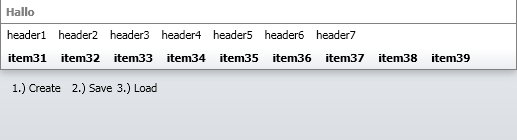
该解决方案是一个简单的导航控件,如图所示。但它使用了 WPF 4 和 C# 4 的所有新功能。
背景
我看到一个由初学者开发者编写的新 WPF 项目。但它是用旧的事件风格编写的,没有接口,没有数据传输对象,没有业务对象,也没有上下文对象。我和他谈过,并解释了 Windows Forms 开发和 WPF 开发之间的区别。本示例是这次对话的结果。
Using the Code
此代码演示了许多新的 C# 4 和 WPF 4 功能。我将解释如何使用此解决方案,我将解释我如何在此解决方案中使用这些功能以及为什么。
接口
在此解决方案中,我使用了许多接口。问题是为什么。接口是不同项目/DLL 之间通信的最佳方式。您还可以为 MVP 模式使用接口。如果您在一个大型解决方案中处理许多项目,例如一个网上商店解决方案,您必须检查项目之间的依赖关系。
示例:如果您使用 MVP 模式,您可以实现一个来自子层“基础设施项目”的接口来将 UserControl 强制转换为该接口。之后,您可以将此接口用作另一个子层“数据项目”的方法参数。这将防止不同项目之间的依赖关系。在当前解决方案中,您可以在“NavigationContext”类中的“OpenForm”RoutedEvent 中使用此模式来强制转换发送者。
您可以在此处看到一个简单的网络直播。
Commands
命令是 WPF 的一项非常强大的功能。它不是 WPF 4 的新功能,但它有助于解决许多问题。命令为您提供了在解决方案中拥有运行方法的信息或上下文的部分编写代码的机会。在运行时,您可以注册此命令,并可以确定该命令是否可以执行。您还可以通过将命令添加到特定的 CommandBinding 来定义命令的作用域。您将在“NavigationHost”类中找到一个示例,该示例是通过“RegisterCommands”方法实现的。
private void RegisterCommands()
{
    Application.Current.MainWindow.CommandBindings.Clear();
    CommandBinding openCB =
	new CommandBinding(NavigationHelper.OpenMenu, Context.OpenMenu);
    Application.Current.MainWindow.CommandBindings.Add(openCB);
    CommandBinding openForm =
	new CommandBinding(NavigationHelper.OpenForm, Context.OpenForm);
    Application.Current.MainWindow.CommandBindings.Add(openForm);
}
示例:在此解决方案中,我使用了一个 static 命令来弹出 MessageBox。您可以使用此代码打开一个窗口。如果扩展此命令,您可以添加一个“CanExecute”处理程序来决定是否可以执行该命令。
您可以在此链接上找到更多关于命令的信息。
工厂模式
我还使用了简单的工厂模式。如果您在 bin 目录中没有序列化的“repository.xml”文件,您可以为示例导航结构创建一个序列化的 XML 文件。我使用此模式来创建一个小的导航结构,并且我不喜欢在表示层中填充空对象。
您将在“NavigationFactory”类中找到此模式。并且我在“NavigationHost”类中使用此模式和 LoadRepository 方法来生成菜单结构。
public static NavigationItem CreateNavigationEntry
(Guid parentGUID, string title = "title",
	string description = "description", string tooltip = "tooltip")
{
    NavigationItem repository = new NavigationItem
    {
        GUID = Guid.NewGuid(),
        Title = title,
        Description = description,
        ToolTip = tooltip,
        Type = NavigationType.NavigationEntry,
        ParentGUID = parentGUID,
    };

    return repository;
}
序列化
序列化是创建 XML 文件的好方法。创建可序列化的类非常简单易行。您只需在类名上方写一个“[Serializeable]”属性。
[Serializable()]
public class NavigationRepository : INavigationRepository
{
    {
        private List<NavigationItem> _items;
        public List<NavigationItem> Items
        {
            get
            {return _items;}
            set
            {_items = value;}
        }
    }
}
要将文件序列化到您的硬盘,您需要运行以下代码
NavigationRepository repository = NavigationFactory.CreateNavigationRepository();
repository.Items.Clear();

foreach (NavigationItem item in cache.GlobalItems)
{
    repository.Items.Add(item);
}

XmlSerializer ser = new XmlSerializer(typeof(NavigationRepository));
FileStream str = new FileStream(path, FileMode.Create);
ser.Serialize(str, repository);
str.Close();
str.Dispose();
控件模板
我在此解决方案中实现了两种定义“控件模板”和“样式”的方法。第一种方法是使用 Visual Studio 生成的通用文件“Generic.xaml”来为控件(非用户控件)定义控件模板。以下代码定义在“Generic.xaml”文件中。它是一个简单的资源字典。它将自动加载。
<style targettype="{x:Type local:NavigationTitle}">
    <Setter Property="Title" Value="asdf"/>
    <Setter Property="TitleBrush" Value="Gray" />
    <Setter Property="FontWeight" Value="Bold"/>
    <Setter Property="BorderBrush" Value="Gray"/>
    <Setter Property="BorderThickness" Value="0,0,0,1"/>
    <Setter Property="Template">
        <Setter.Value>
            <ControlTemplate TargetType="{x:Type local:NavigationTitle}">
                <Border Background="{TemplateBinding Background}"
                        BorderBrush="{TemplateBinding BorderBrush}"
                        BorderThickness="{TemplateBinding BorderThickness}"
                        SnapsToDevicePixels="True">
                   <Grid SnapsToDevicePixels="True">
                        <Grid.RowDefinitions>
                            <RowDefinition Height="Auto"/>
                        </Grid.RowDefinitions>
                        <Grid.ColumnDefinitions>
                            <ColumnDefinition Width="*" />
                        </Grid.ColumnDefinitions>
                        <Label x:Name="_internalTitleLabel"
                        Content="{TemplateBinding Title}"
				Foreground="{TemplateBinding TitleBrush}"
                               Grid.Column="0" Grid.Row="0"
                               SnapsToDevicePixels="True"
				FontWeight="{TemplateBinding FontWeight}"/>
                    </Grid>
                </Border>
            </ControlTemplate>
        </Setter.Value>
    </Setter>
</style>
第二种方法是在加载应用程序后加载一个“ResourceDictionary”并将此文件添加到“Application.Resources.MergedDictionaries”。在下面的 XAML 代码中,您可以看到简单的样式定义,您可以根据自己的想法进行更改。
<LinearGradientBrush x:Key="BackgroundColor" StartPoint="0,0" EndPoint="0,1">
    <GradientStopCollection>
        <GradientStop Color="#EAECEF" Offset="0"/>
        <GradientStop Color="#DADEE3" Offset="1"/>
    </GradientStopCollection>
</LinearGradientBrush>
<LinearGradientBrush x:Key="MenuColor" StartPoint="0,0" EndPoint="0,1">
    <GradientStopCollection>
        <GradientStop Color="#FFFFFF" Offset="0"/>
        <GradientStop Color="#FFFFFF" Offset="0.7"/>
        <GradientStop Color="#EAEDF1" Offset="1"/>
    </GradientStopCollection>
</LinearGradientBrush>

<!-- Simple Button -->
<Style TargetType="{x:Type Button}">
    <Setter Property="Padding" Value="3,1,3,1"/>
    <Setter Property="Background" Value="Transparent"/>
    <Setter Property="BorderBrush" Value="Transparent"/>
    <Setter Property="BorderThickness" Value="1"/>
    <Setter Property="Margin" Value="2"/>
    <Setter Property="LayoutTransform">
    <Setter.Value>
        <ScaleTransform/>
    </Setter.Value>
    </Setter>
    <Setter Property="Template">
        <Setter.Value>
            <ControlTemplate TargetType="{x:Type Button}">
            <Border x:Name="Border" Background="{TemplateBinding Background}"
                BorderBrush="{TemplateBinding BorderBrush}"
                BorderThickness="{TemplateBinding BorderThickness}"
                Padding="3,1,3,1">
                <Grid x:Name="Grid">
                <Grid.RowDefinitions>
                <RowDefinition Height="Auto"/>
                <RowDefinition Height="Auto"/>
                </Grid.RowDefinitions>

            <ContentPresenter Grid.Row="0" Margin="1"
                HorizontalAlignment="{TemplateBinding HorizontalContentAlignment}"
                VerticalAlignment="{TemplateBinding VerticalContentAlignment}"
                RecognizesAccessKey="True" SnapsToDevicePixels="True" >
            </ContentPresenter>
                </Grid>

                    </Border>
                    <ControlTemplate.Triggers>
                    <Trigger Property="IsKeyboardFocused" Value="true">
                    <Setter Property="BorderBrush" Value="{DynamicResource WhiteBrush}"
                    	TargetName="Border"/>
                    </Trigger>
                    <Trigger Property="IsMouseOver" Value="true">
                    <Setter Property="Background"
			Value="{DynamicResource BackgroundColor}"
                    	TargetName="Border"/>
                    <Setter Property="BorderBrush" Value="Silver"
                    	TargetName="Border"/>
                    <Setter Property="BorderThickness" Value="1"
                    	TargetName="Border"/>
                    </Trigger>
                    <Trigger Property="IsPressed" Value="true">
                    <Setter Property="Background"
			Value="{DynamicResource BackgroundColor}"
                    	TargetName="Border"/>
                    <Setter Property="BorderBrush" Value="Transparent"
                    	TargetName="Border"/>
                    </Trigger>
                    <Trigger Property="IsEnabled" Value="true"/>
                    <Trigger Property="IsEnabled" Value="false">
                    <Setter Property="Background"
			Value="{DynamicResource BackgroundColor}"
                    	TargetName="Border"/>
                    <Setter Property="BorderBrush" Value="White" TargetName="Border"/>
                    <Setter Property="Foreground" Value="Gray"/>
                    </Trigger>
                </ControlTemplate.Triggers>
            </ControlTemplate>
        </Setter.Value>
    </Setter>
</Style>
您可以使用以下代码在应用程序中加载此文件。我将此代码片段放在应用程序主窗体的“加载事件”中。
ResourceDictionary dictionary = new ResourceDictionary();
dictionary.Source = new Uri("/MenuStyle.xaml", riKind.RelativeOrAbsolute);
Application.Current.Resources.MergedDictionaries.Add(dictionary);
关注点
但这个解决方案的重点在于这个简单小导航示例的结构和模式。
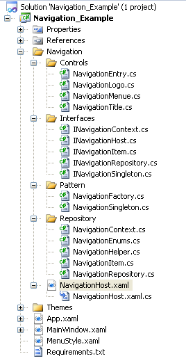
这里您可以看到我在 Visual Studio 解决方案中只使用了一个项目。我认为这是维护此控件的最佳方式。但有一些帮助点我想提一下。如果您在一个包含两个或三个以上项目的解决方案中使用此控件,您应该将接口提取到基础设施项目或数据项目中,以便能够轻松地进行对象转换。您还应该将“Repository”文件夹和“Pattern”文件夹的部分实现到一个全局数据项目中。
在“MainWindow”类中,您可以看到我如何将“MenuStyle.XAML”资源文件加载到应用程序的“MergedDictionaries”中以使用样式。有了这个解决方案,您就可以按照自己的方式对应用程序进行样式设置和主题设置,并且在编译项目后。为了对控件使用此功能,我没有开发 usercontrols。我开发了带有资源字典的控件,该字典在“Themes”文件夹中显示。您也可以将此“generic.xaml”文件部署到您解决方案的“bin”输出目录。
帮助
为了看到最终的菜单结构,如图所示,您应该选择按钮
- “
create” - 这将创建菜单结构,然后 - “
save” - 这会将菜单结构以序列化的 XML 文件保存在解决方案的 bin 文件夹中,然后 - “
load” - 这将从文件中加载菜单结构。
我认为最终解决方案是一个序列化的 XML 文件示例…