
WPF 用户控件 - NumericBox
WPF 用户控件,类似于知名的 NumericUpDown
引言
如您所见,WPF 4.0 没有这样的控件,尽管它对各种应用程序都非常有用。
本文介绍了名为 NumericBox (也称为 NumericUpDown) 的 WPF 用户控件的开发。您将在此处学习如何创建新的用户控件,从在 XAML 中创建界面到注册新事件和定义新模板。
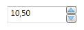
如果您从未听说过此类控件,NumericUpDown (以下简称 NumericBox) 允许您操作数值:按定义的增量值增加和减少,设置允许的最小值和最大值(边界),显示具有特殊格式(小数、货币等)的当前值。
Using the Code
1) 创建界面 (XAML 代码)
首先,我们需要定义 布局 类型。我们的控件包含两部分:
TextBox(显示值)- 两个按钮 (用于增加/减少值)
这些部分由两列分隔:左侧是 TextBox,右侧是 Button。因此,我们需要使用带有两列的 Grid。
  <Grid>
        <Grid.ColumnDefinitions>
            <ColumnDefinition />
            <ColumnDefinition Width="15"/>
        </Grid.ColumnDefinitions>
  </Grid>
定义好布局后,让我们添加一些我们需要的标准控件:TextBox、Popup 和 2 个 Button。
文本框
<!-- Text field for value -->
        <TextBox x:Name="PART_NumericTextBox" Grid.ColumnSpan="2"
	PreviewTextInput="numericBox_TextInput" MouseWheel="numericBox_MouseWheel">
            <TextBox.ContextMenu>
                <ContextMenu>
                    <MenuItem x:Name="PART_MenuItem" Header="Options"
			Click="MenuItem_Click" />
                </ContextMenu>
            </TextBox.ContextMenu>
        </TextBox><span class="Apple-style-span" style="line-height: 16px;
		white-space: normal; ">
</span>
TextBox 的名称是 PART_NumericTextBox。这个名称对于设置新的 ControlTemplate 是必需的,并且根据规则(实际上您无法遵循此规则),所有将在 ControlTemplate 中被重新定义的 User 控件都必须命名为 PART_ControlName。
接下来,我们需要注册新事件:
PreviewTextInput- 使能够通过直接在TextBox中输入来更改值。MouseWheel- 使用鼠标滚轮更改值。
(这些事件的代码将在后面描述。)
您还需要添加 ContextMenu。我将其用于在运行时设置增量值。对于 ContextMenu 中的 MenuItem,我们需要注册 Click 事件,该事件将调用一个 Popup 对象(稍后将描述)。
弹出窗口
我们需要 Popup 控件来配置 Increment 属性。
<!-- Popup options content -->
        <Popup x:Name="PART_Popup" AllowsTransparency="True"
	Placement="Left" Width="180" <span class="Apple-tab-span"
	style="white-space: pre; ">
	</span>Height="36" PopupAnimation="Fade"
	MouseLeftButtonDown="optionsPopup_MouseLeftButtonDown" >
            <Grid>
                <Border BorderThickness="1" BorderBrush="Black"
		Background="White" CornerRadius="2"/>

                <StackPanel Margin="5" Orientation="Horizontal">
                    <TextBlock Text="Increment: " TextWrapping="Wrap"
			FontSize="14" Margin="5,3,5,0" />
                    <TextBox x:Name="PART_IncrementTextBox" FontSize="14"
			Width="80" KeyDown="incrementTB_KeyDown"/>
                </StackPanel>
            </Grid>
        </Popup>
popup 只有一个选项——更改 Increment。为了实现此选项,我们需要添加一个 TextBox 并附加 KeyDown 事件,以便用户可以接受新的 Increment 值并关闭 Popup。
按钮
  <!-- Increase/Decrease buttons -->
        <Grid Grid.Column="1">
            <Grid.RowDefinitions>
                <RowDefinition />
                <RowDefinition />
            </Grid.RowDefinitions>
            <Button x:Name="PART_IncreaseButton" Grid.Row="0"
		Margin="0,0,0,0.2" Click="increaseBtn_Click"
                    PreviewMouseLeftButtonDown="increaseBtn_PreviewMouseLeftButtonDown"
		    PreviewMouseLeftButtonUp="increaseBtn_PreviewMouseLeftButtonUp">
                <Button.Content>
                    <Polygon Stroke="Black" Fill="LightSkyBlue"
		    StrokeThickness="0.2" Points="0,0 -2,5 2,5" Stretch="Fill"/>
                </Button.Content>
            </Button>
            <Button x:Name="PART_DecreaseButton" Grid.Row="1"
		Margin="0,0.2,0,0" Click="decreaseBtn_Click"
                    PreviewMouseLeftButtonDown="decreaseBtn_PreviewMouseLeftButtonDown"
		    PreviewMouseLeftButtonUp="decreaseBtn_PreviewMouseLeftButtonUp">
                <Button.Content>
                    <Polygon Stroke="Black" Fill="LightSkyBlue"
		    StrokeThickness="0.2" Points="-2,0 2,0 0,5 " Stretch="Fill"/>
                </Button.Content>
            </Button>
        </Grid>
为了能够增加和减少我们的值,我们需要为此选项添加两个按钮。每个按钮都有一个 Polygon 对象,看起来像一个小三角形,它向用户显示每个按钮的作用——增加或减少值。我们还需要为每个按钮注册 3 个事件:
Click- 增加/减少值PreviewMouseLeftButtonDown- 调用计时器(您稍后将在代码中看到它的工作原理)并以特定超时开始增加/减少值。PreviewMouseLeftButtonUp- 停止计时器
至此,我们控件界面的制作完成。
2) 创建 C# 代码
变量
首先,让我们定义一些我们需要的变量:
private double value;           // value
private double increment;       // increment
private double minimum;         // minimum value
private double maximum;         // maximum value

private string valueFormat;     // string format of the value

private DispatcherTimer timer;  // timer for Increasing/Decreasing value
				// with certain time interval</span>
方法
然后我们将插入基本方法:IncreaseValue() 和 DecreaseValue()。
private void IncreaseValue()
{
    Value += Increment;
    if (Value < Minimum || Value > Maximum) Value -= Increment;
}

private void DecreaseValue()
{
    Value -= Increment;
    if (Value < Minimum || Value > Maximum) Value += Increment;
}
值按 Increment 增加/减少,然后我们检查 Value 是否在范围内。
属性
ValueFormat属性 - 此属性需要在TextBox中以特定格式显示值。public static readonly DependencyProperty ValueFormatProperty = DependencyProperty.Register("ValueFormat", typeof(string), typeof(NumericBox), new PropertyMetadata("0.00", OnValueFormatChanged)); private static void OnValueFormatChanged(DependencyObject sender, DependencyPropertyChangedEventArgs args) { NumericBox numericBoxControl = new NumericBox(); numericBoxControl.valueFormat = (string)args.NewValue; } public string ValueFormat { get { return (string)GetValue(ValueFormatProperty); } set { SetValue(ValueFormatProperty, value); } }Minimum属性 (定义maximum属性的方法相同) - 此属性表示Value不能小于定义的Minimum(或大于定义的Maximum)。public static readonly DependencyProperty MinimumProperty = DependencyProperty.Register("Minimum", typeof(double), typeof(NumericBox), new PropertyMetadata (Double.MinValue, OnMinimumChanged)); private static void OnMinimumChanged(DependencyObject sender, DependencyPropertyChangedEventArgs args) { NumericBox numericBoxControl = new NumericBox(); numericBoxControl.minimum = (double)args.NewValue; } public double Minimum { get { return (double)GetValue(MinimumProperty); } set { SetValue(MinimumProperty, value); } }Increment- 当您单击按钮时,Value将以此increment更改。public static readonly DependencyProperty IncrementProperty = DependencyProperty.Register("Increment", typeof(double), typeof(NumericBox), new PropertyMetadata((double)1, OnIncrementChanged)); private static void OnIncrementChanged (DependencyObject sender, DependencyPropertyChangedEventArgs args) { NumericBox numericBoxControl = new NumericBox(); numericBoxControl.increment = (double)args.NewValue; } public double Increment { get { return (double)GetValue(IncrementProperty); } set { SetValue(IncrementProperty, value); } }Value- 这是我们的value的属性。public static readonly DependencyProperty ValueProperty = DependencyProperty.Register("Value", typeof(double), typeof(NumericBox), new PropertyMetadata(new Double(), OnValueChanged)); private static void OnValueChanged(DependencyObject sender, DependencyPropertyChangedEventArgs args) { NumericBox numericBoxControl = (NumericBox)sender; numericBoxControl.value = (double)args.NewValue; numericBoxControl.PART_NumericTextBox.Text = numericBoxControl.value.ToString(numericBoxControl.ValueFormat); numericBoxControl.OnValueChanged ((double)args.OldValue, (double)args.NewValue); } public double Value { get { return (double)GetValue(ValueProperty); } set { SetValue(ValueProperty, value); } }
事件
至此,我们定义了所有属性。下一步是注册一个名为 ValueChanged 的新事件。当 Value 属性更改时,将调用它。
        public static readonly RoutedEvent ValueChangedEvent =
            EventManager.RegisterRoutedEvent("ValueChanged",
	RoutingStrategy.Direct, typeof(RoutedPropertyChangedEventHandler<double>),
	typeof(NumericBox));

        public event RoutedPropertyChangedEventHandler<double> ValueChanged
        {
            add { AddHandler(ValueChangedEvent, value); }
            remove { RemoveHandler(ValueChangedEvent, value); }
        }

        private void OnValueChanged(double oldValue, double newValue)
        {
            RoutedPropertyChangedEventArgs<double> args =
		new RoutedPropertyChangedEventArgs<double>(oldValue, newValue);
            args.RoutedEvent = NumericBox.ValueChangedEvent;
            RaiseEvent(args);
        }
我不会解释此控件中的所有事件,但我认为最有趣的事件。让我们看看 MouseWheel 事件。
private void numericBox_MouseWheel(object sender, MouseWheelEventArgs e)
{
      if (e.Delta > 0) IncreaseValue();
      else if (e.Delta < 0) DecreaseValue();
}
Delta 是一个特定属性,它指示滚动方向——向后 (< 0) 或向前 (> 0)。
此事件有助于您更快地增加/减少 Value。
那么,让我们看看如何以另一种方式更改值。当然,这是 Click 事件——当您单击 Increase/Decrease 按钮并更改 Value 时,这太简单了。如果您想按住按钮来更改 Value 怎么办?以下事件将帮助我们实现此选项:
还记得我们称之为 timer 的 value 吗?我们需要在控件的构造函数中创建这个对象。
this.timer = new DispatcherTimer();
this.timer.Interval = TimeSpan.FromMilliseconds(100.0);
在这里,我们创建一个新对象并设置 Interval。这意味着当您按住按钮时,Value 将每 100 毫秒更改一次。
我们需要添加的另一件事是计时器的事件。当调用此事件时(在我们的例子中,它每 100 毫秒调用一次),它必须运行 IncreaseValue() 或 DecreaseValue() 方法。
private void Increase_Timer_Tick(object sender, EventArgs e)
{
    IncreaseValue();
}
(减少值的代码相同。)
至此,我们有了计时器。我们需要做的就是当按下按钮时运行此计时器,并在释放按钮时停止计时器。
private void increaseBtn_PreviewMouseLeftButtonDown
	(object sender, MouseButtonEventArgs e)
{
     this.timer.Tick += Increase_Timer_Tick;
     timer.Start();
}

private void increaseBtn_PreviewMouseLeftButtonUp
	(object sender, MouseButtonEventArgs e)
{
     this.timer.Tick -= Increase_Timer_Tick;
     timer.Stop();
}
当按下 Increase Button 时,计时器附加事件 (Increase_Timer_Tick) 并运行。
当 Increase Button 释放时,计时器分离事件并调用 Stop() 方法。
Decrease Button 的行为相同。
3) 样式和 ControlTemplate
代码
现在我们有了可用的用户控件,但我们需要允许一些控件用户更改样式。
如果您想开放这种可能性,您需要在控件代码中重写 OnApplyTemplate()。
public override void OnApplyTemplate()
{
            base.OnApplyTemplate();

            Button btn = GetTemplateChild("PART_IncreaseButton") as Button;
            if (btn != null)
            {
                btn.Click += increaseBtn_Click;
                btn.PreviewMouseLeftButtonDown += increaseBtn_PreviewMouseLeftButtonDown;
                btn.PreviewMouseLeftButtonUp += increaseBtn_PreviewMouseLeftButtonUp;
            }

            btn = GetTemplateChild("PART_DecreaseButton") as Button;
            if (btn != null)
            {
                btn.Click += decreaseBtn_Click;
                btn.PreviewMouseLeftButtonDown += decreaseBtn_PreviewMouseLeftButtonDown;
                btn.PreviewMouseLeftButtonUp += decreaseBtn_PreviewMouseLeftButtonUp;
            }

            TextBox tb = GetTemplateChild("PART_NumericTextBox") as TextBox;
            if (tb != null)
            {
                PART_NumericTextBox = tb;
                PART_NumericTextBox.Text = Value.ToString(ValueFormat);
                PART_NumericTextBox.PreviewTextInput += numericBox_TextInput;
                PART_NumericTextBox.MouseWheel += numericBox_MouseWheel;
            }

            Popup popup = GetTemplateChild("PART_Popup") as Popup;
            if (popup != null)
            {
                PART_Popup = popup;
                PART_Popup.MouseLeftButtonDown += optionsPopup_MouseLeftButtonDown;
            }

            tb = GetTemplateChild("PART_IncrementTextBox") as TextBox;
            if (tb != null)
            {
                PART_IncrementTextBox = tb;
                PART_IncrementTextBox.KeyDown += incrementTB_KeyDown;
            }

            MenuItem mi = GetTemplateChild("PART_MenuItem") as MenuItem;
            if (mi != null)
            {
                PART_MenuItem = mi;
                PART_MenuItem.Click += MenuItem_Click;
            }
            btn = null;
            mi = null;
            tb = null;
            popup = null;
}
GetTemplateChild() 方法在您的模板中搜索元素,并在成功时返回它。我们需要检查返回的元素是否为 null,如果不是 null,我们则为该元素附加所有必要的事件。
注意:在此方法中,您可能需要捕获一个异常,因为如果用户例如在他的模板中将名称 PART_IncreaseButton 设置为一个 CheckBox 元素,则 GetTemplateChild() 方法将返回 CheckBox 元素,但在代码中它必须是一个 Button 元素。在这种情况下,您将收到一个类型转换异常。
我们需要添加的最后一件事是特殊属性。严格来说,这一步不是必需的,但这部分文档可以帮助一些将使用您控件的开发人员。
    [TemplatePart(Name = "PART_Popup", Type = typeof(Popup))]
    [TemplatePart(Name = "PART_IncrementTextBox", Type = typeof(TextBox))]
    [TemplatePart(Name = "PART_NumericTextBox", Type = typeof(TextBox))]
    [TemplatePart(Name = "PART_MenuItem", Type = typeof(MenuItem))]
    [TemplatePart(Name = "PART_IncreaseButton", Type = typeof(Button))]
    [TemplatePart(Name = "PART_DecreaseButton", Type = typeof(Button))]
    /// <summary>
    /// WPF User control - NumericBox
    /// </summary>
    public partial class NumericBox : UserControl
    { ... }
样式 (XAML)
我们到达了文章的结尾,这里我想演示一个 NumericBox 控件的样式示例。
首先,让我们定义一些将在我们的样式中使用的笔刷:
    <LinearGradientBrush x:Key="PressedBrush" StartPoint="0,0" EndPoint="0,1">
        <GradientBrush.GradientStops>
            <GradientStopCollection>
                <GradientStop Color="#BBB" Offset="0.0"/>
                <GradientStop Color="#EEE" Offset="0.1"/>
                <GradientStop Color="#EEE" Offset="0.9"/>
                <GradientStop Color="#FFF" Offset="1.0"/>
            </GradientStopCollection>
        </GradientBrush.GradientStops>
    </LinearGradientBrush>

    <SolidColorBrush x:Key="DisabledForegroundBrush" Color="#888" />

    <SolidColorBrush x:Key="DisabledBackgroundBrush" Color="#EEE" />

    <LinearGradientBrush x:Key="ConvexHorizontalBrush"
	EndPoint="0.5,1" StartPoint="0.5,0">
        <GradientStop Color="White" />
        <GradientStop Color="#FFC4C4C4" Offset="0.9" />
    </LinearGradientBrush>

    <LinearGradientBrush x:Key="HighlightBrush" EndPoint="0.5,1" StartPoint="0.5,0">
        <GradientStop Color="#FFCBE6FB" />
        <GradientStop Color="#FF6FB0D7" Offset="0.9" />
    </LinearGradientBrush>

    <LinearGradientBrush x:Key="PressedHighlightBrush"
	EndPoint="0.5,1" StartPoint="0.5,0">
        <GradientStop Color="#FFDEF0FF" Offset="0.049" />
        <GradientStop Color="#FF80C5EE" Offset="0" />
    </LinearGradientBrush>

    <SolidColorBrush x:Key="TextBrush" Color="#FF484848" />

    <SolidColorBrush x:Key="HighlightBorderBrush" Color="#FF1C6BA7" />

    <SolidColorBrush x:Key="BorderBrush" Color="#FF484848" />
下一步是为 NumericBox 中使用的元素设置新样式:Popup、TextBox、Button。
弹出窗口
  <!-- Popup border style-->
    <Style x:Key="popupBorder" TargetType="Border">
        <Setter Property="Background" Value="{StaticResource ConvexHorizontalBrush}"/>
        <Setter Property="BorderBrush" Value="{StaticResource BorderBrush}" />
        <Setter Property="Opacity" Value="1" />
        <Setter Property="BorderThickness" Value="1" />
        <Setter Property="CornerRadius" Value="2" />
        <Setter Property="SnapsToDevicePixels" Value="True" />
    </Style>
Button
  <!-- Buttons style -->
    <Style TargetType="{x:Type Button}">
        <Setter Property="SnapsToDevicePixels" Value="true"/>
        <Setter Property="OverridesDefaultStyle" Value="true"/>
        <Setter Property="Template">
            <Setter.Value>
                <ControlTemplate TargetType="Button">
                    <Border x:Name="Border" CornerRadius="2"
			BorderThickness="1" Background="
			{StaticResource ConvexHorizontalBrush}"
			BorderBrush="{StaticResource BorderBrush}">
                        <ContentPresenter Margin="2" HorizontalAlignment="Center"
			VerticalAlignment="Center" RecognizesAccessKey="True"/>
                    </Border>
                    <ControlTemplate.Triggers>
                        <Trigger Property="IsDefaulted" Value="true">
                            <Setter TargetName="Border" Property="BorderBrush"
			Value="{StaticResource DefaultedBorderBrush}" />
                        </Trigger>
                        <Trigger Property="IsMouseOver" Value="true">
                            <Setter TargetName="Border" Property="Background"
			Value="{StaticResource HighlightBrush}" />
                        </Trigger>
                        <Trigger Property="IsPressed" Value="true">
                            <Setter TargetName="Border" Property="Background"
			Value="{StaticResource PressedBrush}" />
                        </Trigger>
                        <Trigger Property="IsEnabled" Value="false">
                            <Setter TargetName="Border" Property="Background"
			Value="{StaticResource DisabledBackgroundBrush}" />
                            <Setter Property="Foreground"
			Value="{StaticResource DisabledForegroundBrush}"/>
                        </Trigger>
                    </ControlTemplate.Triggers>
                </ControlTemplate>
            </Setter.Value>
        </Setter>
    </Style>
文本框
<!-- TextBox style -->
    <Style x:Key="{x:Type TextBox}" TargetType="{x:Type TextBoxBase}">
        <Setter Property="SnapsToDevicePixels" Value="True"/>
        <Setter Property="OverridesDefaultStyle" Value="True"/>
        <Setter Property="Foreground" Value="{StaticResource BorderBrush}" />
        <Setter Property="KeyboardNavigation.TabNavigation" Value="None"/>
        <Setter Property="FocusVisualStyle" Value="{x:Null}"/>
        <Setter Property="AllowDrop" Value="true"/>
        <Setter Property="Template">
            <Setter.Value>
                <ControlTemplate TargetType="{x:Type TextBoxBase}">
                    <Border Name="Border" CornerRadius="2" Padding="2"
		Background="{StaticResource PressedBrush}"
		BorderBrush="{StaticResource BorderBrush}" BorderThickness="1" >
                        <ScrollViewer Margin="0" x:Name="PART_ContentHost"/>
                    </Border>
                    <ControlTemplate.Triggers>
                        <Trigger Property="IsMouseOver" Value="True">
                            <Setter TargetName="Border" Property="Background"
			Value="{StaticResource PressedHighlightBrush}"/>
                            <Setter TargetName="Border" Property="BorderBrush"
			Value="{StaticResource HighlightBorderBrush}"/>
                        </Trigger>
                        <Trigger Property="IsEnabled" Value="False">
                            <Setter TargetName="Border" Property="Background"
			Value="{StaticResource DisabledBackgroundBrush}"/>
                            <Setter TargetName="Border" Property="BorderBrush"
			Value="{StaticResource DisabledBackgroundBrush}"/>
                            <Setter Property="Foreground"
			Value="{StaticResource DisabledForegroundBrush}"/>
                        </Trigger>
                    </ControlTemplate.Triggers>
                </ControlTemplate>
            </Setter.Value>
        </Setter>
</Style>
NumericBox
<Style TargetType="{x:Type local:NumericBox}">
        <Setter Property="Template">
            <Setter.Value>
                <ControlTemplate TargetType="{x:Type local:NumericBox}">
                    <Grid>
                        <Grid.ColumnDefinitions>
                            <ColumnDefinition />
                            <ColumnDefinition Width="15"/>
                        </Grid.ColumnDefinitions>

                        <!-- Popup options content -->
                        <Popup x:Name="PART_Popup" AllowsTransparency="True"
		      Placement="Left" Width="180" Height="36" PopupAnimation="Fade" >
                            <Grid>
                                <Border Style="{StaticResource popupBorder}"/>
                                <StackPanel Margin="5" Orientation="Horizontal">
                                    <TextBlock Text="Increment: "
				TextWrapping="Wrap" FontSize="14" Margin="5,3,5,0" />
                                    <TextBox x:Name="PART_IncrementTextBox"
				FontSize="14" Width="80"/>
                                </StackPanel>
                            </Grid>
                        </Popup>

                        <!-- Text field for value -->
                        <TextBox x:Name="PART_NumericTextBox" Grid.ColumnSpan="2">
                            <TextBox.ContextMenu>
                                <ContextMenu>
                                    <MenuItem x:Name="PART_MenuItem" Header="Options"/>
                                </ContextMenu>
                            </TextBox.ContextMenu>
                        </TextBox>

                        <!-- Increase/Decrease buttons -->
                        <Grid Grid.Column="1">
                            <Grid.RowDefinitions>
                                <RowDefinition />
                                <RowDefinition />
                            </Grid.RowDefinitions>
                            <Button x:Name="PART_IncreaseButton" Grid.Row="0"
				Margin="0,0,0,0.2">
                                <Button.Content>
                                    <Polygon Stroke="Black" Fill="LightSkyBlue"
				StrokeThickness="0.2" Points="0,0 -2,5 2,5"
				Stretch="Fill"/>
                                </Button.Content>
                            </Button>
                            <Button x:Name="PART_DecreaseButton" Grid.Row="1"
				Margin="0,0.2,0,0">
                                <Button.Content>
                                    <Polygon Stroke="Black" Fill="LightSkyBlue"
				StrokeThickness="0.2" Points="-2,0 2,0 0,5 "
				Stretch="Fill"/>
                                </Button.Content>
                            </Button>
                        </Grid>
                    </Grid>
                </ControlTemplate>
            </Setter.Value>
        </Setter>
    </Style>
请注意,我为必须在此模板中存在的控件使用了特定的名称。
新样式的结果
Till
操作后

结论
好了,这就是我今天想为大家写的所有内容,我希望它很有趣,并且这个控件能为您的项目带来帮助。
如果您发现任何错误,或者认为某些选项可以以其他方式实现,我将非常乐意听取您的批评。
历史
- 2011 年 1 月 28 日:初始帖子