
WPF:轮播控件
4.95/5 (82投票s)
高度可定制的WPF轮播控件。
引言
不久前(大约圣诞节),我和 Marcelo Ricardo de Oliveira 正在合作撰写一篇文章,旨在创建一个自定义轮播控件,就像您在流行的组件制造商控件集中经常看到的那种。然而,我们几乎完成了自己的手动解决方案,然后我才想起我以前玩过的 PathListBox。
于是我做了一些谷歌搜索,看看人们对 PathListBox 做了什么,令我惊讶的是,微软在CodePlex上有一个产品,似乎能帮助我们实现使用 PathListBox 的轮播功能。微软发布了许多帮助我们这些普通开发者的类,它们以一系列DLL的形式出现,被称为 PathListBoxUtils,这是CodePlex上的Expression Blend示例的一部分:http://expressionblend.codeplex.com/releases/view/44915。
PathListBoxUtils 包含以下可用的类:
PathListBoxScrollBehaviorPathListBoxItemTransformerAdjustedOffsetToRadiusConverterPathListBoxExtensions
这些都很好,但我和 Marcelo 希望为最终用户提供尽可能多的自定义功能,这意味着允许诸如
- 可以使用几种内置路径之一,或选择您自己的动画路径(通过在Blend中绘制路径)
- 可以更改导航按钮的样式/位置
- 可以使用不同的DataTemplates
- 可以使用不同的缓动动画函数
基本上,我们希望能够创建一个“轮播控件”,它只需公开用户可以设置的相关自定义属性。
正如我所说,PathListBoxUtils 只能实现部分功能,但并非全部,因此需要一个包装器。本文本质上是 PathListBox 的一个包装器,允许它被视为我们 Marcelo 和我梦想并为此辛勤工作实现的“轮播控件”,尽管我们现在已放弃我们的代码,转而使用这个经过微软验证(更有可能被普遍接受)的代码。
这段旅程很美好,不是吗,Marcelo,不冒险就没有收获,等等。
开始之前请注意一件事
在我们深入研究细节之前,我想先说明一件事,那就是,由于我基本上只提供了一个包装器,而原始动画代码是Expression Blend团队提供的,因此关于动画的任何疑问都需要指向Blend团队,特别是 PathListBoxUtils CodePlex站点。我必须说,我不太喜欢这样做,我通常喜欢为自己的工作承担责任,只是这次似乎是,已经有一个解决方案可以做到所需的事情,并且只需要进行泛化以使其更易于最终用户使用。
好了,既然那些都过去了,让我们继续。
目录
总之,本文将涵盖以下内容
- 视频
- 图像
- 工作原理
- 自定义
- CustomPathElement
- NavigationButtonPosition
- PreviousButtonStyle
- NextButtonStyle
- PathType
- AnimationEaseIn
- AnimationEaseOut
- OpacityRange
- ScaleRange
- AngleRange
- DataTemplateToUse
- SelectedItem
- ItemsSource
- NumberOfItemsOnPath
- MinNumberOfItemsOnPath
- MaxNumberOfItemsOnPath
- 演示
- 关于动画到绑定的SelectedItem的重要通知
- 缺点
视频
我认为要了解其可能性,最好的方式是观看下面的视频链接。

图片
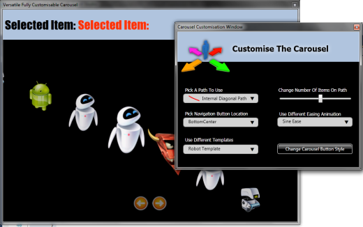
但如果您只是懒得看视频(或者在工作时无法观看),这里有一些截图。


替换默认的导航按钮样式,可以使用您自己的样式(您可以独立地替换左右按钮)。
好了,这就为您提供了这个包装器所能实现的功能的预览。现在,让我们继续看看它是如何工作的。
工作原理
正如我在本文中一直强调的,大部分巧妙之处实际上是通过使用 PathListBoxUtils DLL 实现的。因此,我认为解释所有 PathListBoxUtils 类是最好的起点。我发现使用作者的原始文本(如下所示)是最好的方法。
PathListBoxScrollBehavior
此行为可为您的
PathListBox提供平滑滚动。它公开了三个命令,用于在更改PathListBox控件的StartItemIndex时应用平滑滚动。您可以使用
Increment和Decrement命令滚动一定数量的项目,或者可以使用ScrollSelected命令将所选项目滚动到路径上的相对位置。Commands
IncrementCommand
获取一个命令,该命令将
StartItemIndex增加Amount。DecrementCommand
获取一个命令,该命令将
StartItemIndex减少Amount。ScrollSelectedCommand
获取一个命令,该命令将所选项目滚动到与最接近
DesiredOffset的项目相同的位置。属性
金额
获取或设置用于增加或减少
StartItemIndex的量。持续时间
获取或设置滚动的持续时间。
Ease
获取或设置滚动时使用的缓动函数。
DesiredOffset
获取或设置与此
PathListBox关联的布局路径上的从 0 到 1 的偏移量,用于滚动所选项目。HideEnteringItem
获取或设置在更改
StartItemIndex时是否隐藏将在路径上新排列的项目。在开放路径上滚动时使用此选项。PathListBoxItemTransformer
这是一个自定义内容控件,允许您根据
PathListBoxItem在PathListBox的布局路径上的位置来修改其不透明度、缩放和旋转。设置ScaleRange、OpacityRange和AngleRange为您希望应用的最小值和最大值。最终值将根据Ease、Shift和IsCentered属性的设置进行调整。如果Ease设置为None,则使用线性插值。要调整路径上有效开始和结束的位置,请调整Shift属性。启用IsCentered属性将从路径中心均匀调整偏移,如上例所示。如果您的PathListBox分配了多个LayoutPath,您可以启用UseGlobalOffset属性来指示值应在所有路径上计算,而不是每个单独的路径。属性
OpacityRange
获取或设置用于不透明度的值范围。
ScaleRange
获取或设置用于缩放的值范围。
AngleRange
获取或设置要添加到旋转的角度值范围。
Ease
获取或设置用于调整偏移量的缓动函数。
Shift
获取或设置从路径开头偏移的量。
IsCentered
获取或设置是否从路径中心均匀调整偏移量。
UseGlobalOffset
获取或设置是否通过使用
GlobalOffset而不是LocalOffset作为项目的起始偏移量来调整所有路径上的偏移量。AdjustedOffsetToRadiusConverter
此转换器可用于将
PathListItemTransformer的AdjustedOffset属性数据绑定到 Blur 效果的Radius值。参数可用作缩放因子,以控制最大模糊级别。这是由IsCentered、Ease和Shift属性调整偏移量计算出的值。在上面的轮播示例中,它被用作PathListBox的ItemContainerStyle中ContentPresenter上 Blur 效果的Radius属性的数据绑定转换器。PathListBoxExtensions
此类公开了
PathListBox控件的几个扩展方法。int GetItemsArrangedCount(int layoutPathIndex)确定当前排列在指定布局路径上的项目数量。
int GetFirstArrangedIndex(int layoutPathIndex)查找位于指定布局路径开头的项目。
int GetLastArrangedIndex(int layoutPathIndex)查找位于指定布局路径末尾的项目。
-- http://expressionblend.codeplex.com/wikipage?title=PathListBoxUtils 更新于 2011/04/14。
这就是 PathListBoxUtils 类的工作原理,那么在 XAML 中看起来是怎样的呢?我们如何将它们结合起来使用?好吧,这基本上就是 CarouselControl 的所有 XAML 代码。
<UserControl x:Class="Carousel.CarouselControl"
xmlns="http://schemas.microsoft.com/winfx/2006/xaml/presentation"
xmlns:x="http://schemas.microsoft.com/winfx/2006/xaml"
xmlns:ec="http://schemas.microsoft.com/expression/2010/controls"
xmlns:PathListBoxUtils="clr-namespace:Expression.Samples.PathListBoxUtils;
assembly=Expression.Samples.PathListBoxUtils"
xmlns:d="http://schemas.microsoft.com/expression/blend/2008"
xmlns:mc="http://schemas.openxmlformats.org/markup-compatibility/2006"
xmlns:i="http://schemas.microsoft.com/expression/2010/interactivity"
xmlns:local="clr-namespace:Carousel"
mc:Ignorable="d"
d:DesignHeight="300" d:DesignWidth="300">
<UserControl.Resources>
<!-- Defualt Previous Button style-->
<Style x:Key="navigatorPreviousButtonStyle" TargetType="{x:Type Button}">
<Setter Property="Padding" Value="0"/>
<Setter Property="Margin" Value="5"/>
<Setter Property="FocusVisualStyle" Value="{x:Null}"/>
<Setter Property="Template">
<Setter.Value>
<ControlTemplate TargetType="{x:Type Button}">
<Viewbox Width="40"
Height="40">
<Image x:Name="img" Source="Images/previous.png"
Margin="{TemplateBinding Padding}" Opacity="0.5"
Stretch="Uniform">
</Image>
</Viewbox>
<ControlTemplate.Triggers>
<Trigger Property="IsMouseOver"
Value="True">
<Setter Property="Effect">
<Setter.Value>
<DropShadowEffect Color="Red"
ShadowDepth="2"
Direction="315"
Opacity="0.5" />
</Setter.Value>
</Setter>
<Setter TargetName="img"
Property="Opacity"
Value="1.0" />
</Trigger>
<Trigger Property="IsEnabled"
Value="False">
<Setter TargetName="img"
Property="Opacity"
Value="0.3" />
</Trigger>
</ControlTemplate.Triggers>
</ControlTemplate>
</Setter.Value>
</Setter>
</Style>
<!-- Defualt Next Button style-->
<Style x:Key="navigatorNextButtonStyle" TargetType="{x:Type Button}">
<Setter Property="Padding" Value="0"/>
<Setter Property="Margin" Value="5"/>
<Setter Property="FocusVisualStyle" Value="{x:Null}"/>
<Setter Property="Template">
<Setter.Value>
<ControlTemplate TargetType="{x:Type Button}">
<Viewbox Width="40"
Height="40">
<Image x:Name="img" Source="Images/next.png"
Margin="{TemplateBinding Padding}" Opacity="0.5"
Stretch="Uniform">
</Image>
</Viewbox>
<ControlTemplate.Triggers>
<Trigger Property="IsMouseOver"
Value="True">
<Setter Property="Effect">
<Setter.Value>
<DropShadowEffect Color="Red"
ShadowDepth="2"
Direction="315"
Opacity="0.5" />
</Setter.Value>
</Setter>
<Setter TargetName="img"
Property="Opacity"
Value="1.0" />
</Trigger>
<Trigger Property="IsEnabled"
Value="False">
<Setter TargetName="img"
Property="Opacity"
Value="0.3" />
</Trigger>
</ControlTemplate.Triggers>
</ControlTemplate>
</Setter.Value>
</Setter>
</Style>
<!-- PathlistBox Paath Converter-->
<PathListBoxUtils:AdjustedOffsetToRadiusConverter
x:Key="AdjustedOffsetToRadiusConverter"/>
<!-- PathListBox Style-->
<Style x:Key="PathListBoxItemStyle" TargetType="{x:Type ec:PathListBoxItem}">
<Setter Property="HorizontalContentAlignment" Value="Left"/>
<Setter Property="VerticalContentAlignment" Value="Top"/>
<Setter Property="Background" Value="Transparent"/>
<Setter Property="BorderThickness" Value="1"/>
<Setter Property="FocusVisualStyle" Value="{x:Null}"/>
<Setter Property="Template">
<Setter.Value>
<ControlTemplate TargetType="{x:Type ec:PathListBoxItem}">
<Grid Background="{TemplateBinding Background}"
RenderTransformOrigin="0.5,0.5">
<Grid.RenderTransform>
<TransformGroup>
<ScaleTransform>
<ScaleTransform.ScaleY>
<Binding Path="IsArranged"
RelativeSource="{RelativeSource TemplatedParent}">
<Binding.Converter>
<ec:IsArrangedToScaleConverter/>
</Binding.Converter>
</Binding>
</ScaleTransform.ScaleY>
<ScaleTransform.ScaleX>
<Binding Path="IsArranged"
RelativeSource="{RelativeSource TemplatedParent}">
<Binding.Converter>
<ec:IsArrangedToScaleConverter/>
</Binding.Converter>
</Binding>
</ScaleTransform.ScaleX>
</ScaleTransform>
<SkewTransform/>
<RotateTransform Angle="{Binding OrientationAngle,
RelativeSource={RelativeSource TemplatedParent}}"/>
<TranslateTransform/>
</TransformGroup>
</Grid.RenderTransform>
<VisualStateManager.VisualStateGroups>
<VisualStateGroup x:Name="CommonStates">
<VisualState x:Name="Normal"/>
<VisualState x:Name="MouseOver"/>
<VisualState x:Name="Disabled"/>
</VisualStateGroup>
<VisualStateGroup x:Name="SelectionStates">
<VisualState x:Name="Unselected"/>
<VisualState x:Name="Selected"/>
</VisualStateGroup>
<VisualStateGroup x:Name="FocusStates">
<VisualState x:Name="Focused"/>
<VisualState x:Name="Unfocused"/>
</VisualStateGroup>
</VisualStateManager.VisualStateGroups>
<PathListBoxUtils:PathListBoxItemTransformer
x:Name="pathListBoxItemTransformer"
Loaded="PathListBoxItemTransformer_Loaded"
VerticalAlignment="Top"
d:LayoutOverrides="Width"
IsCentered="True">
<PathListBoxUtils:PathListBoxItemTransformer.Ease>
<SineEase EasingMode="EaseIn"/>
</PathListBoxUtils:PathListBoxItemTransformer.Ease>
<Grid x:Name="TransformerParentGrid" Height="Auto">
<Rectangle x:Name="FocusVisualElement" RadiusY="1"
RadiusX="1" Stroke="#FF6DBDD1"
StrokeThickness="1"
Visibility="Collapsed"/>
<ContentPresenter x:Name="contentPresenter"
ContentTemplate="{TemplateBinding ContentTemplate}"
Content="{TemplateBinding Content}"
HorizontalAlignment=
"{TemplateBinding HorizontalContentAlignment}"
Margin="{TemplateBinding Padding}">
</ContentPresenter>
<Rectangle x:Name="fillColor" Fill="#FFBADDE9"
IsHitTestVisible="False"
Opacity="0" RadiusY="1"
RadiusX="1"/>
<Rectangle x:Name="fillColor2" Fill="#FFBADDE9"
IsHitTestVisible="False"
Opacity="0" RadiusY="1"
RadiusX="1"/>
</Grid>
</PathListBoxUtils:PathListBoxItemTransformer>
</Grid>
</ControlTemplate>
</Setter.Value>
</Setter>
</Style>
</UserControl.Resources>
<Grid Margin="20">
<ec:PathListBox x:Name="pathListBox" Margin="0" WrapItems="True"
SelectionMode="Single"
ItemContainerStyle="{DynamicResource PathListBoxItemStyle}">
<ec:PathListBox.LayoutPaths>
<ec:LayoutPath SourceElement="{Binding ElementName=ell}"
Distribution="Even" Capacity="7" Start="0.01"
FillBehavior="NoOverlap"/>
</ec:PathListBox.LayoutPaths>
<i:Interaction.Behaviors>
<PathListBoxUtils:PathListBoxScrollBehavior
DesiredOffset="0.5"
HideEnteringItem="False">
<PathListBoxUtils:PathListBoxScrollBehavior.Ease>
<SineEase EasingMode="EaseOut" />
</PathListBoxUtils:PathListBoxScrollBehavior.Ease>
<i:Interaction.Triggers>
<i:EventTrigger SourceName="pathListBox"
SourceObject="{Binding ElementName=previousButton}"
EventName="Click">
<i:InvokeCommandAction CommandName="DecrementCommand"/>
</i:EventTrigger>
<i:EventTrigger SourceName="pathListBox"
SourceObject="{Binding ElementName=nextButton}"
EventName="Click">
<i:InvokeCommandAction CommandName="IncrementCommand"/>
</i:EventTrigger>
<i:EventTrigger SourceName="pathListBox"
EventName="SelectionChanged">
<i:InvokeCommandAction CommandName="ScrollSelectedCommand"/>
</i:EventTrigger>
</i:Interaction.Triggers>
</PathListBoxUtils:PathListBoxScrollBehavior>
</i:Interaction.Behaviors>
</ec:PathListBox>
<StackPanel x:Name="spButtons" Orientation="Horizontal"
HorizontalAlignment="Center"
VerticalAlignment="Bottom" Margin="5">
<Button x:Name="previousButton" Content="<"
Style="{StaticResource navigatorPreviousButtonStyle}"
Click="PreviousButton_Click"/>
<Button x:Name="nextButton" Content=">"
Style="{StaticResource navigatorNextButtonStyle}"
Click="NextButton_Click"/>
</StackPanel>
<Grid x:Name="gridForKnownPaths" HorizontalAlignment="Stretch"
VerticalAlignment="Stretch">
<Path x:Name="wavePath"
Data="M-45,335 C59,230 149,187......."
Stretch="Fill" Stroke="Transparent"
StrokeThickness="1"/>
<Path x:Name="diagonalPath"
Data="M-43,120 L249,245.........."
Margin="-44,79,14,-31" Stretch="Fill"
Stroke="Transparent" StrokeThickness="1"/>
<Path x:Name="zigzagPath"
Data="M-38,425 C74,254 -20.5,......"
Margin="-38,32.5,-26.5,16" Stretch="Fill"
Stroke="Transparent" StrokeThickness="1"/>
<Ellipse x:Name="ellipsePath"
Margin="40,32.5,82.5,106"
Stroke="Transparent" StrokeThickness="1"/>
</Grid>
</Grid>
</UserControl>
代码量很大,但我们将在本文的其余部分逐一介绍。
自定义
自定义几乎是本文的核心。正如我所说,本文本质上提供的是 PathListBox 的一个包装器,它使用了 PathListBoxUtils 辅助类。我还说过,我想让开发者尽可能轻松地创建新的、优雅的轮播控件,只需设置一些属性即可,而无需深入研究 XAML。因此,我们创建了一个自定义控件 CarouselControl,它添加了以下允许自定义的属性,我们将逐一介绍:
| CarouselControl 依赖属性 | 依赖属性类型 | 描述 |
CustomPathElement |
FrameworkElement |
将用作自定义路径的 FrameworkElement |
NavigationButtonPosition |
ButtonPosition |
导航按钮的位置 |
PreviousButtonStyle |
样式 |
上一个导航按钮的样式 |
NextButtonStyle |
样式 |
下一个导航按钮的样式 |
PathType |
PathType |
PathType,它是 PathType 枚举值之一 |
AnimationEaseIn |
EasingFunctionBase |
用于缓入动画的类型 |
AnimationEaseOut |
EasingFunctionBase |
用于缓出动画的类型 |
OpacityRange |
Point |
路径上项目的透明度范围 |
ScaleRange |
Point |
路径上项目的缩放范围 |
AngleRange |
Point |
路径上项目的角度范围 |
DataTemplateToUse |
数据模板 |
用于显示项目的 DataTemplate |
SelectedItem |
对象 |
设置 SelectedItem(在使用 MVVM 时有一个问题,请参阅本文底部附近的 关于动画到绑定的SelectedItem的重要通知 详细信息) |
ItemsSource |
IEnumerable |
要使用的源项目集合 |
NumberOfItemsOnPath |
int |
要在路径上显示的项数 |
MinNumberOfItemsOnPath |
int |
允许在路径上显示的最小项数(NumberOfItemsOnPath 的边界检查值) |
MaxNumberOfItemsOnPath |
int |
允许在路径上显示的最大项数(NumberOfItemsOnPath 的边界检查值) |
有一个专门用于展示自定义功能的完整演示,您可以在随附的代码中找到。
CustomPathElement
CarouselControl 包含一些内置路径供您使用,但您也可以提供自己的路径,通常是在使用 CarouselControl 的 XAML 中,或者在 ResourceDictionary 中。无论哪种方式,您都必须有一个 Path 元素,您可以使用它来设置 CarouselControl 的 CustomPath 依赖属性,该属性内部看起来像这样:
/// <summary>
/// The FrameworkElement to use as custom path for Carousel
/// </summary>
public static readonly DependencyProperty CustomPathElementProperty =
    DependencyProperty.Register("CustomPathElement",
        typeof(FrameworkElement), typeof(CarouselControl),
        new FrameworkPropertyMetadata((FrameworkElement)null,
            new PropertyChangedCallback(OnCustomPathElementChanged)));

public FrameworkElement CustomPathElement
{
    get { return (FrameworkElement)GetValue(CustomPathElementProperty); }
    set { SetValue(CustomPathElementProperty, value); }
}

private static void OnCustomPathElementChanged(DependencyObject d,
        DependencyPropertyChangedEventArgs e)
{
    ((CarouselControl)d).OnCustomPathElementChanged(e);
}

protected virtual void OnCustomPathElementChanged(DependencyPropertyChangedEventArgs e)
{
    if (e.NewValue != null)
        SetVisibilityForPath(PathType.Custom);
}
这里有一些 XAML 代码(请看这里的自定义 Path 元素):
<Path x:Name="customPath" Data="M12,547.5........"
      Stretch="Fill" Stroke="Transparent"/>
<Carousel:CarouselControl x:Name="CarouselControl"
                        CustomPathElement="{Binding ElementName=customPath}"
                        SelectionChanged="SelectionChanged"/>
然后,我只需使用 Binding 来设置它,或者从 ResourceDictionary 中获取它,或者(如果我足够大胆)通过代码中的某些复杂的 Path 生成数学来动态创建 Path。最终将触发 CarouselControl 内部的代码,其中 PathType 将设置为 Custom,这要归功于 CarouselControl.CustomPathElement 依赖属性更改回调调用了它。
private void SetVisibilityForPath(PathType pathType)
{
    foreach (UIElement uiElement in gridForKnownPaths.Children)
    {
        uiElement.Visibility = Visibility.Collapsed;
    }

    switch (pathType)
    {
        case PathType.Ellipse:
            this.ellipsePath.Visibility = Visibility.Visible;
            pathListBox.LayoutPaths[0].SourceElement = this.ellipsePath;
            break;
        case PathType.Wave:
            this.wavePath.Visibility = Visibility.Visible;
            pathListBox.LayoutPaths[0].SourceElement = this.wavePath;
            break;
        case PathType.Diagonal:
            this.diagonalPath.Visibility = Visibility.Visible;
            pathListBox.LayoutPaths[0].SourceElement = this.diagonalPath;
            break;
        case PathType.ZigZag:
            this.zigzagPath.Visibility = Visibility.Visible;
            pathListBox.LayoutPaths[0].SourceElement = this.zigzagPath;
            break;
        case PathType.Custom:
            pathListBox.LayoutPaths[0].SourceElement = CustomPathElement;
            break;

    }
}
NavigationButtonPosition
设置此属性将导航按钮放置在 CarouselControl 的不同位置。您只需将 CarouselControl 设置为以下枚举值之一:
public enum ButtonPosition
{
    TopLeft, TopCenter, TopRight, LeftCenter,
    RightCenter, BottomLeft, BottomCenter, BottomRight
};
这是一个示例(注意:也可以通过 Binding 来完成)
CarouselControl.NavigationButtonPosition = ButtonPosition.BottomCenter;
这将内部调用 CarouselControl 中的此代码:
private void SetButtonPosition(ButtonPosition buttonPosition)
{
    switch (buttonPosition)
    {
        case ButtonPosition.TopLeft:
            spButtons.VerticalAlignment = VerticalAlignment.Top;
            spButtons.HorizontalAlignment = HorizontalAlignment.Left;
            spButtons.Orientation = System.Windows.Controls.Orientation.Horizontal;
            break;
        case ButtonPosition.TopCenter:
            spButtons.VerticalAlignment = VerticalAlignment.Top;
            spButtons.HorizontalAlignment = HorizontalAlignment.Center;
            spButtons.Orientation = System.Windows.Controls.Orientation.Horizontal;
            break;
        case ButtonPosition.TopRight:
            spButtons.VerticalAlignment = VerticalAlignment.Top;
            spButtons.HorizontalAlignment = HorizontalAlignment.Right;
            spButtons.Orientation = System.Windows.Controls.Orientation.Horizontal;
            break;
        case ButtonPosition.LeftCenter:
            spButtons.VerticalAlignment = VerticalAlignment.Center;
            spButtons.HorizontalAlignment = HorizontalAlignment.Left;
            spButtons.Orientation = System.Windows.Controls.Orientation.Vertical;
            break;
        case ButtonPosition.RightCenter:
            spButtons.VerticalAlignment = VerticalAlignment.Center;
            spButtons.HorizontalAlignment = HorizontalAlignment.Right;
            spButtons.Orientation = System.Windows.Controls.Orientation.Vertical;
            break;
        case ButtonPosition.BottomLeft:
            spButtons.VerticalAlignment = VerticalAlignment.Bottom;
            spButtons.HorizontalAlignment = HorizontalAlignment.Left;
            spButtons.Orientation = System.Windows.Controls.Orientation.Horizontal;
            break;
        case ButtonPosition.BottomCenter:
            spButtons.VerticalAlignment = VerticalAlignment.Bottom;
            spButtons.HorizontalAlignment = HorizontalAlignment.Center;
            spButtons.Orientation = System.Windows.Controls.Orientation.Horizontal;
            break;
        case ButtonPosition.BottomRight:
            spButtons.VerticalAlignment = VerticalAlignment.Bottom;
            spButtons.HorizontalAlignment = HorizontalAlignment.Right;
            spButtons.Orientation = System.Windows.Controls.Orientation.Horizontal;
            break;

    }
}
PreviousButtonStyle
CarouselControl 附带了为两个导航按钮预制的 Style,但您可以通过设置相应的 CarouselControl 依赖属性来将每个按钮替换为您自己的 Style。
这是一个示例(注意:也可以通过 Binding 来完成):
private Style blackPreviousButtonStyle =
    (Application.Current as App).Resources["BlackPreviousButtonStyle"] as Style;

CarouselControl.PreviousButtonStyle = blackPreviousButtonStyle;
我们在 ResourceDictionary 中声明了一个 Style,如下所示:
<!-- Black Previous Button style-->
<Style x:Key="BlackPreviousButtonStyle" TargetType="{x:Type Button}">
    <Setter Property="Padding" Value="0"/>
    <Setter Property="Margin" Value="5"/>
    <Setter Property="FocusVisualStyle" Value="{x:Null}"/>
    <Setter Property="Template">
        <Setter.Value>
            <ControlTemplate TargetType="{x:Type Button}">
                <Viewbox  Width="60"
                            Height="60">
                    <Image x:Name="img"
                            Source="../Images/BlackArrowPrevious.png"
                            Margin="{TemplateBinding Padding}"
                            Opacity="0.5"
                            Stretch="Uniform">
                    </Image>
                </Viewbox>
                <ControlTemplate.Triggers>
                    <Trigger Property="IsMouseOver"
                                Value="True">
                        <Setter Property="Effect">
                            <Setter.Value>
                                <DropShadowEffect ShadowDepth="0"
                                    Color="White" BlurRadius="15" />
                            </Setter.Value>
                        </Setter>
                        <Setter TargetName="img"
                                Property="Opacity"
                                Value="1.0" />
                    </Trigger>
                    <Trigger Property="IsEnabled"
                                Value="False">
                        <Setter TargetName="img"
                                Property="Opacity"
                                Value="0.3" />
                    </Trigger>
                </ControlTemplate.Triggers>
            </ControlTemplate>
        </Setter.Value>
    </Setter>
</Style>
NextButtonStyle
与上面相同,但这次我们将使用 CarouselControl.NextButtonStyle 依赖属性。
PathType
CarouselControl 具有多种内置路径,如 Wave/Diagonal/ZigZag/Ellipse,只需将 PathType 设置为下面 PathType 枚举中的相应枚举值即可使用。
public enum PathType { Ellipse, Wave, Diagonal, ZigZag, Custom };
我们已经讨论了 Custom 的情况,那么其他内置的呢?好吧,内部运行的代码会根据 PathType 依赖属性上设置的枚举值来确定使用哪个 Path。
private void SetVisibilityForPath(PathType pathType)
{
    foreach (UIElement uiElement in gridForKnownPaths.Children)
    {
        uiElement.Visibility = Visibility.Collapsed;
    }

    switch (pathType)
    {
        case PathType.Ellipse:
            this.ellipsePath.Visibility = Visibility.Visible;
            pathListBox.LayoutPaths[0].SourceElement = this.ellipsePath;
            break;
        case PathType.Wave:
            this.wavePath.Visibility = Visibility.Visible;
            pathListBox.LayoutPaths[0].SourceElement = this.wavePath;
            break;
        case PathType.Diagonal:
            this.diagonalPath.Visibility = Visibility.Visible;
            pathListBox.LayoutPaths[0].SourceElement = this.diagonalPath;
            break;
        case PathType.ZigZag:
            this.zigzagPath.Visibility = Visibility.Visible;
            pathListBox.LayoutPaths[0].SourceElement = this.zigzagPath;
            break;
        case PathType.Custom:
            pathListBox.LayoutPaths[0].SourceElement = CustomPathElement;
            break;
    }
}
AnimationEaseIn
可以通过使用 CarouselControl.AnimationEaseIn 依赖属性来设置新项目淡入时使用的动画缓动类型。此属性可以设置为任何派生自缓动基类 EasingFunctionBase 的动画缓动类。
您可以将该属性设置为以下任何一个 EasingFunctionBase 派生类:

AnimationEaseOut
可以设置旧项目淡出时使用的动画缓动类型。这通过使用 CarouselControl.AnimationEaseOut 依赖属性来实现,该属性可以设置为任何派生自缓动基类 EasingFunctionBase 的动画缓动类,就像我们上面看到的。
OpacityRange
动画路径上的项目可以应用 Opacity。 PathListBoxUtils 允许更改此设置,以便外部项目非常透明(Opacity 接近 0),内部项目非常可见(Opacity 接近 1)。这是通过 Point 结构实现的。基本上,我只是将此值直接传递给内部的 PathListBoxUtils PathListBoxItemTransformer 对象。
这是 CarouselControl 内部发生的情况:
/// <summary>
/// OpacityRange to use for PathListBoxItemTransformer
/// </summary>
public static readonly DependencyProperty OpacityRangeProperty =
    DependencyProperty.Register("OpacityRange", typeof(Point), typeof(CarouselControl),
        new FrameworkPropertyMetadata((Point)new Point(0.7,1.0),
            new PropertyChangedCallback(OnOpacityRangeChanged)));

public Point OpacityRange
{
    get { return (Point)GetValue(OpacityRangeProperty); }
    set { SetValue(OpacityRangeProperty, value); }
}

/// <summary>
/// Handles changes to the OpacityRange property.
/// </summary>
private static void OnOpacityRangeChanged(DependencyObject d,
        DependencyPropertyChangedEventArgs e)
{
    ((CarouselControl)d).OnOpacityRangeChanged(e);
}

/// <summary>
/// Provides derived classes an opportunity to handle changes to the OpacityRange property.
/// </summary>
protected virtual void OnOpacityRangeChanged(DependencyPropertyChangedEventArgs e)
{
    foreach (PathListBoxItemTransformer pathListBoxItemTransformer in transformers)
    {
        pathListBoxItemTransformer.OpacityRange = (Point)e.NewValue;
    }
}
您可以在代码中这样设置:
CarouselControl.OpacityRange = new Point(0.4,1.0);
或者通过 Binding:
<Carousel:CarouselControl OpacityRange="0.4,1.0"/>
ScaleRange
这与 OpacityRange 的工作方式非常相似,只是这次我们讨论的是每个项目的缩放。
您可以在代码中这样设置:
CarouselControl.ScaleRange = new Point(0.4,1.0);
或者通过 Binding:
<Carousel:CarouselControl ScaleRange="0.4,1.0"/>
AngleRange
这与 OpacityRange 的工作方式非常相似,只是这次我们讨论的是每个项目的角度。
您可以在代码中这样设置:
CarouselControl.AngleRange = new Point(10,45);
或者通过 Binding:
<Carousel:CarouselControl ScaleRange="10,45"/>
DataTemplateToUse
DataTemplateToUse 依赖属性只是允许使用内部的 PathListBox.ItemTemplate。尽管这是一个相当标准的属性,但它对您的 CarouselControl 的外观有很大影响,通过设置新的 DataTemplate,可以改变项目显示的方式。例如:
机器人 DataTemplate
这是机器人 DataTemplate:
<!-- Robot DataTemplate -->
<DataTemplate x:Key="robotDataTemplate">
    <StackPanel Orientation="Vertical">
        <Image x:Name="img"
                HorizontalAlignment="Center"
                VerticalAlignment="Center"
                Source="{Binding ImageUrl}"
                Width="50" Height="50"
                ToolTip="{Binding RobotName}" />
    </StackPanel>
    <DataTemplate.Triggers>
        <DataTrigger Binding="{Binding
        RelativeSource={RelativeSource Mode=FindAncestor,
                AncestorType={x:Type ListBoxItem}},Path=IsSelected}"
        Value="True">
            <Setter TargetName="img" Property="Effect">
                <Setter.Value>
                    <DropShadowEffect ShadowDepth="0"
            Color="White" BlurRadius="15" />
                </Setter.Value>
            </Setter>
        </DataTrigger>
    </DataTemplate.Triggers>
</DataTemplate>
这里的机器人数据模型看起来像这样:
using System;
using System.Collections.Generic;
using System.Linq;
using System.Text;

namespace CarouselWPFTestApp
{
    public class RobotData : INPCBase
    {
        private string robotName;
        private string imageUrl;

        public RobotData(string robotName, string imageUrl)
        {
            this.robotName = robotName;
            this.imageUrl = imageUrl;
        }


        public string RobotName
        {
            get { return robotName; }
            set
            {
                if (robotName != value)
                {
                    robotName = value;
                    NotifyPropertyChanged("RobotName");
                }
            }
        }

        public string ImageUrl
        {
            get { return imageUrl; }
            set
            {
                if (imageUrl != value)
                {
                    imageUrl = value;
                    NotifyPropertyChanged("ImageUrl");
                }
            }
        }

    }
}
这看起来像这样:

人员 DataTemplate
这是人员 DataTemplate:
<!-- Person DataTemplate -->
<DataTemplate x:Key="personDataTemplate">

    <Border BorderBrush="#FFFF3204" x:Name="bord"
           BorderThickness="2" CornerRadius="10">
        <Border.Background>
            <LinearGradientBrush EndPoint="0.5,1" StartPoint="0.5,0">
                <GradientStop Color="Black" Offset="1"/>
                <GradientStop Color="#FF4E4E4E"/>
            </LinearGradientBrush>
        </Border.Background>
        <Grid>
            <StackPanel Margin="0">
                <StackPanel Orientation="Horizontal"
                        HorizontalAlignment="Right">
                    <Label Content="{Binding Salutation}"
                        FontSize="9" Foreground="Orange"
                        HorizontalAlignment="Right"
                        HorizontalContentAlignment="Right"
                        Style="{StaticResource personLabel}"/>
                </StackPanel>
                <StackPanel Orientation="Horizontal">
                    <Label Content="FirstName"
                        Style="{StaticResource personLabel}"/>
                    <Label Content="{Binding FirstName}"
                        Style="{StaticResource personLabel}"/>
                </StackPanel>
                <StackPanel Orientation="Horizontal">
                    <Label Content="LastName"
                        Style="{StaticResource personLabel}"/>
                    <Label Content="{Binding LastName}"
                        Style="{StaticResource personLabel}"/>
                </StackPanel>
            </StackPanel>
            <Ellipse Width="30" Height="30" Fill="Black"
                        HorizontalAlignment="Left" Margin="-10,-10,0,0"
                        VerticalAlignment="Top"
                        Stroke="#FFFF3204" StrokeThickness="4"/>
            <Image x:Name="img" Margin="-5,-5,0,0"
                HorizontalAlignment="Left"
                VerticalAlignment="Top"
                Source="../Images/male.png"
                Width="20" Height="20"
                ToolTip="{Binding RobotName}" />
        </Grid>
    </Border>


    <DataTemplate.Triggers>
        <DataTrigger Binding="{Binding Path=IsMale}" Value="False">
            <Setter TargetName="img" Property="Source"
                  Value="../Images/female.png"/>
        </DataTrigger>
        <DataTrigger Binding="{Binding RelativeSource={RelativeSource Mode=FindAncestor,
                AncestorType={x:Type ListBoxItem}},Path=IsSelected}" Value="True">
            <Setter TargetName="bord" Property="Effect">
                <Setter.Value>
                    <DropShadowEffect ShadowDepth="0"
                          Color="White" BlurRadius="15" />
                </Setter.Value>
            </Setter>
        </DataTrigger>
    </DataTemplate.Triggers>
</DataTemplate>
这里的机器人数据模型看起来像这样:
using System;
using System.Collections.Generic;
using System.Linq;
using System.Text;

namespace CarouselWPFTestApp
{
    public class PersonData : INPCBase
    {
        private string firstName;
        private string lastName;
        private string salutation;
        private bool isMale;

        public PersonData(string firstName, string lastName,
            string salutation, bool isMale)
        {
            this.firstName = firstName;
            this.lastName = lastName;
            this.salutation = salutation;
            this.isMale = isMale;
        }

        public string FirstName
        {
            get { return firstName; }
            set
            {
                if (firstName != value)
                {
                    firstName = value;
                    NotifyPropertyChanged("FirstName");
                    NotifyPropertyChanged("FullName");
                }
            }
        }

        public string LastName
        {
            get { return lastName; }
            set
            {
                if (lastName != value)
                {
                    lastName = value;
                    NotifyPropertyChanged("LastName");
                    NotifyPropertyChanged("FullName");
                }
            }
        }

        public string Salutation
        {
            get { return salutation; }
            set
            {
                if (salutation != value)
                {
                    salutation = value;
                    NotifyPropertyChanged("Salutation");
                }
            }
        }

        public bool IsMale
        {
            get { return isMale; }
            set
            {
                if (isMale != value)
                {
                    isMale = value;
                    NotifyPropertyChanged("IsMale");
                }
            }
        }

        public string FullName
        {
            get
            {
                return String.Format("{0} {1} {2}", Salutation, FirstName, LastName);
            }
        }
    }
}
这看起来像这样:

SelectedItem
通过使用 Carousel.SelectedItem 依赖属性,您可以设置将被设置为包装的 PathListBox 中的 SelectedItem。
值得注意的是,PathListBoxUtils 具有某种形式的虚拟化,它不会尝试导航到当前屏幕上未显示的项,因此将 Carousel.SelectedItem 依赖属性设置为不可见项不会引起任何动画效果。
这是我必须承认它工作方式有点奇怪的唯一领域,特别是如果您正在使用 MVVM,如果您是,您应该仔细阅读本文的这一部分:关于动画到绑定的SelectedItem的重要通知。
ItemsSource
ItemsSource 依赖属性只是允许将内部的 PathListBox.ItemsSource 设置为一个 IEnumerable。这可以是任何 IEnumerable,例如(这实际上是机器人项如何应用于演示):
carouselControl.ItemsSource = GetRobotData();

private IEnumerable GetRobotData()
{
    Random rand = new Random();
    List<RobotData> robotData = new List<RobotData>();

    for (int i = 0; i < 15; i++)
    {
        int idx = rand.Next(1, 9);
        robotData.Add(new RobotData(
            string.Format("Robot{0}", idx),
            string.Format("../Images/robot{0}.png", idx)));
    }

    return robotData;
}
NumberOfItemsOnPath
设置应出现在动画路径上的所需项数。您显然只应将其设置为小于提供给 CarouselControl.ItemSource 依赖属性的总项数的数量。这一点 CarouselControl 不会自动为您完成,这取决于您。
CarouselControl 会为您做的一件事是,它会使用 CarouselControl.MinNumberOfItemsOnPath 和 CarouselControl.MaxNumberOfItemsOnPath 属性来强制您设置的 CarouselControl.NumberOfItemsOnPath 的值。
这一切都使用 CarouselControl 中的以下代码完成:
/// <summary>
/// NumberOfItemsOnPath
/// </summary>
public static readonly DependencyProperty NumberOfItemsOnPathProperty =
DependencyProperty.Register(
    "NumberOfItemsOnPath",
    typeof(int),
    typeof(CarouselControl),
    new FrameworkPropertyMetadata(
        7,
        FrameworkPropertyMetadataOptions.None,
        new PropertyChangedCallback(OnNumberOfItemsOnPathChanged),
        new CoerceValueCallback(CoerceNumberOfItemsOnPath)
    ),
    new ValidateValueCallback(IsValidNumberOfItemsOnPath)
);

//property accessors
public int NumberOfItemsOnPath
{
    get { return (int)GetValue(NumberOfItemsOnPathProperty); }
    set { SetValue(NumberOfItemsOnPathProperty, value); }
}

/// <summary>
/// Coerce NumberOfItemsOnPath value if not within limits
/// </summary>
private static object CoerceNumberOfItemsOnPath(DependencyObject d, object value)
{
    CarouselControl depObj = (CarouselControl)d;
    int current = (int)value;
    if (current < depObj.MinNumberOfItemsOnPath) current = depObj.MinNumberOfItemsOnPath;
    if (current > depObj.MaxNumberOfItemsOnPath) current = depObj.MaxNumberOfItemsOnPath;
    return current;
}

private static void OnNumberOfItemsOnPathChanged(DependencyObject d,
    DependencyPropertyChangedEventArgs e)
{
    //invokes the CoerceValueCallback delegate ("CoerceMinNumberOfItemsOnPath")
    d.CoerceValue(MinNumberOfItemsOnPathProperty);
    //invokes the CoerceValueCallback delegate ("CoerceMaxNumberOfItemsOnPath")
    d.CoerceValue(MaxNumberOfItemsOnPathProperty);
    CarouselControl depObj = (CarouselControl)d;
    depObj.pathListBox.LayoutPaths[0].Capacity = (double)depObj.NumberOfItemsOnPath;
}

/// <summary>
/// MinNumberOfItemsOnPath DP
/// </summary>
public static readonly DependencyProperty MinNumberOfItemsOnPathProperty =
    DependencyProperty.Register(
    "MinNumberOfItemsOnPath",
    typeof(int),
    typeof(CarouselControl),
    new FrameworkPropertyMetadata(
        3,
        FrameworkPropertyMetadataOptions.None,
        new PropertyChangedCallback(OnMinNumberOfItemsOnPathChanged),
        new CoerceValueCallback(CoerceMinNumberOfItemsOnPath)
    ),
    new ValidateValueCallback(IsValidNumberOfItemsOnPath));

//property accessors
public int MinNumberOfItemsOnPath
{
    get { return (int)GetValue(MinNumberOfItemsOnPathProperty); }
    set { SetValue(MinNumberOfItemsOnPathProperty, value); }
}

/// <summary>
/// Coerce MinNumberOfItemsOnPath value if not within limits
/// </summary>
private static void OnMinNumberOfItemsOnPathChanged(DependencyObject d,
    DependencyPropertyChangedEventArgs e)
{
    //invokes the CoerceValueCallback delegate ("CoerceMaxNumberOfItemsOnPath")
    d.CoerceValue(MaxNumberOfItemsOnPathProperty);
    //invokes the CoerceValueCallback delegate ("CoerceNumberOfItemsOnPath")
    d.CoerceValue(NumberOfItemsOnPathProperty);
}

private static object CoerceMinNumberOfItemsOnPath(DependencyObject d, object value)
{
    CarouselControl depObj = (CarouselControl)d;
    int min = (int)value;
    if (min > depObj.MaxNumberOfItemsOnPath) min = depObj.MaxNumberOfItemsOnPath;
    return min;
}

/// <summary>
/// MaxNumberOfItemsOnPath
/// </summary>
public static readonly DependencyProperty MaxNumberOfItemsOnPathProperty =
DependencyProperty.Register(
    "MaxNumberOfItemsOnPath",
    typeof(int),
    typeof(CarouselControl),
    new FrameworkPropertyMetadata(
        10,
        FrameworkPropertyMetadataOptions.None,
        new PropertyChangedCallback(OnMaxNumberOfItemsOnPathChanged),
        new CoerceValueCallback(CoerceMaxNumberOfItemsOnPath)
    ),
    new ValidateValueCallback(IsValidNumberOfItemsOnPath)
);

//property accessors
public int MaxNumberOfItemsOnPath
{
    get { return (int)GetValue(MaxNumberOfItemsOnPathProperty); }
    set { SetValue(MaxNumberOfItemsOnPathProperty, value); }
}

/// <summary>
/// Coerce MaxNumberOfItemsOnPath value if not within limits
/// </summary>
private static object CoerceMaxNumberOfItemsOnPath(DependencyObject d, object value)
{
    CarouselControl depObj = (CarouselControl)d;
    int max = (int)value;
    if (max < depObj.MinNumberOfItemsOnPath) max = depObj.MinNumberOfItemsOnPath;
    return max;
}

private static void OnMaxNumberOfItemsOnPathChanged(DependencyObject d,
    DependencyPropertyChangedEventArgs e)
{
    //invokes the CoerceValueCallback delegate ("CoerceMinNumberOfItemsOnPath")
    d.CoerceValue(MinNumberOfItemsOnPathProperty);

    //invokes the CoerceValueCallback delegate ("CoerceNumberOfItemsOnPath")
    d.CoerceValue(NumberOfItemsOnPathProperty);
}
MinNumberOfItemsOnPath
设置应出现在动画路径上的最小项数。
此 CarouselControl 依赖属性主要用于在提供的 CarouselControl.NumberOfItemsOnPath 值小于此值时强制其值。此强制操作如上所示。
MaxNumberOfItemsOnPath
设置应出现在动画路径上的最大项数。
此 CarouselControl 依赖属性主要用于在提供的 CarouselControl.NumberOfItemsOnPath 值大于此值时强制其值。此强制操作如上所示。
演示
随附了 2 个演示项目,它们使用了附带的轮播控件,一个是为了展示自定义功能,另一个是为了展示如何在 MVVM 环境中使用它。
自定义演示
演示项目名称:CarouselWPFTestApp
这个演示项目主要是为了展示我们已经讨论过的 CarouselControl 的自定义功能。
这是自定义窗口的完整代码隐藏,它影响了一个 CarouselControl 实例。我认为,从这段代码中,您可以清楚地看到如何通过设置相应的 CarouselControl 属性来自定义您自己的代码中的 CarouselControl。
using System;
using System.Collections.Generic;
using System.Linq;
using System.Text;
using System.Windows;
using System.Windows.Controls;
using System.Windows.Data;
using System.Windows.Documents;
using System.Windows.Input;
using System.Windows.Media;
using System.Windows.Media.Imaging;
using System.Windows.Shapes;
using Carousel;
using System.Collections;
using System.Windows.Media.Animation;

namespace CarouselWPFTestApp
{
    public partial class CustomiseWindow : Window
    {
        private CarouselControl carouselControl;
        private DataTemplate robotDataTemplate =
            (Application.Current as App).Resources["robotDataTemplate"] as DataTemplate;
        private DataTemplate personDataTemplate =
            (Application.Current as App).Resources["personDataTemplate"] as DataTemplate;
        private Style blackPreviousButtonStyle =
            (Application.Current as App).Resources["BlackPreviousButtonStyle"] as Style;
        private Style blackNextButtonStyle =
            (Application.Current as App).Resources["BlackNextButtonStyle"] as Style;
        private PowerEase powerEaseIn;
        private PowerEase powerEaseOut;
        private BounceEase bounceEaseIn;
        private BounceEase bounceEaseOut;
        private SineEase sineEaseIn;
        private SineEase sineEaseOut;

        public CustomiseWindow()
        {
            InitializeComponent();
            powerEaseIn = new PowerEase() { Power = 6, EasingMode = EasingMode.EaseIn };
            powerEaseOut = new PowerEase() { Power = 6, EasingMode = EasingMode.EaseOut };
            bounceEaseIn = new BounceEase() { Bounces = 1, Bounciness = 4,
                           EasingMode = EasingMode.EaseIn };
            bounceEaseOut = new BounceEase() { Bounces = 1, Bounciness = 4,
                            EasingMode = EasingMode.EaseOut };
            sineEaseIn = new SineEase() { EasingMode = EasingMode.EaseIn };
            sineEaseOut = new SineEase() { EasingMode = EasingMode.EaseOut };
        }

        public CarouselControl CarouselControl
        {
            get { return carouselControl; }
            set
            {
                carouselControl = value;
                carouselControl.ItemsSource = GetRobotData();
                carouselControl.DataTemplateToUse = robotDataTemplate;
                MainWindow.CurrentDemoDataTemplateType = DemoDataTemplateType.Robot;
                slider.Minimum = carouselControl.MinNumberOfItemsOnPath;
                slider.Maximum = carouselControl.MaxNumberOfItemsOnPath;
                slider.Value = carouselControl.NumberOfItemsOnPath;
            }
        }

        private IEnumerable GetRobotData()
        {
            Random rand = new Random();
            List<RobotData> robotData = new List<RobotData>();

            for (int i = 0; i < 15; i++)
            {
                int idx = rand.Next(1, 9);
                robotData.Add(new RobotData(
                    string.Format("Robot{0}", idx),
                    string.Format("../Images/robot{0}.png", idx)));
            }

            return robotData;
        }

        private IEnumerable GetPersonData()
        {
            List<PersonData> personData = new List<PersonData>();
            personData.Add(new PersonData("Steve", "Soloman", "Mr", true));
            personData.Add(new PersonData("Ryan", "Worseley", "Mr", true));
            personData.Add(new PersonData("Sacha", "Barber", "Mr", true));
            personData.Add(new PersonData("Amy", "Amer", "Mrs", false));
            personData.Add(new PersonData("Samar", "Bou-Antoine", "Mrs", false));
            personData.Add(new PersonData("Fredrik", "Bornander", "Mr", true));
            personData.Add(new PersonData("Richard", "King", "Mr", true));
            personData.Add(new PersonData("Henry", "McKeon", "Mr", true));
            personData.Add(new PersonData("Debbie", "Doyle", "Mrs", false));
            personData.Add(new PersonData("Sarah", "Burns", "Mrs", false));
            personData.Add(new PersonData("Hank", "Dales", "Mr", true));
            personData.Add(new PersonData("Daniel", "Jones", "Mr", true));
            personData.Add(new PersonData("Lisa", "Dove", "Mrs", true));
            personData.Add(new PersonData("Rena", "Sams", "Mrs", false));
            personData.Add(new PersonData("Sarah", "Gray", "Mrs", false));

            return personData;
        }

        private void CmbPath_SelectionChanged(object sender, SelectionChangedEventArgs e)
        {
            if (cmbPath.SelectedItem != null && CarouselControl != null)
            {
                CarouselControl.PathType = (PathType)Enum.Parse(typeof(PathType),
                    ((ComboBoxItem)cmbPath.SelectedItem).Tag.ToString());
            }
        }

        private void CmbNavigationButtonLocation_SelectionChanged(
                object sender, SelectionChangedEventArgs e)
        {
            if (cmbNavigationButtonLocation.SelectedItem != null &&
                CarouselControl != null)
            {
                CarouselControl.NavigationButtonPosition =
                 (ButtonPosition)Enum.Parse(typeof(ButtonPosition),
                 ((ComboBoxItem)cmbNavigationButtonLocation.SelectedItem).Tag.ToString());
            }
        }

        private void CmbEasing_SelectionChanged(object sender,
                     SelectionChangedEventArgs e)
        {
            if (cmbEasing.SelectedItem != null && CarouselControl != null)
            {
                String animationSelected =
                  ((ComboBoxItem)cmbEasing.SelectedItem).Tag.ToString();

                switch (animationSelected)
                {
                    case "PowerEase":
                        CarouselControl.AnimationEaseIn = powerEaseIn;
                        CarouselControl.AnimationEaseOut = powerEaseOut;
                        break;
                    case "BounceEase":
                        CarouselControl.AnimationEaseIn = bounceEaseIn;
                        CarouselControl.AnimationEaseOut = bounceEaseOut;
                        break;
                    case "SineEase":
                        CarouselControl.AnimationEaseIn = sineEaseIn;
                        CarouselControl.AnimationEaseOut = sineEaseOut;
                        break;
                }
            }
        }

        private void ChangeButtonStyle_Click(object sender, RoutedEventArgs e)
        {
            CarouselControl.PreviousButtonStyle = blackPreviousButtonStyle;
            CarouselControl.NextButtonStyle = blackNextButtonStyle;
        }

        private void CmbDataTemplate_SelectionChanged(object sender,
                     SelectionChangedEventArgs e)
        {
            if (cmbDataTemplate.SelectedItem != null && CarouselControl != null)
            {
                String templateSelected =
                  ((ComboBoxItem)cmbDataTemplate.SelectedItem).Tag.ToString();

                switch (templateSelected)
                {
                    case "Robot":
                        carouselControl.ItemsSource = GetRobotData();
                        carouselControl.DataTemplateToUse = robotDataTemplate;
                        MainWindow.CurrentDemoDataTemplateType = DemoDataTemplateType.Robot;
                        break;
                    case "Person":
                        carouselControl.ItemsSource = GetPersonData();
                        carouselControl.DataTemplateToUse = personDataTemplate;
                        MainWindow.CurrentDemoDataTemplateType = DemoDataTemplateType.Person;
                        break;
                }
            }
        }

        private void Slider_ValueChanged(object sender,
                RoutedPropertyChangedEventArgs<double> e)
        {
            if(CarouselControl != null)
                CarouselControl.NumberOfItemsOnPath = (int)slider.Value;
        }
    }
}
MVVM演示
演示项目名称:CarouselMVVM

我创建了一个小型演示项目,展示了如何在类似 MVVM 的情况下使用 CarouselControl。
首先是 ViewModel:
using System;
using System.Collections.Generic;
using System.Linq;
using System.Text;
using System.ComponentModel;
using System.Windows.Data;
using System.Windows.Input;

namespace CarouselMVVM
{
    public class MainWindowViewModel : INPCBase
    {
        private List<String> data;
        private string currentData;
        private int currentPos = 0;

        public MainWindowViewModel()
        {
            data = new List<string>();
            for (int i = 0; i < 20; i++)
            {
                data.Add(String.Format("Item_{0}",i.ToString()));
            }

            //commands
            DecrementCommand = new SimpleCommand<Object, Object>(ExecuteDecrementCommand);
            IncrementCommand = new SimpleCommand<Object, Object>(ExecuteIncrementCommand);
        }

        private void ExecuteDecrementCommand(Object parameter)
        {
            if (currentPos > 0)
            {
                --currentPos;
                CurrentData = data[currentPos];
            }
        }

        private void ExecuteIncrementCommand(Object parameter)
        {
            if (currentPos < data.Count -1)
            {
                ++currentPos;
                CurrentData = data[currentPos];
            }
        }

        public ICommand DecrementCommand { get; private set; }
        public ICommand IncrementCommand { get; private set; }

        public List<String> Data
        {
            get { return data; }
        }

        public string CurrentData
        {
            get { return currentData; }
            set
            {
                if (currentData != value)
                {
                    currentData = value;
                    currentPos = data.IndexOf(currentData);
                    NotifyPropertyChanged("CurrentData");
                }
            }
        }
    }
}
然后是 View:
<Window x:Class="CarouselMVVM.MainWindow"
        xmlns="http://schemas.microsoft.com/winfx/2006/xaml/presentation"
        xmlns:x="http://schemas.microsoft.com/winfx/2006/xaml"
        xmlns:Carousel="clr-namespace:Carousel;assembly=Carousel"
        Title="MVVM Carousel Demo"
        WindowStyle="ToolWindow"
        WindowStartupLocation="Manual"
        Left="0"
        Top="0"
        Background="Black"
        Width="800" Height="600">

    <Window.Resources>
        <Style x:Key="labelStyle" TargetType="{x:Type Label}">
            <Setter Property="HorizontalAlignment" Value="Left"/>
            <Setter Property="HorizontalContentAlignment" Value="Left"/>
            <Setter Property="VerticalAlignment" Value="Center"/>
            <Setter Property="VerticalContentAlignment" Value="Center"/>
            <Setter Property="FontFamily" Value="Verdana"/>
            <Setter Property="FontSize" Value="10"/>
            <Setter Property="Height" Value="25"/>
            <Setter Property="Width" Value="Auto"/>
            <Setter Property="Margin" Value="5"/>
        </Style>

        <Style x:Key="buttonStyle" TargetType="{x:Type Button}">
            <Setter Property="HorizontalAlignment" Value="Left"/>
            <Setter Property="VerticalAlignment" Value="Center"/>
            <Setter Property="FontFamily" Value="Verdana"/>
            <Setter Property="FontSize" Value="10"/>
            <Setter Property="Height" Value="25"/>
            <Setter Property="Width" Value="Auto"/>
            <Setter Property="Margin" Value="5"/>
        </Style>

    </Window.Resources>

    <Grid>
        <Grid.RowDefinitions>
            <RowDefinition Height="50"/>
            <RowDefinition Height="80"/>
            <RowDefinition Height="*"/>
        </Grid.RowDefinitions>


        <Grid Grid.Row="0" Background="LightSteelBlue">
            <StackPanel Orientation="Horizontal">
                <Label Style="{StaticResource labelStyle}"
                    Content="Pick Current Item"/>
                <ComboBox  x:Name="cmb" ItemsSource="{Binding Data}"
                           SelectedItem="{Binding CurrentData}"
                           Margin="5" Height="25" Width="100"/>
                <Button Width="25" Height="25"
                   Margin="5" Content="<"
                   Command="{Binding DecrementCommand}"/>
                <Button Width="25" Height="25"
                   Margin="5" Content=">"
                   Command="{Binding IncrementCommand}"/>
            </StackPanel>
        </Grid>

        <Grid Grid.Row="1" Background="LightSteelBlue">
            <Label Content="Selected Item:"
                HorizontalAlignment="Left" Margin="0"
                Width="202" FontFamily="Impact"
                FontSize="32" VerticalAlignment="Center"/>
            <Label x:Name="lblSelectedItem"
                Margin="195,0,0,0" FontFamily="Impact"
                FontSize="32" VerticalAlignment="Center"
                Foreground="#FFFF3204"/>
        </Grid>

        <Grid Grid.Row="2">

            <Path x:Name="customPath" Data="M12,547.5 C42.162511,513.31582.............
                Margin="12,62.168,-25.5,18.5"
                Stretch="Fill" Stroke="Transparent"/>
            <Carousel:CarouselControl x:Name="CarouselControl"
                        ItemsSource="{Binding Data}"
                        SelectedItem="{Binding CurrentData,Mode=TwoWay}"
                        SelectionChanged="CarouselControl_SelectionChanged"
                        CustomPathElement="{Binding ElementName=customPath}">
                <Carousel:CarouselControl.DataTemplateToUse>
                    <DataTemplate>
                        <Border BorderBrush="White" BorderThickness="2"
                                CornerRadius="5" Background="DarkGray">
                            <Label VerticalAlignment="Center"
                               VerticalContentAlignment="Center"
                               HorizontalAlignment="Center"
                               HorizontalContentAlignment="Center"
                               Content="{Binding}" Foreground="White"/>
                        </Border>
                    </DataTemplate>
                </Carousel:CarouselControl.DataTemplateToUse>

            </Carousel:CarouselControl>
        </Grid>
    </Grid>
</Window>
以及代码隐藏(请参阅下面的“不足之处”部分了解原因):
using System;
using System.Collections.Generic;
using System.Linq;
using System.Text;
using System.Windows;
using System.Windows.Controls;
using System.Windows.Data;
using System.Windows.Documents;
using System.Windows.Input;
using System.Windows.Media;
using System.Windows.Media.Imaging;
using System.Windows.Navigation;
using System.Windows.Shapes;

namespace CarouselMVVM
{
    public partial class MainWindow : Window
    {
        MainWindowViewModel vm = new MainWindowViewModel();
        public MainWindow()
        {
            this.DataContext = vm;
            InitializeComponent();
        }

        /// <summary>
        /// This should not be nessecary, but could
        /// not get wrapper to update Binding when
        /// SelectedItem changed...Tried lots of stuff,
        /// this is hack, but ran out of steam.
        /// </summary>
        private void CarouselControl_SelectionChanged(object sender,
                     SelectionChangedEventArgs e)
        {
            if (e.AddedItems.Count > 0)
            {
                lblSelectedItem.Content = e.AddedItems[0].ToString();
                vm.CurrentData = (string)e.AddedItems[0];
            }
        }
    }
}
关于动画到绑定的SelectedItem的重要通知
在使用类似 MVVM 的应用时,使用 CarouselControl 有一个非常重要的事情需要注意,那就是设置 SelectedItem 并期望 CarouselControl 导航到该项目时。有时它会导航到您选择的项目,有时则不会。原因是 PathListBoxUtils 执行了一种形式的虚拟化,即如果您要求选择一个当前未在屏幕上显示的项,内部的 PathListBox 将不会被动画化。但是,如果您设置一个 SelectedItem(例如通过 Binding),并且该项在 CarouselControl 中可见,那么它将正常工作并被动画化。
如果您觉得这种行为是您无法忍受的,您可以下载实际的 PathListBoxUtils 源代码,并注释掉 PathListBoxScrollBehavior 中的以下代码行来更改它(但要小心,这样做可能很危险,如果您有很多项;这些代码是为了提供一定程度的保护,避免等待滚动大量项,所以请谨慎编辑代码)。
说实话,正是这样的问题使得 PathListBoxUtils 在我看来不太适合 MVVM。
private void ScrollSelected()
{
    PathListBox pathListBox = this.AssociatedObject as PathListBox;
    if (pathListBox == null)
    {
        return;
    }
    PathListBoxItem newItem = (PathListBoxItem) pathListBox.ItemContainerGenerator
                    .ContainerFromItem(pathListBox.SelectedItem);

    // find the item on the path that is closest to the position
    PathListBoxItem closestItem = null;
    PathListBoxItem pathListBoxItem;
    for (int i = 0; i < pathListBox.Items.Count; i++)
    {
        pathListBoxItem = (PathListBoxItem)
          pathListBox.ItemContainerGenerator.ContainerFromIndex(i);
        if (pathListBoxItem != null && pathListBoxItem.IsArranged)
        {
            if (closestItem == null)
            {
                closestItem = pathListBoxItem;
            }
            else if (Math.Abs(pathListBoxItem.LocalOffset - this.DesiredOffset)
                < Math.Abs(closestItem.LocalOffset - this.DesiredOffset))
            {
                closestItem = pathListBoxItem;
            }
        }
    }

    //+++++++++++++++++++++++++++++++++++++++++++++++++++++++++++++++
    //If you always want to scroll to the item, comment these lines
    //If you always want to scroll to the item, comment these lines
    //If you always want to scroll to the item, comment these lines
    //If you always want to scroll to the item, comment these lines
    //If you always want to scroll to the item, comment these lines
    //If you always want to scroll to the item, comment these lines
    //If you always want to scroll to the item, comment these lines
    //If you always want to scroll to the item, comment these lines
    //+++++++++++++++++++++++++++++++++++++++++++++++++++++++++++++++
    if (closestItem == null || newItem == null || !newItem.IsArranged ||
        !closestItem.IsArranged)
    {
        return;
    }

    int increment = 0;

    if (newItem.GlobalOffset < closestItem.GlobalOffset &&
        newItem.GlobalIndex > closestItem.GlobalIndex)
    {
        increment = -(pathListBox.Items.Count -
          newItem.GlobalIndex + closestItem.GlobalIndex);
    }
    else if (newItem.GlobalOffset > closestItem.GlobalOffset &&
             newItem.GlobalIndex < closestItem.GlobalIndex)
    {
        increment = (pathListBox.Items.Count - closestItem.GlobalIndex +
                     newItem.GlobalIndex);
    }
    else
    {
        increment = newItem.GlobalIndex - closestItem.GlobalIndex;
    }

    bool hideEnteringItem = this.HideEnteringItem;
    this.HideEnteringItem = false;

    Scroll(increment);

    this.HideEnteringItem = hideEnteringItem;

}
不足之处
我无法实现一些常规功能,例如 IsSynchronizedWithCurrentItem,甚至 SelectedItem 也有点麻烦,所以我认为我需要稍微深入探讨一下。
如果能够完全支持 ICollectionView 和 IsSynchronizedWithCurrentItem,并允许从 ViewModel 设置新项然后完成,那将是很好的。不幸的是,对我来说似乎行不通,所以我最终处于一种折衷状态,即您在 ViewModel 中暴露一个您想用作 CarouselControl 中当前项的项,但您还必须在视图中挂钩 CarouselControl 的 SelectionChanged 事件,并将更改写回 ViewModel,如上面的代码片段所示。
好吧,这可以封装到一个新的 Behavior 或其他东西中,以满足那些崇尚零代码隐藏的人……但就这样吧。
我无法解决这个问题(说实话,我厌倦了尝试;我知道,我知道,我的态度很差……但就是这样),也许有人会找到原因,然后告诉我。
暂时就到这里
捣鼓这个花费了我比我愿意承认的时间更长,我现在要回去继续写我最后的 TPL 文章了。希望到时候再见。