
使用 Matplotlib 进行数据可视化。
5.00/5 (3投票s)
本文演示了使用 Python 的 Matplotlib 库进行数据可视化。


引言
通过本文,我希望演示使用 Python 进行数据可视化的方法。更具体地说,本文是关于使用 Python 的 Matplotlib 库来绘制来自 Oracle 的 scott 示例模式的 emp 表的员工工资。因此,我将向您展示如何从 Python 程序连接到 Oracle 数据库。
背景
数据可视化是一种使用图表、图像、地图等视觉元素简化复杂数据的方法。数据可视化帮助人们以一种简单的方式理解数据中的趋势和模式,否则这些趋势和模式可能难以理解。实现数据可视化的一种方法是使用图表。Matplotlib 是 Python 中一个非常流行的图表库,可以轻松创建不同类型的图表。
cx_Oracle 是一个 Python 扩展模块,用于从 Python 程序建立与 Oracle 数据库的连接。我们可以使用 cx_Oracle 连接到 Oracle 数据库并执行查询,以及执行数据操作 (DML) 操作,如 insert、update 和 delete。对于本文,我们将使用 cx_Oracle 模块连接到 Oracle 并查询来自 scott 模式的 emp 表的记录,以条形图和饼图的形式显示员工的工资。
Using the Code
第一步是下载并安装 Python(如果尚未完成)。可以从 此处 下载 Python。下一步是下载并安装 Matplotlib 库。这可以通过使用 pip 命令来实现,如下所示:
pip install matplotlib
同样,我们可以如下安装 cx_Oracle:
pip install cx-Oracle
下面是一个简单的程序,使用 Matplotlib 库来显示 sin 和 cos 图形。
# Trigonometric graphs
import matplotlib.pyplot as plt
import numpy
from numpy import sin
from numpy import cos
x = numpy.arange(0,15,0.1)
plt.plot(x,sin(x),label="SIN")
plt.plot(x,cos(x),label="COS")
plt.grid(True)
plt.title("SIN/COS Chart")
plt.xlabel("Angle")
plt.ylabel("Sin/Cos")
plt.legend()
plt.show()
在上面的程序中,使用了 numpy 包中的 sin() 和 cos() 函数来计算和绘制相应的曲线。arange() 函数以 0.1 的步长生成介于 0 和 15 之间的数字。plot() 函数创建折线图,将角度、sin/cos 和标签作为参数。标签参数由 legend() 函数使用,用于在图表上显示图例。
运行上述程序后,将显示以下图表
以下程序使用 cx_Oracle 包连接到 Oracle 数据库,并从 scott 模式的 emp 表中获取员工的详细信息。然后,它通过分别在 X 轴和 Y 轴上绘制姓名和工资来创建条形图。
import cx_Oracle
import numpy as np
import matplotlib.pyplot as plt
con=cx_Oracle.connect("scott/tiger@localhost")
cursor=con.cursor()
cursor.execute("select count(*) from emp")
for row in cursor:
    totalemps=row[0]
t=np.arange(totalemps)
cursor.execute("select ename,sal from emp")
names=[]
salaries=[]
for row in cursor:
    names.append(row[0])
    salaries.append(row[1])
bar_width=0.5
plt.bar(t,salaries,bar_width,label="Salary")
plt.title("Employee Details")
plt.xlabel("Employee")
plt.ylabel("Salary")
plt.xticks(t,names)
plt.grid(True)
plt.legend()
xs=[x for x in range(0,totalemps)]
for x,y in zip(xs,salaries):
    plt.annotate(salaries[x],(x-bar_width/2,y))
plt.show()
在上面的程序中,我使用了 cx_Oracle 的 connect 函数来连接到 Oracle 数据库的 scott 模式。然后,我使用了 cursor() 函数来获取游标对象。然后,游标对象用于执行 SQL 命令并从 emp 表中检索所需的数据。我创建了两个列表来存储要在条形图上绘制的员工姓名和工资。numpy 包中的 arange() 函数用于生成 X 轴的序列号。matplotlib 的 bar() 函数在 Y 轴上绘制工资。xticks() 函数在 X 轴上显示 employee 姓名。annotate() 函数用于在条形上显示数据标签。
以下是上述程序的输出
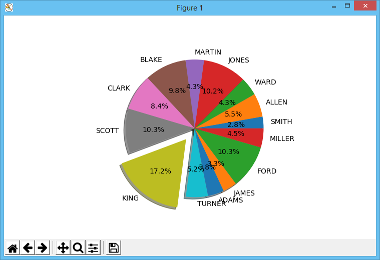
如果您想将员工的工资显示为百分比,那么您可以绘制饼图。以下程序绘制了工资的饼图
import cx_Oracle
import numpy as np
import matplotlib.pyplot as plt
con=cx_Oracle.connect("scott/tiger@localhost")
cursor=con.cursor()
cursor.execute("select count(*) from emp")
for row in cursor:
    totalemps=row[0]
cursor.execute("select ename,sal from emp")
names=[]
salaries=[]
for row in cursor:
    names.append(row[0])
    salaries.append(row[1])
explode=[0.2 if salaries[x]==max(salaries) else 0 for x in np.arange(0,totalemps)]
plt.pie(salaries,explode=explode,labels=names,autopct="%1.1f%%",shadow=True)
plt.show()
pie() 函数将工资列表作为第一个参数。explode 参数指定必须分离哪些饼图切片。在这里,我使用 max() 函数确定要分离的切片。对应于最高工资的值设置为 0.2,而所有其他值均为 0。这将导致具有最高工资的切片被分离。labels 参数指定要在切片上显示的员工姓名。autopct 参数指定要显示的百分比的格式。shadow 参数指定是否应为图表显示阴影效果。
运行上述程序时,将显示以下饼图
关注点
Python 能够编写短而紧凑的程序。这使得 Python 成为数据可视化的一个更合适且有趣的的选择。我希望本文的读者觉得这些东西有用且有趣。
历史
- 2019 年 4 月 23 日:初始版本