
构建您自己的 Silverlight DataGrid:第一步
5.00/5 (24投票s)
了解如何使用 Silverlight 和 GOA Toolkit 构建 DataGrid 的主体部分。实现虚拟模式、处理分层数据,以及构建单元格和单元格导航。
本教程是一系列教程的一部分。您可以在此处阅读第二步:为 Silverlight 构建你自己的 DataGrid:第二步。
1. 引言
为什么我要自己创建网格?
在深入本教程之前,让我们来看看编写自己的数据网格控件的一些好处
- 开箱即用的网格永远无法满足我们的所有需求。要么它们非常糟糕且不适合我们的需求,要么它们包含在巨大的程序集中,导致我们的应用程序体积过大。最重要的是,它们需要很长时间才能学会。
- 相反,通过遵循本教程的步骤,我们将构建一个我们能够完全掌控的网格。随时,我们都可以添加我们真正需要的、并且只添加我们需要的功能,从而保持项目在合理的范围内。此外,我们将了解 Silverlight 和 GOA Toolkit 的一些关键组件的工作原理,并能将我们的知识应用于构建其他高级控件。
但是,请注意,为了完成本教程,我们将需要 GOA Toolkit for Silverlight 的免费版本(http://www.netikatech.com/products/toolkit)。这个库将允许我们采取捷径,没有它们,本教程的篇幅将相当于一整本书。它将允许我们创建最多五个 GridBody 实例。
网格主体
为了确保我们使用相同的词语来指代相同的事物,这里有一张图描述了数据网格的元素

在本教程的第一部分,我们将专注于只读主体的实现。在第二部分,我们将讨论如何为我们的网格添加编辑功能,而在第三部分,我们将转向页眉。
2. 入门
下载并安装 GOA Toolkit
本教程是使用 GOA Toolkit 2009 Vol. 1 Build 212 编写的。请确保您的计算机上已安装此版本或更高版本。您可以从 NETiKA TECH 网站下载试用版安装程序:www.netikatech.com/downloads。
如果您完全不了解 GOA Toolkit,我们建议您花一些时间快速浏览 GOA Toolkit 随附的教程。此教程在安装 GOA Toolkit 时一并安装。您可以通过“开始”菜单访问它。

在 Visual Studio 中创建新解决方案
- 在 Visual Studio 中,创建一个新的 Silverlight 项目,并将其命名为“GridBody”。
- 添加对 GoaEssentials 程序集和 GoaOpen 项目的引用。
最简单的方法是遵循《操作方法》文档中描述的步骤。

- 打开《操作方法》文档
- 选择应用程序屏幕左侧的“如何开始”节点。
- 按照右侧的说明进行操作。
完成此过程后,我们的解决方案的结构应该如下所示:

3. 基本网格主体
GOA Toolkit 架构快速概述
如果您没有阅读 GOA Toolkit 教程,以下是您应该阅读的摘要。
GOA Toolkit 专注于能够显示多个项目的控件。列表、菜单、选项卡、工具栏和数据网格都属于此类控件。在 GOA Toolkit 中,此类控件称为 List control。
GOA Toolkit 分为两个库:GOA Essentials 和 GOA Open。
需要仔细开发和维护的基础组件被分组在 GOA Essentials 中。这些组件是 GOA Toolkit 的核心,在修改它们时应格外小心。
GOA Open 构建在 GOA Essentials 之上。GOA Open 提供源代码。它由菜单或工具栏等高级控件组成。它们都以相同的方式构建。如果您了解 GOA Open 控件的构建方式,就可以将您的知识应用于其他控件。大多数情况下,GOA Open 控件由一个或多个应用了样式的 GOA Essentials 组件组成。
GOA Open 提供了三组 List controls。
Commands
这些控件主要用于在应用程序中执行操作。菜单和工具栏属于此集合。
容器
Container controls 用于以各种方式显示数据。列表、树或组合框属于此集合。
Navigators
Navigator 控件允许在数据集或应用程序部分之间进行导航。TabStrips、TabTrees、TabLists 或 NavigationBars 属于此集合。
实现一个非常基础的网格主体
我们的网格主体将使用 HandyContainer 控件来实现。这是最适合我们需求的控件。
让我们首先看看在不进行任何更改的情况下,使用此控件可以做什么。
让我们将一个 HandyContainer 添加到 GridBody 应用程序的 Page.xaml 文件中。同时,我们将在 XAML 顶部添加必要的 XMLNS 引用,并删除 Width 和 Height 设置。
<UserControl x:Class="GridBody.Page"
    xmlns="http://schemas.microsoft.com/winfx/2006/xaml/presentation"
    xmlns:x="http://schemas.microsoft.com/winfx/2006/xaml"
    xmlns:g="clr-namespace:Netika.Windows.Controls;assembly=GoaEssentials"
    xmlns:o="clr-namespace:Open.Windows.Controls;assembly=GoaOpen">
    <Grid x:Name="LayoutRoot" Background="White">
        <o:HandyContainer
            x:Name="MyGridBody">

        </o:HandyContainer>
    </Grid>
</UserControl>
当然,如果我们现在启动应用程序,页面将不会显示任何内容。我们需要为其附加数据。
准备数据
我们需要数据才能测试我们的网格。我们将用一个人员集合来填充它。
Person 类
这是 Person 类的代码。我们必须将此类添加到 GridBody 项目中。
using Open.Windows.Controls;

namespace GridBody
{
    public class Person : ContainerDataItem
    {
        public Person(string firstName, string lastName, string address,
            string city, string zipCode, bool isCustomer, string comment)
        {
            this.firstName = firstName;
            this.lastName = lastName;
            this.address = address;
            this.city = city;
            this.zipCode = zipCode;
            this.isCustomer = isCustomer;
            this.comment = comment;
        }

        private string firstName;
        public string FirstName
        {
            get { return firstName; }
            set
            {
                if (firstName != value)
                {
                    firstName = value;
                    OnPropertyChanged("FirstName");
                }
            }
        }

        private string lastName;
        public string LastName
        {
            get { return lastName; }
            set
            {
                if (lastName != value)
                {
                    lastName = value;
                    OnPropertyChanged("LastName");
                }
            }
        }

        private string address;
        public string Address
        {
            get { return address; }
            set
            {
                if (address != value)
                {
                    address = value;
                    OnPropertyChanged("Address");
                }
            }
        }

        private string city;
        public string City
        {
            get { return city; }
            set
            {
                if (city != value)
                {
                    city = value;
                    OnPropertyChanged("City");
                }
            }
        }

        private string zipCode;
        public string ZipCode
        {
            get { return zipCode; }
            set
            {
                if (zipCode != value)
                {
                    zipCode = value;
                    OnPropertyChanged("ZipCode");
                }
            }
        }

        private bool isCustomer;
        public bool IsCustomer
        {
            get { return isCustomer; }
            set
            {
                if (isCustomer != value)
                {
                    isCustomer = value;
                    OnPropertyChanged("IsCustomer");
                }
            }
        }

        private string comment;
        public string Comment
        {
            get { return comment; }
            set
            {
                if (comment != value)
                {
                    comment = value;
                    OnPropertyChanged("Comment");
                }
            }
        }
    }
}
请注意,我们已使 Person 类继承自 ContainerDataItem 类。这不是强制性的,但推荐这样做。它是创建可与 HandyContainer 控件配合使用的数据类的最简单方法。如果您选择不继承自 ContainerDataItem 类,则至少应在类中实现 INotifyPropertyChanged 接口。此接口包含一个 PropertyChanged 事件,用于在属性值被修改时通知网格。此接口已在 ContainerDataItem 中实现。为了使其正常工作,您需要在每个属性的 setter 中调用 OnPropertyChanged 方法。
填充 HandyContainer
为了填充网格主体,我们将用人员集合填充 HandyContainer 控件的 ItemsSource 属性。我们可以使用任何实现 IList 接口的集合。但是,如果我们希望 GridBody 能够处理集合中的更改(例如,添加或删除人员时),则该集合应实现 INotifyCollectionChange。ObservableCollection 就是这种情况。
尽管如此,Silverlight 提供的 ObservableCollection 是有限的。使用此集合,您一次只能添加或删除一个元素。
相反,HandyContainer 能够管理一次对多个项目的操作。因此,我们将使用 GObservableCollection(由 Goa Toolkit 提供)。此集合实现了所有必需的接口,并提供了操作多个项目的方法。
所以,让我们创建我们的个人集合,并在我们应用程序的 Page 类的构造函数中填充 GridBody 的 ItemsSource。
public partial class Page : UserControl
{
    private GObservableCollection<Person> personCollection;

    public Page()
    {
        InitializeComponent();

        personCollection = new GObservableCollection<Person>();
        for (int personIndex = 0; personIndex < 1000; personIndex++)
            personCollection.Add(new Person("FirstName" + personIndex,
                                            "LastName" + personIndex,
                                            "Address" + personIndex,
                                            "City" + personIndex,
                                            "ZipCode" + personIndex,
                                            personIndex % 2 == 0,
                                            "Comment" + personIndex));

        MyGridBody.ItemsSource = personCollection;
    }
}
由于本教程的目的不是解释如何连接数据库或应用程序服务器以及从中检索数据,因此数据是从代码生成的。
如果我们现在启动应用程序,我们将面临两个问题:
- 应用程序启动缓慢。
- 网格没有显示人员数据,而是显示
Person类的类型名称。
在继续之前,让我们先纠正这两个问题。
VirtualMode
在显示和操作 UIElements 时,Silverlight 的速度不如桌面应用程序。这就是为什么我们的应用程序启动缓慢的原因。HandyContainer 控件为集合中的每个人创建一个 UIElement。由于我们的集合包含 1000 人,因此必须创建 1000 个 UIElements。创建 1000 个 UIElements 是一个“漫长”的过程,它会减慢我们的应用程序速度。
幸运的是,HandyContainer 控件实现了一个 VirtualMode。当它处于虚拟模式时,仅创建适合控件显示区域的项目。这样,必须创建和操作的 UIElements 数量就会减少到一个可以接受的值。
进行此更改很快,并且可以直接在应用程序页面的 XAML 中完成。
<UserControl x:Class="GridBody.Page"
    xmlns="http://schemas.microsoft.com/winfx/2006/xaml/presentation"
    xmlns:x="http://schemas.microsoft.com/winfx/2006/xaml"
    xmlns:g="clr-namespace:Netika.Windows.Controls;assembly=GoaEssentials"
    xmlns:o="clr-namespace:Open.Windows.Controls;assembly=GoaOpen">
    <Grid x:Name="LayoutRoot" Background="White">
        <o:HandyContainer
            x:Name="MyGridBody"
            VirtualMode="On">

        </o:HandyContainer>
    </Grid>
</UserControl>
如果我们现在启动应用程序,我们会发现它启动速度快了很多。此外,现在虚拟模式已开启,网格的性能将大大降低对数据集合中元素数量的依赖。
ItemsTemplate
我们还没有告诉 GridBody 如何显示人员数据。
这可以通过使用控件的 ItemTemplate 属性来完成。ItemTemplate 是必须应用于每个项目以显示其相关数据(即人员)的数据模板。
我们将创建一个 DataTemplate,它使用 TextBlock 和 Border 来模拟网格单元格。
<UserControl x:Class="GridBody.Page"
    xmlns="http://schemas.microsoft.com/winfx/2006/xaml/presentation"
    xmlns:x="http://schemas.microsoft.com/winfx/2006/xaml"
    xmlns:g="clr-namespace:Netika.Windows.Controls;assembly=GoaEssentials"
    xmlns:o="clr-namespace:Open.Windows.Controls;assembly=GoaOpen">
    <Grid x:Name="LayoutRoot" Background="White">
        <o:HandyContainer
            x:Name="MyGridBody"
            VirtualMode="On">
            <o:HandyContainer.ItemTemplate>
                <g:ItemDataTemplate>
                    <g:GDockPanel>
                        <g:GStackPanel Orientation="Horizontal"
                                  g:GDockPanel.Dock="Top">
                            <Border BorderBrush="Black"
                                      BorderThickness="1"
                                      Width="100" Padding="2">
                                <TextBlock Text="{Binding FirstName}"/>
                            </Border>
                            <Border BorderBrush="Black"
                                     BorderThickness="1"
                                     Width="100" Padding="2">
                                <TextBlock Text="{Binding LastName}"/>
                            </Border>
                            <Border BorderBrush="Black"
                                    BorderThickness="1" Width="100"
                                    Padding="2">
                                <TextBlock Text="{Binding Address}"/>
                            </Border>
                            <Border BorderBrush="Black"
                                      BorderThickness="1"
                                      Width="100" Padding="2">
                                <TextBlock Text="{Binding City}"/>
                            </Border>
                            <Border BorderBrush="Black"
                                   BorderThickness="1"
                                   Width="100" Padding="2">
                                <TextBlock Text="{Binding ZipCode}"/>
                            </Border>
                        </g:GStackPanel>
                        <Border BorderBrush="Black"
                                    BorderThickness="1"
                                    g:GDockPanel.Dock="Fill" Padding="2">
                            <TextBlock Text="{Binding Comment}" />
                        </Border>
                    </g:GDockPanel>
                </g:ItemDataTemplate>
            </o:HandyContainer.ItemTemplate>
        </o:HandyContainer>
    </Grid>
</UserControl>
请注意,为了填充 ItemTemplate 属性,我们使用了 ItemDataTemplate,它是一种特殊类型的 DataTemplate。这不是强制性的,但与 DataTemplate 相比,使用 ItemDataTemplate 可以更好地自定义项目的显示方式。如果我们启动应用程序,人员数据将正确显示,尽管结果远非完美。
DefaultItemModel
我们希望删除项目(即行)之间显示的空白。这可以通过删除每个项目的填充来实现。

项目不应从一个边框拉伸到另一个边框。通过将 Left 值应用于每个项目的 HorizontalAlignement 属性可以解决此问题。

应用这些更改的一种方法是修改项目的样式,但我们暂时不想进行此类更改。使用 HandyContainer 的 DefaultItemModel 属性更简单。
DefaultItemModel 属性允许定义应用于 HandyContainer 每个项目的特殊属性值。为了做到这一点,我们必须用 ContainerItem 填充控件的 DefaultItemModel 属性。我们应用于 DefaultItemModel 的 ContainerItem 的每个属性值(样式除外)也将应用于 HandyContainer 的每个项目。
<o:HandyContainer.DefaultItemModel>
    <o:ContainerItem HandyStyle="StandardItem"
               Padding="0" HorizontalAlignment="Left"/>
</o:HandyContainer.DefaultItemModel>
如果我们现在启动应用程序,数据将显示得更好。
AlternateType
很难看到一个项目在哪里开始和在哪里结束。如果每隔一个项目的背景不同,那会更容易。HandyContainer 的 AlternateType 属性允许我们实现这一点。
<o:HandyContainer
    x:Name="MyGridBody"
    VirtualMode="On"
    AlternateType="Items">
格子
让我们启动应用程序并观察我们的工作成果。我们离数据网格还很远,但这只是一个有趣的开始。
还差什么?首先,我们希望单元格成为真正的单元格,而不是带有边框的 TextBlock。单元格应能够显示不同类型的数据,而不仅仅是文本。用户应该能够从一个单元格导航到另一个单元格。同时,我们希望保留 ItemTemplate 的灵活性。在项目模板中使用面板可以让我们轻松设置每个单元格的位置。我们不限于像标准网格那样只显示一行单元格。
但在实现这些功能之前,让我们探索 HandyContainer 的另一个可能性:节点。
节点
我们希望我们的网格也能显示分层数据。HandyContainer 的项目能够管理这一点。每个项目都可以是一个节点。
作为示例,我们将让我们的个人成为国家的成员,并按他们所属的国家分组显示。让我们创建一个非常简单的 Country 类并将其添加到 GridBody 项目中。
using Open.Windows.Controls;

namespace GridBody
{
    public class Country : ContainerDataItem
    {
        public Country(string name)
        {
            this.name = name;

        }

        private string name;
        public string Name
        {
            get { return name; }
            set
            {
                if (name != value)
                {
                    name = value;
                    OnPropertyChanged("Name");
                }
            }
        }
    }
}
接下来,让我们更改 GridBody 的 ItemsSource。
public partial class Page : UserControl
{
    //private GObservableCollection<Person> personCollection;
    private GObservableCollection<Country> countryCollection;

    public Page()
    {
        InitializeComponent();

        //personCollection = new GObservableCollection<Person>();
        //for (int personIndex = 0; personIndex < 1000; personIndex++)
        //    personCollection.Add(new Person("FirstName" + personIndex,
        //                                    "LastName" + personIndex,
        //                                    "Address" + personIndex,
        //                                    "City" + personIndex,
        //                                    "ZipCode" + personIndex,
        //                                    personIndex % 2 == 0,
        //                                    "Comment" + personIndex));

        //MyGridBody.ItemsSource = personCollection;

        countryCollection = new GObservableCollection<Country>();
        for (int countryIndex = 0; countryIndex < 100; countryIndex++)
        {
            Country country = new Country("CountryName" + countryIndex);
            for (int personIndex = 0; personIndex < 10; personIndex++)
                country.Children.Add(new Person("FirstName" + personIndex,
                                                "LastName" + personIndex,
                                                "Address" + personIndex,
                                                "City" + personIndex,
                                                "ZipCode" + personIndex,
                                                personIndex % 2 == 0,
                                                "Comment" + personIndex));


            country.IsExpanded = true;
            countryCollection.Add(country);
        }

        MyGridBody.ItemsSource = countryCollection;
    }
}
由于 Country 类继承自 ContainerDataItem 类,因此我们能够自动在上面的代码中使用两个非常有趣的属性:Children 和 IsExpanded。Children 属性允许定义元素的子元素。一旦其子元素属性被填充,HandyContainer 就将项目作为节点进行管理。IsExpanded 属性允许定义节点(即项目)是展开(打开)还是折叠。
DataPresenter
但是,如果我们启动应用程序,国家节点将不会显示。这是因为我们仍然需要更改 GridBody 的 ItemTemplate 并描述国家/地区的显示方式。
在 ItemTemplate 中,我们必须能够同时描述人员和国家/地区的显示方式。这可以通过使用 HandyDataPresenter 来完成。
<o:HandyContainer.ItemTemplate>
    <g:ItemDataTemplate>
        <Grid>
            <o:HandyDataPresenter DataType="GridBody.Person">
                <g:GDockPanel>
                    <g:GStackPanel Orientation="Horizontal"
                             g:GDockPanel.Dock="Top">
                        <Border BorderBrush="Black"
                                   BorderThickness="1"
                                   Width="100" Padding="2">
                            <TextBlock Text="{Binding FirstName}"/>
                        </Border>
                        <Border BorderBrush="Black"
                                 BorderThickness="1"
                                 Width="100" Padding="2">
                            <TextBlock Text="{Binding LastName}"/>
                        </Border>
                        <Border BorderBrush="Black"
                               BorderThickness="1"
                               Width="100" Padding="2">
                            <TextBlock Text="{Binding Address}"/>
                        </Border>
                        <Border BorderBrush="Black"
                                  BorderThickness="1"
                                  Width="100" Padding="2">
                            <TextBlock Text="{Binding City}"/>
                        </Border>
                        <Border BorderBrush="Black"
                                 BorderThickness="1"
                                 Width="100" Padding="2">
                            <TextBlock Text="{Binding ZipCode}"/>
                        </Border>
                    </g:GStackPanel>
                    <Border BorderBrush="Black"
                            BorderThickness="1"
                            g:GDockPanel.Dock="Fill" Padding="2">
                        <TextBlock Text="{Binding Comment}" />
                    </Border>
                </g:GDockPanel>
            </o:HandyDataPresenter>
            <o:HandyDataPresenter DataType="GridBody.Country">
                <g:GStackPanel Orientation="Horizontal">
                    <Border BorderBrush="Black"
                              BorderThickness="1"
                              g:GDockPanel.Dock="Fill"  Padding="2">
                        <TextBlock Text="{Binding Name}" />
                    </Border>
                    <Border BorderBrush="Black"
                             BorderThickness="1"
                             g:GDockPanel.Dock="Fill" Padding="2">
                        <TextBlock Text="{Binding Children.Count}" />
                    </Border>
                </g:GStackPanel>
            </o:HandyDataPresenter>
        </Grid>
    </g:ItemDataTemplate>
</o:HandyContainer.ItemTemplate>
HandyDataPresenter 仅在其内容显示的数据是预定义类型时才显示其内容。
在我们的示例中,我们定义了 HandyDataPresenter 的 DataType 属性,以便第一个 HandyDataPresenter 仅在项目与人员关联时显示,第二个 HandyDataPresenter 仅在项目与国家关联时显示。
如果我们现在启动应用程序,国家和人员都会显示,但它们都左对齐,并且层次结构级别之间没有缩进。
这是因为 HandyContainer 控件项目的默认样式不实现缩进。为了使用在视觉上实现节点标准功能的样式,我们必须让 HandyContainer 来完成。
<o:HandyContainer
    x:Name="MyGridBody"
    VirtualMode="On"
    AlternateType="Items"
    HandyDefaultItemStyle="Node">
这样,节点将被缩进,并且每个节点前面都会显示一个箭头,允许用户展开或折叠节点。
由于节点项目有边距,我们必须通过更新 GridBody 项目的 DefaultItemModel 属性来消除它。
<o:HandyContainer.DefaultItemModel>
    <o:ContainerItem HandyStyle="Node"
         Padding="0"
         HorizontalAlignment="Left" Margin="0"/>
</o:HandyContainer.DefaultItemModel>
4. 单元格
引言
现在是时候开始实现我们的单元格了。我们需要的第一样东西是能够显示不同类型数据的单元格。在本教程中,我们将实现 TextCell 类和 CheckBoxCell 类。您可以轻松地自己实现其他类型的单元格。
我们将把所有新功能直接添加到 GoaOpen 项目中。该项目是 GOA Toolkit 的开放部分。
让我们在 GoaOpen 项目中创建一个新的 Extensions 文件夹。我们将在该文件夹中放置所有 GOA 改进。我们还将 Extensions 文件夹添加一个 Grid 子文件夹。该文件夹将保存所有与我们的 Grid 相关的改进。

准备工作
TreeHelper 类
让我们首先实现一个我们将用于代码中多个地方的辅助类。
TreeHelper 类实现了一个 IsChildOf 方法,该方法允许知道树的一个元素是否是树的另一个元素的子元素。例如,如果按钮“button1”是画布 canvas1 的子元素,则以下调用将返回 true。
TreeHelper.IsChildOf(canvas1, button1)
将此类添加到 GoaOpen 项目的 Extensions\Grid 文件夹中。
using System.Windows;
using System.Windows.Media;

namespace Open.Windows.Controls
{
    public static class TreeHelper
    {
        public static bool IsChildOf(DependencyObject parent,
                           DependencyObject child)
        {
            DependencyObject parentElement = child;
            while (parentElement != null)
            {
                if (parentElement == parent)
                    return true;

                parentElement = VisualTreeHelper.GetParent(parentElement);
            }

            return false;
        }
    }
}
准备 HandyContainer
在实现单元格之前,我们需要向 HandyContainer 添加一些方法和属性。
HandyContainer 类位于 GoaOpen 项目的 GoaControls\HandyList\HandyList\HandyContainer 文件夹中。
我们不会直接将方法添加到 HandyContainer 文件中。为了将我们的更改与 GoaOpen 中提供的代码分开,我们将在刚刚创建的 Extensions\Grid 文件夹中添加一个新的 HandyContainer 文件。

让我们修改现有的 HandyContainer.cs 文件(位于 GoaControls\HandyList\HandyList\HandyContainer 文件夹中),使其包含一个分部类。
namespace Open.Windows.Controls
{
    /// <summary>
    /// Containers controls are used to display data in various ways.
     ///Lists, Trees or Combos are part of this set.
    /// </summary>
    public partial class HandyContainer : HandyListControl
    {
        public static readonly DependencyProperty HandyStyleProperty;
        public static readonly DependencyProperty HandyDefaultItemStyleProperty;
让我们在新的 HandyContainer 文件(我们刚刚在 Extensions\Grid 文件夹中创建的文件)中创建一个新的 HandyContainer 分部类。
using System;
using System.Windows;
using Netika.Windows.Controls;
using System.Windows.Media;
using System.Windows.Input;

namespace Open.Windows.Controls
{
    public partial class HandyContainer : HandyListControl
    {

    }
}
GetParentContainer 方法
GetParentContainer 静态方法将允许查找 FrameworkElement 的父 HandyContainer。例如,如果“cell1”单元格是“GridBody1” HandyContainer 的单元格,则以下调用将返回对 GridBody1 HandyContainer 的引用。
HandyContainer.GetParentContainer(cell);
让我们将此方法添加到我们的新分部类中。
using System;
using System.Windows;
using Netika.Windows.Controls;
using System.Windows.Media;
using System.Windows.Input;

namespace Open.Windows.Controls
{
    public partial class HandyContainer : HandyListControl
    {
        public static HandyContainer GetParentContainer(FrameworkElement element)
        {
            DependencyObject parentElement = element;
            while (parentElement != null)
            {
                HandyContainer parentContainer = parentElement as HandyContainer;
                if (parentContainer != null)
                    return parentContainer;

                parentElement = VisualTreeHelper.GetParent(parentElement);
            }

            return null;
        }
    }
}
CurrentCellName 属性
请记住,我们的要求之一是希望通过在 GridBody 的 ItemTemplate 中使用面板来设置单元格的位置。这意味着单元格不一定并排显示在一行中。因此,我们不能像在标准 Grid 中那样通过索引来指定单元格。对于复杂的布局,将不清楚哪个单元格由哪个索引指定。
因此,我们将强制使用每个单元格的名称,并提供从其名称操作单元格的方法。
此时,我们将一个 CurrentCellName 属性添加到 HandyContainer。CurrentCell 是拥有焦点的网格单元格。CurrentCellName 属性将用当前单元格的名称填充。
我们还将添加一个 CurrentCellNameChanged 事件。当当前单元格更改时,将引发此事件。
public event EventHandler CurrentCellNameChanged;
private string currentCellName;
public string CurrentCellName
{
    get { return currentCellName; }
    internal set
    {
        if (currentCellName != value)
        {
            currentCellName = value;
            OnCurrentCellNameChanged(EventArgs.Empty);

        }
    }
}

protected virtual void OnCurrentCellNameChanged(EventArgs e)
{
    if (CurrentCellNameChanged != null)
        CurrentCellNameChanged(this, e);
}
格子
在 GoaOpen 项目中,让我们首先创建一个抽象的 Cell 类,该类实现所有单元格共享的功能,无论它们显示的数据类型是什么。TextCell 类和 CheckBoxCell 类将继承自 Cell 类。
using System;
using System.Windows;
using System.Windows.Controls;
using System.Windows.Input;

namespace Open.Windows.Controls
{
    public abstract class Cell : Control
    {
        public override void OnApplyTemplate()
        {
            base.OnApplyTemplate();

            if (string.IsNullOrEmpty(this.Name))
                throw new InvalidCastException("A cell must have a name");
        }

        private bool isFocused;
        protected override void OnGotFocus(RoutedEventArgs e)
        {
            base.OnGotFocus(e);

            if (!isFocused)
            {
                VisualStateManager.GoToState(this, "Focused", true);

                isFocused = true;
                HandyContainer parentContainer = HandyContainer.GetParentContainer(this);
                if (parentContainer != null)
                {
                    parentContainer.CurrentCellName = this.Name;
                }
            }
        }

        protected override void OnLostFocus(RoutedEventArgs e)
        {
            base.OnLostFocus(e);

            object currentFocusedElement = FocusManager.GetFocusedElement();
            if (!TreeHelper.IsChildOf(this, currentFocusedElement as DependencyObject))
            {
                isFocused = false;
                VisualStateManager.GoToState(this, "Standard", true);
            }
        }

        protected override void OnMouseLeftButtonDown(MouseButtonEventArgs e)
        {
            base.OnMouseLeftButtonDown(e);
            object currentFocusedElement = FocusManager.GetFocusedElement();
            if (!TreeHelper.IsChildOf(this, currentFocusedElement as DependencyObject))
            {
                this.Focus();
            }
        }
    }
}
在 OnApplyTemplate 中,我们确保单元格有一个名称。单元格通过其名称进行引用,并且为每个单元格定义名称是强制性的。
拥有焦点的单元格(这意味着该单元格或其中包含的控件之一拥有焦点)是当前单元格。因此,当单元格获得焦点时(查看 OnGotFocus 方法),我们通过设置 CurrentCellName 属性的值来通知其父 HandyContainer。
此外,我们调用 VisualStateManager.GoToState 方法将单元格的状态切换为“Focused”。这样,我们就可以修改单元格的外观(我们将在应用于单元格的样式中进行此操作),当它成为当前单元格时。
当焦点离开单元格时(查看 OnLostFocus 事件),我们将单元格的状态切换回“Standard”值。
OnMouseLeftButtonDown 方法在用户单击单元格时将其设置为焦点。
TextCell
代码
TextCell 的代码非常简单。Text 属性允许定义单元格必须显示的文本。
在构造函数中,我们定义了 TextCell 必须使用的默认样式。我们将在下一步将此样式添加到 generic.xaml 文件中。
using System.Windows;

namespace Open.Windows.Controls
{
    public class TextCell : Cell
    {
        public static readonly DependencyProperty TextProperty;

        static TextCell()
        {
            TextProperty = DependencyProperty.Register("Text",
                                typeof(string), typeof(TextCell), null);
        }

        public TextCell()
        {
            DefaultStyleKey = typeof(TextCell);
        }

        public string Text
        {
            get { return (string)GetValue(TextProperty); }
            set { SetValue(TextProperty, value); }
        }
    }
}
样式
我们还需要实现 TextCell 的 Style。
GOA Open 随附两个通用文件:generic.xaml 和 genericSL.xaml。第一个文件是默认使用的文件。它包含应用于 GOA open 控件的默认样式。
genericSL.xaml 文件包含 GOA Open 控件的替代样式。当这些样式应用于 GOA 控件时,它们的外观会接近标准 Silverlight 控件的外观。如果您不知道如何使用 genericSL.xaml 文件中的样式而不是默认 generic.xaml 文件中的样式,请阅读 GOAOpen 项目的 ReadMe.Txt 文件中的说明。
在本教程中,我们将假设您使用的是 GOA Open 项目的默认 generic.xaml 文件中提供的样式。如果不是这种情况,我们建议重新激活它们。
如果您下载本教程的代码,您将看到我们还提供了一个 genericSL 文件,其中包含适用于网格的标准 Sliverlight 样式。
让我们在 generic.xaml 文件末尾添加一个分隔符,以清晰地区分我们的样式和其他提供的 GoaOpen 样式。
        . . .

        </Setter.Value>
        </Setter>
    </Style>

    <!--================================================================================-->
    <!--================================================================================-->
    <!--=============================  GRID ============================================-->
    <!--================================================================================-->
    <!--=================================================================================-->

</ResourceDictionary>
然后,让我们在分隔符之后添加我们 TextCell 的样式。
<Style TargetType="o:TextCell">
    <Setter Property="Background" Value="Transparent"/>
    <Setter Property="BorderBrush"
               Value="{StaticResource DefaultListControlStroke}"/>
    <Setter Property="BorderThickness" Value="1"/>
    <Setter Property="Foreground"
               Value="{StaticResource DefaultForeground}"/>
    <Setter Property="HorizontalContentAlignment" Value="Stretch" />
    <Setter Property="VerticalContentAlignment" Value="Stretch" />
    <Setter Property="Cursor" Value="Arrow" />
    <Setter Property="Padding" Value="2,2,1,1" />
    <Setter Property="Width" Value="100"/>
    <Setter Property="Template">
        <Setter.Value>
            <ControlTemplate TargetType="o:TextCell">
                <Grid>
                    <vsm:VisualStateManager.VisualStateGroups>
                        <vsm:VisualStateGroup x:Name="CommonStates">
                            <vsm:VisualState x:Name="Standard"/>
                            <vsm:VisualState x:Name="Focused">
                                <Storyboard>
                                    <ObjectAnimationUsingKeyFrames
                                            Storyboard.TargetName="FocusElement"
                                            Storyboard.TargetProperty="Visibility"
                                            Duration="0">
                                        <DiscreteObjectKeyFrame KeyTime="0">
                                            <DiscreteObjectKeyFrame.Value>
                                                <Visibility>Visible</Visibility>
                                            </DiscreteObjectKeyFrame.Value>
                                        </DiscreteObjectKeyFrame>
                                    </ObjectAnimationUsingKeyFrames>
                                </Storyboard>
                            </vsm:VisualState>
                        </vsm:VisualStateGroup>
                    </vsm:VisualStateManager.VisualStateGroups>
                    <TextBlock
                        x:Name="TextElement"
                        Text="{TemplateBinding Text}"
                        Margin="{TemplateBinding Padding}"
                        HorizontalAlignment=
                          "{TemplateBinding HorizontalContentAlignment}"
                        VerticalAlignment=
                          "{TemplateBinding VerticalContentAlignment}"/>
                    <Rectangle Name="FocusElement"
                        Stroke="{StaticResource DefaultFocus}"
                        StrokeThickness="1"
                        IsHitTestVisible="false"
                        StrokeDashCap="Round"
                        Margin="0,1,1,0"
                        StrokeDashArray=".2 2"
                        Visibility="Collapsed" />
                    <Rectangle Name="CellRightBorder"
                        Stroke="{TemplateBinding BorderBrush}"
                        StrokeThickness="0.5"
                        Width="1"
                        HorizontalAlignment="Right"/>
                </Grid>
            </ControlTemplate>
        </Setter.Value>
    </Setter>
</Style>
请注意,在 TextCell 样式中:
- 我们设置了一个默认的
Width值。这样,如果ItemTemplate中未定义单元格的Width,则会应用默认宽度。 TextCell包含一个TextBlock,该TextBlock将显示TextCell的Text属性的值。FocusElement是一个虚线矩形。它默认情况下是折叠的,当CommonStates值变为“Focused”时会变得可见。- 一个竖线,由一个宽度为 1 像素的
Rectangle构建,显示在单元格的右侧。此线用于绘制单元格的右边框。
在进行所有这些修改之后,让我们再次尝试启动我们的应用程序。但在此之前,我们需要更改 GridBody 教程项目 Page 上的 GridBody 控件的 ItemTemplate。
让我们将所有 Border/TextBlock 对替换为 TextCell。不要忘记为每个单元格指定名称。
<g:ItemDataTemplate>
    <Grid>
        <o:HandyDataPresenter DataType="GridBody.Person">
            <g:GDockPanel>
                <g:GStackPanel Orientation="Horizontal"
                             g:GDockPanel.Dock="Top">
                    <o:TextCell Text="{Binding FirstName}"
                      x:Name="FirstName"/>
                    <o:TextCell Text="{Binding LastName}"
                      x:Name="LastName"/>
                    <o:TextCell Text="{Binding Address}"
                      x:Name="Address"/>
                    <o:TextCell Text="{Binding City}"
                      x:Name="City"/>
                    <o:TextCell Text="{Binding ZipCode}"
                      x:Name="ZipCode"/>
                </g:GStackPanel>
                <o:TextCell Text="{Binding Comment}"
                   g:GDockPanel.Dock="Fill"
                   x:Name="Comment" Width="Auto"/>
            </g:GDockPanel>
        </o:HandyDataPresenter>
        <o:HandyDataPresenter DataType="GridBody.Country">
            <g:GStackPanel Orientation="Horizontal">
                <o:TextCell Text="{Binding Name}"
                          x:Name="CountryName"/>
                <o:TextCell Text="{Binding Children.Count}"
                          x:Name="ChildrenCount"/>
            </g:GStackPanel>
        </o:HandyDataPresenter>
    </Grid>
</g:ItemDataTemplate>
如果我们现在启动应用程序,我们会发现单元格显示正确,并且当我们单击一个单元格时,它会获得焦点。尽管如此,显示并不完美。我们希望能够在这两个单元格行之间添加水平线。
但在执行此操作之前,让我们编写我们想实现的另一种类型的单元格的代码:CheckBoxCell。
CheckBoxCell
代码
让我们将 CheckBoxCell 类添加到 GoaOpen 项目中。
using System;
using System.Windows;

namespace Open.Windows.Controls
{
    public class CheckBoxCell : Cell
    {
        public static readonly DependencyProperty IsCheckedProperty;
        public static readonly DependencyProperty CheckMarkVisibilityProperty;

        private bool isOnReadOnlyChange;

        static CheckBoxCell()
        {
            IsCheckedProperty = DependencyProperty.Register("IsChecked",
                typeof(bool),
                typeof(CheckBoxCell),
                new PropertyMetadata(new PropertyChangedCallback(OnIsCheckedChanged)));
            CheckMarkVisibilityProperty =
              DependencyProperty.Register("CheckMarkVisibility",
                typeof(Visibility),
                typeof(CheckBoxCell),
                new PropertyMetadata(Visibility.Collapsed,
                    new PropertyChangedCallback(OnCheckMarkVisibilityChanged)));
        }

        public CheckBoxCell()
        {
            DefaultStyleKey = typeof(CheckBoxCell);
        }

        public bool IsChecked
        {
            get { return (bool)GetValue(IsCheckedProperty); }
            set { SetValue(IsCheckedProperty, value); }
        }

        private static void OnIsCheckedChanged(DependencyObject d,
                            DependencyPropertyChangedEventArgs e)
        {
            CheckBoxCell cell = (CheckBoxCell)d;
            cell.OnIsCheckedChanged((bool)e.NewValue);
        }

        protected virtual void OnIsCheckedChanged(bool isChecked)
        {
            isOnReadOnlyChange = true;
            if (isChecked)
                CheckMarkVisibility = Visibility.Visible;
            else
                CheckMarkVisibility = Visibility.Collapsed;
            isOnReadOnlyChange = false;
        }

        public Visibility CheckMarkVisibility
        {
            get { return (Visibility)GetValue(CheckMarkVisibilityProperty); }
            private set { SetValue(CheckMarkVisibilityProperty, value); }
        }

        private static void OnCheckMarkVisibilityChanged(DependencyObject d,
            DependencyPropertyChangedEventArgs e)
        {
            CheckBoxCell cell = (CheckBoxCell)d;
            if (!cell.isOnReadOnlyChange)
                throw new InvalidOperationException("Property is read only");
        }
    }
}
此单元格的代码非常简单。我们实现了两个属性:IsChecked 和 CheckMarkVisibility。IsChecked 属性将绑定到数据。CheckMarkVisibility 属性允许定义单元格将显示的 CheckMark 是否显示。CheckMarkVisibility 属性值将取决于 IsChecked 属性值。
或者,我们也可以使用两个状态:IsChecked 和 IsNotChecked,并使用与焦点元素相同的处理方式。
样式
<Style TargetType="o:CheckBoxCell">
    <Setter Property="Background" Value="Transparent" />
    <Setter Property="BorderBrush"
          Value="{StaticResource DefaultListControlStroke}"/>
    <Setter Property="BorderThickness" Value="1"/>
    <Setter Property="Foreground"
          Value="{StaticResource DefaultForeground}"/>
    <Setter Property="Cursor" Value="Arrow" />
    <Setter Property="Width" Value="20"/>
    <Setter Property="Template">
        <Setter.Value>
            <ControlTemplate TargetType="o:CheckBoxCell">
                <Grid Background="Transparent">
                    <vsm:VisualStateManager.VisualStateGroups>
                        <vsm:VisualStateGroup x:Name="CommonStates">
                            <vsm:VisualState x:Name="Standard"/>
                            <vsm:VisualState x:Name="Focused">
                                <Storyboard>
                                    <ObjectAnimationUsingKeyFrames
                                            Storyboard.TargetName="focusElement"
                                            Storyboard.TargetProperty="Visibility"
                                            Duration="0">
                                        <DiscreteObjectKeyFrame KeyTime="0">
                                            <DiscreteObjectKeyFrame.Value>
                                                <Visibility>Visible</Visibility>
                                            </DiscreteObjectKeyFrame.Value>
                                        </DiscreteObjectKeyFrame>
                                    </ObjectAnimationUsingKeyFrames>
                                </Storyboard>
                            </vsm:VisualState>
                        </vsm:VisualStateGroup>
                    </vsm:VisualStateManager.VisualStateGroups>
                    <Rectangle
                            x:Name="ShadowVisual"
                            Fill="{StaticResource DefaultShadow}"
                            Height="12"
                            Width="12"
                            RadiusX="2"
                            RadiusY="2"
                            Margin="1,1,-1,-1"/>
                    <Border
                            x:Name="BackgroundVisual"
                            Background="{TemplateBinding Background}"
                            Height="12"
                            Width="12"
                            BorderBrush="{TemplateBinding BorderBrush}"
                            CornerRadius="2"
                            BorderThickness="{TemplateBinding BorderThickness}"/>
                    <Grid
                            x:Name="CheckMark"
                            Width="8"
                            Height="8"
                            Visibility="{TemplateBinding CheckMarkVisibility}" >
                        <Path
                                Stretch="Fill"
                                Stroke="{TemplateBinding Foreground}"
                                StrokeThickness="2"
                                Data="M129.13295,140.87834 L132.875,145 L139.0639,137" />
                    </Grid>
                    <Rectangle
                            x:Name="ReflectVisual"
                            Fill="{StaticResource DefaultReflectVertical}"
                            Height="5"
                            Width="10"
                            Margin="1,1,1,6"
                            RadiusX="2"
                            RadiusY="2"/>
                    <Rectangle
                            Name="focusElement"
                            Stroke="{StaticResource DefaultFocus}"
                            StrokeThickness="1"
                            Fill="{TemplateBinding Background}"
                            IsHitTestVisible="false"
                            StrokeDashCap="Round"
                            Margin="0,1,1,0"
                            StrokeDashArray=".2 2"
                            Visibility="Collapsed" />
                    <Rectangle
                            Name="CellRightBorder"
                            Stroke="{TemplateBinding BorderBrush}"
                            StrokeThickness="0.5"
                            Width="1"
                            HorizontalAlignment="Right"/>
                </Grid>
            </ControlTemplate>
        </Setter.Value>
    </Setter>
</Style>
既然我们已经制作了 TextBoxCell 的样式,CheckBoxCell 的样式看起来就相当简单了。
- 我们设置了默认的
Width值。 CheckMark元素的可视性绑定到CheckMarkVisibility属性。FocusElement和右侧的竖线与TextCell和CheckBoxCell中的管理方式完全相同。
为了查看 CheckBoxCell 的外观,让我们在 GridBody 项目的 GridBody 控件的 ItemTemplate 中添加一个,并将其绑定到 Person 的 IsCustomer 属性。
<g:ItemDataTemplate>
    <Grid>
        <o:HandyDataPresenter DataType="GridBody.Person">
            <g:GDockPanel>
                <g:GStackPanel Orientation="Horizontal"
                             g:GDockPanel.Dock="Top">
                    <o:TextCell Text="{Binding FirstName}"
                      x:Name="FirstName"/>
                    <o:TextCell Text="{Binding LastName}"
                      x:Name="LastName"/>
                    <o:TextCell Text="{Binding Address}"
                      x:Name="Address"/>
                    <o:TextCell Text="{Binding City}"
                      x:Name="City"/>
                    <o:TextCell Text="{Binding ZipCode}"
                      x:Name="ZipCode"/>
                    <o:CheckBoxCell IsChecked="{Binding IsCustomer}"
                       x:Name="IsCustomer"/>
                </g:GStackPanel>
                <o:TextCell Text="{Binding Comment}"
                  g:GDockPanel.Dock="Fill"
                  x:Name="Comment" Width="Auto"/>
            </g:GDockPanel>
        </o:HandyDataPresenter>
        <o:HandyDataPresenter DataType="GridBody.Country">
            <g:GStackPanel Orientation="Horizontal">
                <o:TextCell Text="{Binding Name}"
                  x:Name="CountryName"/>
                <o:TextCell Text="{Binding Children.Count}"
                  x:Name="ChildrenCount"/>
            </g:GStackPanel>
        </o:HandyDataPresenter>
    </Grid>
</g:ItemDataTemplate>
5. HandyContainer Grid 样式
引言
我们还没有为用于构建 GridBody 的 HandyContainer 创建样式。
GoaOpen 已经为 HandyContainer 提供了一些样式。HandyStyle 属性允许在提供的样式之间进行选择。此属性是一个枚举。每个枚举值都关联一个样式。当您为 HandyStyle 属性选择一个值时,HandyContainer 会在 generic.xaml 文件中查找相应的样式并应用它。
到目前为止,ListStyle 已应用于我们用于创建 GridBody 的 HandyContainer。尽管如此,我们希望不使用 ListStyle,而是使用我们可以随时更改的自定义样式。
GridBody 样式
此时,我们将仅复制 GoaOpen 的 generic.xaml 文件中提供的 ListStyle。
- 在 generic.xaml 文件中查找
ListStyle。 - 将其复制到文件末尾(就在
CheckBoxCell样式之后)。 - 将其重命名为
GridBodyStyle。
<Style x:Key="GridBodyStyle" TargetType="o:HandyContainer">
    <Setter Property="Orientation" Value="Vertical" />
    <Setter Property="Background"
      Value="{StaticResource DefaultControlBackground}" />
    <Setter Property="BorderBrush"
      Value="{StaticResource DefaultListControlStroke}"/>
    <Setter Property="RestoreFocusMode" Value="LastFocusedItem" />
    <Setter Property="AutoClipContent" Value="True" />
    <Setter Property="HorizontalContentAlignment" Value="Stretch"/>
    <Setter Property="VerticalContentAlignment" Value="Stretch"/>
    <Setter Property="HandyStyle" Value="ListStyle"/>
    <!-- needed for combo-->
    <Setter Property="HandyScrollerStyle" Value="StandardScrollerStyle"/>
    <Setter Property="HandyItemsPanelModel" Value="StandardPanel" />
    <Setter Property="HandyStatersModel" Value="StandardStaters"/>
    <Setter Property="HandyDefaultItemStyle" Value="Calculated"/>
    <Setter Property="HandyItemContainerStyle" Value="StandardItem"/>
    <Setter Property="BorderThickness" Value="1"/>
    <Setter Property="Padding" Value="0"/>
    <Setter Property="SelectionMode" Value="Single"/>
    <Setter Property="IsTabStop" Value="False" />
    <Setter Property="ShowColSeparators" Value="False"/>
    <Setter Property="ShowRowSeparators" Value="False"/>
    <Setter Property="ColSpace" Value="5"/>
    <Setter Property="RowSpace" Value="5"/>
    <Setter Property="ItemContainerDefinedStyle"
      Value="{StaticResource EmptyStyle}"/>
    <Setter Property="SeparatorStyle"
      Value="{StaticResource Container_SeparatorStyle}"/>
    <Setter Property="StandardItemStyle"
      Value="{StaticResource Container_ItemStyle}"/>
    <Setter Property="ListItemStyle"
      Value="{StaticResource Container_ListItemStyle}"/>
    <Setter Property="DetailsItemStyle"
      Value="{StaticResource Container_ItemDetailStyle}"/>
    <Setter Property="CheckBoxStyle"
      Value="{StaticResource Container_CheckBoxStyle}"/>
    <Setter Property="RadioButtonStyle"
      Value="{StaticResource Container_RadioButtonStyle}"/>
    <Setter Property="ToggleButtonStyle"
      Value="{StaticResource Container_ToggleButtonStyle}"/>
    <Setter Property="NodeStyle"
      Value="{StaticResource Container_NodeStyle}"/>

    <Setter Property="DropDownListStyle"
      Value="{StaticResource Container_DropDownListStyle}"/>
    <Setter Property="DropDownButtonStyle"
      Value="{StaticResource Container_DropDownButtonStyle}"/>

    <Setter Property="ColSeparatorsStyle"
      Value="{StaticResource StandardColSeparatorStyle}"/>
    <Setter Property="RowSeparatorsStyle"
      Value="{StaticResource StandardRowSeparatorStyle}"/>

    <Setter Property="Template">
        <Setter.Value>
            <ControlTemplate TargetType="o:HandyContainer">
                <Border
                        Background="{TemplateBinding Background}"
                        BorderBrush="{TemplateBinding BorderBrush}"
                        BorderThickness="{TemplateBinding BorderThickness}"
                        Padding="{TemplateBinding Padding}">
                    <Grid x:Name="ELEMENT_Root">
                        <g:Scroller
                                x:Name="ElementScroller"
                                Style="{TemplateBinding ScrollerStyle}"
                                Background="Transparent"
                                BorderThickness="0"
                                Margin="{TemplateBinding Padding}">
                            <g:GItemsPresenter
                                x:Name="ELEMENT_ItemsPresenter"
                                Opacity="{TemplateBinding Opacity}"
                                Cursor="{TemplateBinding Cursor}"
                                HorizontalAlignment =
                                  "{TemplateBinding HorizontalContentAlignment}"
                                VerticalAlignment =
                                  "{TemplateBinding VerticalContentAlignment}"/>
                        </g:Scroller>
                    </Grid>
                </Border>
            </ControlTemplate>
        </Setter.Value>
    </Setter>
</Style>
HandyContainerStyle 枚举
我们需要新的预定义样式“GridBodyStyle”可以通过选择 HandyContainer 的 HandyStyle 属性的新值来应用。为此,我们必须将 GridBodyStyle 枚举值添加到 HandyContainerStyle 枚举中。
- 在 GoaOpen 项目中,找到 HandyContainerStyle 文件并打开它(它位于 GoaControls\HandyList\HandyList\HandyContainer 文件夹中)。
- 将新的
GridBodyStyle枚举值添加到列表末尾。
namespace Open.Windows.Controls
{
    public enum HandyContainerStyle
    {
        None = 0,
        ListStyle,
        ShelfStyle,
        VerticalShelfStyle,
        ComboListStyle,
        GridBodyStyle
    }
}
应用样式
让我们将此新样式应用于 GridBody 项目的 Page 中的 MyGridBody 控件。
<o:HandyContainer
            x:Name="MyGridBody"
            VirtualMode="On"
            AlternateType="Items"
            HandyDefaultItemStyle="Node"
            HandyStyle="GridBodyStyle">
现在,GridBodyStyle 将应用于 HandyContainer。由于我们尚未修改样式,因此此时如果我们启动应用程序,将看不到任何差异。
6. ContainerItem 样式
引言
HandyContainer 控件有一个 HandyDefaultItemStyle 属性,该属性允许选择应用于其包含的项目(items)的样式。我们在介绍中已经使用过此属性,当时我们将节点样式应用于项目。此属性是一个枚举。它可以具有以下值:None、Calculated、ItemContainer、Separator、StandardItem、ListItem、DetailsItem、CheckBox、RadioButton、ToggleButton、Node、DropDownList、DropDownButton。
这些值中的每一个都关联到 HandyContainer 的一个包含样式的属性。定义了以下属性:
ItemContainerDefinedStyleSeparatorStyleStandardItemStyleListItemStyleDetailsItemStyleCheckBoxStyleRadioButtonStyleToggleButtonStyleNodeStyleDropDownListStyleDropDownButtonStyle
当我们为 HandyContainer 的 HandyDefaultItemStyle 属性选择 StandardItem 值时,StandardItemStyle 属性中定义的样式将应用于 HandyContainer 的每个项目。当我们选择 Node 值时,NodeStyle 属性中定义的样式将应用于 HandyContainer 的每个项目,依此类推。
到目前为止,我们已经处理了 StandardItemStyle(默认样式)和 NodeStyle。
与我们定义自己的 GridBodyStyle 以应用于 HandyContainer 相同的方式,我们希望定义自己的 StandardItemStyle 和 NodeStyles,以便在需要时进行更改。
创建样式
如果您查看我们在 generic.xaml 文件中创建的 GridBodyStyle,您会看到这两个属性已定义:
<Setter Property="StandardItemStyle" Value="{StaticResource Container_ItemStyle}"/>
<Setter Property="NodeStyle" Value="{StaticResource Container_NodeStyle}"/>
这意味着,当您为 HandyDefaultItemStyle 属性选择 StandardItem 值时,“Container_ItemStyle”样式将应用于 HandyContainer 的每个项目,当您选择“Node”值时,“Container_NodeStyle”样式将应用于每个项目。
让我们用新的值替换这两个值。
<Setter Property="StandardItemStyle" Value="{StaticResource Container_RowItemStyle}"/>
<Setter Property="NodeStyle" Value="{StaticResource Container_RowNodeStyle}"/>
这样,当我们为 HandyDefaultItemStyle 选择 StandardItem 值时,新的“Container_RowItemStyle”样式将应用于 HandyContainer 的每个项目,当我们选择“Node”值时,“Container_RowNodeStyle”样式将应用于每个项目。
我们仍然需要创建这两种样式。
以下是它们的代码。您可以将它们复制并粘贴到 generic.xaml 文件中。
请注意将它们粘贴到 GridBodyStyle 样式之前。由于 GridBodyStyle 引用了 Container_RowItemStyle 和 Container_RowNodeStyle,因此最好先定义两个项目样式,然后再定义 HandyContainer 样式。
<Style x:Key="Container_RowItemStyle" TargetType="o:HandyListItem">
<Setter Property="HorizontalAlignment" Value="Left" />
<Setter Property="HorizontalContentAlignment" Value="Stretch" />
<Setter Property="VerticalContentAlignment" Value="Center" />
<Setter Property="Cursor" Value="Arrow" />
<Setter Property="Padding" Value="0" />
<Setter Property="Margin" Value="0"/>
<Setter Property="Background"
Value="{StaticResource DefaultControlBackground}" />
<Setter Property="Foreground"
Value="{StaticResource DefaultForeground}"/>
<Setter Property="FontSize" Value="11" />
<Setter Property="Indentation" Value="10" />
<Setter Property="IsTabStop" Value="True" />
<Setter Property="IsKeyActivable" Value="True"/>
<Setter Property="ItemUnpressDropDownBehavior"
Value="CloseAll" />
<Setter Property="BorderBrush"
Value="{StaticResource DefaultListControlStroke}"/>
<Setter Property="BorderThickness" Value="1"/>
<Setter Property="Template">
<Setter.Value>
<ControlTemplate TargetType="o:HandyListItem">
<Grid Background="Transparent" x:Name="LayoutRoot">
<vsm:VisualStateManager.VisualStateGroups>
<vsm:VisualStateGroup x:Name="CommonStates">
<vsm:VisualState x:Name="Normal"/>
<vsm:VisualState x:Name="Disabled">
<Storyboard>
<DoubleAnimation Duration="0"
Storyboard.TargetName="ELEMENT_ContentPresenter"
Storyboard.TargetProperty="Opacity"
To="0.6"/>
<DoubleAnimation Duration="0"
Storyboard.TargetName="SelectedVisual"
Storyboard.TargetProperty="Opacity"
To="0.6"/>
<DoubleAnimation Duration="0"
Storyboard.TargetName="ReflectVisual"
Storyboard.TargetProperty="Opacity"
To="0"/>
</Storyboard>
</vsm:VisualState>
</vsm:VisualStateGroup>
<vsm:VisualStateGroup x:Name="FocusStates">
<vsm:VisualState x:Name="NotFocused"/>
<vsm:VisualState x:Name="Focused">
<Storyboard>
<ObjectAnimationUsingKeyFrames
Storyboard.TargetName="FocusVisual"
Storyboard.TargetProperty="Visibility"
Duration="0">
<DiscreteObjectKeyFrame KeyTime="0">
<DiscreteObjectKeyFrame.Value>
<Visibility>Visible</Visibility>
</DiscreteObjectKeyFrame.Value>
</DiscreteObjectKeyFrame>
</ObjectAnimationUsingKeyFrames>
</Storyboard>
</vsm:VisualState>
</vsm:VisualStateGroup>
<vsm:VisualStateGroup x:Name="MouseOverStates">
<vsm:VisualState x:Name="NotMouseOver"/>
<vsm:VisualState x:Name="MouseOver">
<Storyboard>
<ObjectAnimationUsingKeyFrames
Storyboard.TargetName="MouseOverVisual"
Storyboard.TargetProperty="Visibility"
Duration="0">
<DiscreteObjectKeyFrame KeyTime="0">
<DiscreteObjectKeyFrame.Value>
<Visibility>Visible</Visibility>
</DiscreteObjectKeyFrame.Value>
</DiscreteObjectKeyFrame>
</ObjectAnimationUsingKeyFrames>
</Storyboard>
</vsm:VisualState>
</vsm:VisualStateGroup>
<vsm:VisualStateGroup x:Name="PressedStates">
<vsm:VisualState x:Name="NotPressed"/>
<vsm:VisualState x:Name="Pressed">
<Storyboard>
<ObjectAnimationUsingKeyFrames
Storyboard.TargetName="PressedVisual"
Storyboard.TargetProperty="Visibility"
Duration="0">
<DiscreteObjectKeyFrame KeyTime="0">
<DiscreteObjectKeyFrame.Value>
<Visibility>Visible</Visibility>
</DiscreteObjectKeyFrame.Value>
</DiscreteObjectKeyFrame>
</ObjectAnimationUsingKeyFrames>
</Storyboard>
</vsm:VisualState>
</vsm:VisualStateGroup>
<vsm:VisualStateGroup x:Name="SelectedStates">
<vsm:VisualState x:Name="NotSelected"/>
<vsm:VisualState x:Name="Selected">
<Storyboard>
<ObjectAnimationUsingKeyFrames
Storyboard.TargetName="SelectedVisual"
Storyboard.TargetProperty="Visibility"
Duration="0">
<DiscreteObjectKeyFrame KeyTime="0">
<DiscreteObjectKeyFrame.Value>
<Visibility>Visible</Visibility>
</DiscreteObjectKeyFrame.Value>
</DiscreteObjectKeyFrame>
</ObjectAnimationUsingKeyFrames>
<ObjectAnimationUsingKeyFrames
Storyboard.TargetName="ReflectVisual"
Storyboard.TargetProperty="Visibility"
Duration="0">
<DiscreteObjectKeyFrame KeyTime="0">
<DiscreteObjectKeyFrame.Value>
<Visibility>Visible</Visibility>
</DiscreteObjectKeyFrame.Value>
</DiscreteObjectKeyFrame>
</ObjectAnimationUsingKeyFrames>
</Storyboard>
</vsm:VisualState>
</vsm:VisualStateGroup>
<vsm:VisualStateGroup x:Name="AlternateStates">
<vsm:VisualState x:Name="NotIsAlternate"/>
<vsm:VisualState x:Name="IsAlternate">
<Storyboard>
<ObjectAnimationUsingKeyFrames
Storyboard.TargetName=
"AlternateBackgroundVisual"
Storyboard.TargetProperty="Visibility"
Duration="0">
<DiscreteObjectKeyFrame KeyTime="0">
<DiscreteObjectKeyFrame.Value>
<Visibility>Visible</Visibility>
</DiscreteObjectKeyFrame.Value>
</DiscreteObjectKeyFrame>
</ObjectAnimationUsingKeyFrames>
<ObjectAnimationUsingKeyFrames
Storyboard.TargetName="BackgroundVisual"
Storyboard.TargetProperty="Visibility"
Duration="0">
<DiscreteObjectKeyFrame KeyTime="0">
<DiscreteObjectKeyFrame.Value>
<Visibility>Collapsed</Visibility>
</DiscreteObjectKeyFrame.Value>
</DiscreteObjectKeyFrame>
</ObjectAnimationUsingKeyFrames>
</Storyboard>
</vsm:VisualState>
</vsm:VisualStateGroup>
<vsm:VisualStateGroup x:Name="OrientationStates">
<vsm:VisualState x:Name="Horizontal"/>
<vsm:VisualState x:Name="Vertical"/>
</vsm:VisualStateGroup>
</vsm:VisualStateManager.VisualStateGroups>
<Grid>
<Grid.RowDefinitions>
<RowDefinition Height="1*"/>
<RowDefinition Height="1*"/>
</Grid.RowDefinitions>
<Border x:Name="BackgroundVisual"
Background="{TemplateBinding Background}"
Grid.RowSpan="2" />
<Border x:Name="AlternateBackgroundVisual"
Background=
"{StaticResource DefaultAlternativeBackground}"
Grid.RowSpan="2"
Visibility="Collapsed"/>
<Rectangle x:Name="SelectedVisual"
Fill="{StaticResource DefaultDownColor}"
Grid.RowSpan="2" Visibility="Collapsed"/>
<Rectangle x:Name="MouseOverVisual"
Fill="{StaticResource DefaultDarkGradientBottomVertical}"
Grid.RowSpan="2"
Margin="0,0,1,0"
Visibility="Collapsed"/>
<Grid x:Name="PressedVisual"
Visibility="Collapsed"
Grid.RowSpan="2" >
<Grid.RowDefinitions>
<RowDefinition Height="1*"/>
<RowDefinition Height="1*"/>
</Grid.RowDefinitions>
<Rectangle
Fill="{StaticResource DefaultDarkGradientBottomVertical}"
Grid.Row="1" Margin="0,0,1,0" />
</Grid>
<Rectangle x:Name="ReflectVisual"
Fill="{StaticResource DefaultReflectVertical}"
Margin="1,1,1,0" Visibility="Collapsed"/>
<Rectangle x:Name="FocusVisual" Grid.RowSpan="2"
Stroke="{StaticResource DefaultFocus}"
StrokeDashCap="Round"
Margin="0,1,1,0" StrokeDashArray=".2 2"
Visibility="Collapsed"/>
<!-- Item content -->
<g:GContentPresenter
Grid.RowSpan="2"
x:Name="ELEMENT_ContentPresenter"
Content="{TemplateBinding Content}"
ContentTemplate="{TemplateBinding ContentTemplate}"
OrientatedHorizontalAlignment=
"{TemplateBinding HorizontalContentAlignment}"
OrientatedMargin="{TemplateBinding Padding}"
OrientatedVerticalAlignment=
"{TemplateBinding VerticalContentAlignment}"
PresenterOrientation=
"{TemplateBinding PresenterOrientation}"/>
<Rectangle x:Name="BorderElement" Grid.RowSpan="2"
Stroke="{TemplateBinding BorderBrush}"
StrokeThickness="{TemplateBinding BorderThickness}"
Margin="-1,0,0,-1"/>
</Grid>
</Grid>
</ControlTemplate>
</Setter.Value>
</Setter>
</Style>
<Style x:Key="Container_RowNodeStyle" TargetType="o:HandyListItem">
<Setter Property="HorizontalAlignment" Value="Left" />
<Setter Property="HorizontalContentAlignment" Value="Stretch" />
<Setter Property="VerticalContentAlignment" Value="Center" />
<Setter Property="Cursor" Value="Arrow" />
<Setter Property="Padding" Value="0" />
<Setter Property="Margin" Value="0"/>
<Setter Property="Foreground"
Value="{StaticResource DefaultForeground}"/>
<Setter Property="Background" Value="White" />
<Setter Property="FontSize" Value="11" />
<Setter Property="Indentation" Value="10" />
<Setter Property="IsTabStop" Value="True" />
<Setter Property="IsKeyActivable" Value="True"/>
<Setter Property="ItemUnpressDropDownBehavior" Value="CloseAll" />
<Setter Property="BorderBrush"
Value="{StaticResource DefaultListControlStroke}"/>
<Setter Property="BorderThickness" Value="1"/>
<Setter Property="Template">
<Setter.Value>
<ControlTemplate TargetType="o:HandyListItem">
<Grid x:Name="LayoutRoot" Background="Transparent">
<vsm:VisualStateManager.VisualStateGroups>
<vsm:VisualStateGroup x:Name="CommonStates">
<vsm:VisualState x:Name="Normal"/>
<vsm:VisualState x:Name="Disabled">
<Storyboard>
<DoubleAnimation Duration="0"
Storyboard.TargetName=
"ELEMENT_ContentPresenter"
Storyboard.TargetProperty="Opacity"
To="0.6"/>
<DoubleAnimation Duration="0"
Storyboard.TargetName="ExpandedVisual"
Storyboard.TargetProperty=
"Opacity" To="0.6"/>
<DoubleAnimation Duration="0"
Storyboard.TargetName="SelectedVisual"
Storyboard.TargetProperty="Opacity"
To="0.6"/>
<ObjectAnimationUsingKeyFrames
Storyboard.TargetName="ExpandedReflectVisual"
Storyboard.TargetProperty=
"Visibility" Duration="0">
<DiscreteObjectKeyFrame KeyTime="0">
<DiscreteObjectKeyFrame.Value>
<Visibility>Visible</Visibility>
</DiscreteObjectKeyFrame.Value>
</DiscreteObjectKeyFrame>
</ObjectAnimationUsingKeyFrames>
<ObjectAnimationUsingKeyFrames
Storyboard.TargetName="SelectedReflectVisual"
Storyboard.TargetProperty="Visibility"
Duration="0">
<DiscreteObjectKeyFrame KeyTime="0">
<DiscreteObjectKeyFrame.Value>
<Visibility>Visible</Visibility>
</DiscreteObjectKeyFrame.Value>
</DiscreteObjectKeyFrame>
</ObjectAnimationUsingKeyFrames>
<DoubleAnimation Duration="0"
Storyboard.TargetName="HasItem"
Storyboard.TargetProperty="Opacity"
To="0.6"/>
</Storyboard>
</vsm:VisualState>
</vsm:VisualStateGroup>
<vsm:VisualStateGroup x:Name="FocusStates">
<vsm:VisualState x:Name="NotFocused"/>
<vsm:VisualState x:Name="Focused">
<Storyboard>
<ObjectAnimationUsingKeyFrames
Storyboard.TargetName="FocusVisual"
Storyboard.TargetProperty="Visibility"
Duration="0">
<DiscreteObjectKeyFrame KeyTime="0">
<DiscreteObjectKeyFrame.Value>
<Visibility>Visible</Visibility>
</DiscreteObjectKeyFrame.Value>
</DiscreteObjectKeyFrame>
</ObjectAnimationUsingKeyFrames>
</Storyboard>
</vsm:VisualState>
</vsm:VisualStateGroup>
<vsm:VisualStateGroup x:Name="MouseOverStates">
<vsm:VisualState x:Name="NotMouseOver"/>
<vsm:VisualState x:Name="MouseOver">
<Storyboard>
<ObjectAnimationUsingKeyFrames
Storyboard.TargetName="MouseOverVisual"
Storyboard.TargetProperty=
"Visibility" Duration="0">
<DiscreteObjectKeyFrame KeyTime="0">
<DiscreteObjectKeyFrame.Value>
<Visibility>Visible</Visibility>
</DiscreteObjectKeyFrame.Value>
</DiscreteObjectKeyFrame>
</ObjectAnimationUsingKeyFrames>
<ObjectAnimationUsingKeyFrames
Storyboard.TargetName="ExpandedOverVisual"
Storyboard.TargetProperty="Visibility"
Duration="0">
<DiscreteObjectKeyFrame KeyTime="0">
<DiscreteObjectKeyFrame.Value>
<Visibility>Visible</Visibility>
</DiscreteObjectKeyFrame.Value>
</DiscreteObjectKeyFrame>
</ObjectAnimationUsingKeyFrames>
</Storyboard>
</vsm:VisualState>
</vsm:VisualStateGroup>
<vsm:VisualStateGroup x:Name="PressedStates">
<vsm:VisualState x:Name="NotPressed"/>
<vsm:VisualState x:Name="Pressed">
<Storyboard>
<ObjectAnimationUsingKeyFrames
Storyboard.TargetName="PressedVisual"
Storyboard.TargetProperty="Visibility"
Duration="0">
<DiscreteObjectKeyFrame KeyTime="0">
<DiscreteObjectKeyFrame.Value>
<Visibility>Visible</Visibility>
</DiscreteObjectKeyFrame.Value>
</DiscreteObjectKeyFrame>
</ObjectAnimationUsingKeyFrames>
</Storyboard>
</vsm:VisualState>
</vsm:VisualStateGroup>
<vsm:VisualStateGroup x:Name="SelectedStates">
<vsm:VisualState x:Name="NotSelected"/>
<vsm:VisualState x:Name="Selected">
<Storyboard>
<ObjectAnimationUsingKeyFrames
Storyboard.TargetName="SelectedVisual"
Storyboard.TargetProperty="Visibility"
Duration="0">
<DiscreteObjectKeyFrame KeyTime="0">
<DiscreteObjectKeyFrame.Value>
<Visibility>Visible</Visibility>
</DiscreteObjectKeyFrame.Value>
</DiscreteObjectKeyFrame>
</ObjectAnimationUsingKeyFrames>
</Storyboard>
</vsm:VisualState>
</vsm:VisualStateGroup>
<vsm:VisualStateGroup x:Name="HasItemsStates">
<vsm:VisualState x:Name="NotHasItems">
<Storyboard>
<DoubleAnimation Duration="0"
Storyboard.TargetName="ExpandedVisual"
Storyboard.TargetProperty="Opacity"
To="0"/>
</Storyboard>
</vsm:VisualState>
<vsm:VisualState x:Name="HasItems">
<Storyboard>
<ObjectAnimationUsingKeyFrames
Storyboard.TargetName="HasItem"
Storyboard.TargetProperty="Visibility"
Duration="0">
<DiscreteObjectKeyFrame KeyTime="0">
<DiscreteObjectKeyFrame.Value>
<Visibility>Visible</Visibility>
</DiscreteObjectKeyFrame.Value>
</DiscreteObjectKeyFrame>
</ObjectAnimationUsingKeyFrames>
</Storyboard>
</vsm:VisualState>
</vsm:VisualStateGroup>
<vsm:VisualStateGroup x:Name="IsExpandedStates">
<vsm:VisualState x:Name="NotIsExpanded"/>
<vsm:VisualState x:Name="IsExpanded">
<Storyboard>
<ObjectAnimationUsingKeyFrames
Storyboard.TargetName="CheckedArrow"
Storyboard.TargetProperty="Visibility"
Duration="0">
<DiscreteObjectKeyFrame KeyTime="0">
<DiscreteObjectKeyFrame.Value>
<Visibility>Visible</Visibility>
</DiscreteObjectKeyFrame.Value>
</DiscreteObjectKeyFrame>
</ObjectAnimationUsingKeyFrames>
<ObjectAnimationUsingKeyFrames
Storyboard.TargetName="ArrowUnchecked"
Storyboard.TargetProperty="Visibility"
Duration="0">
<DiscreteObjectKeyFrame KeyTime="0">
<DiscreteObjectKeyFrame.Value>
<Visibility>Collapsed</Visibility>
</DiscreteObjectKeyFrame.Value>
</DiscreteObjectKeyFrame>
</ObjectAnimationUsingKeyFrames>
<ObjectAnimationUsingKeyFrames
Storyboard.TargetName="ExpandedVisual"
Storyboard.TargetProperty="Visibility"
Duration="0">
<DiscreteObjectKeyFrame KeyTime="0">
<DiscreteObjectKeyFrame.Value>
<Visibility>Visible</Visibility>
</DiscreteObjectKeyFrame.Value>
</DiscreteObjectKeyFrame>
</ObjectAnimationUsingKeyFrames>
</Storyboard>
</vsm:VisualState>
</vsm:VisualStateGroup>
<vsm:VisualStateGroup x:Name="AlternateStates">
<vsm:VisualState x:Name="NotIsAlternate"/>
<vsm:VisualState x:Name="IsAlternate">
<Storyboard>
<ObjectAnimationUsingKeyFrames
Storyboard.TargetName="AlternateBackgroundVisual"
Storyboard.TargetProperty="Visibility"
Duration="0">
<DiscreteObjectKeyFrame KeyTime="0">
<DiscreteObjectKeyFrame.Value>
<Visibility>Visible</Visibility>
</DiscreteObjectKeyFrame.Value>
</DiscreteObjectKeyFrame>
</ObjectAnimationUsingKeyFrames>
<ObjectAnimationUsingKeyFrames
Storyboard.TargetName="BackgroundVisual"
Storyboard.TargetProperty="Visibility"
Duration="0">
<DiscreteObjectKeyFrame KeyTime="0">
<DiscreteObjectKeyFrame.Value>
<Visibility>Collapsed</Visibility>
</DiscreteObjectKeyFrame.Value>
</DiscreteObjectKeyFrame>
</ObjectAnimationUsingKeyFrames>
</Storyboard>
</vsm:VisualState>
</vsm:VisualStateGroup>
<vsm:VisualStateGroup x:Name="InvertedStates">
<vsm:VisualState x:Name="InvertedItemsFlowDirection">
<Storyboard>
<ObjectAnimationUsingKeyFrames
Storyboard.TargetName="ArrowCheckedToTop"
Storyboard.TargetProperty="Visibility"
Duration="0">
<DiscreteObjectKeyFrame KeyTime="0">
<DiscreteObjectKeyFrame.Value>
<Visibility>Visible</Visibility>
</DiscreteObjectKeyFrame.Value>
</DiscreteObjectKeyFrame>
</ObjectAnimationUsingKeyFrames>
<ObjectAnimationUsingKeyFrames
Storyboard.TargetName="ArrowCheckedToBottom"
Storyboard.TargetProperty="Visibility"
Duration="0">
<DiscreteObjectKeyFrame KeyTime="0">
<DiscreteObjectKeyFrame.Value>
<Visibility>Collapsed</Visibility>
</DiscreteObjectKeyFrame.Value>
</DiscreteObjectKeyFrame>
</ObjectAnimationUsingKeyFrames>
</Storyboard>
</vsm:VisualState>
<vsm:VisualState x:Name="NormalItemsFlowDirection"/>
</vsm:VisualStateGroup>
</vsm:VisualStateManager.VisualStateGroups>
<Grid.RowDefinitions>
<RowDefinition Height="*"/>
<RowDefinition Height="Auto"/>
</Grid.RowDefinitions>
<StackPanel Orientation="Horizontal">
<Rectangle Width="{TemplateBinding FullIndentation}" />
<Grid MinWidth="16" Margin="0,0,1,0">
<Grid x:Name="HasItem"
Visibility="Collapsed"
Height="16" Width="16"
Margin="0,0,0,0">
<Path x:Name="ArrowUnchecked"
HorizontalAlignment="Right" Height="8"
Width="8"
Fill="{StaticResource DefaultForeground}"
Stretch="Fill"
Data="M 4 0 L 8 4 L 4 8 Z" />
<Grid x:Name="CheckedArrow"
Visibility="Collapsed">
<Path x:Name="ArrowCheckedToTop"
HorizontalAlignment="Right"
Height="8" Width="8"
Fill="{StaticResource DefaultForeground}"
Stretch="Fill"
Data="M 8 4 L 0 4 L 4 0 z"
Visibility="Collapsed"/>
<Path x:Name="ArrowCheckedToBottom"
HorizontalAlignment="Right"
Height="8" Width="8"
Fill="{StaticResource DefaultForeground}"
Stretch="Fill"
Data="M 0 4 L 8 4 L 4 8 Z" />
</Grid>
<ToggleButton x:Name="ELEMENT_ExpandButton"
Height="16" Width="16"
Style="{StaticResource EmptyToggleButtonStyle}"
IsChecked="{TemplateBinding IsExpanded}"
IsThreeState="False" IsTabStop="False"/>
</Grid>
</Grid>
<Grid>
<Border x:Name="BackgroundVisual"
Background="{TemplateBinding Background}" />
<Rectangle
Fill="{StaticResource DefaultAlternativeBackground}"
x:Name="AlternateBackgroundVisual"
Visibility="Collapsed"/>
<Grid x:Name="ExpandedVisual"
Visibility="Collapsed">
<Grid.RowDefinitions>
<RowDefinition Height="1*"/>
<RowDefinition Height="1*"/>
</Grid.RowDefinitions>
<Rectangle Fill="{StaticResource DefaultBackground}"
Grid.RowSpan="2"/>
<Rectangle x:Name="ExpandedOverVisual"
Fill=
"{StaticResource DefaultDarkGradientBottomVertical}"
Grid.RowSpan="2"
Visibility="Collapsed"
Margin="0,0,0,1"/>
<Rectangle x:Name="ExpandedReflectVisual"
Fill="{StaticResource DefaultReflectVertical}"
Margin="0,1,0,0"/>
</Grid>
<Grid x:Name="SelectedVisual"
Visibility="Collapsed" >
<Grid.RowDefinitions>
<RowDefinition Height="1*"/>
<RowDefinition Height="1*"/>
</Grid.RowDefinitions>
<Rectangle
Fill="{StaticResource DefaultDownColor}"
Grid.RowSpan="2"/>
<Rectangle x:Name="SelectedReflectVisual"
Fill="{StaticResource DefaultReflectVertical}"
Margin="0,1,1,0"
RadiusX="1" RadiusY="1"/>
</Grid>
<Rectangle x:Name="MouseOverVisual"
Fill="{StaticResource DefaultDarkGradientBottomVertical}"
Visibility="Collapsed" Margin="0,0,1,0"/>
<Grid x:Name="PressedVisual"
Visibility="Collapsed">
<Grid.RowDefinitions>
<RowDefinition Height="1*"/>
<RowDefinition Height="1*"/>
</Grid.RowDefinitions>
<Rectangle Fill="{StaticResource DefaultDownColor}"
Grid.RowSpan="2"/>
<Rectangle
Fill="{StaticResource DefaultDarkGradientBottomVertical}"
Grid.Row="1" Margin="0,0,1,0"/>
<Rectangle Fill="{StaticResource DefaultReflectVertical}"
Margin="0,1,1,0"
RadiusX="1" RadiusY="1"/>
</Grid>
<Rectangle HorizontalAlignment="Stretch"
VerticalAlignment="Top"
Stroke="{TemplateBinding BorderBrush}"
StrokeThickness="0.5"
Height="1"/>
<Rectangle x:Name="FocusVisual"
Stroke="{StaticResource DefaultFocus}"
StrokeDashCap="Round" Margin="0,1,1,0"
StrokeDashArray=".2 2"
Visibility="Collapsed"/>
<g:GContentPresenter
x:Name="ELEMENT_ContentPresenter"
Content="{TemplateBinding Content}"
ContentTemplate="{TemplateBinding ContentTemplate}"
Cursor="{TemplateBinding Cursor}"
OrientatedHorizontalAlignment=
"{TemplateBinding HorizontalContentAlignment}"
OrientatedMargin="{TemplateBinding Padding}"
OrientatedVerticalAlignment=
"{TemplateBinding VerticalContentAlignment}"
PresenterOrientation=
"{TemplateBinding PresenterOrientation}"/>
<Rectangle x:Name="BorderElement"
Stroke="{TemplateBinding BorderBrush}"
StrokeThickness="{TemplateBinding BorderThickness}"
Margin="-1,0,0,-1"/>
</Grid>
</StackPanel>
</Grid>
</ControlTemplate>
</Setter.Value>
</Setter>
</Style>
为了避免本教程中繁琐的编辑过程,我们为您提供了最终的 Container_RowItemStyle 和 Container_RowNodeStyle 样式。这样,您只需将它们复制/粘贴到 generic.xaml 中即可。
Container_RowItemStyle 和 Container_RowNodeStyle 样式是通过复制 Container_ItemStyle 和 Container_NodeStyle 并调整其中一些元素来实现的,以便它们看起来更像网格行。
- 我们将填充和边距属性值设置为 0,以便在网格的项目(即行)之间或项目边框与其中包含的单元格之间不显示任何间隙。
- 我们还将
HorizontalAlignement值设置为Left。
多亏了这些更改,我们可以删除本教程开头与 GridBody 项目的 GridBody 关联的 DefaultItemModel。
<o:HandyContainer
            x:Name="MyGridBody"
            VirtualMode="On"
            AlternateType="Items"
            HandyDefaultItemStyle="Node"
            HandyStyle="GridBodyStyle">
    <o:HandyContainer.ItemTemplate>
        <g:ItemDataTemplate>
            <Grid>
                <o:HandyDataPresenter DataType="GridBody.Person">
                    <g:GDockPanel>
                        <g:GStackPanel Orientation="Horizontal"
                                g:GDockPanel.Dock="Top">
                            <o:TextCell Text="{Binding FirstName}"
                                x:Name="FirstName"/>
                            <o:TextCell Text="{Binding LastName}"
                                x:Name="LastName"/>
                            <o:TextCell Text="{Binding Address}"
                                x:Name="Address"/>
                            <o:TextCell Text="{Binding City}"
                                x:Name="City"/>
                            <o:TextCell Text="{Binding ZipCode}"
                                x:Name="ZipCode"/>
                            <o:CheckBoxCell
                              IsChecked="{Binding IsCustomer}"
                              x:Name="IsCustomer"/>
                        </g:GStackPanel>
                        <o:TextCell Text="{Binding Comment}"
                          g:GDockPanel.Dock="Fill" x:Name="Comment"
                          Width="Auto"/>
                    </g:GDockPanel>
                </o:HandyDataPresenter>
                <o:HandyDataPresenter DataType="GridBody.Country">
                    <g:GStackPanel Orientation="Horizontal">
                        <o:TextCell Text="{Binding Name}"
                          x:Name="CountryName"/>
                        <o:TextCell Text="{Binding Children.Count}"
                          x:Name="ChildrenCount"/>
                    </g:GStackPanel>
                </o:HandyDataPresenter>
            </Grid>
        </g:ItemDataTemplate>
    </o:HandyContainer.ItemTemplate>
</o:HandyContainer>
此外,我们在样式中添加了一个名为 BorderElement 的 Rectangle,它将显示项目的边框。我们还进行了一些小的更改,以便元素在项目内正确放置。
我们不会花时间解释这些样式的每个元素和属性。这些样式很庞大,但没有什么特别之处。尽管如此,如果您有时间,可以仔细阅读它们,或者最好尝试修改它们以深入了解它们的工作原理。
这两种样式都以相同的方式构建。两者之间的主要区别在于 Container_RowNodeStyle 样式可以处理节点。
- 节点子项的内容被缩进。
- 如果节点有子节点,则前面会显示一个箭头,允许展开或折叠节点。
如果我们再次启动应用程序,我们可以看到网格的项目(即行)周围显示了边框,并且我们的网格看起来更漂亮了。
缺失的线
但是,在人员项目内显示的单元格行的两行之间缺少一条线。
这是合乎逻辑的。在我们的样式中,我们构建了单元格的右边框和项目(即行)的边框,但我们必须自己添加单元格行之间的边框。
如果我们查看下面的 ItemDataTemplate,我们会看到我们在注释的 TextCell 之前添加了一个矩形。这个矩形用于显示分隔线。
不要忘记对您的 ItemDataTemplate 进行相同的更改。
<g:ItemDataTemplate>
    <Grid>
        <o:HandyDataPresenter DataType="GridBody.Person">
            <g:GDockPanel>
                <g:GStackPanel Orientation="Horizontal"
                            g:GDockPanel.Dock="Top">
                    <o:TextCell Text="{Binding FirstName}"
                            x:Name="FirstName"/>
                    <o:TextCell Text="{Binding LastName}"
                            x:Name="LastName"/>
                    <o:TextCell Text="{Binding Address}"
                            x:Name="Address"/>
                    <o:TextCell Text="{Binding City}"
                            x:Name="City"/>
                    <o:TextCell Text="{Binding ZipCode}"
                            x:Name="ZipCode"/>
                    <o:CheckBoxCell IsChecked="{Binding IsCustomer}"
                            x:Name="IsCustomer"/>
                </g:GStackPanel>
                <Rectangle Height="1"
                  Stroke="{StaticResource DefaultListControlStroke}"
                  StrokeThickness="0.5" Margin="-1,0,0,-1"
                  g:GDockPanel.Dock="Top"/>
                <o:TextCell Text="{Binding Comment}"
                  g:GDockPanel.Dock="Fill" x:Name="Comment"
                  Width="Auto"/>
            </g:GDockPanel>
        </o:HandyDataPresenter>
        <o:HandyDataPresenter DataType="GridBody.Country">
            <g:GStackPanel Orientation="Horizontal">
                <o:TextCell Text="{Binding Name}"
                   x:Name="CountryName"/>
                <o:TextCell Text="{Binding Children.Count}"
                   x:Name="ChildrenCount"/>
            </g:GStackPanel>
        </o:HandyDataPresenter>
    </Grid>
</g:ItemDataTemplate>
如果我们现在尝试启动应用程序,它将不起作用。我们刚刚添加的矩形的描边值链接到一个我们尚未定义的 DefaultListControlStroke 静态资源。
GoaOpen 的 generic.xaml 文件中定义的样式引用文件中顶部的画笔和颜色。这样,更改样式的默认颜色非常简单:我们只需要更改文件中顶部的画笔和颜色。
如果我们查看文件顶部,我们会看到还有许多其他预定义的画笔和颜色:例如“Background:Beige, StandardColor: Brown, ActionColor: Green”或“All Grey”。要使用这些预定义的画笔和颜色而不是默认的,您必须注释掉默认的预定义画笔和颜色,并取消注释您想使用的。
为了使我们的分隔符矩形看起来不错,我们将 DefaultListControlStroke 资源值应用于其描边。然而,由于 DefaultListControlStroke 定义在 GoaOpen 项目的 generic.xaml 文件中,因此无法从我们的 GridBody 项目访问它。我们必须复制一份。
让我们将其添加到我们的 GridBody 项目的 App.xaml 文件中。
<Application xmlns="http://schemas.microsoft.com/winfx/2006/xaml/presentation"
             xmlns:x="http://schemas.microsoft.com/winfx/2006/xaml"
             x:Class="GridBody.App"
             >
    <Application.Resources>
        <SolidColorBrush x:Key="DefaultListControlStroke"
               Color="#FF99B0BB" />
    </Application.Resources>
</Application>
7. 单元格导航
引言
现在我们有了一个看起来不错的网格主体。
我们在网格项目(即行)中有单元格。我们可以使用键盘在网格的项目之间导航,也可以通过单击单元格在项目的单元格之间导航。
在完成本教程的第一部分之前,我们必须实现的第一个主要缺失功能是使用标准导航键(如左右箭头键和 Home 或 End 键)从单元格导航到单元格的功能。
项目内单元格之间的键盘导航
SpatialNavigator
为了能够在项目内的单元格之间导航,我们可以使用 SpatialNavigator。SpatialNavigator 是一个类,可以管理面板子元素之间的键盘导航。通过将 SpatialNavigator “连接”到面板,我们可以自动允许用户通过键盘(箭头键、Home 和 End 键)在面板的子元素之间导航。
当焦点从一个子元素移动到另一个子元素时,SpatialNavigator 会考虑子元素的位置,并将焦点移动到用户按下的键所代表的方向上最近的元素。例如,如果用户按下“向下箭头”键,SpatialNavigator 将找到当前焦点元素下方最近的元素,并将焦点移到它上面。
让我们将 SpatialNavigator 添加到 GridBody 项目的 GridBody 的 ItemTemplate 中使用的面板中。
<g:ItemDataTemplate>
    <Grid>
        <o:HandyDataPresenter DataType="GridBody.Person">
            <g:GDockPanel>
                <g:GDockPanel.KeyNavigator>
                    <g:SpatialNavigator/>
                </g:GDockPanel.KeyNavigator>
                <g:GStackPanel Orientation="Horizontal"
                           g:GDockPanel.Dock="Top">
                    <g:GStackPanel.KeyNavigator>
                        <g:SpatialNavigator/>
                    </g:GStackPanel.KeyNavigator>
                    <o:TextCell Text="{Binding FirstName}"
                       x:Name="FirstName"/>
                    <o:TextCell Text="{Binding LastName}"
                       x:Name="LastName"/>
                    <o:TextCell Text="{Binding Address}"
                       x:Name="Address"/>
                    <o:TextCell Text="{Binding City}"
                       x:Name="City"/>
                    <o:TextCell Text="{Binding ZipCode}"
                       x:Name="ZipCode"/>
                    <o:CheckBoxCell IsChecked="{Binding IsCustomer}"
                       x:Name="IsCustomer"/>
                </g:GStackPanel>
                <Rectangle Height="1"
                   Stroke="{StaticResource DefaultListControlStroke}"
                   StrokeThickness="0.5" Margin="-1,0,0,-1"
                   g:GDockPanel.Dock="Top"/>
                <o:TextCell Text="{Binding Comment}"
                   g:GDockPanel.Dock="Fill" x:Name="Comment"
                   Width="Auto"/>
            </g:GDockPanel>
        </o:HandyDataPresenter>
        <o:HandyDataPresenter DataType="GridBody.Country">
            <g:GStackPanel Orientation="Horizontal">
                <g:GStackPanel.KeyNavigator>
                    <g:SpatialNavigator/>
                </g:GStackPanel.KeyNavigator>
                <o:TextCell Text="{Binding Name}"
                   x:Name="CountryName"/>
                <o:TextCell Text="{Binding Children.Count}"
                   x:Name="ChildrenCount"/>
            </g:GStackPanel>
        </o:HandyDataPresenter>
    </Grid>
</g:ItemDataTemplate>
如果我们现在启动应用程序,我们就可以使用键盘在项目中的单元格之间导航。我们可以通过执行以下操作来验证这一点:
- 单击一个单元格,使其成为当前单元格(它获得焦点)。
- 使用右箭头、左箭头、Home 键或 End 键在单元格之间导航。
尽管如此,没有任何东西可以确保当我们从一个单元格移动到另一个单元格时,它保持可见。我们可以通过执行以下操作来验证这一点:
- 启动应用程序。
- 调整网格大小,以便最后一列(行的)单元格不可见。
- 单击一行的第一个单元格,使其成为当前单元格(它获得焦点)。
- 使用 End 键导航到最后一个单元格。
最后一个单元格成为当前单元格,但 HandyContainer 不会向右滚动以使其可见。为了解决这个问题,我们将 EnsureCellIsVisible 方法添加到 HandyContainer,并将 GetPosition 方法添加到 Cell 类。
GetPosition
GetPosition 静态方法用于了解单元格相对于另一个 UIElement 的位置。
让我们将此方法添加到 Cell 类的代码中。
public static Point GetPosition(Cell cell, UIElement element)
{
    Point result = new Point();

    MatrixTransform transform = null;
    try
    {
        transform = cell.TransformToVisual(element) as MatrixTransform;
    }
    catch
    {
    }

    result.X = transform.Matrix.OffsetX;
    result.Y = transform.Matrix.OffsetY;

    return result;
}
EnsureCellIsVisible
EnsureCellsVisible 方法的目的是修改 HandyContainer 的 HorizontalOffset 值,以便使一个单元格可见。
在 EnsureCellIsVisible 方法中,我们首先调用 Cell.GetPosition 方法,以便获得单元格在 ItemsHost 中的位置(ItemsHost 是 HandyContainer 内的面板,其中包含 HandyContainer 的项目)。
如果单元格的 Left 位置在 ItemsHost 的“左边界”的左侧,我们则更改 HorizontalOffset,使得单元格的左侧正好位于 ItemsHost 的“左边界”。如果单元格的 Right 位置在 ItemsHost 的“右边界”的右侧,我们则更改 HorizontalOffset,使得单元格的右侧正好位于 ItemsHost 的“右边界”。

让我们将此方法添加到我们的 HandyContainer 分部类中。
public void EnsureCellIsVisible(Cell cell)
{
    GStackPanel itemsHost = (GStackPanel)this.ItemsHost;
    Point cellPosition = Cell.GetPosition(cell, itemsHost);
    if (cellPosition.X < 0)
        this.HorizontalOffset += cellPosition.X;
    else if ((cellPosition.X + cell.ActualWidth > itemsHost.ViewportWidth) &&
             (cell.ActualWidth <= this.ViewportWidth))
        this.HorizontalOffset += cellPosition.X + cell.ActualWidth - this.ViewportWidth;
}
调用 EnsureCellIsVisible
现在,当一个单元格成为当前单元格时,即当它获得焦点时,我们需要调用 EnsureCellIsVisible。让我们修改 Cell 类的 OnGotFocus 方法,如下所示:
protected override void OnGotFocus(RoutedEventArgs e)
{
    base.OnGotFocus(e);

    if (!isFocused)
    {
        VisualStateManager.GoToState(this, "Focused", true);

        isFocused = true;
        HandyContainer parentContainer = HandyContainer.GetParentContainer(this);
        if (parentContainer != null)
        {
            parentContainer.CurrentCellName = this.Name;
            parentContainer.EnsureCellIsVisible(this);
        }
    }
}
我们现在可以重新启动应用程序,并确保当前单元格保持可见。
- 启动应用程序。
- 调整网格大小,以便最后一列(行的)单元格不可见。
- 单击一行的第一个单元格,使其成为当前单元格(它获得焦点)。
- 使用 End 键导航到最后一个单元格。
这一次,HandyContainer 的水平偏移量会自动修改,以便当前单元格保持可见。
两个项目单元格之间的键盘导航
保持单元格在同一“列”中
当使用向上或向下箭头键,或使用 PageUp 或 PageDown 键从一个项目移动到另一个项目时,我们希望源行的当前单元格成为目标行的当前单元格。
例如,此时,如果当前单元格是 Address6,当我按下向上箭头时,焦点会移到当前项目上方的项目。但不再有单元格获得焦点。在这种情况下,我们希望 Address5 成为当前单元格。

为了能够处理这种情况,第一步是能够告诉一个项目(即一行)哪个单元格必须成为当前单元格。让我们扩展 ContainerItem 类以能够管理它包含的单元格。
扩展 ContainerItem 类
ContainerItem 是创建 HandyContainer 项目时使用的类型。我们将以与向 HandyContainer 类添加功能相同的方式向此类添加功能。
首先,让我们在 GoaOpen 项目的 Extensions\Grid 文件夹中创建一个 ContainerItem 分部类。

using System;
using System.Windows;
using System.Windows.Input;
using System.Collections.Generic;
using System.Windows.Media;
using System.Windows.Controls;

namespace Open.Windows.Controls
{
    public partial class ContainerItem : HandyListItem
    {
    }
}
让我们将 partial 关键字添加到 GoaOpen 中已存在的 ContainerItem 类(它位于 GoaControls\HandyList\HandyList\HandyContainer 文件夹中)。
using System;
using System.Windows;

namespace Open.Windows.Controls
{
    /// <summary>
    /// Item to use inside a HandyContainer control.
    /// </summary>
    public partial class ContainerItem : HandyListItem
    {
        public static readonly DependencyProperty HandyStyleProperty;
        public static readonly DependencyProperty HandyOverflowedStyleProperty;

        . . .
让我们向我们刚刚添加的 ContainerItem 分部类中添加一个 FocusCell 方法。此方法将接受单元格名称作为参数。它将查找具有参数名称的单元格(如果存在),然后将其设置为焦点。
public bool FocusCell(string cellName)
{
    object focusedElement = FocusManager.GetFocusedElement();
    FrameworkElement firstChild = GetFirstTreeChild() as FrameworkElement;
    if (firstChild != null)
    {
        Cell cell = firstChild.FindName(cellName) as Cell;
        if (cell != null)
        {
            cell.Focus();
        }
    }

    return false;
}

private DependencyObject GetFirstTreeChild()
{
    ContentPresenter presenter = this.ContentPresenter;
    if (presenter != null)
    {
        if (VisualTreeHelper.GetChildrenCount(presenter) > 0)
            return VisualTreeHelper.GetChild(presenter, 0);
    }

    return null;

}
GridSpatialNavigator
当用户按下向上、向下箭头键,或 Page Up 或 Page Down 键时,焦点会在项目之间移动。这是可能的,因为一个 SpatialNavigator 被链接到 HandyContainer 的 ItemsHost。ItemsHost 是 HandyContainer 内的面板,其中包含 HandyContainer 的项目。
我们将增强链接到 ItemHost 的 SpatialNavigator,使其按我们想要的方式工作。
让我们首先在 Extensions\Grid 文件夹中创建一个继承自 SpatialNavigator 的 GridSpatialNavigator。
namespace Open.Windows.Controls
{
    public class GridSpatialNavigator : SpatialNavigator
    {
    }
}
让我们修改 HandyContainer 的 GridBodyStyle,以便使用我们的 GridSpatialNavigator 而不是标准的 SpatialNavigator。HandyContainer 必须使用的 ItemsHost 的描述定义在 HandyContainer 的 ItemsPanelModel 属性中。默认情况下,此属性包含以下值:
<g:GStackPanelModel>
    <g:GStackPanelModel.ChildrenAnimator>
        <g:TweenChildrenAnimator Duration="00:00:0.1"
                      TransitionType="Linear" />
    </g:GStackPanelModel.ChildrenAnimator>
    <g:GStackPanelModel.KeyNavigator>
        <o:SpatialNavigator/>
    </g:GStackPanelModel.KeyNavigator>
</g:GStackPanelModel>
这意味着,默认情况下,ItemsHost 是一个 GStackPanel,并且:
- 使用
TweenChildrenAnimator来管理项目的动画。 - 使用
SpatialNavigator来管理项目之间的键盘导航。
我们希望使用我们的 GridSpatialNavigator 而不是标准的 SpatialNavigator。我们暂时不想更改其他任何内容。
让我们修改我们创建的 generic.xaml 文件末尾的 GridBodyStyle。
在定义 GridBody 的 Template 属性的行(<Setter Property="Template">)之前,让我们添加一个新的 setter,它描述要使用的 ItemsHost:
<Setter Property="ItemsPanelModel">
    <Setter.Value>
        <g:GStackPanelModel>
            <g:GStackPanelModel.ChildrenAnimator>
                <g:TweenChildrenAnimator Duration="00:00:0.1"
                             TransitionType="Linear" />
            </g:GStackPanelModel.ChildrenAnimator>
            <g:GStackPanelModel.KeyNavigator>
                <o:GridSpatialNavigator/>
            </g:GStackPanelModel.KeyNavigator>
        </g:GStackPanelModel>
    </Setter.Value>
</Setter>
如果我们查看 GridBodyStyle 样式,我们也会看到此属性:
<Setter Property="HandyItemsPanelModel" Value="StandardPanel" />
HandyItemsPanelModel 是一个枚举属性。它允许选择必须用作 ItemsHost 的面板。它的工作方式与 HandyStyle 属性相同。
如果我们不更改 HandyItemsPanelModel 属性的值,那么 ItemsPanelProperty 中设置的值将不会被考虑,而是会使用 HandyItemPanelModel 属性的值。当然,我们可以增强 HandyItemsPanelModel 属性,使其允许我们选择新的 ItemsPanelModel,但这并非本教程的目的。
让我们仅将 HandyItemsPanelModel 属性设置为“None”值。这样,它就不会干扰 ItemsPanelModel 属性。
<Setter Property="HandyItemsPanelModel" Value="None" />
让我们回到我们的 GridSpatialNavigator 并向其添加一些代码。
using System.Windows.Input;
using Netika.Windows.Controls;

namespace Open.Windows.Controls
{
    public class GridSpatialNavigator : SpatialNavigator
    {
        public Key LastKeyProcessed
        {
            get;
            internal set;
        }

        public ModifierKeys LastModifier
        {
            get;
            internal set;
        }

        public override void ActiveKeyDown(IKeyNavigatorContainer container, GKeyEventArgs e)
        {
            LastKeyProcessed = e.Key;
            LastModifier = Keyboard.Modifiers;

            base.ActiveKeyDown(container, e);

        }

        public override void KeyDown(IKeyNavigatorContainer container, GKeyEventArgs e)
        {
            LastKeyProcessed = e.Key;
            LastModifier = Keyboard.Modifiers;
            base.KeyDown(container, e);
        }


        protected override Model GetNakedClone()
        {
            return new GridSpatialNavigator();
        }
    }
}
当用户按下键盘键时,ActiveKeyDown 和 KeyDown 方法是调用 SpatialNavigator 的方法。
我们修改了这些方法,并将 Key 值放在 LastKeyProcessed 属性中,将 Modifiers 值放在 LastModifier 属性中。这样,我们将知道哪个键被 GridSpatialNavigator 处理了,并能够采取措施修改其默认行为。
GetNakedClone 方法由 GOA Toolkit 在需要时用于创建 SpatialNavigator 的克隆。
当我们调用我们 HandyContainer 的 OnNavigatorSetKeyboardFocus 方法时,我们将知道 GridSpatialNavigator 已处理了一个键并将焦点移到了另一个项目。这就是我们将采取措施确保正确单元格获得焦点的地方。
但是,为了确保我们完全理解我们正在做什么,让我们回顾一下当用户按下键时的过程的各个步骤:
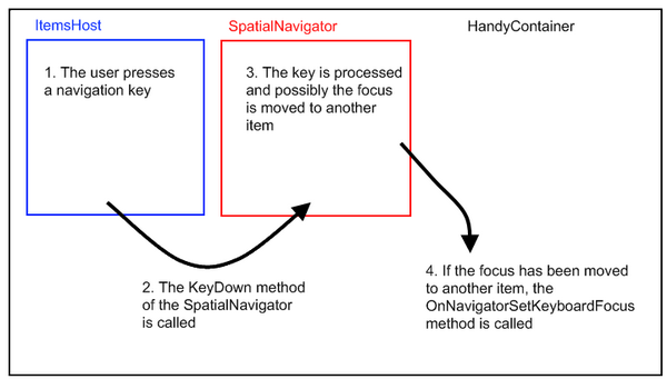
在我们的 HandyContainer 分部类中,让我们修改 OnNavigatorSetKeyboardFocus 方法。
protected override void OnNavigatorSetKeyboardFocus(UIElement item)
{
    base.OnNavigatorSetKeyboardFocus(item);

    GridSpatialNavigator gridSpatialNavigator = GetGridSpatialNavigator();
    if (gridSpatialNavigator != null)
    {
        if ((gridSpatialNavigator.LastKeyProcessed == Key.Down) ||
             (gridSpatialNavigator.LastKeyProcessed == Key.Up) ||
             (gridSpatialNavigator.LastKeyProcessed == Key.PageDown) ||
             (gridSpatialNavigator.LastKeyProcessed == Key.PageUp))
        {
            if (item != null)
            {
                if (!String.IsNullOrEmpty(CurrentCellName))
                {
                    ContainerItem newItem = (ContainerItem)item;
                    newItem.FocusCell(CurrentCellName);
                }
            }
        }
    }
}

private GridSpatialNavigator GetGridSpatialNavigator()
{
    GPanel gPanel = this.ItemsHost as GPanel;
    if (gPanel != null)
        return gPanel.KeyNavigator as GridSpatialNavigator;

    return null;
}
如果 GridSpatialNavigator 处理了 Down、Up、Page Down 或 Page Up 键,我们将强制具有 CurrentCellName 名称的单元格获得焦点。
让我们测试我们的更改。
- 启动应用程序。
- 单击 Address8 单元格。
- 按下向上箭头键。
Address7 单元格成为当前单元格(即获得焦点的单元格)。这是我们期望的行为。
Ctrl-Home 和 Ctrl-End 键
引言
让我们启动应用程序并分析当我们按下 Ctrl-Home 和 Ctrl-End 键时会发生什么。
- 启动应用程序。
- 单击 Address8 单元格。
- 按下 Ctrl-Home 键。
FirstName8 成为当前单元格。如果我们按下 Ctrl-End 键,当前行的最后一个单元格将成为当前单元格。此行为很容易理解:我们在 ItemTemplate 中定义的 SpatialNavigator 会处理用户按下的键并更改单元格的焦点。但是,我们希望当用户按下 Ctrl-Home 键时,网格第一行的第一个单元格获得焦点,而不是当前行的第一个单元格。同样,我们希望当用户按下 Ctrl-End 键时,网格最后一行的最后一个单元格获得焦点,而不是当前行的最后一个单元格。
扩展 ContainerItem
我们的要求是“当用户按下 Ctrl-Home 键时,网格第一行的第一个单元格成为当前单元格”和“当用户按下 Ctrl-End 键时,网格最后一行的最后一个单元格成为当前单元格”。
但是,第一个单元格和最后一个单元格是什么?请记住,单元格的位置是使用 ItemTemplate 中的面板设置的,该面板位于 HandyContainer 中。这意味着单元格不一定排成一行,并排排列。
我们将假定一行中的第一个单元格是离行(即项目)的左上角最近的单元格,而最后一个单元格是靠近行右下角的单元格。
让我们增强我们的 ContainerItem 分部类,并编写方法来查找项目(即行)的第一个单元格和最后一个单元格。
private class CellPosition
{
    public CellPosition(Cell cell, Point position)
    {
        Cell = cell;
        Position = position;
    }

    public Cell Cell
    {
        get;
        private set;
    }

    public Point Position
    {
        get;
        private set;
    }
}

private class CellPositionComparer : IComparer<CellPosition>
{

    public int Compare(CellPosition x, CellPosition y)
    {
        if (x.Position.Y > y.Position.Y)
            return 1;
        else if (x.Position.Y < y.Position.Y)
            return -1;

        if (x.Position.X > y.Position.X)
            return 1;
        else if (x.Position.X < y.Position.X)
            return -1;

        return 0;
    }

}

public string GetFirstCellName()
{
    this.UpdateLayout();

    List<CellPosition> cellPositions = new List<CellPosition>();
    List<Cell> cells = GetCells();
    UIElement rootVisual = Application.Current.RootVisual;
    foreach (Cell cell in cells)
    {
        cellPositions.Add(new CellPosition(cell, Cell.GetPosition(cell, rootVisual)));
    }

    cellPositions.Sort(new CellPositionComparer());

    foreach (CellPosition cellPosition in cellPositions)
    {
        if (cellPosition.Cell.IsTabStop)
            return cellPosition.Cell.Name;
    }

    return null;

}

public string GetLastCellName()
{
    this.UpdateLayout();

    List<CellPosition> cellPositions = new List<CellPosition>();
    List<Cell> cells = GetCells();
    UIElement rootVisual = Application.Current.RootVisual;
    foreach (Cell cell in cells)
    {
        cellPositions.Add(new CellPosition(cell, Cell.GetPosition(cell, rootVisual)));
    }

    cellPositions.Sort(new CellPositionComparer());

    for (int cellIndex = cellPositions.Count - 1; cellIndex >= 0; cellIndex--)
    {
        CellPosition cellPosition = cellPositions[cellIndex];
        if (cellPosition.Cell.IsTabStop)
            return cellPosition.Cell.Name;
    }

    return null;

}

List<Cell> cellCollection;
private List<Cell> GetCells()
{
    if (cellCollection == null)
    {
        cellCollection = new List<Cell>();
        DependencyObject firstChild = GetFirstTreeChild();
        if (firstChild != null)
            AddChildrenCells(firstChild, cellCollection);
    }

    return cellCollection;
}

private void AddChildrenCells(DependencyObject parent, List<Cell> cellsCollection)
{
    int childrenCount = VisualTreeHelper.GetChildrenCount(parent);
    for (int index = 0; index < childrenCount; index++)
    {
        DependencyObject child = VisualTreeHelper.GetChild(parent, index);
        Cell childCell = child as Cell;
        if (childCell != null)
            cellsCollection.Add(childCell);
        else
            AddChildrenCells(child, cellsCollection);
    }
}
GetFirstCellName 首先通过调用 GetCells 方法检索所有可用的单元格。然后,它获取所有单元格的位置并使用 CellPositionCompare 比较器对它们进行排序。然后,它返回第一个可以获得焦点的单元格(IsTapStop == true)。GetLastCellName 的工作方式相同。GetCells 方法扫描 VisualTree 以查找 ContainerItem 的所有子单元格。为了避免每次调用 GetCells 方法时都扫描 VisualTree,扫描结果被缓存到 cellCollection 集合中。
但是,我们必须考虑到,如果模板应用于 ContainerItem,cellCollection 将不再是最新的。因此,我们必须覆盖 OnApplyTemplate 方法并清除集合缓存。
public override void OnApplyTemplate()
{
    cellCollection = null;

    base.OnApplyTemplate();
}
如果我们现在尝试编译项目,我们将遇到以下错误:
Type 'Open.Windows.Controls.ContainerItem' already defines
  a member called 'OnApplyTemplate' with the same parameter types.
这是因为 OnApplyTemplate 方法已在 GoaOpen 的“另一个”ContainerItem 分部类中定义。
让我们通过重命名和重写我们自己的 ContainerItem 分部类中的 OnApplyTemplate 方法来解决此冲突。
private void _OnApplyTemplate()
{
    if ((this.Style == null) &&
               (!System.ComponentModel.DesignerProperties.GetIsInDesignMode(this)))
         throw new NotSupportedException("ContainerItem style is null. " +
               "Please apply a style to the item either using the DefaultItemStyle " +
               "or the HandyDefaultItemStyle of its container. A frequent mistake " +
               "is to use a ContainerItem inside a HandyNavigator or a HandyCommand.");
}
让我们从我们自己的 ContainerItem 分部类中的 OnApplyTemplate 方法调用原始 ContainerItem 类中的 _OnApplyTemplate 方法。
public override void OnApplyTemplate()
{
    cellCollection = null;

    _OnApplyTemplate();
    base.OnApplyTemplate();
}
增强 GridSpatialNavigator
既然我们有了查找 ContainerItem 的第一个和最后一个单元格的方法,我们就可以增强我们的 GridSpatialNavigator,使其能够处理 Ctrl-Home 和 End 键。
让我们首先修改 KeyDown 和 ActiveKeyDown 方法,以确保当用户按下 Ctrl-Home 或 End 键时,不再处理导航器的默认行为。
public override void ActiveKeyDown(IKeyNavigatorContainer container, GKeyEventArgs e)
{
    LastKeyProcessed = e.Key;
    LastModifier = Keyboard.Modifiers;
    if (((e.Key != Key.Home) && (e.Key != Key.End)) ||
        ((Keyboard.Modifiers & ModifierKeys.Control) != ModifierKeys.Control))
    {
        base.ActiveKeyDown(container, e);
    }
    else
        ProcessKey(container, e);
}

public override void KeyDown(IKeyNavigatorContainer container, GKeyEventArgs e)
{
    LastKeyProcessed = e.Key;
    LastModifier = Keyboard.Modifiers;
    if (((e.Key != Key.Home) && (e.Key != Key.End)) ||
        ((Keyboard.Modifiers & ModifierKeys.Control) != ModifierKeys.Control))
    {
        base.KeyDown(container, e);
    }
    else
        ProcessKey(container, e);
}
我们改变 ActiveKeyDown 和 KeyDown 方法的方式是,当用户按下 Ctrl-Home 或 End 键时,调用 ProcessKey 方法。
让我们编写 ProcessKey 方法。
private void ProcessKey(IKeyNavigatorContainer container, GKeyEventArgs e)
{
    GStackPanel gStackPanel = (GStackPanel)container;
    HandyContainer parentContainer = HandyContainer.GetParentContainer(gStackPanel);

    if (gStackPanel.Children.Count > 0)
    {
        if ((e.Key == Key.Home) &&
           ((Keyboard.Modifiers & ModifierKeys.Control) == ModifierKeys.Control))
        {
            gStackPanel.MoveToFirstIndex();

            ContainerItem firstItem = (ContainerItem)gStackPanel.Children[0];

            parentContainer.CurrentCellName = firstItem.GetFirstCellName();
            if (firstItem.FocusCell(parentContainer.CurrentCellName))
                e.Handled = true;

        }
        else if ((e.Key == Key.End) &&
                ((Keyboard.Modifiers & ModifierKeys.Control) == ModifierKeys.Control))
        {
            gStackPanel.MoveToLastIndex();

            ContainerItem lastContainerItem =
               (ContainerItem)gStackPanel.Children[gStackPanel.Children.Count - 1];

            parentContainer.CurrentCellName = lastContainerItem.GetLastCellName();
            if (lastContainerItem.FocusCell(parentContainer.CurrentCellName))
                e.Handled = true;
        }
    }
}
ProcessKey 方法的 container 参数包含 GridSpatialNavigator 链接到的面板。在我们的例子中,这个面板是我们的 HandyContainer 的 ItemsHost,而这个面板是一个 GStackPanel。
在 ProcessKey 方法中,首先要做的是移动到 ItemsHost 的第一个项目(或最后一个项目)。这就是我们调用 gStackPanel.MoveToFirstIndex()(或 gStackPanel.MoveToLastIndex())方法时所做的。
然后,我们必须找到第一个单元格(或最后一个单元格)并将其焦点放在上面,使其成为当前单元格。同时,我们不能忘记更新 HandyContainer 的 CurrentCellName 属性值。
RowSpatialNavigator
如果我们现在启动应用程序,并尝试通过按 Ctrl-Home 键导航到第一个行的第一个单元格,它将不起作用。如果我们尝试导航到最后一个行的最后一个单元格,也会出现同样的问题。这是因为我们在 ItemTemplate 中定义的 SpatialNavigator 仍在处理用户按下的键。我们必须用我们自己的 SpatialNavigator 替换这些 SpatialNavigator,这些 SpatialNavigator 不处理 Ctrl-Home 和 Ctrl-End 键。
让我们在 GoaOpen 项目的 Extensions\Grid 文件夹中创建一个新的 RowSpatialNavigator 类,并修改 ActiveKeyDown 和 KeyDown 方法,以便不再处理 Ctrl-Home 和 End 键。
using System.Windows.Input;
using Netika.Windows.Controls;

namespace Open.Windows.Controls
{
    public class RowSpatialNavigator : SpatialNavigator
    {
        public override void ActiveKeyDown(IKeyNavigatorContainer container, GKeyEventArgs e)
        {
            if (((e.Key != Key.Home) && (e.Key != Key.End)) ||
                ((Keyboard.Modifiers & ModifierKeys.Control) != ModifierKeys.Control))
                base.ActiveKeyDown(container, e);
        }

        public override void KeyDown(IKeyNavigatorContainer container, GKeyEventArgs e)
        {
            if (((e.Key != Key.Home) && (e.Key != Key.End)) ||
                ((Keyboard.Modifiers & ModifierKeys.Control) != ModifierKeys.Control))
                base.KeyDown(container, e);

        }

        protected override Model GetNakedClone()
        {
            return new RowSpatialNavigator();
        }
    }
}
现在,让我们用 RowSpatialNavigator 替换我们 GridBody 的 ItemTemplate 中定义的 SpatialNavigator。
<o:HandyContainer.ItemTemplate>
    <g:ItemDataTemplate>
        <Grid>
            <o:HandyDataPresenter DataType="GridBody.Person">
                <g:GDockPanel>
                    <g:GDockPanel.KeyNavigator>
                        <o:RowSpatialNavigator/>
                    </g:GDockPanel.KeyNavigator>
                    <g:GStackPanel Orientation="Horizontal"
                           g:GDockPanel.Dock="Top">
                        <g:GStackPanel.KeyNavigator>
                            <o:RowSpatialNavigator/>
                        </g:GStackPanel.KeyNavigator>
                        <o:TextCell Text="{Binding FirstName}"
                           x:Name="FirstName"/>
                        <o:TextCell Text="{Binding LastName}"
                           x:Name="LastName"/>
                        <o:TextCell Text="{Binding Address}"
                           x:Name="Address"/>
                        <o:TextCell Text="{Binding City}"
                           x:Name="City"/>
                        <o:TextCell Text="{Binding ZipCode}"
                           x:Name="ZipCode"/>
                        <o:CheckBoxCell
                           IsChecked="{Binding IsCustomer}"
                           x:Name="IsCustomer"/>
                    </g:GStackPanel>
                    <Rectangle Height="1"
                       Stroke="{StaticResource DefaultListControlStroke}"
                       StrokeThickness="0.5" Margin="-1,0,0,-1"
                       g:GDockPanel.Dock="Top"/>
                    <o:TextCell Text="{Binding Comment}"
                       g:GDockPanel.Dock="Fill" x:Name="Comment"
                       Width="Auto"/>
                </g:GDockPanel>
            </o:HandyDataPresenter>
            <o:HandyDataPresenter DataType="GridBody.Country">
                <g:GStackPanel Orientation="Horizontal">
                    <g:GStackPanel.KeyNavigator>
                        <o:RowSpatialNavigator/>
                    </g:GStackPanel.KeyNavigator>
                    <o:TextCell Text="{Binding Name}"
                       x:Name="CountryName"/>
                    <o:TextCell Text="{Binding Children.Count}"
                       x:Name="ChildrenCount"/>
                </g:GStackPanel>
            </o:HandyDataPresenter>
        </Grid>
    </g:ItemDataTemplate>
</o:HandyContainer.ItemTemplate>
_OnNavigatorSetKeyboardFocus
我们几乎完成了,但还没有完全完成。
让我们尝试我们的更改。
- 启动应用程序。
- 将 Address 8 单元格设置为当前单元格,方法是单击它。
- 按下 Ctrl-Home 键。
第一个项目中的第一个单元格成为当前单元格,如预期。但是,选择并未跟随我们的更改。包含 Address 8 的项目仍然被选中。我们可以看到这一点,因为它的背景仍然是橙色的。
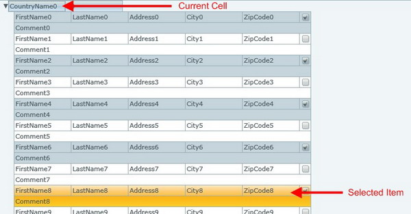
HandyContainer 的 SelectionMode 属性的当前值设置为“Single”。这意味着一次只能选择一个项目,并且选择会“跟随”焦点。
当我们按下其他导航键时,选择会“跟随”焦点。例如,如果我们单击 Address8,然后单击 Address7 单元格,然后单击 Address6 单元格,这些单元格将获得焦点,并且包含这些单元格的项目将成为选定的项目:它们的背景将变为橙色。按向上或向下箭头键时也会发生同样的情况。
但是,当我们按下 Ctrl-Home 或 End 键时,选择不会跟随焦点单元格。这是因为在 GridSpatialNavigator 中,我们用自己的代码替换了标准的 SpatialNavigator 代码。在我们的代码中,在 ProcessKey 方法中,我们忘记了“告知”HandyNavigator 我们已更改了当前项目。这可以通过调用 HandyContainer 的“OnNavigatorSetKeyboardFocus”方法来完成。
尽管如此,我们不会修改 GridSpatialNavigator 的 ProcessKey 方法来调用此方法,而是在 ContainerItem 方法的 FocusCell 方法中进行更改。
这样,我们就不会再需要处理 OnNavigatorSetKeyboardFocus 了。FocusCell 方法将在必要时调用它。
由于 OnNavigatorSetKeyboardFocus 方法是一个 protected 方法,让我们首先向我们的 HandyContainer 分部类添加一个 internal _OnNavigatorSetKeyboardFocus 方法。
internal void _OnNavigatorSetKeyboardFocus(UIElement item)
{
    this.OnNavigatorSetKeyboardFocus(item);
}
然后,让我们修改我们 ContainerItem 分部类的 FocusCell 方法。
public bool FocusCell(string cellName)
{
    object focusedElement = FocusManager.GetFocusedElement();
    FrameworkElement firstChild = GetFirstTreeChild() as FrameworkElement;
    if (firstChild != null)
    {
        Cell cell = firstChild.FindName(cellName) as Cell;
        if (cell != null)
        {
            if (cell.Focus())
            {
                if (!TreeHelper.IsChildOf(this, focusedElement as DependencyObject))
                {
                    HandyContainer parentContainer =
                            HandyContainer.GetParentContainer(this);
                    if (parentContainer != null)
                        parentContainer._OnNavigatorSetKeyboardFocus(this);
                }
                return true;
            }
        }
    }
    return false;
}
让我们再次尝试我们的应用程序。
现在,当我们按下 Ctrl-Home 或 End 键时,一切正常。
Tab 键
让我们尝试在我们的网格中使用 tab 键。
- 启动应用程序。
- 单击 Address8 单元格以使其成为当前单元格。
- 按下 Tab 键。
City8 单元格成为当前单元格。这是我们期望的行为。
- 按下 Shift-Tab 键。
Address8 单元格再次成为当前单元格。这同样是我们期望的行为。
- 现在,单击 Comment8 单元格以使其成为当前单元格。
- 按下 Tab 键。
焦点移到了网格的第一个项目。这完全不是我们期望的行为。
- 单击 FirstName8 单元格以使其成为当前单元格。
- 按下 Shift-Tab 键。
焦点移到了包含 FirstName8 单元格的项目。这也不是我们期望的行为。
当一个项目的第一个单元格是当前单元格,并且我们按下 Shift-Tab 键时,我们希望上一个项目的最后一个单元格成为当前单元格。当一个项目的最后一个单元格是当前单元格,并且我们按下 Tab 键时,我们希望下一个项目的第一个单元格成为当前单元格。
让我们修改我们的 GridSpatialNavigator 以实现这两个功能。
GridSpatialNavigator
首先,让我们修改 ActiveKeyDown 和 KeyDown 方法,以确保当用户按下 Tab 键时调用 ProcessKey 方法。
public override void ActiveKeyDown(IKeyNavigatorContainer container, GKeyEventArgs e)
{
    LastKeyProcessed = e.Key;
    LastModifier = Keyboard.Modifiers;
    if ((((e.Key != Key.Home) && (e.Key != Key.End)) ||
        ((Keyboard.Modifiers & ModifierKeys.Control) != ModifierKeys.Control)) &&
        (e.Key != Key.Tab))
    {
        LastKeyProcessed = e.Key;
        base.ActiveKeyDown(container, e);
    }
    else
        ProcessKey(container, e);
}

public override void KeyDown(IKeyNavigatorContainer container, GKeyEventArgs e)
{
    LastKeyProcessed = e.Key;
    LastModifier = Keyboard.Modifiers;
    if ((((e.Key != Key.Home) && (e.Key != Key.End)) ||
        ((Keyboard.Modifiers & ModifierKeys.Control) != ModifierKeys.Control))
         && (e.Key != Key.Tab))
    {
        LastKeyProcessed = e.Key;
        base.KeyDown(container, e);
    }
    else
        ProcessKey(container, e);
}
让我们现在修改 ProcessKey 方法来处理 Tab 键。
private void ProcessKey(IKeyNavigatorContainer container, GKeyEventArgs e)
{
    GStackPanel gStackPanel = (GStackPanel)container;
    HandyContainer parentContainer =
       HandyContainer.GetParentContainer(gStackPanel);

    if (gStackPanel.Children.Count > 0)
    {
        if ((e.Key == Key.Home) &&
            ((Keyboard.Modifiers & ModifierKeys.Control)
                     == ModifierKeys.Control))
        {
         . . .
        }
        else if ((e.Key == Key.End) &&
           ((Keyboard.Modifiers & ModifierKeys.Control)
                     == ModifierKeys.Control))
        {
         . . .
        }
        else if (e.Key == Key.Tab)
        {
            ContainerItem currentItem =
              parentContainer.GetElement(parentContainer.HoldFocusItem)
              as ContainerItem;
            if (currentItem != null)
            {
                if ((Keyboard.Modifiers & ModifierKeys.Shift) ==
                              ModifierKeys.Shift)
                {
                    if (String.IsNullOrEmpty(parentContainer.CurrentCellName) ||
                       (parentContainer.CurrentCellName ==
                                currentItem.GetFirstCellName()))
                    {
                        ContainerItem prevItem =
                           currentItem.PrevNode as ContainerItem;
                        if (prevItem != null)
                        {
                            parentContainer.CurrentCellName =
                                          prevItem.GetLastCellName();
                            if (prevItem.FocusCell(parentContainer.CurrentCellName))
                            {
                                gStackPanel.EnsureVisible(
                                     gStackPanel.Children.IndexOf(prevItem));
                                e.Handled = true;
                            }
                        }
                    }
                }
                else
                {
                    if (String.IsNullOrEmpty(parentContainer.CurrentCellName) ||
                       (parentContainer.CurrentCellName ==
                                 currentItem.GetLastCellName()))
                    {
                        ContainerItem nextItem = currentItem.NextNode as ContainerItem;
                        if (nextItem != null)
                        {
                            parentContainer.CurrentCellName = nextItem.GetFirstCellName();
                            if (nextItem.FocusCell(parentContainer.CurrentCellName))
                            {
                                gStackPanel.EnsureVisible(
                                     gStackPanel.Children.IndexOf(nextItem));
                                e.Handled = true;
                            }
                        }
                    }
                }
            }
        }
    }
}
我们首先要做的是找到当前项目。当前项目是拥有焦点或包含拥有焦点的控件的项目:它是 HandyContainer 的 HoldFocusItem 属性的值。
然后,我们检查当前单元格是否是项目中的第一个单元格(或最后一个单元格),方法是使用 ContainerItem 的 GetFirstCellName(或 GetLastCellName)。
接下来,我们通过使用当前项目的 PrevNode(或 NextNode)属性获取前一个项目(或下一个项目)。之后,我们确保前一个项目(或下一个项目)的最后一个单元格(或第一个单元格)是当前单元格。
我们还调用 gStackPanel.EnsureVisible 方法,以确保新当前项目位于 HandyContainer 控件的 ItemHost 的显示区域内。
Enter 键
在网格中使用时,Enter 键通常具有与向下箭头键相同的行为。让我们修改我们 GridSpatialNavigator 的 ActiveKeyDown 和 KeyDown 方法来实现此功能。
public override void ActiveKeyDown(IKeyNavigatorContainer container, GKeyEventArgs e)
{
    LastKeyProcessed = e.Key;
    LastModifier = Keyboard.Modifiers;
    if ((((e.Key != Key.Home) && (e.Key != Key.End)) ||
        ((Keyboard.Modifiers & ModifierKeys.Control)
           != ModifierKeys.Control)) && (e.Key != Key.Tab))
    {
        if (e.Key == Key.Enter)
            e.Key = Key.Down;

        LastKeyProcessed = e.Key;

        base.ActiveKeyDown(container, e);
    }
    else
        ProcessKey(container, e);
}

public override void KeyDown(IKeyNavigatorContainer container, GKeyEventArgs e)
{
    LastKeyProcessed = e.Key;
    LastModifier = Keyboard.Modifiers;
    if ((((e.Key != Key.Home) && (e.Key != Key.End)) ||
        ((Keyboard.Modifiers & ModifierKeys.Control)
          != ModifierKeys.Control)) && (e.Key != Key.Tab))
    {
        if (e.Key == Key.Enter)
            e.Key = Key.Down;

        LastKeyProcessed = e.Key;

        base.KeyDown(container, e);
    }
    else
        ProcessKey(container, e);
}
聚焦于项目
引言
在某些情况下,焦点可能会转到项目而不是单元格。
我们可以测试以下两种情况:
- 单击分隔两个项目的线。
- 单击 FirstName0 单元格,然后按向上箭头键。
这两种情况很容易解释。
第一种情况是,通过单击线,我们单击的是一个项目而不是一个单元格。项目获得焦点。
第二种情况是,第一行包含的单元格与第二行包含的单元格不同。因此,在从一行移动到另一行时,GridBody“不知道”应该将焦点放在项目的哪个单元格上。
我们可以轻松地修改上述两种行为,例如,通过强制将项目中的第一个单元格设置为当前单元格,如果没有任何其他单元格拥有焦点。
但是,如果您想这样做,我们将让您自己实现此功能。
在本教程中,我们将假定项目获得焦点而不是单元格获得焦点不是一个不期望的行为。与其避免这种情况发生,不如为用户提供一种简单的方法,在这种情况发生时将焦点移到项目的第一或最后一个单元格。
修改 ContainerItem 类
让我们修改 ContainerItem 类,以便用户可以使用“Home”和“End”键将项目的第一或最后一个单元格设置为当前单元格。
protected override void OnKeyDown(KeyEventArgs e)
{
    base.OnKeyDown(e);

    if (!e.Handled)
    {
        if ((e.Key == Key.Home) &&
            ((Keyboard.Modifiers & ModifierKeys.Control)
                  != ModifierKeys.Control))
        {
            string firstCellName = GetFirstCellName();
            if (!string.IsNullOrEmpty(firstCellName))
            {
                if (FocusCell(firstCellName))
                    e.Handled = true;

            }
        }

        if ((e.Key == Key.End) &&
            ((Keyboard.Modifiers & ModifierKeys.Control)
                      != ModifierKeys.Control))
        {
            string lastCellName = GetLastCellName();
            if (!string.IsNullOrEmpty(lastCellName))
            {
                if (FocusCell(lastCellName))
                    e.Handled = true;

            }
        }
    }
}
8. 辅助方法
在本节中,我们将添加一些方法来帮助从代码中操作网格。
FindCell
让我们向 ContainerItem 类添加一个 FindCell 方法。此方法将接受单元格名称作为参数,并返回具有该名称的单元格。
public Cell FindCell(string cellName)
{
    FrameworkElement firstChild = GetFirstTreeChild() as FrameworkElement;
    if (firstChild != null)
        return firstChild.FindName(cellName) as Cell;

    return null;
}
CurrentItem
当前项目是拥有焦点的 ContainerItem,或者是包含拥有焦点的单元格的 ContainerItem。
HandyContainer 的 HoldFocusItem 属性包含拥有焦点或包含拥有焦点的控件的项目。HoldFocusItem 属性不返回 ContainerItem,而是返回与它关联的 ItemsSource 集合中的元素。
因此,我们可以从 HoldFocusItem 检索当前项目。但是,我们将向我们的 HandyContainer 分部类添加一个 CurrentItem 属性,以提供一种方便的方式来访问 CurrentItem。
HandyContainer 的 GetElement 方法允许从链接到它的 ItemsSource 集合中的元素中查找 ContainerItem。我们正在使用此方法从 HoldFocusItem 检索 ContainerItem。
public ContainerItem CurrentItem
{
    get { return this.GetElement(this.HoldFocusItem) as ContainerItem; }
}
CurrentItemIndex
CurrentItemIndex 是当前项目的索引。此索引是堆叠在当前项目之上的项目数。
这个数字取决于一些节点可能被折叠或未折叠的事实。在下图中,当前项目的索引是 12,而在下图,当前项目的索引是 2。
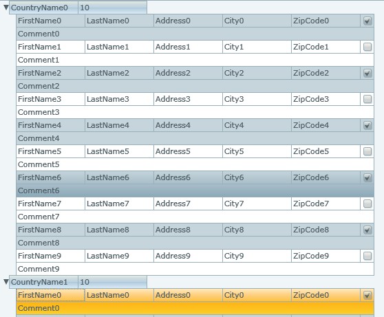

如果 HandyContainer 未处于虚拟模式,则查找当前项目索引的简单方法是使用 ItemsHost 的 IndexOf 方法。
ItemsHost.Children.IndexOf(currentItem);
如果 HandyContainer 处于虚拟模式,则会更复杂。在这种情况下,ItemHost 将只包含项目的一个子集。HandyContainer 的 VirtualPageStartIndex 属性包含 ItemHost 子项集合中第一个项目的索引。

因此,当前项目索引将是:
VirtualPageStartIndex + ItemsHost.Children.IndexOf(currentItem);
为了避免每次需要时都自己进行此计算,让我们向我们的 HandyContainer 分部类添加一个 CurrentItemIndex 属性。
public int CurrentItemIndex
{
    get
    {
        ContainerItem currentItem = this.CurrentItem;
        if (currentItem != null)
        {
            if (this.VirtualMode == VirtualMode.On)
            {
                int currentItemIndex =
                  this.ItemsHost.Children.IndexOf(currentItem);
                return this.VirtualPageStartIndex + currentItemIndex;
            }
            else
                return this.ItemsHost.Children.IndexOf(currentItem);

        }
        return -1;
    }
}
9. 如何使用 GridBody
创建 GridBody
谨记,以下是创建 GridBody 所需的步骤列表:
- 将
HandyContainer添加到您的页面,并将其HandyStyle更改为“GridBodyStyle”值。 - 如果您预计处理大量数据,请将
HandyContainer的VirtualMode属性设置为“On”。 - 如果您希望在网格主体中显示分层数据,请将
HandyDefaultItemStyle属性值设置为“Node”。 - 如果您希望项目使用备用背景显示,请将
AlternateType属性值设置为“Items”。 - 准备数据。
- 创建将保存
Grid中显示的数据的数据类。这些类应继承自ContainerDataItem(在本教程中,我们创建了Person和Country类)。 - 使用包含您的数据的集合填充
GridBody的ItemsSource。理想情况下,该集合将是一个GObservableCollection,但这并非强制性的。 - 填充
GridBody的ItemTemplate。 - 最好使用
ItemDataTemplate而不是DataTemplate。 - 如果您显示不同种类的项目(例如,人员和国家),请使用
HandyContentPresenter分隔ItemTemplate中的描述。 - 在
ItemDataTemplate中使用面板放置Cell,并将RowSpatialNavigator链接到这些面板。 - 请不要忘记为您的单元格命名。
- 请不要忘记将数据绑定到您的单元格。
GridBody、ContainerItems 和 Cells 成员
您可以使用我们已实现的所有方法、属性和事件,以及 HandyContainer 和 ContainerItems 类及其祖先中已实现的。在此,我们将对最重要的几项进行简要介绍。您可以查阅 GOA Toolkit 随附的帮助文件,查看所有这些内容。
GridBody 成员
VerticalOffset、HorizontalOffset、ViewportHeight、ViewportWidth、ScrollableHeight 和 ScrollableWidth
VerticalOffset是显示区域顶部所显示项目的索引。HorizontalOffset是项目左侧与显示区域左侧之间的距离(以像素为单位)。ViewportHeight是在显示区域中显示的项目的数量。ViewportWidth是显示区域的宽度。ScollableHeight是可以显示的项目的总数。ScrollableWidth是最大项目的宽度。

VerticalOffsetChanged、HorizontalOffsetChanged、VerticalScrollSettingsChanged、HorizontalScrollSettingsChanged
- 当
VerticalOffset值或HorizontalOffset值更改时,会发生VerticalOffsetChanged和HorizontalOffsetChanged事件。 - 当
ViewportHeight值或ViewportWidth值更改时,会发生VerticalScrollSettingsChanged和HorizontalScrollSettingsChanged事件。
EnsureItemVisible
调用 EnsureItemVisible(ItemIndex) 方法,以确保 ItemIndex 索引处的项目显示在控件的显示区域中。
GetItemFormIndex
此方法将根据索引返回 ContainerItem。
CurrentItemIndex
此属性将返回当前项目的索引。
CurrentItem
此属性将返回当前项目 ContainerItem。
HoldFocusItemChanged
HoldFocusItem 是具有焦点或包含具有焦点的控件的项目。当 HoldFocusItem 更改时,会发生 HoldFocusItemChanged 事件,因此当 CurrentItem 更改时,也会发生此事件。
CurrentCellName
此属性包含当前单元格的名称。
OnCurrentCellNameChanged
当当前单元格名称更改时,会发生 OnCurrentCellNameChanged 事件。
Items
Items 属性包含所有“链接”到 HandyContainer 的项目。
此属性起初可能会令人困惑,因为当设置 HandyContainer 的 ItemsSource 时,它不会返回 ContainerItem 的集合,而是返回从中生成 ContainersItem 的所有元素的集合(这些元素来自 ItemsSource)。
如果您想知道为什么 Items 属性不返回 ContainerItem 的集合,请记住 HandyContainer 可以以 VirtualMode 工作。在这种情况下,只有一部分 ContainerItem 是从 ItemsSource 生成的。
GetElement
此方法允许从 ItemsSource 的元素中检索 ContainerItem。
例如,您可以编写
ContainerItem firstContainerItem = MyGridBody.GetElement(MyGridBody.Items[0]);
GetItemSource(静态方法)
GetItemSource 方法与 GetElement 方法相反。此方法检索用于生成 ContainerItem 的源。
VirtualMode
如果设置为“On”,HandyContainer 将不会从 ItemsSource 元素生成所有 ContainerItem。只会生成显示的项目。
VirtualPageSize
在使用 VirtualMode 工作时,VirtualPageSize 属性包含从 ItemsSource 生成的 ContainerItem 的数量。
VirtualPageStartIndex
在使用 VirtualMode 工作时,VirtualPageStartIndex 属性包含用于生成 ContainersItem 的 ItemsSource 中第一个元素的索引。
VerticalScrollbarVisibility 和 HorizontalScrollbarVisibility
这些属性允许显示或隐藏滚动条。
ItemClick
单击项目时会发生此事件。
SelectionMode
SelectionMode 允许定义用户选择项目(即行)的方式。在本教程中,使用了默认值(单选模式),但您也可以使用其他值,例如 None 或 Multiple。
SelectedItem
当前选定的项目(如果有)。如果选择了多个项目,此属性将保存最后选定的项目。
SelectedItems
当前选定的项目(如果有)。
SelectedItemChanged
当 SelectedItems 集合发生更改时,会发生此事件。
SelectedItemChanging
在 SelectedItems 集合更改之前,会发生此事件。
UIItemIsExpandedChanged
当 ContainerItem 的 IsExpanded 属性发生更改时,会发生此事件。
ContainerItems 成员
FocusCell
此方法允许聚焦一个单元格并将其设为当前单元格。
GetFirstCellName
此方法返回 ContainerItem 的第一个单元格的名称。第一个单元格是离左上角最近的单元格。
GetLastCellName
此方法返回 ContainerItem 的最后一个单元格的名称。最后一个单元格是离右下角最近的单元格。
FindCell
此方法根据名称返回一个单元格。
IsExpanded
如果项目有子项目(即,如果项目是节点),则此属性允许获取或设置节点是否打开(即,是否显示子项目)。
IsExpandedChanged
当 IsExpanded 属性值发生更改时,会发生此事件。
CollapseAll
当调用项目的 CollapseAll 方法时,项目及其所有子项(和孙项)的 IsExpanded 属性值都将设置为 false。
ExpandAll
当调用项目的 CollapseAll 方法时,项目及其所有子项(和孙项)的 IsExpanded 属性值都将设置为 true。
Items
Items 属性包含所有“链接”到 Item 的子项目。
当设置 HandyContainer 的 ItemsSource 时,它不会返回 ContainerItem 的集合,而是返回从中生成 ContainerItem 的所有元素的集合。请参阅上面 HandyContainer 的 Items 属性的说明以了解更多信息。
NextNode
此属性将返回当前项目正下方的项目。
PrevNode
此属性将返回当前项目正上方的项目。
虚拟模式
在 VirtualMode 设置为“On”时使用 HandyContainer 工作起初可能会令人困惑。
必须理解的主要概念是,并非所有 ContainerItem 都是从 ItemsSource 生成的。只生成其中的一部分,以填充 HandyControl 的显示区域。
如果用户在 HandyContainer 中滚动,则会生成其他 ContainerItem 以保持显示区域的更新。因此,我们不能断定总会有一个 ContainerItem 链接到集合的 ItemsSource 的某个元素。
在操作 ContainerItem 之前,必须先确保该 ContainerItem 已生成。唯一的方法是确保 VerticalOffset 属性的值使项目位于控件的显示区域中。您可以手动更改 VerticalOffset 属性值,或调用 EnsureItemVisible 方法。
大多数情况下,您不需要直接操作 ContainerItem。操作 HandyContainer 的 ItemsSource 集合的元素更方便。
另外请注意,HandyContainer 的大多数属性返回的不是 ContainerItem,而是与其关联的源元素。例如,HoldFocusItem、SelectedItem、Items、PressedItem 和 MouseOverItem 属性就是这种情况。如果您拥有集合的 ItemsSource 元素的引用并想查找与其关联的 ContainerItem,请使用 HandyContainer 的 GetElement 方法。但是,此方法仅在 ContainerItem 位于控件的显示区域并且已生成时才返回 ContainerItem。
练习
从外部设置当前单元格
在设置当前单元格之前,您必须确保包含该单元格的 ContainerItem 位于网格主体显示区域中。然后,您可以使用 ContainerItem 的 FocusCell 方法。
假设我们希望第 100 个项目的 City 单元格成为当前单元格。我们可以这样写:
MyGridBody.EnsureItemVisible(100);
((ContainerItem) MyGridBody.GetItemFromIndex(100)).FocusCell("City");
了解当前单元格何时更改
为了了解当前单元格何时更改,我们需要监视两个事件:CurrentCellNameChanged 和 HoldFocusItemChanged。每次当前项目更改时,HoldFocusItemChanged 事件都会发生。每次当前单元格名称更改时,CurrentCellNameChanged 事件都会发生。
示例
- 当前单元格是 City8,用户单击了 Address8 单元格。
- 当前单元格是 City8,用户单击了 City7 单元格。
- 当前单元格是 City8,用户单击了 Address7 单元格。
HoldFocusItemChanged和CurrentCellNameChanged事件都发生。
CurrentCellNameChanged 事件发生,但 HoldFocusItemChanged 事件不发生。
HoldFocusItemChanged 事件发生,但 CurrentCellNameChanged 事件不发生。
10. 结论
恭喜您完成了这个漫长的教程。现在我们已经奠定了数据网格的基础,接下来的教程将更简短。请不要错过。
本教程是一系列教程的一部分。您可以在此处阅读第二步:为 Silverlight 构建您自己的 DataGrid:第二步。