
使用 Silverlight 绘制圆形关系图
4.99/5 (90投票s)
本文介绍如何创建圆形关系图,该图将相互连接的节点网络绘制成一个圆。
目录
引言
自从一年多以前开始使用 Stack Overflow 以来,我一直是它的忠实粉丝。它不仅是查找编程问题答案的绝佳资源,还能深入了解开发人员目前正在使用的语言、工具和框架。我想,创建一个图来展示每个标签的流行度,以及它与其他标签的关系以及这些关系的强度,会很有趣。
利用公开可用的 Stack API,我下载了最新的 1000 个问题,这是我提出的图:

图表的构建如下:
- 每个段的大小与其相关的imerick成比例,即 Android 和 Java 是最受欢迎的标签。
- 标签之间的连接表示同时被标记了这两种技术的问题。连接的粗细表示有多少问题共享这两个标签,例如,jQuery 和 JavaScript 标签经常一起出现。
- 每个段的颜色基于其连接数量,红色表示连接多,蓝色表示连接少。
接下来,我将段进行聚类,以最小化连接的长度。应用聚类后,我们可以看到相关技术的“小口袋”,并出现以下模式:
- 最受欢迎的两个标签,**Java** 和 **Android**,彼此之间关系非常密切,但与其他标签的关系很少。
- **iOS**、**Objective-C** 和 **iPhone** 形成了一个紧密的群体。但是,**Objective-C** 问题有时也会标记为 **C#**、**C** 和 **C++**。
- **C#**、**.NET** 和 **ASP.NET** 被聚类在一起,但是 **C#** 与许多其他标签都有链接。
- 最强的关系是 **jQuery** 和 **JavaScript** 之间,这可能是因为 jQuery 已成为 JavaScript 开发的事实框架,在 53% 的网站上都有使用。
- 有一大群连接的 Web 技术,**CSS**、**HTML**、**JavaScript**、**jQuery**,反映了创建 Web 站点和 Web 应用程序所涉及的技术混合。
- **Python** 虽然是一个流行的标签,但关系很少,只与 **PHP** 有微弱的联系。
当我**在我的博客上发布这个可视化图时**,反馈非常积极。因此,我决定整理我的代码,创建一个通用的 Silverlight 控件,它可以绘制一组相关节点之间的关系图。本文介绍了该通用控件的创建过程。
这里是这个控件的几个实际应用示例……
第一个是 Stack Overflow 标签关系图,这次绘制了前 50 个标签,标签经过模板化处理,文本旋转,连接线粗细也进行了调整。

下一个是与时事相关的,它说明了各个国家的债务以及相互之间的欠款。我们将在文章的最后部分介绍其构建过程。

你可以在**我的博客上查看此图的交互式版本**。
创建数据源
简单的 Silverlight 控件具有简单的接口,由几个依赖属性组成,例如,`TextBlock` 控件具有 `Text` 依赖属性,该属性详细说明了呈现的字符串。列表类控件,如 `ListBox`,具有 `ItemsSource` 依赖属性,你可以在其中提供要呈现的项的集合,以及 `ItemTemplate` 属性,该属性详细说明了每个实例的呈现方式。节点集之间的关系图比简单控件或基于列表的控件要复杂一些,因此我决定我的 `RelationshipGraph` 控件将拥有自己专门用于呈现数据的接口。
`RelationshipGraph` 控件以 `INodeList` 作为其数据源。
public interface INodeList : IList<INode>
{
}

public interface INode
{
  /// <summary>
  /// Gets the number of instances of this node type
  /// </summary>
  double Count { get; }

  /// <summary>
  /// Gets the name of this node
  /// </summary>
  string Name { get; }

  /// <summary>
  /// Gets the nodes that this node instance is related to
  /// </summary>
  List<INodeRelationship> Relationships { get; }
}
其中每个 `INode` 都有一个 `Name` 属性,对于前面显示的 Stack Overflow 图,它就是标签的名称(例如,C#、Python、Java 等),还有一个 `Count`,表示此节点的频率。这决定了呈现该节点的段的大小。最后,每个节点都有由 `INodeRelationship` 接口定义的的关系集合。
public interface INodeRelationship
{
  /// <summary>
  /// Gets the name of the node which this is a relationship to
  /// </summary>
  string To { get; }

  /// <summary>
  /// Gets the strength of this relationship
  /// </summary>
  double Strength { get; }
}
每个关系通过其 `To` 属性指示相关节点的名称,以及关系的强度。对于我们的 Stack Overflow 图,强度表示共享两个标签的问题数量。
**注意:** `INodeRelationship` 的 `To` 属性本来可以是 `INode` 实例,而不是相关节点的名称。然而,这会使控件的用户更难构造所需的数据。为了易用性,我更喜欢让此控件的最终用户更简单。
[SnippetDependencyProperty(property = "Data", defaultValue = "null",
                            type = "INodeList", containerType = "RelationshipGraph")]
public partial class RelationshipGraph : Control
{
}
关于代码生成的快速说明
如果你开发一个打算高度灵活的控件,它可能会公开大量的依赖属性。不幸的是,定义依赖属性的语法相当冗长,这就是为什么开发人员倾向于使用代码片段来帮助生成所需的样板代码。代码片段的问题在于,虽然它们有助于属性的初始定义,但它们不太适合重构。如果你想更改通过代码片段生成的依赖属性的名称,你必须手动更改大约 5 个不同的地方。
<?xml version="1.0" encoding="utf-8" ?>
<CodeSnippets  xmlns="http://schemas.microsoft.com/VisualStudio/2005/CodeSnippet">
  <CodeSnippet Format="1.0.0">
    <Header>
      <Title>Defines a DependencyProperty</Title>
      <Shortcut>DependencyProperty</Shortcut>
      <Description>Defines a DependencyProperty</Description>
      <Author>Colin Eberhardt</Author>
      <SnippetTypes>
        <SnippetType>Expansion</SnippetType>
      </SnippetTypes>
    </Header>
    <Snippet>
      <Declarations>
        <Literal>
          <ID>type</ID>
          <ToolTip>Property Type</ToolTip>
          <Default>string</Default>
        </Literal>
        <Literal>
          <ID>summary</ID>
          <ToolTip>Summary Documentation</ToolTip>
          <Default>Gets / sets the property value</Default>
        </Literal>
        <Literal>
          <ID>property</ID>
          <ToolTip>Property Name</ToolTip>
          <Default>MyProperty</Default>
        </Literal>
        <Literal>
          <ID>containerType</ID>
          <ToolTip>Containing type</ToolTip>
          <Default>Control</Default>
        </Literal>
        <Literal>
          <ID>defaultValue</ID>
          <ToolTip>Property default value</ToolTip>
          <Default>null</Default>
        </Literal>
      </Declarations>
      <Code Language="csharp">
        <![CDATA[
    /// <summary>
    /// $summary$ This is a dependency property
    /// </summary>
    public $type$ $property$
    {
        get { return ($type$)GetValue($property$Property); }
        set { SetValue($property$Property, value); }
    }

    /// <summary>
    /// Defines the $property$ dependnecy property.
    /// </summary>
    public static readonly DependencyProperty $property$Property =
        DependencyProperty.Register("$property$", typeof($type$), typeof($containerType$),
            new PropertyMetadata($defaultValue$, new PropertyChangedCallback(On$property$PropertyChanged)));

    /// <summary>
    /// Invoked when the $property$ property changes
    /// </summary>
    partial void On$property$PropertyChanged(DependencyPropertyChangedEventArgs e);

    private static void On$property$PropertyChanged(DependencyObject d, DependencyPropertyChangedEventArgs e)
    {
        $containerType$ control = d as $containerType$;
        control.On$property$PropertyChanged(e);
    }

    $end$]]>
      </Code>
    </Snippet>
  </CodeSnippet>
</CodeSnippets>
T4 模板会生成一个相应的属性。
/// <summary>
/// Defines a DependencyProperty
/// </summary>
[AttributeUsage(AttributeTargets.Class , AllowMultiple = true)]
public class SnippetDependencyProperty  : Attribute
{

    /// <summary>
    /// Property Type
    /// </summary>
    public string type = "string";

    /// <summary>
    /// Summary Documentation
    /// </summary>
    public string summary = "Gets / sets the property value";

    /// <summary>
    /// Property Name
    /// </summary>
    public string property = "MyProperty";

    /// <summary>
    /// Containing type
    /// </summary>
    public string containerType = "Control";

    /// <summary>
    /// Property default value
    /// </summary>
    public string defaultValue = "null";

}
如果你将此属性应用于一个类,并将其标记为部分类:
[SnippetDependencyProperty(property = "Data", defaultValue = "null",
                            type = "INodeList", containerType = "RelationshipGraph")]
public partial class RelationshipGraph : Control
{
}
T4 模板将使用你提供给属性的值,在一个相应的部分类中生成依赖属性的代码片段。
public partial class RelationshipGraph
{

  /// <summary>
  /// Gets / sets the property value. This is a dependency property
  /// </summary>
  public INodeList Data
  {
      get { return (INodeList)GetValue(DataProperty); }
      set { SetValue(DataProperty, value); }
  }

  /// <summary>
  /// Defines the Data dependnecy property.
  /// </summary>
  public static readonly DependencyProperty DataProperty =
      DependencyProperty.Register("Data", typeof(INodeList), typeof(RelationshipGraph),
          new PropertyMetadata(null, new PropertyChangedCallback(OnDataPropertyChanged)));

  /// <summary>
  /// Invoked when the Data property changes
  /// </summary>
  partial void OnDataPropertyChanged(DependencyPropertyChangedEventArgs e);

  private static void OnDataPropertyChanged(DependencyObject d, DependencyPropertyChangedEventArgs e)
  {
      RelationshipGraph control = d as RelationshipGraph;
      control.OnDataPropertyChanged(e);
  }
}
此项目使用各种代码片段来自动生成依赖属性和引发更改通知的 CLR 属性。你可以在 `CodeGen` 文件夹中看到执行此代码生成的 T4 模板,代码片段及其生成的属性位于 `CodeGen/Snippets` 文件夹中。任何被标记为自动代码片段的类都会创建一个相应的 `MyClass_Generated.cs` 文件,如下所示:

我发现这种技术可以节省大量时间。尽情试验,插入你自己的代码片段。无论如何,这种技术在我**之前的代码项目文章**中有详细介绍。
回到圆形……
节点段形状
关系图的 UI 由几种不同的形状组成;第一种是 `NodeSegment`,它是一个圆弧;第二种是 `NodeConnector`,一个连接两个段的弧形连接器。可以通过编程方式使用路径和几何图形来构建此 UI。然而,我选择了一种更模块化的方法,即将这些形状定义为它们自己的控件。在本文后面,我们将看到这种方法的优点,例如在动画化图形时。这些形状,在关系图上下文之外使用时,如下图所示:
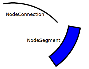
在本节中,我们将研究 `NodeSegment` 的构建方式。
在 WPF 中,可以通过继承 Shape 并提供几何图形来定义自定义形状。然而,Silverlight 框架,可以看作是 WPF 框架的简化版本,不支持这一点。在 Silverlight 中,我们可以通过创建一个自定义控件来实现类似的效果,该控件将形状几何图形作为 Path。我们将看到节点段形状如何在实践中工作。
节点段由多个属性描述,如下图所示:

使用前面描述的代码生成技术,这些属性被添加到我们的 `NodeSegment` 自定义控件中。
[SnippetDependencyProperty(property = "StartAngle", defaultValue = "0.0",
                            type = "double", containerType = "NodeSegment")]
[SnippetDependencyProperty(property = "SweepAngle", defaultValue = "0.0",
                            type = "double", containerType = "NodeSegment")]
[SnippetDependencyProperty(property = "InnerRadius", defaultValue = "0.0",
                            type = "double", containerType = "NodeSegment")]
[SnippetDependencyProperty(property = "OuterRadius", defaultValue = "0.0",
                            type = "double", containerType = "NodeSegment")]
[SnippetDependencyProperty(property = "Center", defaultValue = "new Point()",
                            type = "Point", containerType = "NodeSegment")]
public partial class NodeSegment : Control, INotifyPropertyChanged
{

}
使用一两个弧线和连接线创建我们所需的形状的路径相对容易。我们可以构造一个 `Path` 并将其添加到 `NodeSegment` 控件的模板中,将这些属性绑定到描述我们段的各种图形和线段。
<Style TargetType="local:NodeSegment">
  <Setter Property="Template">
    <Setter.Value>
       <ControlTemplate>
          <Path>
            <Path.Data>
              <PathGeometry>
                <PathFigure StartPoint="{...}"
                            IsClosed="True">
                  <ArcSegment Point="{...}"
                              SweepDirection="Counterclockwise"
                              IsLargeArc="{...}"
                              Size="{...}"/>
                  <LineSegment Point="{...}"/>
                  <ArcSegment Point="{...}"
                              SweepDirection="Clockwise"
                              IsLargeArc="{...}"
                              Size="{...}"/>
                </PathFigure>
              </PathGeometry>
            </Path.Data>
          </Path>
        </Canvas>
      </ControlTemplate>
    </Setter.Value>
  </Setter>
</Style>
问题是……我们应该绑定到哪些属性?`NodeSegment` 控件的接口以中心点、半径和角度(即极坐标系)表示。而在上面添加到控件模板的 `Path` 期望的点表示为 X 和 Y 位置(即,它们使用 Silverlight 直角坐标系)。我们需要找到一种方法将各种极坐标属性值转换为屏幕坐标系。
WPF 允许你通过 `MultiBinding` 将多个源属性绑定到单个目标,我之前**创建了一个 Silverlight 等效项**,尽管考虑到要呈现的段数和每个段所需的 `MultiBinding` 数量,我认为这是一种略微重量级的解决方案。
相反,我将使用一种我之前描述过的模式,**我称之为 mini-ViewModel 模式**,其中在用户控件内构造一个 view model,以本地化的方式辅助绑定框架。
`NodeSegment` 用户控件公开多个 CLR 属性,同样,这些属性以及 `INotifyPropertyChanged` 本身都通过代码片段自动化生成。
[SnippetINotifyPropertyChanged]
[SnippetPropertyINPC(property = "S1", field = "_s1",
                    type = "Point", defaultValue = "EMPTY_POINT")]
[SnippetPropertyINPC(property = "S2", field = "_s2",
                    type = "Point", defaultValue = "EMPTY_POINT")]
[SnippetPropertyINPC(property = "S3", field = "_s3",
                    type = "Point", defaultValue = "EMPTY_POINT")]
[SnippetPropertyINPC(property = "S4", field = "_s4",
                    type = "Point", defaultValue = "EMPTY_POINT")]
[SnippetPropertyINPC(property = "InnerSize", field = "_innerSize",
                    type = "Size", defaultValue = "EMPTY_SIZE")]
[SnippetPropertyINPC(property = "OuterSize", field = "_outerSize",
                    type = "Size", defaultValue = "EMPTY_SIZE")]
[SnippetPropertyINPC(property = "IsLargeArc", field = "_isLargeArc",
                    type = "bool", defaultValue = "false")]
public partial class NodeSegmentViewModel : INotifyPropertyChanged
{
  private static readonly Point EMPTY_POINT = new Point();

  private static readonly Size EMPTY_SIZE = new Size();
}
在 `NodeSegment` 控件内部,我们创建了这个 view model 的一个实例,并通过一个属性将其公开。`NodeSegment` 的根元素的 `DataContext` 也设置为它本身。
public partial class NodeSegment : Control, INotifyPropertyChanged
{
  private NodeSegmentViewModel _viewmodel = new NodeSegmentViewModel();

  public NodeSegmentViewModel ViewModel
  {
    get
    {
      return _viewmodel;
    }
  }

  private void UpdateViewModel()
  {
    double startAngle = StartAngle;
    double endAngle = StartAngle + SweepAngle;

    // compute the properties that the segment exposes to support other UI elements
    MidPointAngle = startAngle + (SweepAngle / 2);
    ConnectorPoint = Util.RadialToCartesian(MidPointAngle, InnerRadius, Center);

    // compute the path control points
    ViewModel.S1 = Util.RadialToCartesian(startAngle, OuterRadius, Center);
    ViewModel.S2 = Util.RadialToCartesian(endAngle, OuterRadius, Center);
    ViewModel.S3 = Util.RadialToCartesian(endAngle, InnerRadius, Center);
    ViewModel.S4 = Util.RadialToCartesian(startAngle, InnerRadius, Center);

    // create sizes from radius values
    ViewModel.InnerSize = new Size(InnerRadius, InnerRadius);
    ViewModel.OuterSize = new Size(OuterRadius, OuterRadius);

    ViewModel.IsLargeArc = SweepAngle > 180;

  }

  public NodeSegment()
  {
    this.DefaultStyleKey = typeof(NodeSegment);
  }

  public override void OnApplyTemplate()
  {
    // set the control’s root element DataContext
    Panel root = this.GetTemplateChild("rootElement") as Panel;
    root.DataContext = this;

    UpdateViewModel();
  }
}
`UpdateViewModel` 方法广泛使用一个简单的实用函数,用于从极坐标转换为直角坐标。每当 `NodeSegment` 的任何依赖属性发生更改时,我们只需调用 `UpdateViewModel` 来更新公开的 view model 状态。
有了这个 view model,我们现在就可以绑定控件模板内的 `Path` 了。
<Style TargetType="local:NodeSegment">
  <Setter Property="Template">
    <Setter.Value>
      <ControlTemplate TargetType="local:NodeSegment">
          <Path Stroke="{TemplateBinding Stroke}"
                StrokeThickness="{TemplateBinding StrokeThickness}"
                Fill="{TemplateBinding Background}"
                DataContext="{Binding ViewModel}"
                x:Name="segmentShape">
            <Path.Data>
              <PathGeometry>
                <PathFigure StartPoint="{Binding Path=S1}"
                            IsClosed="True">
                  <ArcSegment Point="{Binding Path=S2}"
                              SweepDirection="Counterclockwise"
                              IsLargeArc="{Binding Path=IsLargeArc}"
                              Size="{Binding Path=OuterSize}"/>
                  <LineSegment Point="{Binding Path=S3}"/>
                  <ArcSegment Point="{Binding Path=S4}"
                              SweepDirection="Clockwise"
                              IsLargeArc="{Binding Path=IsLargeArc}"
                              Size="{Binding Path=InnerSize}"/>
                </PathFigure>
              </PathGeometry>
            </Path.Data>
          </Path>
        </Canvas>
      </ControlTemplate>
    </Setter.Value>
  </Setter>
</Style>
请注意,`Path` 的 `DataContext` 绑定到公开的 `ViewModel` 属性。这简化了子元素的绑定,例如 `Path=ViewModel.S1` 变成简单的 `Path=S1`。
有了上面的代码,我们现在就可以像使用其他形状一样,从代码隐藏或 XAML 中使用 `NodeSegment` 了。
<local:NodeSegment InnerRadius="200" OuterRadius="250"
                    StartAngle="35" SweepAngle="45"
                    Center="100,80"
                    Background="Blue"
                    Stroke="Black" StrokeThickness="5"/>
生成节点段
现在我们有了两种形状中的第一种,我们可以开始组装图了。`RelationshipGraph` 的模板只包含一个 `Grid`,我们动态地用段填充它。
<Style TargetType="local:RelationshipGraph">
  <Setter Property="Template">
    <Setter.Value>
      <ControlTemplate TargetType="local:RelationshipGraph">
        <Border Background="{TemplateBinding Background}"
                BorderBrush="{TemplateBinding BorderBrush}"
                BorderThickness="{TemplateBinding BorderThickness}">
          <Grid x:Name="graphContainer">
          </Grid>
        </Border>
      </ControlTemplate>
    </Setter.Value>
  </Setter>
</Style>
为了呈现我们的数据,首先将几个属性添加到 `RelationshipGraph`,这些属性将各种半径表示为图高度/宽度的因子。然后调用 `Render` 方法,该方法简单地遍历提供的数据并添加所需角度和扫掠角的节点段。
[SnippetDependencyProperty(property = "InnerRadius", defaultValue = "0.7",
                            type = "double", containerType = "RelationshipGraph")]
[SnippetDependencyProperty(property = "OuterRadius", defaultValue = "0.8",
                            type = "double", containerType = "RelationshipGraph")]
public partial class RelationshipGraph : Control
{

  private Panel _graphContainer;

  public RelationshipGraph()
  {
    this.DefaultStyleKey = typeof(RelationshipGraph);
  }

  public override void OnApplyTemplate()
  {
    _graphContainer = this.GetTemplateChild("graphContainer") as Panel;

    Render();
  }

  /// <summary>
  /// Renders the relationship graph
  /// </summary>
  private void Render()
  {
    if (_graphContainer == null ||
        double.IsNaN(ActualWidth) || double.IsNaN(ActualHeight) ||
        ActualHeight == 0.0 || ActualWidth == 0.0)
      return;

    // clear the UI
    _graphContainer.Children.Clear();

    if (Data == null || Data.Count == 0)
      return;
    // compute the various radii
    double minDimension = Math.Min(ActualWidth, ActualHeight) / 2;
    Point center = new Point(ActualWidth / 2, ActualHeight / 2);
    double innerRadius = minDimension * InnerRadius;
    double outerRadius = minDimension * OuterRadius;
    double labelRadius = minDimension * LabelRadius;

    // render the segments
    double currentAngle = 0;
    foreach (INode node in Data)
    {
      double sweepAngle = ((double)node.Count) * 360.0 / totalCount;
      var segment = new NodeSegment()
      {
        SweepAngle = sweepAngle,
        StartAngle = currentAngle,
        InnerRadius = innerRadius,
        OuterRadius = outerRadius,
        LabelRadius = labelRadius,
        Center = center
      };
      _graphContainer.Children.Add(segment);
      currentAngle += sweepAngle;
    }
  }
}
有了上述代码,我们只需在 XAML 中创建此控件的一个实例。
<UserControl x:Class="CircularRelationshipGraph.MainPage"
    ...>
  <Grid x:Name="LayoutRoot" Background="White">
    <local:RelationshipGraph x:Name="graph" />
  </Grid>
</UserControl>
并通过 Linq-to-XML 以 XML 格式提供数据。
var doc = XDocument.Parse(_xml);
var data = doc.Descendants("tag")
            .Select(el => new Node()
            {
              Name = el.Attribute("name").Value,
              Count = int.Parse(el.Attribute("count").Value),
              Relationships = el.Descendants("rel")
                            .Select(rel => new NodeRelationship()
                            {
                              To = rel.Attribute("name").Value,
                              Strength = int.Parse(rel.Attribute("count").Value)
                            }).Cast<INodeRelationship>().ToList()
            }).Cast<INode>();

graph.Data = new NodeList(data);
在这种情况下,数据采用 XML 格式,我使用一个简单的控制台应用程序创建了它,该应用程序查询最新的 1000 个 Stack Overflow 问题。
 <tags>
  <tag name='android' count='107'>
    <rel name='java' count='34' />
    <rel name='javascript' count='8' />
    <rel name='c++' count='2' />
    <rel name='html' count='2' />
    <rel name='ios' count='2' />
  </tag>
  <tag name='java' count='103'>
    <rel name='android' count='34' />
    <rel name='c++' count='2' />
  </tag>
  <tag name='javascript' count='90'>
    <rel name='jquery' count='60' />
    <rel name='php' count='22' />
    <rel name='html' count='20' />
    <rel name='css' count='14' />
    <rel name='android' count='8' />
    <rel name='ruby-on-rails' count='4' />
    <rel name='asp.net' count='2' />
    <rel name='c#' count='2' />
    <rel name='.net' count='2' />
  </tag>
  <tag name='php' count='84'>
    <rel name='javascript' count='22' />
    <rel name='mysql' count='20' />
    <rel name='jquery' count='14' />
    <rel name='html' count='8' />
    <rel name='css' count='6' />
    <rel name='c#' count='2' />
    <rel name='python' count='2' />
  </tag>
  ...
</tags>
有了上述代码,图表已开始成形……

添加一些颜色
下一步是为这些段添加一些颜色和一个文本标签,以指示它们所关联的节点的名称。
`NodeSegment` 添加了更多属性:`ConnectorPoint`、`LabelRadius`、`IsHighlight`、`LabelText` 和 `MidPointAngle`。段的填充颜色使用继承的 `Background` 属性,而不是为此目的添加新属性。新添加的 `LabelText` 属性由 `RelationshipGraph` 在构造每个段时设置,而 `MidPointAngle` 和 `ConnectorPoint` 则略有不同,它们由 NodeSegment 本身计算 - 稍后将用于附加连接器。
同样,mini-ViewModel 用于将所需的坐标公开给渲染标签的 `TextBlock`。`NodeSegment` 的完整 XAML 如下所示。
<Style TargetType="local:NodeSegment">
  <Setter Property="Canvas.ZIndex" Value="100"/>
  <Setter Property="Template">
    <Setter.Value>
      <ControlTemplate TargetType="local:NodeSegment">
        <Canvas x:Name="rootElement">
          <vsm:VisualStateManager.VisualStateGroups>
            <vsm:VisualStateGroup x:Name="CommonStates">
              <vsm:VisualState x:Name="Normal">
                <Storyboard>
                  <ColorAnimation Storyboard.TargetName="segmentShape"
                                  Storyboard.TargetProperty="(Path.Fill).(SolidColorBrush.Color)"
                                  Duration="0:0:0.2"/>
                </Storyboard>
              </vsm:VisualState>
              <vsm:VisualState x:Name="Highlighted">
                <Storyboard>
                  <ColorAnimation Storyboard.TargetName="segmentShape"
                                  Storyboard.TargetProperty="(Path.Fill).(SolidColorBrush.Color)"
                                  To="LightGray" Duration="0:0:0.2" />
                  <ObjectAnimationUsingKeyFrames Storyboard.TargetName="label"
                                  Storyboard.TargetProperty="(UIElement.Visibility)">
                    <DiscreteObjectKeyFrame KeyTime="00:00:00">
                      <DiscreteObjectKeyFrame.Value>
                        <Visibility>Visible</Visibility>
                      </DiscreteObjectKeyFrame.Value>
                    </DiscreteObjectKeyFrame>
                  </ObjectAnimationUsingKeyFrames>
                </Storyboard>
              </vsm:VisualState>
            </vsm:VisualStateGroup>
          </vsm:VisualStateManager.VisualStateGroups>

          <!-- the segment itself -->
          <Path Stroke="{TemplateBinding Stroke}"
                StrokeThickness="{TemplateBinding StrokeThickness}"
                Fill="{TemplateBinding Background}"
                DataContext="{Binding ViewModel}"
                x:Name="segmentShape">
            <Path.Data>
              <PathGeometry>
                <PathFigure StartPoint="{Binding Path=S1}"
                            IsClosed="True">
                  <ArcSegment Point="{Binding Path=S2}"
                              SweepDirection="Counterclockwise"
                              IsLargeArc="{Binding Path=IsLargeArc}"
                              Size="{Binding Path=OuterSize}"/>
                  <LineSegment Point="{Binding Path=S3}"/>
                  <ArcSegment Point="{Binding Path=S4}"
                              SweepDirection="Clockwise"
                              IsLargeArc="{Binding Path=IsLargeArc}"
                              Size="{Binding Path=InnerSize}"/>
                </PathFigure>
              </PathGeometry>
            </Path.Data>
          </Path>

          <!-- the text label for this segment -->
          <TextBlock Text="{Binding Path=LabelText}"
                      Visibility="{Binding Path=SweepAngle, Converter={StaticResource DoubleToVisibility}, ConverterParameter=3}"
                      Canvas.Top="{Binding Path=ViewModel.LabelLocation.Y}"
                      Canvas.Left="{Binding Path=ViewModel.LabelLocation.X}"
                      x:Name="label"
                      Height="20"
                      VerticalAlignment="Center"
                      HorizontalAlignment="Center">
            <TextBlock.RenderTransform>
              <TransformGroup>
                <TranslateTransform X="0" Y="-10"/>
                <RotateTransform Angle="{Binding Path=MidPointAngle, Converter={StaticResource NegateDouble}}"/>
                <RotateTransform Angle="90"/>
              </TransformGroup>
            </TextBlock.RenderTransform>
          </TextBlock>

        </Canvas>
      </ControlTemplate>
    </Setter.Value>
  </Setter>
</Style>
这里有几个有趣的新功能 - 用于标记每个段的 `TextBlock` 按预期定位,通过各种渲染转换和绑定到 view model 的附加 `Canvas` 属性。`Visibility` 属性通过值转换器 `DoubleToVisibility` 绑定到 `SweepAngle` 属性,这个简单的转换器如果提供的 double 大于指定的参数,则返回“可见”值。在这种情况下,只有当扫掠角大于 3 度时,标签才可见。
还添加了几个视觉状态。在 `NodeSegment` 的代码隐藏中,`MouseEnter` 和 `MouseLeave` 事件在路径上被处理,以设置控件的 `IsHighlighted` 属性。这也设置/取消设置 `Highlighted` 视觉状态,该状态会更改段的填充颜色并设置标签的可见性,确保在鼠标悬停时显示隐藏的标签。
每个段的颜色由其连接数量决定,为了提供漂亮的颜色渐变,我借用了 Silverlight Toolkit 的 `SolidColourBrushInterpolator`,它将某个预定范围内的数字值转换为颜色值(你也可以使用更复杂的插值器,允许你指定超过两种颜色,**如这篇博文所述**)。
通过在图中添加一个 `SegmentFillInterpolator` 依赖属性,并添加一些简单的代码来将连接数转换为颜色,我们可以指定一个颜色范围如下:
<local:RelationshipGraph x:Name="graph" FontSize="10"
                          LabelRadius="0.73" OuterRadius="0.7" InnerRadius="0.6">
  <local:RelationshipGraph.SegmentFillInterpolator>
    <datavis:SolidColorBrushInterpolator From="Blue" To="Orange"/>
  </local:RelationshipGraph.SegmentFillInterpolator>
</local:RelationshipGraph>
结果图如下:

连接段
为了连接段,我创建了另一个“形状”,`NodeConnector`,它使用与 `NodeSegment` 完全相同的模式,即一个自定义控件,其中包含一个由 Path 元素定义的形状,并由 mini-ViewModel 支持。
`NodeConnection` 由三个点指定:`From`、`To` 和 `Via`。`From` 和 `To` 位置是与段的接触点,而 `Via` 点是图的中心。

连接只是一个 `ArcSegment`。
<Style TargetType="local:NodeConnection">
  <Setter Property="Template">
    <Setter.Value>
      <ControlTemplate TargetType="local:NodeConnection">
        <Canvas x:Name="rootElement">
          <vsm:VisualStateManager.VisualStateGroups>
            <vsm:VisualStateGroup x:Name="CommonStates">
              <vsm:VisualState x:Name="Normal">
                <Storyboard>
                  <ColorAnimation Storyboard.TargetName="connectorPath"
                                  Storyboard.TargetProperty="(Path.Stroke).(SolidColorBrush.Color)"
                                  Duration="0:0:0.2"/>
                </Storyboard>
              </vsm:VisualState>
              <vsm:VisualState x:Name="Highlighted">
                <Storyboard>
                  <ColorAnimation Storyboard.TargetName="connectorPath"
                                  Storyboard.TargetProperty="(Path.Stroke).(SolidColorBrush.Color)"
                                  To="Red" Duration="0:0:0.2" />
                </Storyboard>
              </vsm:VisualState>
            </vsm:VisualStateGroup>
          </vsm:VisualStateManager.VisualStateGroups>

          <Path Stroke="{Binding Path=Stroke}"
                StrokeThickness="{Binding Path=StrokeThickness}"
                x:Name="connectorPath">
            <Path.Data>
              <PathGeometry>
                <PathFigure StartPoint="{Binding Path=From}"
                            IsClosed="False">
                  <ArcSegment Point="{Binding Path=To}"
                              Size="{Binding Path=ViewModel.Size}"
                              SweepDirection="{Binding Path=ViewModel.SweepDirection}"/>
                </PathFigure>
              </PathGeometry>
            </Path.Data>
          </Path>
        </Canvas>
      </ControlTemplate>
    </Setter.Value>
  </Setter>
</Style>
同样,应用了一个高亮显示的视觉状态。
计算 `ArcSegment` 的半径(`Size`)很有趣!穿过图中心的连接需要是直的,而相邻段之间的连接应该是大的圆段。为了实现这一点,我应用了 `Tan` 函数,该函数在 `PI / 2` 处趋于无穷大,应用于 `To` 点和 `From` 点之间的角度,这些点由以 `Via` 为中心的圆描述。更新 view model 的代码如下所示:
/// <summary>
/// Gets the angle between the point from and to on a circle with
/// the given center. The returned value is in the range -360 to 360.
/// </summary>
private static double SubtendedAngle(Point from, Point to, Point center)
{
  double fromAngle = Math.Atan2(from.Y - center.Y, from.X - center.X);
  double toAngle = Math.Atan2(to.Y - center.Y, to.X - center.X);
  double angle = toAngle - fromAngle;
  return 180 * angle / Math.PI;
}

private void UpdateViewModel()
{
  double angle = SubtendedAngle(From, To, Via);
  if (angle < 0)
    angle += 360;

  double radius = Math.Sqrt((From.Y - Via.Y) * (From.Y - Via.Y) + (From.X - Via.X) * (From.X - Via.X));
  double shortestAngle = (angle > 180) ? 360 - angle : angle;
  double func = Math.Tan(shortestAngle * (Math.PI / 2) / 180) * radius;

  _viewModel.Size = new Size(func, func);
  _viewModel.SweepDirection = Math.Abs(angle) < 180 ? SweepDirection.Counterclockwise : SweepDirection.Clockwise;
}
然后扩展 `RelationshipGraph` 的 `Render` 代码,在构造完段后呈现连接。
double maxRelation = Data.SelectMany(d => d.Relationships).Max(d => d.Strength);
double minRelation = Data.SelectMany(d => d.Relationships).Min(d => d.Strength);

// set the interpolator bounds
ConnectorFillInterpolator.ActualDataMaximum = maxRelation;
ConnectorFillInterpolator.ActualDataMinimum = minRelation;

// render the connections
foreach (INode fromNode in sortedData)
{
  foreach (var rel in fromNode.Relationships)
  {
    // locate the other end of this connection
    INode toNode = Data.SingleOrDefault(n => n.Name == rel.To);

    if (toNode == null)
    {
      Debug.WriteLine("A relationship to a node that does not exist was found [" + rel.To + "]");
      continue;
    }

    // locate the segment for each node
    var fromSegment = _segmentForNode[fromNode];
    var toSegment = _segmentForNode[toNode];

    // create a connector
    var conn = new NodeConnection()
    {
      Via = center,
      StrokeThickness = Interpolate(minRelation, maxRelation, ConnectorThickness.Minimum,
                                      ConnectorThickness.Maximum, rel.Strength),
      Stroke = ConnectorFillInterpolator.Interpolate(rel.Strength) as SolidColorBrush,
      Style = NodeConnectorStyle
    };

    // bind the connector from / to points to the respective segments
    conn.SetBinding(NodeConnection.FromProperty, new Binding("ConnectorPoint")
    {
      Source = fromSegment
    });
    conn.SetBinding(NodeConnection.ToProperty, new Binding("ConnectorPoint")
    {
      Source = toSegment
    });

    // bind the highlighted state to the highlight state of the source segment
    conn.SetBinding(NodeConnection.IsHighlightedProperty, new Binding("IsHighlighted")
    {
      Source = fromSegment
    });

    _graphContainer.Children.Add(conn);
  }
}
上述代码的大部分都相当直接,当段生成时,它们被添加到 `_segmentForNode` 字典中,以便我们可以快速从节点映射到段。此外,我还添加了另一个用于连接器颜色的插值器和一个用于确定连接器粗细的双精度范围。
上述代码中有趣的部分是绑定。前两个将段的 `To` 和 `From` 属性绑定到每个 `NodeSegment` 的 `ConnectorPoint` 依赖属性。这些绑定确保连接器始终附加到段,无论它们位于何处。这与你在 PowerPoint 和 Word 中使用的连接器的工作方式类似。
第二个绑定确保当一个段被高亮显示时,所有从该段发出的连接也都被高亮显示。
有了这段代码,图就完成了。

你可以在**我的博客上查看此图的交互式版本**。
排序数据
虽然这个可视化图相当漂亮,但我也希望它有用,换句话说,能够帮助观察者理解它所表示的数据。各种节点呈现的顺序对图的外观有显著影响,并允许用户发现不同的模式。为了动画化排序顺序的变化,我需要使应用新排序顺序的过程原子化,换句话说,`INotifyCollectionChanged` 并不真正适合!
为了支持原子排序,我引入了以下接口:
/// <summary>
/// Takes a list of nodes and sorts them.
/// </summary>
public interface ISortOrderProvider
{
  INodeList Sort(INodeList nodes);
}
关系图通过依赖属性接受 `ISortOrderProvider` 的实例。在呈现段和连接之前,此提供程序用于对提供的节点列表进行排序。
下面显示了该接口的一个简单实现:
/// <summary>
/// A sort order provider that doesn't actually perform any sorting.
/// </summary>
public class NaturalSortOrderProvider : ISortOrderProvider
{
  public INodeList Sort(INodeList nodes)
  {
    return nodes;
  }
}
这实际上并没有排序数据,而是默认行为。我还创建了一个更通用的提供程序,它通过委托进行排序,如下所示:
/// <summary>
/// A sort provider that orders the nodes via the given delegate
/// </summary>
public class DelegateSortOrderProvider : ISortOrderProvider
{
  private Func<IList<INode>, IEnumerable<INode>> _func;

  public DelegateSortOrderProvider(Func<IList<INode>, IEnumerable<INode>> func)
  {
    _func = func;
  }

  public INodeList Sort(INodeList nodes)
  {
    return new NodeList(_func(nodes));
  }
}
通过这种方法,你可以让图表按节点计数进行排序:
graph.SortOrderProvider = new DelegateSortOrderProvider(nodes =>
                                 nodes.OrderBy(node => node.Count));
当 `SortOrderProvider` 属性更改时,不是重新渲染图表,而是将各个部分动画到它们的新位置。当依赖属性更改时调用的部分方法会调用一个执行动画的方法。
partial void OnSortOrderProviderPropertyChanged(DependencyPropertyChangedEventArgs e)
{
  var sortedData = SortOrderProvider.Sort(Data);
  AnimateToOrder(sortedData);
}

/// <summary>
/// Launch a storyboard to animate each segment into place
/// </summary>
private void AnimateToOrder(IList<INode> data)
{
  var sb = new Storyboard();

  double currentAngle = 0;
  foreach (INode node in data)
  {
    NodeSegment segment = _segmentForNode[node];

    double toAngle = currentAngle;
    double fromAngle = segment.StartAngle;

    // find the shortest route between the from / to angles
    if (Math.Abs(fromAngle - (toAngle - 360)) < Math.Abs(fromAngle - toAngle))
      toAngle -= 360;
    if (Math.Abs(fromAngle - (toAngle + 360)) < Math.Abs(fromAngle - toAngle))
      toAngle += 360;

    // animate the segment
    var db = CreateDoubleAnimation(fromAngle, toAngle,
        new SineEase(),
        segment, NodeSegment.StartAngleProperty, TimeSpan.FromMilliseconds(1500));
    sb.Children.Add(db);

    currentAngle += segment.SweepAngle;
  }
  sb.Begin();
}


private static DoubleAnimation CreateDoubleAnimation(double from, double to, IEasingFunction easing,
                                          DependencyObject target, object propertyPath, TimeSpan duration)
{
  var db = new DoubleAnimation();
  db.To = to;
  db.From = from;
  db.EasingFunction = easing;
  db.Duration = duration;
  Storyboard.SetTarget(db, target);
  Storyboard.SetTargetProperty(db, new PropertyPath(propertyPath));
  return db;
}
非常巧妙的是,由于连接器的 `To` / `From` 属性绑定到它们各自段的 `ConnectorPoint` 属性,因此只需要动画化段的位置。所有其他内容都会自动更新。
聚类相关节点
排序图的一种有趣方式是,通过最小化穿过圆中心的连接数来聚类相关节点。为了实现这一点,我创建了一个排序提供程序 `MinimisedConnectionLengthSort`,该提供程序通过最小化连接长度来对节点进行排序,从而实现节点的聚类。
该提供程序为给定的节点配置分配一个“权重”,其中权重是通过对每个连接的“长度”求和来计算的。然后,该提供程序依次移动每个节点,向左和向右移动,以确定新配置是否最小化了权重。经过多次迭代后,找到了最佳配置。
应用这种迭代方法的结果如下图所示:

最终示例
到目前为止,所有示例都使用了与 Stack Overflow 标签相关的数据。为了证明这个图更具通用性,我的最后一个例子是欧元区债务图,数据(和概念!)来自**BBC 新闻网站**。
你可以在**我的博客上查看此图的交互式版本**。
此示例将国家之间相互欠下的各种债务存储在 XML 文件中。
<debt>
  <country name='France' debt='4200' text='Europes second biggest economy owes the UK, the US and Germany ...'>
    <owes name='Italy' amount='37.6'/>
    <owes name='Japan' amount='79.8'/>
    <owes name='Germany' amount='123.5'/>
    <owes name='UK' amount='227'/>
    <owes name='US' amount='202.1'/>
  </country>
  <country name='Spain' debt='1900' text='Spain owes large amounts to Germany and France. However...'>
    <owes name='Portugal' amount='19.7'/>
    <owes name='Italy' amount='22.3'/>
    <owes name='Japan' amount='20'/>
    <owes name='Germany' amount='131.7'/>
    <owes name='UK' amount='74.9'/>
    <owes name='US' amount='49.6'/>
    <owes name='France' amount='112'/>
  </country>
  <country name='Portugal' debt='400' text='Portugal, the third eurozone country to need a bail-out...'>
    <owes name='Italy' amount='2.9'/>
    <owes name='Germany' amount='26.6'/>
    <owes name='UK' amount='18.9'/>
    <owes name='US' amount='3.9'/>
    <owes name='France' amount='19.1'/>
    <owes name='Spain' amount='65.7'/>
  </country>
  ...
</debt>
使用非常相似的 Linq-to-XML 代码来解析此数据,以构造节点和关系。需要注意的一点是,“text”属性用于填充具体节点实现上的 `Tag` 属性(是的……我知道这有点老式,我只是想避免创建可绑定的 `INode` 实现!)。
此示例的 XAML 包括一个显示此文本值的右侧列。这是通过数据绑定到图公开的 `HighlightedNode` 属性,然后绑定到节点 `Name` 和 `Tag` 来实现的。
<Grid x:Name="LayoutRoot"
      Background="White">
  <Grid Margin="15">
    <Grid.ColumnDefinitions>
      <ColumnDefinition Width="2*"/>
      <ColumnDefinition Width="*"/>
    </Grid.ColumnDefinitions>

    <local:RelationshipGraph x:Name="graph" FontSize="12"
                              NodeSegmentStyle="{StaticResource NodeSegmentStyle}"
                              LabelRadius="0.93"
                              Margin="0,0,30,0">
      <local:RelationshipGraph.ConnectorThickness>
        <local:DoubleRange Minimum="0.5" Maximum="80"/>
      </local:RelationshipGraph.ConnectorThickness>
      <local:RelationshipGraph.SegmentFillInterpolator>
        <datavis:SolidColorBrushInterpolator From="LightGray" To="DarkGray"/>
      </local:RelationshipGraph.SegmentFillInterpolator>
      <local:RelationshipGraph.ConnectorFillInterpolator>
        <datavis:SolidColorBrushInterpolator From="#66dddddd" To="#66dddddd"/>
      </local:RelationshipGraph.ConnectorFillInterpolator>
    </local:RelationshipGraph>

    <Line X1="0" Y1="0" X2="0" Y2="350"
          Grid.Column="1"
          Stroke="LightGray" StrokeThickness="2"
          VerticalAlignment="Center"/>
    <Grid Grid.Column="1"
          DataContext="{Binding ElementName=graph, Path=HighlightedNode}"
          Margin="10">
      <Grid.RowDefinitions>
        <RowDefinition Height="Auto"/>
        <RowDefinition/>
      </Grid.RowDefinitions>
      <TextBlock Text="{Binding Name}"
                  FontSize="20"
                  TextDecorations="Underline"
                  FontFamily="Georgia"
                  Margin="0,10,0,10"/>
      <TextBlock Text="{Binding Tag}"
                  FontSize="13"
                  TextWrapping="Wrap"
                  Foreground="#999"
                  Grid.Row="2"
                  FontFamily="Georgia"/>
    </Grid>
  </Grid>
</Grid>
换句话说,无需代码隐藏即可实现交互性。这让我很高兴!
结论
好了,我没什么可说的了,除了希望你喜欢这个控件并喜欢阅读它。我当然认为 Silverlight 框架的模板化和绑定功能实现了非常优雅的实现,`RelationshipGraph` 控件本身的代码非常少。如果你有任何评论,或者在自己的项目中使用此控件,请告诉我!