
KRBTabControl
4.92/5 (59投票s)
本文介绍了如何在C#中制作一个自定义的Windows Tab控件。
引言
本文讨论了如何使用.NET框架为Windows窗体应用程序制作自定义选项卡控件。演示和源代码项目zip文件中提供了示例应用程序。
- 助记支持
- 支持键盘导航
- 支持在同一容器中拖放选项卡页,以及在不同容器之间拖放选项卡页
- 通过下拉菜单添加选项卡页显示/隐藏功能
- 渐变所选选项卡项及其背景
- 控件标题的着色器支持(RGBA改变器)
- 支持最终用户的动态属性
- 展示了如何添加设计时支持,以便您的自定义控件在设计时正常运行
- 自定义msctls_updown32滚动条。支持6种不同的样式
- 为用户提供KRBTabControl操作的键盘支持
- 支持控件标题和选定选项卡项的透明背景
- 序列化支持(加载以前的设置或保存当前设置。)
- 事件通知(绘图更改、下拉菜单更改、选项卡页选择和关闭操作)
Contents at a Glance
总之,本文将涵盖以下内容
- 开始
- ExpandableObjectConverter
- UITypeEditor
- RGBA着色器
- 用户交互的键盘快捷键
- 高级设计时支持
- 拖放支持
- 选项卡标题样式
- 下拉菜单自定义
- 阻止用户操作选择或关闭选项卡页
类表
KRBTabControl类提供了其基控件类的基本实现,但我们需要为我们的控件创建特定的类、属性、方法和一些事件。为此,我实现了自定义类。
您可以在此处查看类描述。
| 类名 | 描述 |
GradientTab |
我们使用此类的成员以特定的渐变填充所选选项卡项矩形及其边框。它包含几种用于绘图操作的属性。 |
GradientTabConverter |
通常,无法在设计时设置GradientTab类的子属性。为了解决这个问题,我们需要创建一个自定义类型转换器,它是一个从ExpandableObjectConverter派生的特殊类。 |
GradientTabEditor |
为了支持缩略图视图,我们需要创建一个自定义类型编辑器。类型编辑器允许您通过在属性窗口中创建渐变的自定义缩略图来获得一些花哨的效果。 |
Hatcher |
通过此类别,我们使用各种图案填充选项卡页标题区域。它包含四个用于绘制操作的属性。 |
HatcherConverter |
一个用于从ExpandableObjectConverter派生的实时Hatcher对象的自定义类型转换器。 |
HatcherEditor |
我们在属性窗口中为BackgroundHatcher属性定义一个缩略图视图。 |
HatchStyleConverter |
错误!调用HatchStyle枚举时,HatchStyle枚举的结果中有多个值。因此,我们提供了HatchStyle标准值列表。 |
CaptionGradient |
您可以使用这些类成员为您的选项卡控件确定新的标题渐变样式。 |
CaptionGradientConverter |
CaptionGradient成员的自定义类型转换器类。 |
CaptionGradientEditor |
一个自定义类型编辑器类。用于在属性窗口中创建渐变的自定义缩略图。 |
ButtonsCaption |
您可以使用这些类成员更改活动或非活动标题按钮的颜色。 |
ButtonsCaptionConverter |
ButtonsCaption成员的自定义类型转换器类。 |
ButtonsCaptionEditor |
一个自定义类型编辑器类。用于在属性窗口中创建渐变的自定义缩略图。 |
RandomizerCaption |
我们控件标题的RGBA(红、绿、蓝和Alpha)着色器。您可以使用此类的成员轻松更改标题外观。 |
RandomizerCaptionConverter |
CaptionRandomizer属性的简单ExpandableObjectConverter。 |
CaptionColorChooserEditor |
为了向CaptionRandomizer属性添加模态对话框功能,我们需要创建一个新的UITypeEditor。 |
TabpageExCollectionEditor |
我们需要创建一个自定义集合编辑器,用于在我们的TabPages集合编辑器中创建TabPageEx类的新实例或销毁现有的TabPageEx。 |
TabPageExPool |
此集合类保存我们的隐藏选项卡页。您不能在设计时隐藏选项卡页。它只在运行时模式下工作。 |
Custom3DBorder |
我们的分隔线绘制器类。它绘制一条连接由坐标对指定的两个点的垂直线。 |
ArrowWindow |
它只在我们拖动一个选项卡项到另一个选项卡项时出现。 |
UpDown32 |
为了隐藏或销毁容器中的系统“msctls-updown32”滚动条按钮,我们需要创建一个派生自NativeWindow的本机窗口类。 |
Scroller |
滚动条类包括左右RolloverUpDown控件。您可以从属性对话框更改滚动条样式。 |
RolloverUpDown |
通过翻转上下控件,使用GDI+完成的工作很少。相反,所有四种状态的上下图像都在单独的程序中准备,并作为资源导入到应用程序中。然后将这些图像分配给控件,控件在它们之间无缝切换(通过从UpDownBase派生一个类)。 |
UpDownBase |
要制作自定义的上下按钮滚动条,最合理的方法是直接从Control类派生,因为您需要自己实现所有绘图操作。UpDownBase控件被声明为一个抽象类,因此不能直接实例化。 |
KRBTabControlDesigner |
添加设计时便利,如设计器动词或智能标记,并从视图中删除不适当的事件或属性(或添加仅设计时事件、属性并为我们的自定义控件创建动态属性)。要创建基本控件设计器,请从ParentControlDesigner派生一个类。 |
KRBTabControlActionList |
此类有两个作用——它为智能标记配置DesignerActionItem实例的集合,当发出命令或进行更改时,它对链接的控件执行相应的操作。 |
TabPageEx |
我们的自定义选项卡页类。我们需要更改并添加一些属性。 |
CaptionColorChooser |
要更改标题位图上的RGBA值。我们需要使用模态对话框来更改颜色属性。 |
ContextMenuShownEventArgs |
此类保存我们的下拉菜单项参数。 |
SelectedIndexChangingEventArgs |
为了防止选项卡页选择或关闭,我们需要创建一个自定义的EventArgs类。 |
控件边框样式
| 边框样式 | 预览 |
实线 |
 |
点线 |
 |
虚线 |
 |
控件属性表
| 属性 | 描述 |
|
获取或设置选定的选项卡页样式。 |
|
获取或设置控件的边框颜色。 |
|
获取或设置所选选项卡项的图标颜色。 |
|
获取或设置第一个选项卡页左边缘与其容器客户端区域左边缘之间的像素距离,该值必须在-2到5像素大小的范围内。 |
|
获取或设置选项卡页标题的背景样式。 |
|
获取或设置所选选项卡页项的渐变颜色。 |
|
您可以为您的选项卡控件确定新的标题渐变样式和颜色。 |
|
您可以更改活动或非活动标题按钮的颜色。 |
|
您可以更改活动和非活动标题颜色分量(红、绿、蓝、Alpha)。 |
|
获取或设置选项卡控件的滚动条(上/下)样式。 |
|
确定活动选项卡是否拉伸到其父容器。 |
|
确定是否绘制选项卡标题背景。 |
|
确定选项卡控件标题是否可见。 |
|
确定是否绘制选项卡控件的边缘边框,您必须将IsCaptionVisible的值设置为false,此更改才能生效。 |
|
为用户提供选项卡控件操作的键盘支持。 |
|
确定选项卡页之间是否显示选项卡分隔线。 |
|
确定选项卡控件是否为文档选项卡样式。 |
选项卡页样式
| 选项卡页样式 | 预览 |
KRBStyle |
 |
OfficeXP |
 |
VS2010 |
 |
控制事件
我为控件设计和最终用户通知实现了一些事件。
| 事件名称 | 描述 |
|
当IsDrawHeader属性的值发生更改时引发的事件。 |
|
当IsCaptionVisible属性的值发生更改时引发的事件。 |
|
当HeaderVisibility(StretchToParent)属性的值发生更改时引发的事件。 |
|
当选项卡页正在关闭时发生。 |
|
当选项卡页正在选择时发生。 |
|
当用户点击标题上的下拉图标(如果可见)时发生。 |
透明背景支持
| 预览 | |
标题栏 |
|
TabPages |
|
空容器 |
如果您的选项卡页数量小于一个,您将看到一个空的选项卡容器,如下所示。
|


ExpandableObjectConverter
不幸的是,无法在设计时设置自定义对象的子属性。要解决这个问题,您需要创建一个自定义类型转换器,它是一个专门的类,可以将自定义对象转换为string,然后将string转换回活动的自定义对象。如果您不使用类型转换器并在属性窗口中查看,您将看到一段static文本,它显示调用自定义对象的ToString()的结果。
Windows Forms控件支持许多对象属性。最好的例子是Font,它指的是一个具有Bold、Italic、Name等属性的成熟Font对象。当您在属性窗口中设置Font属性时,您不需要在一个正确格式化的string中输入所有这些信息。相反,您可以通过单击加号(+)框并单独编辑所有Font子属性来展开Font属性。
您可以使用自己的自定义对象类型启用相同类型的编辑。您实际上有两种选择——您可以直接使用ExpandableObjectConverter,或者您可以创建一个派生自ExpandableObjectConverter的自定义类型转换器。如果您使用这种方法,您将受益于string表示和展开属性以查看子属性的能力。
第一步是创建一个从基类System.ComponentModel.ExpandableObjectConverter派生的自定义类,如下所示
class RandomizerCaptionConverter : ExpandableObjectConverter
{
    // To do something.
}
之后,我们重写了我们所需的必要方法。
| 方法 | 描述 |
CanConvertFrom() |
此方法检查数据类型,如果类型转换器可以从该数据类型转换为自定义数据类型,则返回true。 |
ConvertFrom() |
此方法执行从提供的数据类型到自定义数据类型的转换。 |
CanConvertTo() |
此方法检查数据类型,如果类型转换器可以将自定义对象转换为此数据类型,则返回true。 |
ConvertTo() |
此方法执行从自定义数据类型到请求数据类型的转换。 |
#region Override Methods

//All the CanConvertTo() method needs to is check that the target type is a string.
public override bool CanConvertTo
	(ITypeDescriptorContext context, Type destinationType)
{
    if (destinationType == typeof(string))
        return true;
    else
        return base.CanConvertTo(context, destinationType);
}

//ConvertTo() simply checks that it can indeed convert to the desired type.
public override object ConvertTo(ITypeDescriptorContext context,
    System.Globalization.CultureInfo culture, object value, Type destinationType)
{
    if (destinationType == typeof(string))
        return ToString(value);
    else
        return base.ConvertTo(context, culture, value, destinationType);
}

/* The exact same process occurs in reverse
when converting a RandomizerCaption object to a string.
First the Properties window calls CanConvertFrom().
If it returns true, the next step is to call
the ConvertFrom() method. */
public override bool CanConvertFrom(ITypeDescriptorContext context, Type sourceType)
{
    if (sourceType == typeof(string))
        return true;
    else
        return base.CanConvertFrom(context, sourceType);
}

public override object ConvertFrom(ITypeDescriptorContext context,
	System.Globalization.CultureInfo culture, object value)
{
    if (value is string)
        return FromString(value);
    else
        return base.ConvertFrom(context, culture, value);
}

#endregion
附加类型转换器
有两种方法可以附加类型转换器。在大多数情况下,您应该使用的方法是通过将TypeConverter属性添加到类声明中,将自定义类型链接到类型转换器。
[TypeConverter(typeof(RandomizerCaptionConverter))]
public class RandomizerCaption : ICaptionRandomizer
{ ... }
另一种选择是将TypeConverter属性应用于自定义控件中的属性。
/// <summary>
/// You can change your active and inactive caption color components
/// (Red, Green, Blue, Alpha).
/// </summary>
[Description("You can change your active and inactive caption color components (Red, Green, Blue, Alpha)")]
[TypeConverter(typeof(RandomizerCaptionConverter))]
[DesignerSerializationVisibility(DesignerSerializationVisibility.Content)]
[Browsable(true)]
public RandomizerCaption CaptionRandomizer
{
    get { return _captionRandomizer; }
    set
    {
        try
        {
            if (!value.Equals(_captionRandomizer))
            {
                _captionRandomizer.CaptionRandomizerChanged -=
					CONTROL_INVALIDATE_UPDATE;
                _captionRandomizer = value;
                _captionRandomizer.CaptionRandomizerChanged +=
                	new EventHandler(CONTROL_INVALIDATE_UPDATE);

                Invalidate();
                Update();
            }
        }
        catch (NullReferenceException)
        {
            MessageBox.Show("Value cannot be null!, please enter a valid value.");
        }
    }
}

UITypeEditor
基类UITypeEditor位于System.Drawing.Design命名空间中。您可以从该类继承以创建自定义类型编辑器。
您使用Editor属性将属性与类型编辑器关联。与类型转换器一样,您可以将Editor属性应用于类声明或属性声明。
要创建自定义类型编辑器,您必须首先创建一个派生自System.Drawing.Design.UITypeEditor的类。然后可以重写下表中所示的四个方法。
| 类方法 | 描述 |
EditValue() |
在编辑属性时调用。通常,这是您创建特殊对话框进行属性编辑的地方。 |
GetEditStyle() |
指定类型编辑器是下拉(提供专门绘制选项的列表)、模态(提供用于属性选择的对话框)还是无(不支持编辑)。 |
GetPaintValueSupported() |
如果您提供了PaintValue()实现,请使用此方法返回true。 |
PaintValue() |
调用此方法以绘制表示属性窗口中值的图形缩略图。 |
模态类型编辑器
模态类型编辑器在属性值旁边显示一个省略号 (...) 按钮。单击此按钮时,将出现一个对话框,允许开发人员更改属性值。
CaptionColorChooser
CaptionColorChooser是一个模态窗体。将其从代码编辑器中取出是合理的。您可以通过向类声明添加internal关键字来实现此目的。
internal partial class CaptionColorChooser : Form
{
    // To do something.
}
此示例中的真正技巧是,您为编辑属性而创建的模态窗体需要一种接收来自自定义控件对象信息的方式。为此,您应该为您的编辑控件创建一些公共实例,这些实例接受它所需的所有信息。
以下是存储实例提供信息的详细信息
#region Instance Members

public KRBTabControl contextInstance;
public ICaptionRandomizer Randomizer;

#endregion
每个NumericUpDown值都可以由用户在模态对话框中更改。因此,我们需要为每个NumericUpDown控件创建一个事件处理程序,然后我们应该更新窗体上的当前视图。
private void numeric_ValueChanged(object sender, EventArgs e)
{
    // Update current view on the control.
    Captions.Invalidate();
    Captions.Update();
}
下一步是开发使用此模态窗体的类型编辑器。以下是类声明
class CaptionColorChooserEditor : UITypeEditor
{
    // To do something.
}
之后,我们需要使用Editor属性将此类型编辑器连接到RandomizerCaption类。以下代码片段展示了如何将此属性添加到您的相应类声明中。如上所述,您也可以使用相同的属性将此类型编辑器附加到相应的属性。
[Editor(typeof(CaptionColorChooserEditor), typeof(UITypeEditor))]
public class RandomizerCaption : ICaptionRandomizer
{ ... }
现在您需要做的就是填写类型编辑器代码。首先,我们为我们的UITypeEditor选择模态样式。之后,我们关闭缩略图。因为;我们的工作类(RandomizerCaption)没有实现设计时绘图行为。最后,在EditValue()方法中,您创建CaptionColorChooser窗体的实例,并在using作用域中设置其初始属性,如下所示
#region Override Methods

public override object EditValue
(ITypeDescriptorContext context, IServiceProvider provider, object value)
{
    ICaptionRandomizer current;
    using (CaptionColorChooser frm = new CaptionColorChooser())
    {
        // Set currently objects to the form.
        frm.Randomizer = (ICaptionRandomizer)value;
        frm.contextInstance = context.Instance as KRBTabControl;

        if (frm.ShowDialog() == DialogResult.OK)
            current = frm.Randomizer;
        else
            current = (ICaptionRandomizer)value;
    }

    return current;
}

public override UITypeEditorEditStyle GetEditStyle(ITypeDescriptorContext context)
{
    // We will use a window for property editing.
    return UITypeEditorEditStyle.Modal;
}

public override bool GetPaintValueSupported(ITypeDescriptorContext context)
{
    // No special thumbnail will be shown for the grid.
    return false;
}

#endregion

绘制缩略图
类型编辑器还允许您通过在属性窗口中创建渐变的自定义缩略图来获得一些花哨的效果。要添加这一额外的修饰,您只需创建一个类型编辑器并重写PaintValue()方法。以下是GradientTabEditor类的完整示例
#region Override Methods

public override bool GetPaintValueSupported(ITypeDescriptorContext context)
{
    return true;
}

public override void PaintValue(PaintValueEventArgs e)
{
    GradientTab gradient = e.Value as GradientTab;
    using (LinearGradientBrush brush = new LinearGradientBrush(e.Bounds, gradient.ColorStart,
        gradient.ColorEnd, gradient.GradientStyle))
    {
        e.Graphics.FillRectangle(brush, e.Bounds);
    }
}

#endregion

RGBA着色器
我创建了RandomizerCaption类,通过使用这些类成员来更改标题栏的外观。它实现了ICaptionRandomizer接口。
public interface ICaptionRandomizer : IDisposable
{
    /// <summary>
    /// Determines whether the randomizer effect is enable or not for tab control caption.
    /// </summary>
    bool IsRandomizerEnabled { get; set; }

    /// <summary>
    /// Determines whether the transparency effect is visible or not
    /// for tab control caption.
    /// </summary>
    bool IsTransparencyEnabled { get; set; }

    /// <summary>
    /// Gets or Sets, the red color component value of the caption bitmap.
    /// </summary>
    byte Red { get; set; }

    /// <summary>
    /// Gets or Sets, the green color component value of the caption bitmap.
    /// </summary>
    byte Green { get; set; }

    /// <summary>
    /// Gets or Sets, the blue color component value of the caption bitmap.
    /// </summary>
    byte Blue { get; set; }

    /// <summary>
    /// Gets or Sets, the alpha color component value of the caption bitmap.
    /// </summary>
    byte Transparency { get; set; }
}
有关此主题的更多详细信息,请参阅我的Windows Forms应用程序的EasyProgressBar文章。如果标题栏可见,您可以操作其外观,如下例所示
| 颜色操作表 - 在非活动模式下 | ||||||||
|


快捷键
如果IsUserInteraction属性启用,则为用户提供选项卡控件操作的键盘支持。
| 密钥 | 描述 |
End |
选择容器中的最后一个选项卡页。 |
Home |
选择容器中的第一个选项卡页。 |
左侧 |
选择容器中当前选定选项卡页左侧的选项卡。 |
右侧 |
选择容器中当前选定选项卡页右侧的选项卡。 |
Insert |
当用户按下“Insert”键时,将出现一个问题对话框,允许开发人员插入新的选项卡页。如下图所示;
|
删除 |
从容器中删除选定的选项卡页。按下此键时,将出现一个对话框,允许开发人员从容器中删除当前选定的选项卡页,如下所示。
|


KRBTabControlDesigner
控件设计器允许您管理控件公开的设计时行为和设计时界面(属性和事件)。尽管控件设计器是Windows Forms基础设施中相当复杂的组件,但自定义现有控件设计器以添加新功能并不困难。
您可以派生自定义控件设计器以与您的自定义控件一起使用。为什么要创建自己的设计器?
- 添加设计时便利,如上下文菜单选项和智能标记。
- 从视图中删除不适当的事件或属性(或添加仅设计时事件、属性并创建动态属性)。
- 调整控件的设计时外观,使其与运行时外观不同(例如,在空面板周围添加边框)。
- 添加对包含其他控件的控件(如工具栏)或具有特殊设计时需求的控件(如菜单)的支持。
在设计时,设计器基础设施在组件放置在窗体上时为其附加一个设计器。(如果将同一组件的多个实例添加到窗体中,Visual Studio将为所有实例重用同一个设计器。)一旦建立此连接,控件设计器就能够参与开发人员与控件之间的交互。
要为您的容器(如控件)创建自定义设计器,请从ParentControlDesigner派生一个类。以下代码片段展示了如何为您的控件创建控件设计器。
public class KRBTabControlDesigner : System.Windows.Forms.Design.ParentControlDesigner
{
    // To do something.
}
然后,您可以通过重写内置方法向控件设计器添加功能。完成后,您需要将自定义控件设计器链接到相应的控件。为此,您将Designer属性应用于控件声明并指定适当的设计器类型。以下是一个示例,将KRBTabControlDesigner链接到KRBTabControl控件
[Designer(typeof(KRBTabControlDesigner))]
public partial class KRBTabControl : TabControl
{ ... }
设计器提供了IDesignerFilter接口中的六个方法,您可以重写这些方法以筛选属性、事件和特性。这些方法列在下表中。
| 方法 | 描述 |
PostFilterAttributes |
重写此方法以删除未使用或不适当的属性。 |
PostFilterEvents |
重写此方法以删除未使用或不适当的事件。 |
PostFilterProperties |
重写此方法以删除未使用或不适当的属性。 |
PreFilterAttributes |
重写此方法以添加属性。 |
PreFilterEvents |
重写此方法以添加事件。 |
PreFilterProperties |
重写此方法以添加属性。 |
从技术上讲,过滤方法允许您修改一个System.ComponentModel.TypeDescriptor对象,该对象存储自定义控件的属性、特性和事件信息。Visual Studio使用此TypeDescriptor中的信息来确定它在设计时环境中提供什么。
以下是一个示例,它删除了以下代码转储中指定的不适当属性。
protected override void PostFilterProperties
	(System.Collections.IDictionary properties)
{
    properties.Remove("Margin");
    properties.Remove("ImeMode");
    properties.Remove("Padding");
    properties.Remove("Enabled");
    properties.Remove("RightToLeft");
    properties.Remove("RightToLeftLayout");
    properties.Remove("ApplicationSettings");
    properties.Remove("DataBindings");

    base.PostFilterProperties(properties);
}
重要提示:通常情况下,始终先在PreFilterXxx()方法中调用基方法,最后在PostFilterXxx()方法中调用。这样,所有设计器类都有适当的机会应用其更改。ControlDesigner和ComponentDesigner使用这些方法添加Visible、Enabled、Name和Locked等属性。
动态属性
为了为我们的自定义控件创建动态属性。我们需要重写PreFilterProperties方法。此外,我们还需要在同一方法中使用TypeDescriptor.CreateProperty()更改属性特性。以下代码片段展示了如何将此行为应用于您的自定义控件。
/// <summary>
/// Override this method to add some properties
/// to the control or change the properties attributes for a dynamic user interface.
/// </summary>
/// <param name="properties">Properties collection of the control
/// before than add a new property to the collection by user.</param>
protected override void PreFilterProperties(System.Collections.IDictionary properties)
{
    base.PreFilterProperties(properties);

    // We don't want to show the "Location" and "ShowToolTips" properties for our control at the design-time.
    properties["Location"] = TypeDescriptor.CreateProperty(typeof(KRBTabControl),
      (PropertyDescriptor)properties["Location"], BrowsableAttribute.No);
    properties["ShowToolTips"] = TypeDescriptor.CreateProperty(typeof(KRBTabControl),
      (PropertyDescriptor)properties["ShowToolTips"], BrowsableAttribute.No);

    /* After than, we don't want to see some properties at design-time for general reasons
      (Dynamic property attributes). */
    KRBTabControl parentControl = Control as KRBTabControl;

    if (parentControl != null)
    {
        if (parentControl.HeaderVisibility)
        {
            properties["ItemSize"] = TypeDescriptor.CreateProperty(typeof(KRBTabControl),
              (PropertyDescriptor)properties["ItemSize"], BrowsableAttribute.No);
            properties["TabStyles"] = TypeDescriptor.CreateProperty(typeof(KRBTabControl),
              (PropertyDescriptor)properties["TabStyles"], BrowsableAttribute.No);
            properties["Alignments"] = TypeDescriptor.CreateProperty(typeof(KRBTabControl),
              (PropertyDescriptor)properties["Alignments"], BrowsableAttribute.No);
            properties["UpDownStyle"] = TypeDescriptor.CreateProperty(typeof(KRBTabControl),
              (PropertyDescriptor)properties["UpDownStyle"], BrowsableAttribute.No);
            properties["HeaderStyle"] = TypeDescriptor.CreateProperty(typeof(KRBTabControl),
              (PropertyDescriptor)properties["HeaderStyle"], BrowsableAttribute.No);
            properties["TabGradient"] = TypeDescriptor.CreateProperty(typeof(KRBTabControl),
              (PropertyDescriptor)properties["TabGradient"], BrowsableAttribute.No);
            properties["IsDrawHeader"] = TypeDescriptor.CreateProperty(typeof(KRBTabControl),
              (PropertyDescriptor)properties["IsDrawHeader"], BrowsableAttribute.No);
            properties["CaptionButtons"] = TypeDescriptor.CreateProperty(typeof(KRBTabControl),
              (PropertyDescriptor)properties["CaptionButtons"], BrowsableAttribute.No);
            properties["TabBorderColor"] = TypeDescriptor.CreateProperty(typeof(KRBTabControl),
              (PropertyDescriptor)properties["TabBorderColor"], BrowsableAttribute.No);
            properties["GradientCaption"] = TypeDescriptor.CreateProperty(typeof(KRBTabControl),
              (PropertyDescriptor)properties["GradientCaption"], BrowsableAttribute.No);
            properties["BackgroundColor"] = TypeDescriptor.CreateProperty(typeof(KRBTabControl),
              (PropertyDescriptor)properties["BackgroundColor"], BrowsableAttribute.No);
            properties["BackgroundImage"] = TypeDescriptor.CreateProperty(typeof(KRBTabControl),
              (PropertyDescriptor)properties["BackgroundImage"], BrowsableAttribute.No);
            properties["BackgroundHatcher"] = TypeDescriptor.CreateProperty(typeof(KRBTabControl),
              (PropertyDescriptor)properties["BackgroundHatcher"], BrowsableAttribute.No);
            properties["CaptionRandomizer"] = TypeDescriptor.CreateProperty(typeof(KRBTabControl),
              (PropertyDescriptor)properties["CaptionRandomizer"], BrowsableAttribute.No);
            properties["IsDrawTabSeparator"] = TypeDescriptor.CreateProperty(typeof(KRBTabControl),
              (PropertyDescriptor)properties["IsDrawTabSeparator"], BrowsableAttribute.No);

            return;
        }

        if (!parentControl.IsCaptionVisible)
        {
            properties["CaptionButtons"] = TypeDescriptor.CreateProperty(typeof(KRBTabControl),
                (PropertyDescriptor)properties["CaptionButtons"], BrowsableAttribute.No);
            properties["CaptionRandomizer"] = TypeDescriptor.CreateProperty(typeof(KRBTabControl),
                (PropertyDescriptor)properties["CaptionRandomizer"], BrowsableAttribute.No);
            properties["GradientCaption"] = TypeDescriptor.CreateProperty(typeof(KRBTabControl),
                (PropertyDescriptor)properties["GradientCaption"], BrowsableAttribute.No);
        }

        if (parentControl.IsDrawHeader)
        {
            switch (parentControl.HeaderStyle)
            {
                case KRBTabControl.TabHeaderStyle.Hatch:
                    properties["BackgroundColor"] = TypeDescriptor.CreateProperty(typeof(KRBTabControl),
                      (PropertyDescriptor)properties["BackgroundColor"], BrowsableAttribute.No);
                    properties["BackgroundImage"] = TypeDescriptor.CreateProperty(typeof(KRBTabControl),
                      (PropertyDescriptor)properties["BackgroundImage"], BrowsableAttribute.No);
                    break;
                case KRBTabControl.TabHeaderStyle.Solid:
                    properties["BackgroundImage"] = TypeDescriptor.CreateProperty(typeof(KRBTabControl),
                      (PropertyDescriptor)properties["BackgroundImage"], BrowsableAttribute.No);
                    properties["BackgroundHatcher"] = TypeDescriptor.CreateProperty(typeof(KRBTabControl),
                      (PropertyDescriptor)properties["BackgroundHatcher"], BrowsableAttribute.No);
                    break;
                default:
                    properties["BackgroundColor"] = TypeDescriptor.CreateProperty(typeof(KRBTabControl),
                      (PropertyDescriptor)properties["BackgroundColor"], BrowsableAttribute.No);
                    properties["BackgroundHatcher"] = TypeDescriptor.CreateProperty(typeof(KRBTabControl),
                      (PropertyDescriptor)properties["BackgroundHatcher"], BrowsableAttribute.No);
                    break;
            }
        }
        else
        {
            properties["HeaderStyle"] = TypeDescriptor.CreateProperty(typeof(KRBTabControl),
              (PropertyDescriptor)properties["HeaderStyle"], BrowsableAttribute.No);
            properties["BackgroundColor"] = TypeDescriptor.CreateProperty(typeof(KRBTabControl),
              (PropertyDescriptor)properties["BackgroundColor"], BrowsableAttribute.No);
            properties["BackgroundImage"] = TypeDescriptor.CreateProperty(typeof(KRBTabControl),
              (PropertyDescriptor)properties["BackgroundImage"], BrowsableAttribute.No);
            properties["BackgroundHatcher"] = TypeDescriptor.CreateProperty(typeof(KRBTabControl),
              (PropertyDescriptor)properties["BackgroundHatcher"], BrowsableAttribute.No);
        }
    }
}
您仍然需要使用自定义控件类中的System.ComponentModel.RefreshProperties属性将每个自定义属性链接到相应的属性。以下代码片段展示了如何将此属性添加到您的相应属性声明并指定适当的标识符类型。
[RefreshProperties(RefreshProperties.All)]
public TabHeaderStyle HeaderStyle
{ get; set; }
例如,当用户更改KRBTabControl.HeaderStyle属性时。我们向最终用户显示或隐藏BackgroundColor、BackgroundImage和BackgroundHatcher属性。
智能标记
最新版本的Visual Studio包含一个新功能,用于创建丰富的设计时体验——智能标记。智能标记是当您单击控件角落的小箭头时出现在控件旁边的弹出窗口。
智能标记类似于菜单,它们有一个项目列表。但是,这些项目可以是命令(像超链接一样呈现),也可以是其他控件,如复选框、下拉列表等。它们还可以包含静态描述性文本。通过这种方式,智能标记可以充当迷你属性窗口。
下图显示了自定义智能标记的示例。它允许开发人员设置KRBTabControl属性的组合。

要创建此智能标记,您需要以下要素
- DesignerActionItem对象集合:每个
DesignerActionItem代表智能标记中的一个项目。 - 操作列表类:此类有两个作用——它为智能标记配置
DesignerActionItem实例的集合,当发出命令或进行更改时,它对链接的控件执行相应的操作。 - 控件设计器:这将您的操作列表连接到控件,以便智能标记在设计时出现。
操作列表
创建智能标记在概念上类似于添加设计器动词——您重写控件设计器中的方法,并返回您想要支持的命令集合。(此命令列表称为操作列表。)
但是,智能标记比设计器动词提供更多的选项,因此相关的代码可能更复杂。为了将其保持在控制之下,最好通过创建一个封装操作列表的自定义类来分离代码。此自定义类应从DesignerActionList(在System.ComponentModel.Design命名空间中)派生。
以下是一个创建用于KRBTabControl的操作列表的示例
public class KRBTabControlActionList : DesignerActionList
{
    // To do something.
}
您应该向操作列表添加一个需要匹配控件类型的单个构造函数。然后,您可以将对控件的引用存储在成员变量中。这不是必需的,因为基ActionList类确实提供了一个Component属性,该属性提供对控件的访问。但是,通过使用这种方法,您可以方便地强类型访问控件。
#region Constructor

// The constructor associates the control to the smart tag action list.
public KRBTabControlActionList(KRBTabControl control)
    : base(control)
{
    _linkedControl = control;
    _host = (IDesignerHost)GetService(typeof(IDesignerHost));
    _changeService = (IComponentChangeService)GetService(typeof(IComponentChangeService));
    _designerService = (DesignerActionUIService)GetService(typeof(DesignerActionUIService));

    // When this control will be added to the design area, the smart tag panel will open automatically.
    this.AutoShow = true;
}

#endregion
要创建智能标记,您需要构建一个DesignerActionItemCollection,它结合了您的DesignerActionItem对象组。在此集合中,顺序很重要,因为Visual Studio将按照它们出现的顺序从上到下将DesignerActionItem对象添加到智能标记中。
要构建操作列表,您需要重写DesignerActionList.GetSortedActionItems()方法,创建DesignerActionItemCollection,将每个DesignerActionItem添加到其中,然后返回集合。根据智能标记的复杂性,这可能需要几个步骤。
第一步是创建将智能标记划分为不同区域的标题。然后您可以将其他项目添加到这些类别中,如下所示
public override DesignerActionItemCollection GetSortedActionItems()
{
    DesignerActionItemCollection items = new DesignerActionItemCollection();
    try
    {
        // Creating the action list static headers.
        items.Add(new DesignerActionHeaderItem("Commands"));
        items.Add(new DesignerActionHeaderItem("Appearance"));

        if (!_linkedControl.HeaderVisibility)
        {
            // Creates other action list headers.
            items.Add(new DesignerActionHeaderItem("Tab Item Appearance"));

            items.Add(new DesignerActionPropertyItem("TabStyles", "Tab Styles", "Appearance",
                 "Tab Style"));

            items.Add(new DesignerActionPropertyItem("Alignments", "Tab Alignments", "Appearance",
                "Tab Alignment"));

            items.Add(new DesignerActionPropertyItem("FirstColor", "First Color", "Tab Item Appearance",
                "First TabItem Color"));

            items.Add(new DesignerActionPropertyItem("SecondColor", "Second Color", "Tab Item Appearance",
                "Second TabItem Color"));

            items.Add(new DesignerActionPropertyItem("GradientMode", "Gradient Mode", "Tab Item Appearance",
                "Gradient Style"));

            items.Add(new DesignerActionPropertyItem("IsSupportedAlphaColor", "Support Alpha Color",
                "Tab Item Appearance", "Supports alpha component for tab item background colors"));

            items.Add(new DesignerActionMethodItem(this,
                "RandomizeColors", "Randomize Colors", "Tab Item Appearance",
                "Randomize TabItem Colors", false));
        }

        items.Add(new DesignerActionMethodItem(this,
            "HeaderVisibility", "StretchToParent " + (_linkedControl.HeaderVisibility ? "ON" : "OFF"),
            "Appearance", "Determines whether the active tab is stretched to its parent container or not",
             false));

        items.Add(new DesignerActionMethodItem(this,
            "AddTab", "Add Tab", "Commands",
            "Add a new tab page to the container", false));

        if (_linkedControl.TabCount > 0)
        {
            DesignerActionMethodItem methodRemove = new DesignerActionMethodItem(this, "RemoveTab",
            "Remove Tab", "Commands", "Removes the selected tab page from the container", false);

            items.Add(methodRemove);
        }

        // Add a new static header and its items.
        items.Add(new DesignerActionHeaderItem("Information"));
        items.Add(new DesignerActionTextItem("X: " + _linkedControl.Location.X + ", " + "Y: "
        + _linkedControl.Location.Y, "Information"));
        items.Add(new DesignerActionTextItem("Width: " + _linkedControl.Size.Width + ", " + "Height: "
        + _linkedControl.Size.Height, "Information"));
    }
    catch (Exception ex)
    {
        MessageBox.Show("Exception while generating the action list panel for this KRBTabControl, " +
        ex.Message);
    }

    return items;
}
您仍然需要将其连接到您的控件。要将此操作列表添加到您的控件,您需要重写自定义设计器中的ActionLists属性,创建一个新的DesignerActionListCollection,并添加适当的DesignerActionList对象条目。您的控件设计器处理操作项事件,通常通过更新关联的控件。请注意,操作列表并非每次调用ActionList时都创建,而是将其缓存为private成员变量以优化性能。
public override DesignerActionListCollection ActionLists
{
    get
    {
        if (_actionLists == null)
        {
            _actionLists = new DesignerActionListCollection();
            _actionLists.Add(new KRBTabControlActionList((KRBTabControl)Control));
        }

        return _actionLists;
    }
}
拖放支持
如果AllowDrop属性启用,您可以将当前选定的选项卡页拖动到其他选项卡页上。您还可以将选项卡页从一个选项卡容器拖动到另一个选项卡容器。
选项卡标题样式
| 标题样式 | 预览 |
实线 |
 |
阴影 |
 |
纹理 |
 |
下拉菜单自定义
有两种方法可以自定义下拉菜单。在大多数情况下,您应该使用的方法是处理ContextMenuShown事件。它将ContextMenuShownEventArgs的实例传递给方法以进行菜单自定义。
#region Customize ContextMenuStrip

private void krbTabControl1_ContextMenuShown(object sender, ContextMenuShownEventArgs e)
{
    ToolStripMenuItem menuItem = new ToolStripMenuItem()
    {
        Text = "Another menu item",
        ShortcutKeys = Keys.Control | Keys.N
    };

    menuItem.Click += (thrower, ea) =>
    {
        MessageBox.Show("Hello World!!!");
    };

    e.ContextMenu.Items.Insert(0, new ToolStripSeparator());
    e.ContextMenu.Items.Insert(0, menuItem);

    menuItem = new ToolStripMenuItem()
    {
        Text = "Open a new tab",
        Image = this.ımageList1.Images[2],
        ShortcutKeys = Keys.Control | Keys.O
    };

    menuItem.Click += (thrower, ea) =>
    {
        KRBTabControl.TabPageEx newTabPage = new KRBTabControl.TabPageEx();
        newTabPage.ImageIndex = 2;
        krbTabControl1.TabPages.Add(newTabPage);
        Label newLabel = new Label();
        newLabel.AutoSize = true;
        newLabel.Text = String.Format("I've created by the drop-down menu, {0}", newTabPage.Text);
        newLabel.Font = new Font("Tahoma", 9.75f, FontStyle.Bold);
        newLabel.Location = new Point(10, 10);
        newTabPage.Controls.Add(newLabel);
    };

    e.ContextMenu.Items.Insert(0, new ToolStripSeparator());
    e.ContextMenu.Items.Insert(0, menuItem);
    e.ContextMenu.Items.Add(new ToolStripSeparator());

    menuItem = new ToolStripMenuItem("My Menu Item");
    if (krbTabControl1.SelectedTab != null)
    {
        menuItem.Click += (thrower, ea) =>
        {
            MessageBox.Show(String.Format("Selected Tab Page: {0}", krbTabControl1.SelectedTab));
        };
    }
    e.ContextMenu.Items.Add(menuItem);
}

#endregion
另一种选择是,当创建具有不同视觉外观的继承控件时,您必须通过重写OnContextMenuShown方法提供代码来自定义下拉菜单。您还可以在同一菜单中隐藏或显示您的选项卡页。您将在“Available Tab Pages”项下看到可用的选项卡页,如下所示
| 下拉菜单 | 预览 |
自定义菜单 |
 |
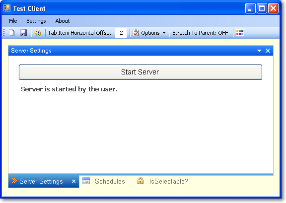
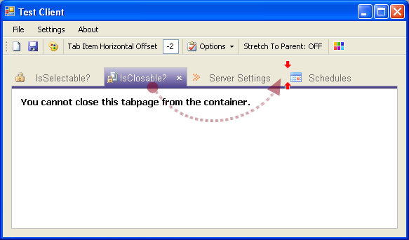
阻止用户操作选择或关闭选项卡页
| 操作 | 代码转储 |
选项卡页选择 |
private void krbTabControl1_SelectedIndexChanging(object sender, SelectedIndexChangingEventArgs e)
{
    if (e.TabPage.Text == "IsSelectable?")
        e.Cancel = true;
}
|
选项卡页关闭 |
private void krbTabControl1_TabPageClosing(object sender, SelectedIndexChangingEventArgs e)
{
    if (e.TabPage.Text == "Schedules")
    {
        if (MessageBox.Show("Do you want to remove the Schedules tab page?",
            Application.ProductName, MessageBoxButtons.YesNo, MessageBoxIcon.Question)
            != DialogResult.Yes)
        {
            e.Cancel = true;
        }
    }
}
|
参考文献
有关更多详细信息,请参阅以下书籍
- C#中的Pro .NET 2.0 Windows窗体和自定义控件,Matthew MacDonald著
- Pro .NET 2.0 图形编程,Eric White著
历史
- 2011年8月1日 - 更新
- 修复了拖放操作。
- 修复了底部对齐的纹理绘制。
- 添加了动态属性支持。
- 添加了助记符支持。
- 通过下拉菜单添加了选项卡页的显示/隐藏功能。
- 为控件标题栏和选项卡页背景添加了透明度支持。
- 添加了键盘用户交互。
- 为数据加载和保存添加了序列化和反序列化支持(Xml和二进制序列化,您可以从
DataSaverAttribute类中选择一个)。 - 2009年7月11日 - 首次发布