
WPF 组合框支持多选
4.93/5 (22投票s)
此组合框支持多选、SelectedItems 属性的双向绑定以及 ItemsSource 属性的原位编辑。
引言
WPF 自带的组合框不支持选择多个项目。此外,WPF 列表框虽然支持多选,但不能在 XAML 中绑定到 SelectedItems 属性。本文将描述一个支持这两种功能的 WPF 组合框。它还将描述一个列表框(组合框继承自它),该列表框支持绑定到 SelectedItems 属性。
要求和设计考虑
一个可绑定的列表框
我将首先描述可绑定的列表框,因为组合框是基于它的。控件的名称是 BindableListBox。
虽然 System.Windows.Controls.ListBox 有一个 SelectedItems 依赖属性,但它是只读的,这意味着您不能在 XAML 中绑定它。但如果可以绑定,那又意味着什么呢?有多种可能性,这使得整个事情相当模糊,这很可能是 Microsoft 不这样做 的原因。但在现实世界中,它通常作为一个“如果能这样就好了”的事情出现,对您的特定情况来说效果会很好,但就是不受支持。我提到这一点是为了强调准确定义“可绑定”SelectedItems 属性的作用的重要性。我是这样定义的:
- 当客户端设置属性时,客户端的存储应反映所有更改。换句话说,属性类型是
IList并且它有一个公共 setter(是的,FxCop 会发出警告,但我想能够直接编辑客户端的列表)。 - 当一个项目被选中或取消选中时——无论是通过 UI 还是通过编程方式——底层存储都应该与视觉显示保持同步。
- 最后,如果(并且仅当)底层存储支持
INotifyCollectionChanged接口,并且其内容从外部修改,则更改应反映在 UI 中。(这遵循 Microsoft 在其他地方使用的一种模式,例如,ListBox的ItemsSource属性,我们将在下面看到。)
另一个考虑因素是 public 接口。假设 MultiListBox 继承自 ListBox(它确实继承),那么选定项属性基本上有两种选择:定义一个全新的属性来保存绑定的选定项列表,或者通过使用同名“new”属性隐藏(非虚拟)ListBox.SelectedItemsProperty 来保持接口与基类不变。我选择了后者,因为我喜欢保持接口与基类接口相同的想法。(当派生类定义一个与基类成员同名同签名的方法、属性或字段,并且基类成员未标记为虚拟时,派生类“隐藏”基类成员。“new”关键字用于表明隐藏基类成员的意图。)
有了这两个决定,实现就相对简单了。BindableListBox 只是一个 ListBox,它用自己的属性隐藏了基类的 SelectedItems。这种更改对用户是透明的。不需要任何 XAML,继承 ListBox 的所有默认视觉效果就足够了。
多选组合框
在我看来,一个带有多选功能的组合框应该如何表现似乎是相当直观的。它应该像一个带有多选功能的列表框,除了下拉菜单。与单选 ComboBox 不同,当选中(或取消选中)一个值时,下拉菜单应该保持打开状态,让用户有机会选择任意多的项目,而无需不断重新打开下拉菜单。当用户在控件外部或下拉按钮上单击时(像 ComboBox),下拉菜单应该关闭。此外,我希望支持单选模式。在单选模式下,MultiComboBox 应该像 ComboBox 一样工作。
设计一个支持多选的组合框时要问的第一个问题是它应该继承自什么?是 Control、MultiSelector、ComboBox 还是 ListBox?如果是 Control,仍然需要嵌入其他三个之一,否则就需要做大量额外的工作。MultiSelector 可能是一个不错的选择,但一方面,我找不到任何使用它的例子,另一方面,您可能会重复 ListBox 或 ComboBox 中已有的许多功能。乍一看,继承自 ComboBox 似乎很明显。但是,由于 ComboBox 不允许多选,您仍然必须嵌入一个 ListBox 才能获得该功能,并且仍然需要覆盖默认模板。MultiComboBox 是一个 ListBox,因为使用 ListBox,我们获得了多选和单选模式以及 ListBox 和 ComboBox 共有的所有标准属性,例如 ItemsSource、SelectedItem 等。这显示了 WPF 的强大功能,可以制作一个实际上是列表框伪装成组合框的组合框。
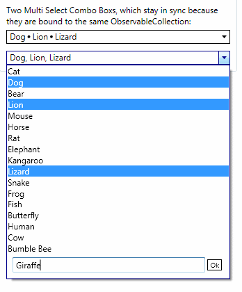
我的用例还需要实现另外几个功能,一个是 SelectedItems 属性可在 XAML 中绑定,这就是 MultiComboBox 继承自 BindableListBox 而不是 ListBox 的原因。另一个功能稍微复杂一些,超出了组合框的正常场景,但我的应用程序需要它。这就是在组合框本身打开时,能够向组合框的项目列表添加项目的能力。我需要在下拉菜单中单击一个“创建新项目”按钮,然后弹出一个文本框,我可以在其中输入新项目的文本。然后,单击“确定”按钮,新文本将添加到组合框的 ItemsSource 中,并自动选中。这是本文随附的示例应用程序中的一个图像:
实现
实现 BindableListBox 需要使基类的 SelectedItems 和派生类的 SelectedItems 相互同步。除了一个或两个注意事项外,它相当直接,我无意在此深入探讨。如果您有兴趣,请下载代码。
MultiComboBox 从 BindableListBox 继承了选择多个项目并在 XAML 中绑定这些项目的能力。那么,要使其成为组合框需要什么呢?主要是它需要下拉菜单。ComboBox 暴露了两个支持下拉菜单行为的依赖属性:IsDropDownOpen 和 MaxDropDownHeight 依赖属性。这些可以使用 DependencyProperty 类的 AddOwner 方法添加到 MultiComboBox(即 ComboBox.MaxDropDownHeight.AddOwner(...),这样做的好处是提供了默认值。一旦这两个属性到位,大部分工作都在控件的模板中完成。
尽管 MultiComboBox 继承自 ListBox,但我希望它看起来像一个组合框,因此我通过研究 ComboBox 的模板来开始创建模板。(为此,我使用 .NET Reflector 和 BAMLViewer 插件,这允许我检查 .NET 程序集 PresentationFramework.Aero.dll 中定义的资源的 XAML)
MultiComboBox 的 XAML 与 ComboBox 的 XAML 惊人地相似。主要区别在于用于显示所选项目文本的内容。在 ComboBox 中,这是一个绑定到 SelectionBoxItem 属性的 ContentPresenter。我选择使用 StackPanel 并在代码中填充其子属性,当选择更改时。当然,另一个主要区别是用于将新项目添加到 ItemsSource 集合的按钮和文本框的部分。这个组件基本上只是附加到 Popup 的底部。它的 Visibility 属性默认是 Collapsed,然后在触发器中设置为 Visible,当 IsCreateNewEnabled 变为 true 时。显示和隐藏下拉菜单(一个 Popup 在这里的工作方式与 ComboBox 相同。切换按钮和弹出窗口都绑定到控件的 IsDropDownOpen 属性。当切换按钮被选中时,IsDropDownOpen 变为 true,这会导致弹出窗口打开。反之亦然。
我必须使用带有 StoryBoard 动画的 EventTrigger 来在单击按钮时显示和隐藏“输入新项目”组件。这有点混乱,但可以在事件触发器中设置 Visibility,使用 ObjectAnimationUsingKeyFrames 集合中的 DiscreteObjectKeyFrame。这是完整的模板:
<ControlTemplate x:Key="MultiSelectComboBoxReadOnlyTemplate"
	TargetType="{x:Type local:MultiComboBox}">
    <Grid>
        <ToggleButton Name="toggleButton" IsTabStop="False"
                      Background="{TemplateBinding Background}"
                      BorderBrush="{TemplateBinding BorderBrush}"
                      BorderThickness="{TemplateBinding BorderThickness}"
                      Template="{StaticResource MultiSelectComboBoxToggleButtonTemplate}"
                      IsChecked="{Binding RelativeSource=
				{RelativeSource TemplatedParent},
			 Path=IsDropDownOpen, Mode=TwoWay}"
                      >
            <StackPanel Name="PART_labelContentPanel" IsHitTestVisible="False"
		Margin="4,0,5,0" Orientation="Horizontal"
                  HorizontalAlignment="{TemplateBinding HorizontalContentAlignment}" />
        </ToggleButton>

        <Popup Name="PART_popup"
               StaysOpen="False"
               AllowsTransparency="True"
               Placement="Bottom"
               IsOpen="{Binding RelativeSource={RelativeSource TemplatedParent},
		Path=IsDropDownOpen}"
               PopupAnimation="Slide">
            <theme:SystemDropShadowChrome Name="Shadow" Color="Transparent"
                                          MaxHeight="{TemplateBinding MaxDropDownHeight}"
                                          MinWidth="{TemplateBinding ActualWidth}">
                <Border BorderBrush="{TemplateBinding BorderBrush}"
                    BorderThickness="{TemplateBinding BorderThickness}"
                    Background="{TemplateBinding Background}">
                    <StackPanel>
                        <ScrollViewer MaxHeight="{TemplateBinding MaxDropDownHeight}" >
                            <ItemsPresenter Margin="{TemplateBinding Padding}"
                            SnapsToDevicePixels="{TemplateBinding SnapsToDevicePixels}" />
                        </ScrollViewer>
                        <Grid Name="EditBoxGrid" Visibility="Collapsed"
					Grid.Row="1" Margin="5" >
                            <Button Name="ShowEditBoxButton" HorizontalAlignment="Right"
                                    Foreground="{TemplateBinding Foreground}"
                                    Style="{StaticResource CreateNewItemButtonStyle}"
                                    Content="Create New Item"
                                    />
                            <Border Margin="3,0,3,3" Name="NewItemEditGroup"
						Visibility="Collapsed">
                                <Grid>
                                    <Grid.ColumnDefinitions>
                                        <ColumnDefinition Width="*"/>
                                        <ColumnDefinition Width="Auto"/>
                                    </Grid.ColumnDefinitions>
                                    <TextBox Grid.Column="0" Background="White"
						Name="PART_textBoxNewItem"/>
                                    <Button Name="PART_newItemCreatedOkButton"
                                        Grid.Column="1"
                                        Margin="3"
                                        Content="Ok"
                                        Foreground="{TemplateBinding Foreground}"
                                        Style="{StaticResource CreateNewItemButtonStyle}"
                                        />
                                </Grid>
                            </Border>
                        </Grid>
                    </StackPanel>
                </Border>
            </theme:SystemDropShadowChrome>
        </Popup>

    </Grid>

    <ControlTemplate.Triggers>
        <Trigger SourceName="PART_popup" Property="HasDropShadow" Value="true">
            <Setter TargetName="Shadow" Property="Margin" Value="0,0,5,5" />
            <Setter TargetName="Shadow" Property="Color" Value="#71000000" />
        </Trigger>
        <Trigger Property="IsMouseOver" Value="True">
            <Setter Property="BorderBrush" Value="{StaticResource ActiveBorderBrush}" />
        </Trigger>
        <Trigger SourceName="toggleButton" Property="IsChecked" Value="True">
            <Setter Property="BorderBrush" Value="{StaticResource ActiveBorderBrush}" />
        </Trigger>

        <Trigger Property="IsCreateNewEnabled" Value="True">
            <Setter TargetName="EditBoxGrid" Property="Visibility" Value="Visible" />
        </Trigger>

        <EventTrigger SourceName="ShowEditBoxButton" RoutedEvent="Button.Click">
            <BeginStoryboard>
                <Storyboard>
                    <ObjectAnimationUsingKeyFrames
				Storyboard.TargetName="NewItemEditGroup"
                                     Storyboard.TargetProperty="Visibility">
                        <DiscreteObjectKeyFrame KeyTime="00:00:00"
				Value="{x:Static Visibility.Visible}" />
                    </ObjectAnimationUsingKeyFrames>
                    <DoubleAnimation Storyboard.TargetName="ShowEditBoxButton"
                                     Storyboard.TargetProperty="Opacity"
                                     To="0" Duration="0:0:0"/>
                    <BooleanAnimationUsingKeyFrames
			Storyboard.TargetName="ShowEditBoxButton"
                                                  Storyboard.TargetProperty="IsTabStop">
                        <DiscreteBooleanKeyFrame Value="False" KeyTime="0:0:0" />
                    </BooleanAnimationUsingKeyFrames>
                </Storyboard>
            </BeginStoryboard>
        </EventTrigger>
        <EventTrigger SourceName="PART_newItemCreatedOkButton"
				RoutedEvent="Button.Click">
            <BeginStoryboard>
                <Storyboard>
                    <ObjectAnimationUsingKeyFrames BeginTime="00:00:00"
                                               Storyboard.TargetName="NewItemEditGroup"
                                               Storyboard.TargetProperty="Visibility">
                        <DiscreteObjectKeyFrame KeyTime="00:00:00"
			Value="{x:Static Visibility.Collapsed}" />
                    </ObjectAnimationUsingKeyFrames>
                    <DoubleAnimation Storyboard.TargetName="ShowEditBoxButton"
                                     Storyboard.TargetProperty="Opacity"
                                     To="1" Duration="0:0:0"/>
                    <BooleanAnimationUsingKeyFrames Storyboard.TargetName=
						"ShowEditBoxButton"
                                                    Storyboard.TargetProperty="IsTabStop">
                        <DiscreteBooleanKeyFrame Value="True" KeyTime="0:0:0" />
                    </BooleanAnimationUsingKeyFrames>

                </Storyboard>
            </BeginStoryboard>
        </EventTrigger>
    </ControlTemplate.Triggers>
</ControlTemplate>
更新选定项目列表的显示必须在代码中完成,每当选择发生变化时,并且可以在重写的 OnSelectionChanged 方法中处理。获取模板中定义的 Panel 的句柄,并用于首先清除当前内容,然后添加选定项目的列表。项目由 DisplaySeparator 分隔,该分隔符可以在 XAML 中设置,可以是任何可以视觉呈现的内容。这里有一个警告是,如果分隔符是 Visual 对象,它只能作为视觉子项使用一次,这意味着它必须进行深克隆。(我在 Justin-Josef Angel 的博客上找到了执行此操作的方法。)
// <summary>
// Sets the display contents for the label.
// Inserts the DisplaySeparator object between items.
// </summary>
private void LoadLabelContents()
{
    // Ignore if the panel is not present.
    if (_labelPanel == null)
        return;

    // Clear current contents.
    _labelPanel.Children.Clear();

    if (SelectionMode != SelectionMode.Single && SelectedItems != null)
    {
        for (int x = 0; x < SelectedItems.Count; x++)
        {
            // For each selected item, create a content control,
            // set the content of the control to be the selected item,
            // and add the content control to the label panel's children.
            ContentControl itemContent = new ContentControl();
            itemContent.IsTabStop = false;
            itemContent.Content = SelectedItems[x];
            _labelPanel.Children.Add(itemContent);

            if (x < SelectedItems.Count - 1)
            {
                // Add the separator, as defined in the DisplaySeparatory property.
                // This can be anything, including a Visual element
	       // that has been defined in xaml,
                // which can only be the visual child once, so do a deep Clone
                // of the Visual before putting adding it to the label.
                ContentControl separatorContent = new ContentControl();
                separatorContent.IsTabStop = false;
                if (DisplaySeparator is Visual)
                    separatorContent.Content = Clone(DisplaySeparator) as Visual;
                else
                    separatorContent.Content = DisplaySeparator;

                _labelPanel.Children.Add(separatorContent);
            }
        }
    }
    else if (SelectedItem != null)
    {
        ContentControl itemContent = new ContentControl();
        itemContent.IsTabStop = false;
        itemContent.Content = SelectedItem;
        _labelPanel.Children.Add(itemContent);
    }
}
将项目添加到 ItemsSource 集合是在“确定”按钮的 Click 事件中处理的。当然,要使此功能正常工作,ItemsSource 需要是 string 集合或可以从 string 转换的类型。为了使下拉菜单中项目的显示更新以包含新项目,ItemsSource 背后的集合需要实现 INotifyCollectionChanged 接口。
使用控件
该控件的使用方式与 ListBox 类似,增加了可绑定的 SelectedItems 属性。需要记住的一点是,要接收选定项目更改的通知,而不处理 ListBox.SelectionChanged 事件,请使用 ObservableCollection 或其他实现 INotifyCollectionChanged 的集合类型。如果集合绑定到其他任何内容,这会非常有用。ItemsSource 的后端存储也适用相同的规则。
此外,IsDropDownOpen 和 MaxDropDownHeight 这两个属性的功能与其在 ComboBox 中的对应属性相同。
要启用在下拉菜单中向项目集合添加项目的功能,请将 IsCreateNewEnabled 设置为 true。
关注点
一个特别棘手的问题是管理下拉菜单的状态。有两种基本方法:将弹出窗口的 StaysOpen 属性设置为 false 和设置为 true。当 StaysOpen 为 false 时,只要弹出窗口检测到系统中的任何鼠标点击,无论是在弹出窗口内部还是外部,或者当前应用程序,它都会自动关闭。当 StaysOpen 为 true 时,除非被告知,否则弹出窗口不会关闭。(这是 Popup 的默认行为。)采用这种方法需要使用全局鼠标钩子来检测系统范围的鼠标点击。这是可行的(Code Project 上有文章演示了如何操作),但使用全局钩子有一定风险,而且无论如何都需要大量额外工作。然而,使用另一种方法,将 StaysOpen 设置为 false,也有其挑战。
在代码中不修改行为,并且模板如上定义的情况下,存在一个明显的问题和一个细微的问题。明显的问题是在多选模式下,下拉菜单在点击其中任何项目时都会关闭。请记住,指定的行为是当项目被点击时下拉菜单保持打开,以便用户可以继续选择。更细微的问题是下拉菜单在 MouseDown 事件上关闭,但检查内置组合框的行为会发现它在 MouseUp 事件上关闭下拉菜单,这是一个更好的效果。避免第一个问题的一个技巧是阻止弹出窗口接收鼠标按下事件。为此,我重写 OnPreviewMouseDown(MouseDown 事件通知从未到达控件,所以我不能使用它)并将事件参数的 Handled 属性设置为 true。但正因为如此,底层列表框没有收到点击事件,所以我必须手动设置当前鼠标下的 ListItem 的 IsSelected 属性。这让我在多选模式下得到了我想要的结果。那么单选模式呢?在这个阶段,当选择一个项目时,下拉菜单不会关闭,而它应该关闭。因为我更喜欢下拉菜单在鼠标抬起事件时关闭,所以我重写了 OnPreviewMouseUp 并添加了代码,以在单选模式下关闭下拉菜单。
嗯,就这些了。我真诚地希望您能发现本文和随附的代码具有信息性、实用性和趣味性。
历史
- 2009年12月1日:首次发布