
玩转 Div 和 Table 布局
5.00/5 (18投票s)
比较和对比使用 div 与 table 的 UI 布局
目录
引言
这是一篇直接的文章,演示了使用 DIV 或 TABLE 元素的一些非常基本的 UI 布局概念。这样做的原因很简单,因为我经常纠结于如何定位 UI 中的元素才能获得我想要的外观和行为。我所说的外观,是指 UI 各部分及其内部元素的定位,而行为则指 UI 在浏览器窗口调整大小时的反应。我没有涵盖设备屏幕尺寸或用“三条杠”下拉菜单替换菜单栏等内容——这些有像 Bootstrap 这样的组件库来处理。
所有这些示例都可以在 Visual Code 中编写代码,并与 Quick HTML Previewer 并排查看,在所有我尝试过的 HTML 预览插件中,这是我发现唯一真正有效的。
基本布局
让我们从一些基本的东西开始——两个行内 div。HTML 代码
<p>Two inline divs:</p>
<div class='border1 quarter inline'>Div 1</div>
<div class='border1 quarter inline m10'>Div 2</div>
以及我用来定义边框、宽度、外边距和行内样式的 CSS
.border1 {
  border-style:solid;
  border-width: 1px;
}

.quarter {
  width: 25%;
}

.inline {
  display: inline-block;
}

.m10 {
  margin-left:10px;
}
效果图
浮动 vs. 行内块
如果你想深入了解这两者,我推荐 Ternstyle 的博客文章 和 Thoughtbot 的博客文章。就目前而言,我们只处理实际问题,也就是 WTF???
让我们用 float 样式来比较一下。HTML 代码
<p>Inline divs using float:<br>
Note a slight shift of Div2 to the left as compared to using inline.</p>
<div class='border1 quarter fleft'>Div 1</div>
<div class='border1 quarter fleft m10'>Div 2</div>
以及 fleft CSS
.fleft {
  float:left;
}

看起来几乎一样,对吧?但请注意,两个 div 之间存在轻微的间距差异

这是为什么呢?嗯,请继续阅读。
字里行间
原来,使用 inline-block 会保留 div 之间的任何文本,而 float 会将 div 之间的文本移到右侧。这是一个重要的行为差异!所以 div 使用 inline-block 之间的差异是因为我在 HTML 中留有空格

看到我精心格式化的 HTML 的缩进了吗?让我们夸大 inline-block 和 float 之间的差异,去掉左外边距并移除编辑器的缩进
<p>Two inline-block divs:</p>
James <div class='border1 quarter inline'>Div 1</div>Tiberius
<div class='border1 quarter inline'>Div 2</div> Kirk

<p>Two float divs:</p>
James <div class='border1 quarter fleft'>Div 1</div>Tiberius
<div class='border1 quarter fleft'>Div 2</div> Kirk
然后我们得到

哦,哇。即使是 inline-block div 之间的回车符也会增加一个空格
<p>Two inline-block divs:</p>
James <div class='border1 quarter inline'>Div 1</div>Tiberius
<div class='border1 quarter inline'>Div 2</div> Kirk
请注意,第二个 div 前面的空格现在已被移除
第一课 - 你的编辑器在扰乱你的思路
你精心格式化的 HTML 缩进,特别是你的编辑器为你进行的 *自动缩进*,正在影响你使用 inline-block 的布局!
第二课 - 你的最小化器也会扰乱你的思路
所以,你在编辑器中创建了完美的布局,然后运行一个最小化器,它可能会删除 div 之间的空格和回车符。突然之间,你的 UI 看起来略有不同!
第三课 - 所有的解决方案都很糟糕
- 删除 div 之间的所有空格和回车符。可读的 HTML 就这样没了。
- 使用
float,但如上文所示,这会对div之间的文本产生副作用。 - 创建一个
font-size为0的容器div,然后覆盖子div中的字体大小。太恶心了。
以及我最喜欢的“开着马桶巴士”的解决方案
James<!--
--><div class='border1 quarter inline'>Div 1</div>Tiberius<!--
--><div class='border1 quarter inline'>Div 2</div> Kirk
好吧。所以,至少在我看来,没有一种可行的解决方案可以在保持 HTML 文档格式美观的同时,在 HTML 被最小化时呈现完全相同的布局。这基本上意味着,始终在最小化后的 HTML 中测试你的布局,而不是在预览编辑器中。当然,据我所知,没有预览编辑器会在将 HTML 输入浏览器之前对其进行最小化。嗯,这是另一个文章主题!当然,如果你有一个非常智能的最小化器,它能保留 inline-block div 之间和周围的空格和回车符,那将会有所帮助。有人有更好的建议吗?
左、中、右,立正!
大多数时候,我需要布局选项,包括能够将整个部分定位在页面左侧、中间和/或右侧,以及将这些部分内的元素定位在左侧、中间、右侧以及顶部、中部或底部。这要求不过分吧?真的。
以下是一个简单布局的 HTML(请注意,我使用的是 float)
<p>Left, centered, and right floating divs:<br>
Note the centered div must come last so the left and right<br>
margins can be computed. Furthermore, we can't use "inline-block",<br>
we have to use "float."</p>
<div class='border1 fleft quarter'>Left</div>
<div class='border1 fright quarter taright'>Right</div>
<div class='border1 center tacenter'>Center</div>
以及额外的 CSS
.center {
  margin-left:auto;
  margin-right:auto;
}

.quarter {
  width: 25%;
}

.fleft {
  float:left;
  padding: 0;
  margin: 0;
}

.fright {
  float:right;
}

.tacenter {
  text-align: center;
}

.taright {
  text-align: right;
}
结果

第三课 - 浮动,而非行内块
- 我们必须使用
float! - 中间的
div必须放在最后!
如果我们尝试在 float 中使用 inline-block,中间的自动外边距将被忽略。使用此 HTML
<div class='border1 inline fleft quarter'>Left</div>
<div class='border1 inline center quarter tacenter'>Center</div>
<div class='border1 inline fright quarter taright'>Right</div>
我们将得到:
这里的问题在于我们指定了中间区域的宽度。这意味着中间区域不会像中间 float 版本那样随着浏览器宽度的缩小而动态扩展。
使用 float
使用 inline-block
相反,使用 inline-block 的中间 div 的宽度由 div 的内容决定。这使得无法将文本右对齐到最右侧 div 的左边缘。明白了吗?如果存在解决方案,我还没找到。有人吗?
第四课 - 始终测试不同的宽度
我们可以得到一些奇怪的效果。给定这个 HTML
<p>Playing with wrapper and inner widths:</p>
<div class='border1 fleft quarter'>Left</div>
<div class='border1 fright right quarter taright'>Right</div>
<div class='border1 center tacenter w40p'>
  <div class='border1 fleft taleft w40p'>Left: Some long text that forces a line wrap.</div>
  <div class='border1 fright right taright w40p'>
   Right: Some long text that forces a line wrap.</div>
  <div class='border1 center tacenter'>Center: Some long text that forces a line wrap.</div>
</div>
我们可以调整浏览器窗口的宽度,然后看到

但是等等!稍微改变一下宽度,我们就会得到

这种效果是由于内部右侧 div 的高度迫使 inner-center 文本底部无法延伸到中心 div 的全部宽度。有道理,对吧?关键在于,始终在不同的浏览器宽度下测试你的布局。当然,是在合理的范围内!
元素的垂直定位
我发现了 vanseo design 的博客文章 解决了我的问题,所以这里的内容只是对他们文章的转述。要实现这个

需要将 div 当作表格单元格处理!这是 HTML 代码
<p>Child element positioning:</p>
  <div class='parent border1 fleft w33p h100px'>
  <div class="child-top-left"><button>Button A</button></div>
</div>
  <div class='parent border1 fleft w33p h100px'>
  <div class="child-middle-center"><button>Button B</button></div>
</div>
  <div class='parent border1 fleft w33p h100px'>
  <div class="child-bottom-right"><button>Button C</button></div>
</div>
这是额外的 CSS
.w33p {
  width: 33%;
}

.h100px {
  height: 100px;
}

.parent {display: table;}

.child-top-left {
  display: table-cell;
}

.child-middle-center {
  display: table-cell;
  vertical-align: middle;
  text-align: center;
}

.child-bottom-right {
  display: table-cell;
  vertical-align: bottom;
  text-align: right;
}
有趣的是,我们使用 text-align 样式来对齐内部 HTML 元素!所以这样做是因为我们创建了模拟表格单元格的 div,这自然地引出了下一节,用表格做同样的事情。但首先……
清除浮动和行内块
考虑这个片段
<div class='border1 quarter inline'>Div 1</div>
<div class='border1 quarter inline m10'>Div 2</div>

<div class='border1 quarter fleft'>Div 1</div>
<div class='border1 quarter fleft m10'>Div 2</div>
结果是

这根本不是我们想要的!为了解决这个问题,我们需要清除左右两侧的 float 元素:。
HTML
<div class='border1 quarter inline'>Div 1</div>
<div class='border1 quarter inline m10'>Div 2</div>

<div class='clear'></div>

<div class='border1 quarter fleft'>Div 1</div>
<div class='border1 quarter fleft m10'>Div 2</div>
CSS
.clear {
  clear:both;
}
导致“换行”
虽然段落会产生相同的效果,但它会在两个 div 之间添加不希望有的垂直间距。
HTML
<div class='border1 quarter inline'>Div 1</div>
<div class='border1 quarter inline m10'>Div 2</div>

<p></p>

<div class='border1 quarter fleft'>Div 1</div>
<div class='border1 quarter fleft m10'>Div 2</div>
结果

固定宽度的左侧和右侧 Div
假设你想要 3 个 div,其中左侧和右侧的 width 是固定的(以像素为单位),而中间的 div 根据浏览器 width 调整大小。我找到的唯一解决方案(在浏览了 SO 后)是使用 calc 样式
<p>Left and Right divs of fixed width:</p>

<div class='parent border1 fleft w100px h100px'>
  <div class="child-top-left"><button>Button A</button></div>
</div>
<div class='parent border1 fleft h100px' style='width: calc(100% - 206px);'>
  <div class="child-middle-center"><button>Button B</button></div>
</div>
<div class='parent border1 fleft w100px h100px'>
  <div class="child-bottom-right"><button>Button C</button></div>
</div>
由于这个计算非常依赖于“row”中的 div 数量,我决定将其作为实际的 style 而不是 CSS 来实现。数字 206 来自左右两侧 div 各 100 像素,加上每个 div 的边框 1 像素:100 + 100 + 1 + 1 + 1 + 1 + 1 + 1 = 206。
结果在任何浏览器窗口宽度下都能很好地工作

这个魔法数字不太理想,与使用表格的解决方案相比。
根据 Mozilla 文档:“calc() CSS 函数允许你在指定 CSS 属性值时执行计算。它可以在允许 <length>、<frequency>、<angle>、<time>、<percentage>、<number> 或 <integer> 的任何地方使用。”
Div 滚动
很多时候,你会看到一个 div,当内容超出高度时会显示滚动条。让我们看看如何使用 overflow-y 和 height 样式来完成这个操作。
HTML
<p>Left div scrolling:</p>
<div class='parent border1 fleft w100px h100px'>
  <div class="child-top-left">
    <div class='scrolly h100p'>
      <p>Menu Item 1</p>
      <p>Menu Item 2</p>
      <p>Menu Item 3</p>
      <p>Menu Item 4</p>
      <p>Menu Item 5</p>
      <p>Menu Item 6</p>
    </div>
  </div>
</div>
  <div class='parent border1 fleft h100px' style='width: calc(100% - 206px);'>
  <div class="child-middle-center"><button>Button B</button></div>
</div>
  <div class='parent border1 fleft w100px h100px'>
  <div class="child-bottom-right"><button>Button C</button></div>
</div>
额外的 CSS
.h100p {
  height: 100%;
}

.scrolly {
  overflow-y: auto;
}
请注意,我们必须为子 div 使用一个内部 div。结果是

如果子元素的内部 div 的高度小于子 div 的高度,scrollbar 就会消失。然而,我们失去了垂直对齐内部元素的能力;它们仍然可以水平对齐。这有一定的道理,因为为什么会有一个内容垂直居中或底部的滚动条呢?
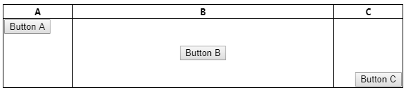
使用 Table 而非 Div
让我们直奔主题,使用实际的表格、行和列来重现之前的布局。这是 HTML 代码
<p>Tables instead of Divs</p>
<table class='w100p'>
  <tr>
    <th>A</th>
    <th>B</th>
    <th>C</th>
  </tr>
  <tr class='h100px'>
    <td class='border1 w33p vatop'><button>Button A</button></td>
    <td class='border1 w33p tacenter vacenter'><button>Button B</button></td>
    <td class='border1 w33p taright vabottom'><button>Button C</button></td>
  </tr>
</table>
以及 CSS
.w100p {
  width: 100%;
}

.taleft {
  text-align: left;
}

.tacenter {
  text-align: center;
}

.taright {
  text-align: right;
}

.vatop {
  vertical-align: top;
}

.vamiddle {
  vertical-align: middle;
}

.vabottom {
  vertical-align: bottom;
}
结果是

请注意列之间的间距?要消除它,我们必须使用 border-collapse 样式
HTML
<table class='w100p noborders'>
CSS
.noborders {
  border-collapse: collapse;
}
结果是

第五课 - 隐藏的间距
与 div 一样,表格列也存在你可能不知道的隐藏间距。我开始意识到,最好用边框围绕 *所有内容* 来开始 UI 布局设计,这样你就能确切地了解布局中发生的一切!这可以通过指定元素的 CSS 样式轻松完成,例如
table {
  border-style:solid;
  border-width: 1px;
}

th {
  border-style:solid;
  border-width: 1px;
}

tr {
  border-style:solid;
  border-width: 1px;
}

td {
  border-style:solid;
  border-width: 1px;
}
当您对布局满意后,可以删除此 CSS。
固定宽度列
在这里,auto 样式和 col 元素起到了作用。以下示例说明了左右两侧列的宽度固定,而中间的列的尺寸则适合两者之间。
HTML(请注意,我使用了上面描述的元素 CSS 来为 table、tr、th 和 td 元素设置边框)
<p>Three column with left and right in fixed pixels</p>
<table class='w100p noborders' style='table-layout:fixed'>
  <col class='w100px'/>
  <col class='wauto'/>
  <col class='w100px'/>
  <tr>
    <th>A</th>
    <th>B</th>
    <th>C</th>
  </tr>
  <tr class='h100px'>
    <td class='vatop'><button>Button A</button></td>
    <td class='tacenter vacenter'><button>Button B</button></td>
    <td class='taright vabottom'><button>Button C</button></td>
  </tr>
</table>
额外的 CSS
.w100px {
  width: 100px;
}

.wauto {
  width: auto;
}
这导致中间列随着浏览器宽度的增加/减小而调整大小,而左侧和右侧列则保持固定宽度。

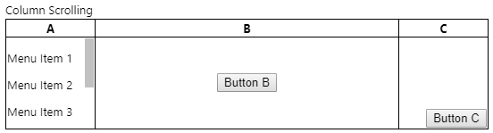
列滚动
与 div 一样,让我们看看是否能在列中实现滚动。解决方案很简单——在 td 内部放置一个 div!与 div 部分描述的方法相比,请特别注意,当使用 div 时,height 被指定为 100%,而在这里,它被指定为列高度,100 *像素*,与外部 tr 高度匹配。
HTML
<p>Column Scrolling</p>
<table class='w100p noborders' style='table-layout:fixed'>
  <col class='w100px'/>
  <col class='wauto'/>
  <col class='w100px'/>
  <tr>
    <th>A</th>
    <th>B</th>
    <th>C</th>
  </tr>
  <tr class='h100px'>
    <td class='vatop'>
      <div class='scrolly h100px'>
        <p>Menu Item 1</p>
        <p>Menu Item 2</p>
        <p>Menu Item 3</p>
        <p>Menu Item 4</p>
        <p>Menu Item 5</p>
        <p>Menu Item 6</p>
      </div>
    </td>
    <td class='tacenter vacenter'><button>Button B</button></td>
    <td class='taright vabottom'><button>Button C</button></td>
  </tr>
</table>
额外的 CSS
.scrolly {
  overflow-y: auto;
}
然后我们得到
结论
今天就到这里。我在这里展示了,你可以同样有效地使用 div 和 table 来进行布局控制,尽管考虑到 div 布局的某些方面需要 div 的行为像 table 和 table 单元格,这似乎表明使用 table 比使用 div 更好。此外,一些奇怪的事情,比如使用 calc() 函数,在使用表格时是不必要的。我希望你至少读得开心,并学到了一两样东西。如果有什么更好的方法,请留下评论!