
Blazor 和 CSS 框架
4.87/5 (9投票s)
如何自定义 Blazor 中的默认 CSS 设置,以及对新的 Scoped CSS 的介绍
引言
本文涵盖
- 自定义已部署的 BootStrap
- 如何切换到不同的 CSS 框架
- 新的 Scoped CSS 功能
请注意,本文档面向的是对 DotNetCore 和 Blazor 相对较新的程序员,并假设您对 SASS 有一定的了解。本文档还假设您正在使用 Visual Studio 2019 - 我使用的是社区版。
代码可在 GitHub 上的 Blazor.CSS 中找到。
入门
- 使用 Net5 创建一个新的 Blazor 应用程序。我在提供的代码中使用了 Server,但 Server 和 WASM 之间没有区别。
- 运行站点以确保其正常工作。
- 安装 Web Compiler 扩展。选择“扩展”>“管理扩展”。您需要重新启动 Visual Studio 以完成安装。
设置 SASS
- 向项目中添加 SASS 文件夹。
- 将 wwwroot/css/site.css 文件移动到 SASS 文件夹中,并将其重命名为 custom.scss。
- 向文件夹中添加 bootstrap-site.scss。
- 右键单击文件 > Web Compiler > Compile File(编译文件)。
- 这将向项目中添加一个 compilerconfig.json 文件。这是 Web Compiler 的配置文件。
compilerconfig.json 将如下所示
[ { "outputFile": "SASS/bootstrap-site.css", "inputFile": "SASS/bootstrap-site.scss" } ] - 将其更改为将编译后的文件输出到网站
[ { "outputFile": "wwwroot/css/site.css", "inputFile": "SASS/bootstrap-site.scss" } ] - 保存后,一个新的 site.css 文件应出现在 wwwroot/css 文件夹中。由于源文件为空,因此其中将没有任何内容。
设置 Bootstrap
- 在 SASS 文件夹中添加一个 Bootstrap 文件夹。
- 在 Bootstrap 文件夹中添加一个 custom 文件夹。
- 从 Bootstrap 网站下载 Bootstrap Source,并将 scss 文件夹复制到 Bootstrap 文件夹中。
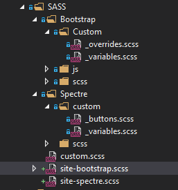
完整的 SASS 文件夹(包括我们稍后将添加的 Spectre 和其他文件)应如下所示

- 编辑 SASS/bootstrap-site.scss。
/* Source SASS file to build custom Bootstrap site file */
@import "../wwwroot/css/open-iconic/font/css/open-iconic-bootstrap.min.css";
@import "Bootstrap/scss/_functions";
@import "Bootstrap/scss/bootstrap";
/* This is the original site.css file that contains the site specific customizations*/
@import "custom.scss";
- 保存后,Web Compiler 将编译一个新的 site.css 文件。请注意 Visual Studio 左下角的编译状态。
您应该在 wwwroot/css 文件夹中有一个 *site.css 和一个 site.min.css 文件。
- 编辑 _Host.cshtml,并删除对 bootstrap.min.css 的引用 - 现在所有 CSS 都已编译到 site.css 中。
<head> <meta charset="utf-8" /> <meta name="viewport" content="width=device-width, initial-scale=1.0" /> <title>Blazor.CSS</title> <base href="~/" /> \\ Remove bootstrap CSS reference <link rel="stylesheet" href="css/bootstrap/bootstrap.min.css" /> \\ <link href="css/site.css" rel="stylesheet" /> \\ This is the new Net5 build generated Scoped CSS stylesheet \\ more later in this article <link href="Blazor.CSS.styles.css" rel="stylesheet" /> </head> - 运行项目。一切应该与之前相同。
自定义 Bootstrap
我们通过添加新的 scss 文件来定制 Bootstrap。我假设您对 SASS 有基本的了解。如果没有,请做一些背景阅读 - 这并不复杂。
为了演示定制,我们将调整一些颜色并添加一些新的按钮样式。大部分代码源自 SB2 Bootstrap 模板。
将 _variables.scss 添加到 SASS/custom 文件夹中,并添加以下内容。您可以将其与基础 SASS/Bootstrap/scss/_variables.scss 进行比较,以查看差异。
// Override Bootstrap default variables here
// Do not edit any of the files in /bootstrap/scss/!

// Color Variables
// Bootstrap Color Overrides

$white: #fff !default;
$gray-100: #f8f9fc !default;
$gray-200: #eaecf4 !default;
$gray-300: #dddfeb !default;
$gray-400: #d1d3e2 !default;
$gray-500: #b7b9cc !default;
$gray-600: #858796 !default;
$gray-700: #6e707e !default;
$gray-800: #5a5c69 !default;
$gray-900: #3a3b45 !default;
$black: #000 !default;

// We've adjusted the colors
$blue: #4e73df !default;
$indigo: #6610f2 !default;
$purple: #6f42c1 !default;
$pink: #e83e8c !default;
$red: #e74a3b !default;
$orange: #fd7e14 !default;
$yellow: #f6c23e !default;
$green: #1cc88a !default;
$teal: #20c9a6 !default;
$cyan: #36b9cc !default;

$primary: $blue !default;
$secondary: $gray-600 !default;
$success: $green !default;
$info: $cyan !default;
$warning: $yellow !default;
$danger: $red !default;
$light: $gray-100 !default;
$dark: $gray-800 !default;
$brand: #b3ccff;

$theme-colors: () !default;
// stylelint-disable-next-line scss/dollar-variable-default

// We've added brand, add, edit,...
$theme-colors: map-merge( (
    "primary": $primary,
    "secondary": $secondary,
    "success": $success,
    "info": $info,
    "warning": $warning,
    "danger": $danger,
    "error": $danger,
    "light": $light,
    "dark": $dark,
    "brand": $brand,
    "add": $primary,
    "new": $info,
    "edit": $primary,
    "delete": $danger,
    "nav": $secondary,
    "change": $warning,
    "save": $success
),
$theme-colors );

// Custom Colors
$brand-google: #ea4335 !default;
$brand-facebook: #3b5998 !default;

// Set Contrast Threshold
$yiq-contrasted-threshold: 195 !default;

// Typography
$body-color: $gray-600 !default;

$font-family-sans-serif: "Nunito", -apple-system, BlinkMacSystemFont,
 "Segoe UI", Roboto, "Helvetica Neue", Arial, sans-serif, "Apple Color Emoji",
 "Segoe UI Emoji", "Segoe UI Symbol", 'Noto Color Emoji' !default;

$font-size-base: .925rem !default;
$font-size-lg: $font-size-base * 1.20 !default;
$font-size-sm: $font-size-base * .875 !default;

$font-weight-light: 300 !default;
// $font-weight-base: 400;
$headings-font-weight: 400 !default;

// Shadows
$box-shadow-sm: 0 0.125rem 0.25rem 0 rgba($gray-900, .2) !default;
$box-shadow: 0 0.15rem 1.75rem 0 rgba($gray-900, .15) !default;
// $box-shadow-lg: 0 1rem 3rem rgba($black, .175) !default;

// Borders Radius
$border-radius: 0.35rem !default;
$border-color: darken($gray-200, 2%) !default;

// Spacing Variables
// Change below variable if the height of the navbar changes
$topbar-base-height: 4.375rem !default;
// Change below variable to change the width of the sidenav
$sidebar-base-width: 14rem !default;
// Change below variable to change the width of the sidenav when collapsed
$sidebar-collapsed-width: 6.5rem !default;

// Card
$card-cap-bg: $gray-100 !default;
$card-border-color: $border-color !default;

// Adjust column spacing for symmetry
$spacer: 1rem !default;
$grid-gutter-width: $spacer * 1.5 !default;

// Transitions
$transition-collapse: height .15s ease !default;

// Dropdowns
$dropdown-font-size: 0.85rem !default;
$dropdown-border-color: $border-color !default;

/* turn off rounding */
$enable-rounded: false;
将 _overrides.scss 添加到 SASS/custom 文件夹中,并添加以下内容。它演示了您可以进行的更改类型 - 我们实际上并没有在网站上使用它。
/* Reduce the default form-group bottom margin*/
.form-group {
    margin-bottom: .25rem;
}

/* set new margins and padding for small alerts*/
div.alert-sm .alert {
    padding: .25rem 1.25rem;
    margin-bottom: 0rem;
}
构建自定义 Bootstrap
要构建自定义版本的 Bootstrap,我们需要将新的 SASS 文件添加到编译过程中。
编辑 SASS/bootstrap-site.scss
/* Source SASS file to build custom Bootstrap site file */
@import "../wwwroot/css/open-iconic/font/css/open-iconic-bootstrap.min.css";
@import "Bootstrap/scss/_functions";
@import "Bootstrap/Custom/_variables";
@import "Bootstrap/scss/bootstrap";
@import "Bootstrap/Custom/_overrides";
/* This is the original site.css file that contains the site specific customizations*/
@import "custom.scss";
保存后,这应该会编译成功。
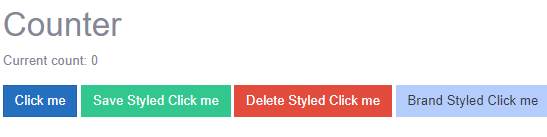
要查看更改,请编辑 Pages/Counter.razor 文件,并在页面上添加几个额外的按钮。
<button class="btn btn-primary" @onclick="IncrementCount">Click me</button>
<button class="btn btn-save" @onclick="IncrementCount">Save Styled Click me</button>
<button class="btn btn-delete" @onclick="IncrementCount">Delete Styled Click me</button>
<button class="btn btn-brand" @onclick="IncrementCount">Brand Styled Click me</button>
运行站点并导航到计数器页面以检查按钮定制。它们应该看起来像这样
更改 CSS 框架
并非每个人都想使用 Bootstrap - 有些人喜欢与众不同!在本节中,我们将切换到 Spectre。
- 从 Github 下载 Spectre 代码:Github。
- 在 SASS 文件夹中创建一个 Spectre 目录。
- 在 Spectre 文件夹中创建一个 scss 目录。
- 将 spectre.src 的内容复制到 SASS/Spectre/scss 目录中。
- 在 SASS 文件夹中创建 site-spectre.scss 文件,并添加以下代码
@import "Spectre/scss/spectre";
- 编辑 compilerconfig.json
[
  {
    "outputFile": "wwwroot/css/site.css",
    "inputFile": "SASS/site.scss"
  },
  {
    "outputFile": "wwwroot/css/spectre.css",
    "inputFile": "SASS/site-spectre.scss"
  },
  {
    "outputFile": "wwwroot/css/spectre-icons.css",
    "inputFile": "SASS/Spectre/scss/Spectre-icons.scss"
  }
]
保存后,您应该会在 wwwroot/css 文件夹中得到一个编译后的 spectre.css 和 spectre-icons.css 文件。
自定义
在 SASS/Spectre 文件夹中添加 custom 目录。
添加 _variables.scss
// Control colors
$brand-color: #7952b3 !default;
$exit-color: #66758c !default;
$save-color: #32b643 !default;
$delete-color: #e85600 !default;
添加 _buttons.scss
// Button Colors
.btn {
    &.btn-exit {
        @include button-variant($exit-color);
    }
    &.btn-brand {
        @include button-variant($brand-color);
    }
    &.btn-delete {
        @include button-variant($delete-color);
    }
}
编辑 SASS/site-spectre.scss
@import "Spectre/custom/_variables";
@import "Spectre/scss/spectre";
@import "Spectre/custom/_buttons";
最后,将 _Host.cshtml 文件更改为使用新的 CSS
<head>
    <meta charset="utf-8" />
    <meta name="viewport" content="width=device-width, initial-scale=1.0" />
    <title>Blazor.CSS</title>
    <base href="~/" />
    \\ Link to the new custom Spectre CSS
    <link href="css/spectre.css" rel="stylesheet" />
    <link href="Blazor.CSS.styles.css" rel="stylesheet" />
</head>
运行站点。
外观会略有不同 - 需要一些工作来修复小问题,但基本功能可用。转到计数器页面查看不同的按钮 - Spectre 和 Bootstrap 的按钮类名非常相似,所以可以使用。

Scoped CSS - 组件样式
Net5 中的一项新功能是 Scoped CSS,也称为组件样式。查看项目中的 Shared 文件夹,您会看到附加到 NavMenu 和 MainLayout Razor 组件的 CSS 文件。

为了探索其工作原理,让我们重新样式化 FetchData 数据表。
- 在 Shared 文件夹中添加一个新的 Razor 组件 DataGrid.razor,并添加以下代码 - 这是现有 fetchdata 代码的修改版本。
@using Blazor.CSS.Data @if (forecasts == null) { <p><em>Loading...</em></p> } else { <table class="table"> <thead> <tr> <th>Date</th> <th>Temp. (C)</th> <th>Temp. (F)</th> <th>Summary</th> <th class="max-column">Detail</th> </tr> </thead> <tbody> @foreach (var forecast in forecasts) { <tr> <td>@forecast.Date.ToShortDateString()</td> <td>@forecast.TemperatureC</td> <td>@forecast.TemperatureF</td> <td>@forecast.Summary</td> <td class="max-column"> <div class="grid-overflow"> <div class="grid-overflowinner"> @($"The Weather Forecast for this {forecast.Date.DayOfWeek}, the {forecast.Date.Day} of the month {forecast.Date.Month} in the year of our Lord {forecast.Date.Year} is {forecast.Summary}") </div> </div> </td> </tr> } </tbody> </table> } @code { [Parameter] public WeatherForecast[] forecasts { get; set; } = null; } - 在 Shared 文件夹中添加 DataGrid.razor.css。它应该与 DataGrid.razor 相关联。组件特定的 CSS 在这里编写。我们添加了一些 CSS 来格式化 max 列并优雅地处理文本溢出。
.max-column { width:50%; } .grid-overflow { display: flex; } .grid-overflowinner { flex: 1; width: 1px; overflow-x: hidden; white-space: nowrap; text-overflow: ellipsis; } - 修改 Fetchdata 以使用新组件。
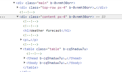
@page "/fetchdata" @using Blazor.CSS.Data @inject WeatherForecastService ForecastService <h1>Weather forecast</h1> <p>This component demonstrates fetching data from a service and a data grid to displaying it.</p> <DataGrid forecasts="this.forecasts"></DataGrid> @code { private WeatherForecast[] forecasts; protected override async Task OnInitializedAsync() { forecasts = await ForecastService.GetForecastAsync(DateTime.Now); } } - 运行站点,
Fetchdata应该看起来像这样
注意 max 列在页面宽度减小时的省略号截断效果。

发生了什么
在浏览器中打开开发人员工具,查看 HTML。
注意 HTML 中各种元素使用的新唯一 ID 属性。
查看 Blazor.CSS.styles.css - 这是 Blazor 在构建过程中生成的 CSS 文件。您可以看到使用唯一 ID 对组件进行范围限定的 CSS。

最后,在项目中的解决方案资源管理器中查看 obj 视图。您可以看到为每个组件生成的特定 CSS 文件以及基于项目名称的捆绑文件。这在 wwwroot 文件夹中可见。

总结
在 Blazor 中部署和使用自定义 CSS 有许多方法。这是一种方法,但可能是最简单的一种。
我在这里介绍了 Scoped CSS,虽然我不确定我将使用它多少。
历史
- 2020 年 12 月 16 日:初始版本