
C# 自定义控件, 具有可折叠面板
4.74/5 (31投票s)
一个 C# 自定义控件,
引言
在使用 ASP.NET AJAX CollapsiblePanel 控件扩展时,我发现它非常实用,可以将更多内容放入相对较小的网页或屏幕空间中。因此,我认为为 WinForm 应用程序提供这种控件会很好,因为 VS 2005 和 VS 2008 工具箱中没有提供这种控件。
背景
CollapsiblePanel AJAX Web 控件是一个很棒的 Web 控件。但不幸的是,VS 2005 或 VS 2008 标准工具箱中没有这种控件,所以我决定创建一个并与社区分享。
在设计时使用控件
在设计时使用该控件非常简单。基本上,它的行为方式与普通 Panel 相同,只是它可以展开和折叠。
将控件添加到工具箱后,将其拖放到表单的设计图面上,您将获得
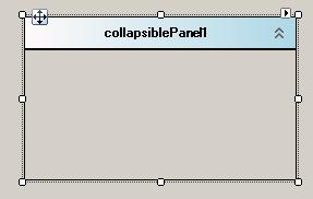
单击控件时会显示智能标签,打开窗口显示面板的新功能和属性,我们可以使用这些功能和属性来自定义面板。

运行时控件
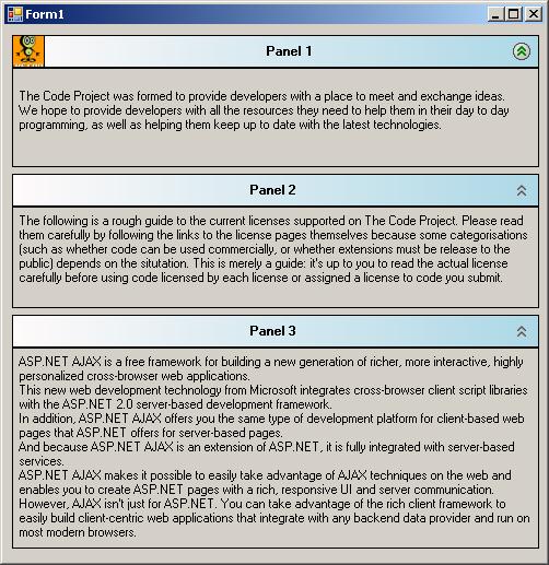
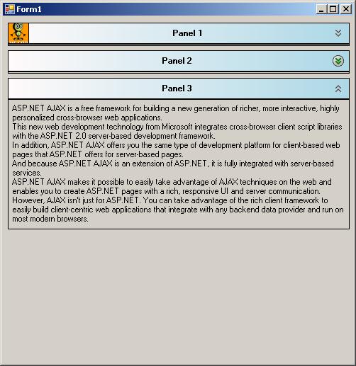
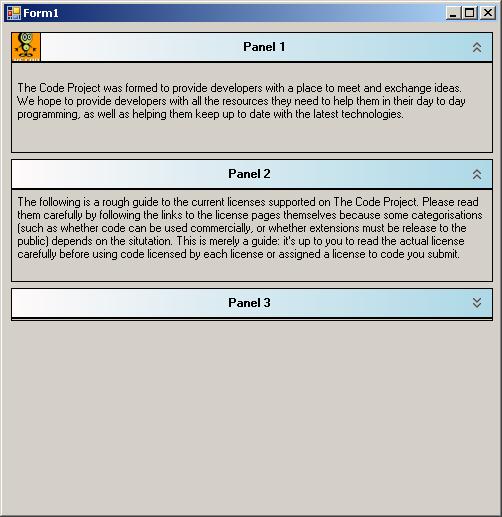
以下是一些显示运行时控件的图片
当鼠标悬停在展开/折叠图像上时,图像将被突出显示以显示可以触发该操作。
有些面板已折叠。
折叠的面板再次展开。
Using the Code
此示例演示如何实例化 CollapsiblePanel 并使用它。
this.collapsiblePanel1 = new OVT.CustomControls.CollapsiblePanel();
//
// collapsiblePanel1
//
            this.collapsiblePanel1.BackColor = System.Drawing.Color.Transparent;
            this.collapsiblePanel1.HeaderCornersRadius = 5;
            this.collapsiblePanel1.HeaderFont =
		new System.Drawing.Font("Microsoft Sans Serif",
			8.25F, System.Drawing.FontStyle.Bold);
            this.collapsiblePanel1.HeaderImage = null;
            this.collapsiblePanel1.HeaderText = "My Collapsible panel\'s header";
            this.collapsiblePanel1.HeaderTextColor = System.Drawing.Color.Black;
            this.collapsiblePanel1.Location = new System.Drawing.Point(88, 50);
            this.collapsiblePanel1.Name = "collapsiblePanel1";
            this.collapsiblePanel1.RoundedCorners = true;
            this.collapsiblePanel1.Size = new System.Drawing.Size(316, 204);
            this.collapsiblePanel1.TabIndex = 0;
            this.collapsiblePanel1.UseAnimation = true;
// Form1
//
this.AutoScaleDimensions = new System.Drawing.SizeF(6F, 13F);
this.AutoScaleMode = System.Windows.Forms.AutoScaleMode.Font;
this.ClientSize = new System.Drawing.Size(571, 353);
this.Controls.Add(this.collapsiblePanel1);
this.Name = "Form1";
this.Text = "Form1";
this.ResumeLayout(false);
代码解释
CollapsiblePanel 简单地从 System.Windows.Forms.Panel 类派生而来。
我添加了一个子面板,用于渲染面板的标题,但更重要的是,用于托管两个 PictureImage 控件,一个位于右上角,用于显示展开/折叠按钮,另一个位于左上角,用于托管开发人员指定的任何图像。
代码中最重要的一部分在于 OnPaint 方法,自定义控件渲染就在这里进行。该方法被重写,以便进行自定义绘制。
protected override void OnPaint(PaintEventArgs e)
{
    base.OnPaint(e);
    DrawHeaderPanel(e);
}
private void DrawHeaderPanel(PaintEventArgs e)
{
    Rectangle headerRect = pnlHeader.ClientRectangle;
// if header rectangle is empty then escape painting.
if (headerRect.Width * headerRect.Height == 0)
    return;
LinearGradientBrush headerBrush = new LinearGradientBrush(
    headerRect, Color.Snow, Color.LightBlue, LinearGradientMode.Horizontal);

if (!roundedCorners)
{// Fill a regular rectangle.
    e.Graphics.FillRectangle(headerBrush, headerRect);
    if (showHeaderSeparator)
    {
        e.Graphics.DrawRectangle(new Pen(headerTextColor), headerRect);
    }
}
else
// Fill rounded rectanlge
DrawHeaderCorners(e.Graphics, headerBrush, headerRect.X,
	headerRect.Y, headerRect.Width, headerRect.Height, headerCornersRadius);

        // Draw header separator
if (showHeaderSeparator)
{
    Point start = new Point(pnlHeader.Location.X,
	pnlHeader.Location.Y+ pnlHeader.Height);
    Point end = new Point(pnlHeader.Location.X+
	pnlHeader.Width, pnlHeader.Location.Y+ pnlHeader.Height);
    e.Graphics.DrawLine(new Pen(headerTextColor, 2), start, end);
    // Draw rectangle lines for the rest of the control.
    Rectangle bodyRect = this.ClientRectangle;
    bodyRect.Y += this.pnlHeader.Height;
    bodyRect.Height -= (this.pnlHeader.Height+1);
    bodyRect.Width -= 1;
    e.Graphics.DrawRectangle(new Pen(headerTextColor), bodyRect);
}

int headerRectHeight = pnlHeader.Height;
// Draw header image.
if (headerImage != null)
{
    pictureBoxImage.Image = headerImage;
    pictureBoxImage.Visible = true;
}
else
{
    pictureBoxImage.Image = null;
    pictureBoxImage.Visible = false;
}

// Calculate header string position.
if (!String.IsNullOrEmpty(headerText))
{
    useToolTip = false;
    int delta = pictureBoxExpandCollapse.Width+5;
    int offset = 0;
    if (headerImage != null)
    {
        offset = headerRectHeight;
    }
    PointF headerTextPosition = new PointF();
    Size headerTextSize = TextRenderer.MeasureText(headerText, headerFont);
    if (headerTextAutoEllipsis)
    {
//If using autoEllipsis then manage to show tooltip containing the complete text.
                    if (headerTextSize.Width >= headerRect.Width - (delta+offset))
                    {
                        RectangleF rectLayout =
                            new RectangleF((float)headerRect.X + offset,
                            (float)(headerRect.Height - headerTextSize.Height) / 2,
                            (float)headerRect.Width - delta,
                            (float)headerTextSize.Height);
                        StringFormat format = new StringFormat();
                        format.Trimming = StringTrimming.EllipsisWord;
                        e.Graphics.DrawString(headerText, headerFont,
			new SolidBrush(headerTextColor),
                            rectLayout, format);

                        toolTipRectangle = rectLayout;
                        useToolTip = true;
                    }
                    else
                    {
                        headerTextPosition.X =
			(offset + headerRect.Width - headerTextSize.Width) / 2;
                        headerTextPosition.Y =
			(headerRect.Height - headerTextSize.Height) / 2;
                        e.Graphics.DrawString(headerText, headerFont,
				new SolidBrush(headerTextColor),
                            headerTextPosition);
                    }
                }
                else
                {
                    headerTextPosition.X = (offset + headerRect.Width -
			headerTextSize.Width) / 2;
                    headerTextPosition.Y = (headerRect.Height -
			headerTextSize.Height) / 2;
                    e.Graphics.DrawString(headerText, headerFont,
			new SolidBrush(headerTextColor),
                        headerTextPosition);
                }
            }
        }
要绘制带有圆角的矩形,我们使用 GraphicPath 对象,如下所示
public void DrawHeaderCorners(Graphics g, Brush brush, float x,
		float y, float width, float height, float radius)
        {
            GraphicsPath gp = new GraphicsPath();

            gp.AddLine(x + radius, y, x + width - (radius * 2), y); // Line
            gp.AddArc(x + width - (radius * 2), y,
		radius * 2, radius * 2, 270, 90); // Corner
            gp.AddLine(x + width, y + radius, x + width, y + height ); // Line
            gp.AddLine(x + width , y + height, x , y + height); // Line
            gp.AddLine(x, y + height , x, y + radius); // Line
            gp.AddArc(x, y, radius * 2, radius * 2, 180, 90); // Corner
            gp.CloseFigure();
            g.FillPath(brush, gp);
            if (showHeaderSeparator)
            {
                g.DrawPath(new Pen(headerTextColor), gp);
            }
            gp.Dispose();
        }
在不使用动画的情况下展开或折叠面板非常简单。所有操作就是将面板的高度设置为与标题面板相同,如这段从 ExpandOrCollapse() 方法中提取的代码所示
if (!useAnimation)
            {
                if (collapse)
                {
                    originalHight = this.Height;
                    this.Height = pnlHeader.Height + 3;
                    pictureBoxExpandCollapse.Image = Resources.expand;
                }
                else
                {
                    this.Height = originalHight;
                    pictureBoxExpandCollapse.Image = Resources.collapse;
                }
            }
现在,如果使用动画进行展开/折叠操作,将使用计时器来控制展开/折叠速度。
else
            {
                // Keep original height only in case of a collapse operation.
                if(collapse)
                    originalHight = this.Height;

                timerAnimation.Enabled = true;
                timerAnimation.Start();
            }
private void timerAnimation_Tick(object sender, EventArgs e)
{
    if (collapse)
    {
        if (this.Height <= pnlHeader.Height + 3)
        {
            timerAnimation.Stop();
            timerAnimation.Enabled = false;
            pictureBoxExpandCollapse.Image = Resources.expand;
        }
        else
        {
            int newHight = this.Height - 20;
            if (newHight <= pnlHeader.Height + 3)
                newHight = pnlHeader.Height + 3;
            this.Height = newHight;
        }
    }
    else
    {
        if (this.Height >=  originalHight)
        {
            timerAnimation.Stop();
            timerAnimation.Enabled = false;
            pictureBoxExpandCollapse.Image = Resources.collapse;
        }
        else
        {
            int newHeight = this.Height + 20;
            if (newHeight >= originalHight)
                newHeight = originalHight;
            this.Height = newHeight;
        }
    }
}
关注点
编写这个自定义控件非常简单。所有需要做的就是了解如何操作图形并绘制项目。
历史
- 首次发布于 2010/01/19