
iPhone 类控件 for .Net 第一部分:Rotator
iPhone 选择旋转器作为 Winform .Net 控件
更新 2014年7月29日
Zip 文件包含一个 Visual Studio 项目家族,由三个项目组成。
- IOSrotor
- IOSswitch
- 测试
开发系统:VisualStudio 2012
框架:.Net 4.5
语言:VB.Net


引言
你喜欢这些 iOS (iPhone/iPad) 控件吗?如果是,我采用了基本思路,并开发了一些相等的控件供 Winform 在 .Net 中使用。
这是两个控件中的第一个,另一个控件是
- IOSswitch 一个带 2 种模式(开关和滑动)的动画开关
- 文章iPhone 类控件 for .Net 第二部分。
https://codeproject.org.cn/Articles/799890/iPhone-like-controls-for-Net-Part-2-IOS-switch
我知道有一篇关于带类似 WPF 控件的 Code Project Rotator 控件的文章,我也知道可以在 Winform 中使用 WPF 控件,但我不喜欢这种变通方法,因此我开发了这个漂亮的控件来扩展在 Winform 中向用户展示选择列表的可能性。
ISOrotor 能为你做什么?
A) 对用户而言。
- 通过使用鼠标滚轮或键盘的向上/向下键在字符串或图像列表项中循环。
- 通过单击选择器(控件的中间区域)来选择/选取某个项目。
- 看到圆柱体向前或向后移动时循环。
- 如果控件获得焦点,则看到边框。
- 使用向上/向下键而不是鼠标滚轮。
B) 对开发者而言
- 选择要使用的项目类型(字符串或图像),并预设 3-15 个要显示的字符串或图像。
- 为每个图像指定唯一的名称作为标识符。
- 更改项目的前景色和对齐方式。
- 更改选择器(中间可点击的选取区域)的字体和前景色。
- 更改循环圆柱体的颜色。
- 决定选择器区域是否用半透明绿色高亮显示。
- 决定选择器区域是否有边框。
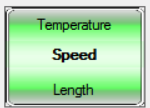
示例请参见上图。
基本思路
控件的基础是一个 UserControl,它包含 3 个透明面板。Panel A 停靠在顶部,Panel C 停靠在底部,Panel B(选择器)在中间。
每个面板包含一个 Label 和一个 PictureBox 控件。根据属性 ItemType 的值,Label 或 PictureBox 可见。
为了模仿预定义项目(字符串或图像)的循环,我们将它们向上或向下移动到上面/下面面板的下一个/上一个 Label/PictureBox。
开始时,预定义项目列表的第一个项目显示在中间区域(在选择器中)。
项目以无限链的形式呈现。
使用代码
使用的图像可能具有透明的 Alpha 通道,尺寸不小于 150x99 像素。之所以使用这么大的尺寸,是为了即使在控件被放大到更大尺寸时也能显示出美观的圆柱体图片。标准尺寸为 150 x 99 像素。
控件至少需要 3 个项目,最多 15 个项目,这在父窗体的 Load 事件中完成(请参见下面的描述)。自定义属性可以通过代码或直接在控件的属性网格中设置。
安装
将控件的 DLL 添加到 VisualStudio 工具箱。它由图标  表示。
表示。
- 将控件从工具箱拖到窗体上。
- 设置项目(图像和/或字符串)- Form_load 事件。
- 通过代码或在属性网格中设置属性 - Form_load 事件。
- 在父窗体中创建 Sub SelectorClicked(..) 事件。
循环的魔力
控件最重要的工作是以正确的顺序向上或向下循环项目并为循环的圆柱体制作动画。
为了管理循环,我构建了一套特殊的类。非常感谢我的朋友 Christoph Knorr,他是一名计算机科学专业的学生,他为我做了这项出色的工作。
类 clsListitem
此类创建一个新的对象Listelement。Listelement 保存从一个 Label/PictureBox 移动到下一个/上一个的值。Listelement 被DoubleChainedList 类使用。set 函数用于将值传输到 Label/PictureBox。
Public Class Listelement
    'Public value As Integer 'eigentliche Daten
    Public value As Object
    Public nextElem, prevElem As Listelement 'Zeiger auf nächstes und vorheriges Element
    ' ## waren vorher private´, müsen aber public sein, da sonst von aussen nicht darauzf zugegriffen werden kann

    Public Sub New(ByVal value As Object) 'Konstruktor
        Me.value = value
        nextElem = Nothing
        prevElem = Nothing
    End Sub

    Public Sub setNextElem(ByVal nextElem As Listelement)
        Me.nextElem = nextElem
    End Sub

    Public Sub setPrevElem(ByVal prevElem As Listelement)
        Me.prevElem = prevElem
    End Sub

    Public Function getNextElem() As Listelement
        Return nextElem
    End Function

    Public Function getPrevElem() As Listelement
        Return Me.prevElem
    End Function

    Public Function getValue() As Object 'Integer
        Return value
    End Function
End Class
类 DoubleChainedList
此类管理正确的向前或向后移动。它移动 Listelements 并提供将新 Listelements 添加到内部元素堆栈的可能性。该类提供了scrollUp 和scrollDown 函数,用于在控件的移动事件(鼠标滚轮滚动/ keyDown 事件)中使用。
Public Class DoubleChainedList

    Private startElem As New Listelement(0)
    Private secondElem As New Listelement(1)
    Private thirdElem As New Listelement(2)

    Public Sub New(ByVal firstvalue As Object, ByVal secondvalue As Object, ByVal thirdvalue As Object)
        startElem.setNextElem(secondElem)
        startElem.setPrevElem(thirdElem)
        startElem.value = firstvalue
        secondElem.setNextElem(thirdElem)
        secondElem.setPrevElem(startElem)
        secondElem.value = secondvalue
        thirdElem.setPrevElem(secondElem)
        thirdElem.setNextElem(startElem)
        thirdElem.value = thirdvalue
    End Sub

    Public Sub add(ByVal value As Object) ' wird immer vor dem aktuell ersten Element eingefügt
        Try
            Cursor.Current = Cursors.WaitCursor
            Dim newElem, pointerElem As Listelement
            newElem = New Listelement(value)
            pointerElem = startElem.getPrevElem()
            pointerElem.setNextElem(newElem)
            newElem.setNextElem(startElem)
            newElem.setPrevElem(pointerElem)
            startElem.setPrevElem(newElem)
        Catch ex As Exception
            Cursor.Current = Cursors.Default
            MsgBox(ex.Message, MessageBoxIcon.Exclamation, Application.ProductName)
        Finally
            Cursor.Current = Cursors.Default
        End Try

    End Sub

    Public Function getFirstElem() As Listelement
        Return startElem
    End Function

    Public Function getSecondElem() As Listelement
        Return secondElem
    End Function

    Public Function getThirdElem() As Listelement
        Return thirdElem
    End Function

    Public Sub scrollUp()
        startElem = secondElem
        secondElem = thirdElem
        thirdElem = thirdElem.nextElem
    End Sub

    Public Sub scrollDown()
        thirdElem = secondElem
        secondElem = startElem
        startElem = startElem.prevElem
    End Sub
End Class
类 IOSrotor
这是 UserControl 的类。为了便于阅读,它按区域划分。现在让我们看一下这些区域。
类头 私有变量和自定义事件区域
Imports System.Windows.Forms
Imports System.ComponentModel
Imports System.Threading.Thread
Imports System.Drawing.Drawing2D

<ToolboxBitmap(GetType(IOSrotor))> Public Class IOSrotor

#Region " Declaration"

    ' ## the event to return the clicked result
    Public Event SelectorClicked(ByVal Result As Object)

    ' ## variables for the properties
    Public Enum enuItemType As Integer
        Text
        Picture
    End Enum
    Public Enum enuAlignment As Integer
        Left
        Center
        Right
    End Enum
    Public Enum enuSkin As Integer
        Silver
        Red
        Yellow
        Green
        Blue
    End Enum

    Private _ItemType As Integer = enuItemType.Text
    Private _ItemTextAlign As Integer = enuAlignment.Center
    Private _Skin As Integer = enuSkin.Silver
    Private _SelectorBorder As Boolean = False
    Private _SelectorFont As Font
    Private _SelectorForeColor As Color
    Private _INIReg As Boolean = False

    ' ## the arrays and variables to hold the selectable items
    Public ItemText(14) As String
    Public Image(14) As Image
    Public ImageName(14) As String

    ' ## the variables to manage the register changing (scrolling)
    Private imageA, imageB, imageC As Image
    Public Register As DoubleChainedList
    Private RegisterItem As Listelement

    Private intBorderThickness As Integer = 1
    Private colBorderColor As Color = Color.Transparent

#End Region
类自定义属性区域
注意属性Name 与属性网格中显示的名称(DisplayName)之间的区别。
#Region "custom Properties"

    <Category("Items"), DisplayName("Initialize"), _
        Description("First populate Images/ItemText Arrays!"),
    Browsable(False)> Public Property IniRegister As Boolean
        Get
            Return _INIReg
        End Get
        Set(value As Boolean)
            If value Then
                If ItemType = enuItemType.Picture Then
                    ' ## check how many pictures are populated
                    Dim temp As Integer = 0
                    For y0 As Integer = 0 To UBound(Image)
                        If Not IsNothing(Image(y0)) Then
                            temp += 1
                        Else
                            Exit For
                        End If
                    Next
                    If temp >= 3 Then ' minimum must be 3
                        Register = Nothing ' clear
                        Register = New DoubleChainedList(Image(0), Image(1), _
                            Image(2))
                        For y1 As Integer = 3 To temp - 1
                            If Not IsNothing(Image(y1)) Then Register.add(Image(y1))
                        Next
                    End If
                        ' ## reset value
                        _INIReg = False
                    ElseIf ItemType = enuItemType.Text Then
                        ' ## check how many pictures are populated
                        Dim temp As Integer = 0
                    For x As Integer = 0 To UBound(ItemText)
                        If ItemText(x) <> "" Then
                            temp += 1
                        Else
                            Exit For
                        End If
                    Next
                        If temp >= 3 Then ' minimum must be 3
                            Register = Nothing ' clear
                            Register = New DoubleChainedList(ItemText(0), _
                                ItemText(1), ItemText(2))
                        For y2 As Integer = 3 To temp - 1
                            If ItemText(y2) <> "" Then _
                                Register.add(ItemText(y2))
                        Next
                        End If
                        ' ## reset value
                        _INIReg = False
                    End If
                ' ## go to first register position
                    moveForward()
                End If
        End Set
    End Property

    <Category("Items"), DisplayName("Item Type"), _
        Description("Type of Items.")> Public Property ItemType As enuItemType
        Get
            Return _ItemType
        End Get
        Set(value As enuItemType)
            _ItemType = value
            If value = enuItemType.Text Then
                picA.Dock = DockStyle.None : picB.Dock = DockStyle.None
                picA.Dock = DockStyle.None
                picB.Visible = False : picA.Visible = False
                picC.Visible = False
                lblA.Dock = DockStyle.Fill : lblB.Dock = DockStyle.Fill
                lblC.Dock = DockStyle.Fill
                lblB.Visible = True : lblA.Visible = True
                lblC.Visible = True

            Else
                lblA.Dock = DockStyle.None : lblB.Dock = DockStyle.None
                lblC.Dock = DockStyle.None
                lblB.Visible = False : lblA.Visible = False
                lblC.Visible = False
                picA.Dock = DockStyle.Fill : picB.Dock = DockStyle.Fill
                picA.Dock = DockStyle.Fill
                picB.Visible = True : picA.Visible = True
                picC.Visible = True
            End If
        End Set
    End Property

    <Category("Items"), DisplayName("Item Alignment"), _
        Description("Aligment for Items type of Text.")> Public Property _
        ItemTextAlign As enuAlignment
        Get
            Return _ItemTextAlign
        End Get
        Set(value As enuAlignment)
            ' ## change alignment only if ItemType is Text
            If ItemType = enuItemType.Text Then
                _ItemTextAlign = value
                Select Case value
                    Case enuAlignment.Center
                        lblB.TextAlign = ContentAlignment.MiddleCenter
                        lblA.TextAlign = ContentAlignment.MiddleCenter
                        lblC.TextAlign = ContentAlignment.MiddleCenter
                    Case enuAlignment.Left
                        lblB.TextAlign = ContentAlignment.MiddleLeft
                        lblA.TextAlign = ContentAlignment.MiddleLeft
                        lblC.TextAlign = ContentAlignment.MiddleLeft
                    Case enuAlignment.Right
                        lblB.TextAlign = ContentAlignment.MiddleRight
                        lblA.TextAlign = ContentAlignment.MiddleRight
                        lblC.TextAlign = ContentAlignment.MiddleRight
                End Select
            End If
        End Set
    End Property

    <Category("Selector"), DisplayName("Selector Highlighted"), _
        Description("Show/hide transparent green Selector")> Public Property _
        SelectorGreen As Boolean
        Get
            Return _SelectorBorder
        End Get
        Set(value As Boolean)
            _SelectorBorder = value
            If value Then
                PanelB.BackgroundImage = My.Resources.SelectorBack
            Else
                PanelB.BackgroundImage = Nothing
            End If
        End Set
    End Property

    <Category("Selector"), DisplayName("Selector Font"), _
        Description("The Font of the Selector.")> Public Property SelectorFont _
        As Font
        Get
            Return _SelectorFont
        End Get
        Set(value As Font)
            _SelectorFont = value
            lblB.Font = value
        End Set
    End Property

    <Category("Selector"), DisplayName("Selector Textcolor"), _
        Description("Textcolor of the Selector.")> Public Property _
        SelectorForeColor As Color
        Get
            Return _SelectorForeColor
        End Get
        Set(value As Color)
            _SelectorForeColor = value
            lblB.ForeColor = value
        End Set
    End Property

    <Category("Skin"), DisplayName("Skin"), _
        Description("The controls skin.")> Public Property Skin As enuSkin
        Get
            Return _Skin
        End Get
        Set(value As enuSkin)
            _Skin = value
            My.Settings.Skin = value
            My.Settings.Save()
            Select Case value
                Case enuSkin.Blue
                    Me.BackgroundImage = My.Resources.blueB
                    imageA = My.Resources.bluebA
                    imageB = My.Resources.bluebA
                    imageC = My.Resources.blueB
                Case enuSkin.Green
                    Me.BackgroundImage = My.Resources.greenB
                    imageA = My.Resources.greenA
                    imageB = My.Resources.greenB
                    imageC = My.Resources.greenC
                Case enuSkin.Red
                    Me.BackgroundImage = My.Resources.redB
                    imageA = My.Resources.redA
                    imageB = My.Resources.redB
                    imageC = My.Resources.redC
                Case enuSkin.Yellow
                    Me.BackgroundImage = My.Resources.yellowB
                    imageA = My.Resources.yellowA
                    imageB = My.Resources.yellowB
                    imageC = My.Resources.yellowC
                Case enuSkin.Silver
                    Me.BackgroundImage = My.Resources.silverB
                    imageA = My.Resources.silverA
                    imageB = My.Resources.silverB
                    imageC = My.Resources.silverC
            End Select
        End Set
    End Property

    <Category("Info"), DisplayName("Version"), _
        Description("The controls version information")> Public ReadOnly _
        Property Version As Object
        Get
            Return My.Application.Info.Version
        End Get
    End Property
#End Region
类 UserControl 事件区域
首先,我们使用标准的控件属性Font changed 和ForeColor changed 将给定属性值传输到子项的相同值。
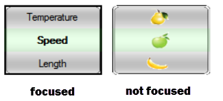
有一个大问题需要解决。面板及其子控件覆盖了 UserControl 的整个区域。因此,获得正确的焦点存在问题,这导致只有一个控件在工作,如果同一窗体中有多个控件实例。
解决方案的第一部分是通过在控件获得焦点时在其周围绘制边框,并在失去焦点时不显示边框来实现的。通过这种方式,用户可以识别哪个旋转器控件当前具有焦点。我们在Got Fous 和Lost Focus 事件中调用边框绘制。请注意Invalidate 命令会强制完全重绘,此命令比使用refresh 命令效果更好。边框的绘制在Paint event 中完成。
#Region "control events"
    ' ## if the controls font changed transmit new font value to child controls
    Private Sub tumbler_FontChanged(sender As Object, e As EventArgs) _
        Handles Me.FontChanged
        ' ## ini the font  except lblB as the independend selector
        lblB.Font = Me.Font : lblC.Font = Me.Font
    End Sub

    ' ## if the controls ForeColor changed transmit the new color to the child controls
    Private Sub tumbler_ForeColorChanged(sender As Object, e As EventArgs) _
        Handles Me.ForeColorChanged
        ' ## ini the forecolor except lblB as the independend selector
        lblB.ForeColor = Me.ForeColor : lblC.ForeColor = Me.ForeColor
    End Sub

    ' ## if focus is on draw a thicker border
    Private Sub IOSrotor_GotFocus(sender As Object, e As EventArgs) Handles Me.GotFocus
        colBorderColor = Color.Black
        intBorderThickness = 2
        Invalidate()
    End Sub

    ' ## if fous is lost draw the standard border
    Private Sub IOSrotor_LostFocus(sender As Object, e As EventArgs) Handles Me.LostFocus
        colBorderColor = Color.Transparent
        intBorderThickness = 1
        Invalidate()
    End Sub

    ' ## if Key Down or Key Up is pressed do the same as using the mouse wheel
    Private Sub tumbler_KeyDown(sender As Object, e As KeyEventArgs) Handles Me.KeyDown
        If e.KeyCode = Keys.Oemplus Then
            moveForward()
        ElseIf e.KeyCode = Keys.OemMinus Then
            moveBackward()
        End If
    End Sub

    ' ## inbitialize values if control is loaded
    Private Sub tumbler_Load(sender As Object, e As EventArgs) Handles _
        Me.Load
        ' ## ini fonts and forecolor except lblB as the independend selector
        lblB.Font = Me.Font : lblC.Font = Me.Font
        lblB.ForeColor = Me.ForeColor : lblC.ForeColor = Me.ForeColor
        SelectorForeColor = Me.ForeColor : SelectorFont = Me.Font
        ' ## ini backcolor
        Me.BackColor = Me.ParentForm.BackColor
        Me.BorderStyle = Windows.Forms.BorderStyle.None
        Invalidate()
    End Sub

    ' ## on mouse wheel turn move the controls selectable items in then
    ' ## same direction up/downward
    Private Sub tumbler_MouseWheel(sender As Object, e As MouseEventArgs) Handles Me.MouseWheel
        Try
            Cursor.Current = Cursors.WaitCursor
            ' ## move down / foreward)
            If e.Delta < 0 Then
                moveForward()
            Else ' back
                moveBackward()
            End If
        Catch ex As Exception
            Cursor.Current = Cursors.Default
            MsgBox(ex.Message, MessageBoxIcon.Exclamation, _
                Application.ProductName)
        Finally
            Cursor.Current = Cursors.Default
        End Try
    End Sub

    ' ## paint event to drwa the border
    Private Sub IOSrotor_Paint(sender As Object, e As PaintEventArgs) Handles Me.Paint
        ControlPaint.DrawBorder(e.Graphics, Me.ClientRectangle, _
                colBorderColor, intBorderThickness, ButtonBorderStyle.Solid, _
                colBorderColor, intBorderThickness, ButtonBorderStyle.Solid, _
                colBorderColor, intBorderThickness, ButtonBorderStyle.Solid, _
                colBorderColor, intBorderThickness, ButtonBorderStyle.Solid)
    End Sub

    ' ## if control is resized  make sure that the  panels are
    ' ## covering the controls area correctly
    Private Sub tumbler_Resize(sender As Object, e As EventArgs) Handles _
        Me.Resize
        ' ## set height of panels
        Dim intHeight As Integer = Me.Height / 3
        PanelA.Height = intHeight
        PanelB.Height = Me.Height - PanelA.Height - PanelC.Height
        PanelC.Height = intHeight
        ' ## redraw
        Invalidate()
    End Sub

#End Region
解决方案的第二部分是通过确保控件获得焦点来实现的。当用户单击子控件之一时,我们必须激活它的焦点。
#Region "other control events"
    ' ## this is used to grab/set the focus on this control
    Private Sub lblA_Click(sender As Object, e As EventArgs) Handles lblA.Click, lblC.Click, picA.Click, picB.Click
        Me.Focus()
    End Sub
#End Region
为了传输所选项目的相关信息,我们使用中间Panel B 中的子控件的单击事件和自定义事件SelectorClicked。
Public Event SelectorClicked(ByVal Result As Object)
- Result 包含选定的字符串或选定图像的名称。
#Region "selector events"

    ' ## if lblB/picB is clicked (the Selector) than fire
    ' ## event SelectorCLicked and report selected item info
    Protected Sub Selector_Click(sender As Object, e As EventArgs) Handles _
        picB.Click, lblB.Click
        Try
            ' ## set fous on me
            Me.Focus()
            ' ## return selected value
            If ItemType = enuItemType.Picture Then
                ' lookup for the pictures name
                For x = 0 To Image.Length
                    If Image(x) Is picB.Image Then
                        ' Report selected item/image and its name
                        RaiseEvent SelectorClicked(ImageName(x))
                        Exit Sub
                    End If
                Next
            ElseIf ItemType = enuItemType.Text Then
                ' ## report selected item text
                RaiseEvent SelectorClicked(lblB.Text)
            End If
        Catch ex As Exception
            Cursor.Current = Cursors.Default
            MsgBox(ex.Message, MessageBoxIcon.Exclamation, _
                Application.ProductName)
        End Try
    End Sub
当鼠标指针悬停在中间面板(选择器)上方时,我们希望标准光标更改为Hand cursor。
    Private Sub lblB_MouseHover(sender As Object, e As EventArgs) Handles _
        lblB.MouseHover, picB.MouseHover
        ' ## show cursor.hand over selector
        lblB.Cursor = Cursors.Hand
        picB.Cursor = Cursors.Hand
    End Sub
最后,我们需要两个私有函数来向前或向后移动。
除了不同的移动方向外,这些函数是相同的。我们首先切换背景图像来为圆柱体循环制作动画。为了看到每个图像,我们在进程中等待 250 毫秒,然后加载下一个。由于 Vb.Net 中没有直接的 sleep 或 wait 命令,我们使用适当的Thread 命令来替代它。为了显示 Label/PictureBox 的正确内容,我们使用我们DoubleChainedList 类的get.Elem 函数。
#Region "private Functions"

    ' ## animate a forwar turnd and rearrange the registers
    ' ## (labels/pictureboxes)
    Sub moveForward()
        Try
            ' ## animate
            Me.BackgroundImage = imageC : Me.Refresh()
            Threading.Thread.Sleep(250) ' wait to show animation
            Me.BackgroundImage = imageB : Me.Refresh()
            ' ## set slots
            Register.scrollDown()
            If ItemType = enuItemType.Picture Then
                picA.Image = Register.getFirstElem.value
                picB.Image = Register.getSecondElem.value
                picC.Image = Register.getThirdElem.value
            ElseIf ItemType = enuItemType.Text Then
                lblA.Text = Register.getFirstElem.value
                lblB.Text = Register.getSecondElem.value
                lblC.Text = Register.getThirdElem.value
            End If
        Catch ex As Exception
            Cursor.Current = Cursors.Default
            MsgBox(ex.Message, MessageBoxIcon.Exclamation, _
                Application.ProductName)
        Finally
            ' ## control repaint
            Me.Refresh()
        End Try
    End Sub

    ' ## animate a backward turn and rearrange the registers
    ' ## (labels/pictureboxes)
    Sub moveBackward()
        Try
            ' ## animate
            Me.BackgroundImage = imageA : Me.Refresh()
            Threading.Thread.Sleep(250) ' wait to show animation
            Me.BackgroundImage = imageB : Me.Refresh()
            ' ## set slots
            Register.scrollUp()
            If ItemType = enuItemType.Picture Then
                picA.Image = Register.getFirstElem.value
                picB.Image = Register.getSecondElem.value
                picC.Image = Register.getThirdElem.value
            ElseIf ItemType = enuItemType.Text Then
                lblA.Text = Register.getFirstElem.value
                lblB.Text = Register.getSecondElem.value
                lblC.Text = Register.getThirdElem.value
            End If
        Catch ex As Exception
            Cursor.Current = Cursors.Default
            MsgBox(ex.Message, MessageBoxIcon.Exclamation, _
                Application.ProductName)
        Finally
            ' ## control repaint
            Me.Refresh()
        End Try
    End Sub
#End Region
设置父窗体
为了初始化控件,我们使用 Load 事件。
- 我们将项目字符串和/或图像设置到内部项目数组ItemText() /Image()。
- 我们选择要显示的ItemType。
- 我们将IniReg 属性值设置为true 以强制将数组中的项目添加到类DoubleChainedList 使用的内部堆栈中。
重要!在设置好项目字符串/图像数组之前,请勿使用此属性。如果您想先清除堆栈,请更改字符串/图像数组值,然后再次使用此属性。 - 我们设置了剩余的自定义属性(请记住,您也可以直接在属性网格中进行设置)。
 Private Sub Form1_Load(sender As Object, e As EventArgs) Handles MyBase.Load
        Try
            Cursor.Current = Cursors.WaitCursor
            ' ## initialize 1st IOSrotor control
            With IoSrotor1
                ' ## set string values
                .ItemText(0) = "Speed"
                .ItemText(1) = "Length"
                .ItemText(2) = "Weight"
                .ItemText(3) = "Volume"
                .ItemText(4) = "Temperature"
                ' ## choose item type to be displayed
                .ItemType = TechDOCiosRotor.IOSrotor.enuItemType.Text
                ' ## ini the internal register with above the values
                ' ##
                .IniRegister = True
                ' ## choose skin
                .Skin = TechDOCiosRotor.IOSrotor.enuSkin.Silver
                ' ## choose text alignment
                .ItemTextAlign = TechDOCiosRotor.IOSrotor.enuAlignment.Center

                ' ## chosse selector paramters
                .SelectorForeColor = Color.Black
                .SelectorGreen = True
                .SelectorFont = New Font(IoSrotor1.Font.FontFamily, IoSrotor1.Font.Size, FontStyle.Bold)
            End With
            ' ## initialize 2nd IOSrotor control
            With IoSrotor3
                ' ## set image values
                .Image(0) = My.Resources.apple : .ImageName(0) = "Apple"
                .Image(1) = My.Resources.Banana : .ImageName(0) = "Banana"
                .Image(2) = My.Resources.pear : .ImageName(0) = "Pear"
                ' ## choose item type to be displayed
                .ItemType = TechDOCiosRotor.IOSrotor.enuItemType.Picture
                ' ## ini the internal register with above the values
                ' ##
                .IniRegister = True
                ' ## choose skin
                .Skin = TechDOCiosRotor.IOSrotor.enuSkin.Silver
                ' ## choose text alignment
                .ItemTextAlign = TechDOCiosRotor.IOSrotor.enuAlignment.Center

                ' ## chosse selector paramters
                .SelectorForeColor = Color.Black
                .SelectorGreen = True
                .SelectorFont = New Font(IoSrotor1.Font.FontFamily, IoSrotor1.Font.Size, FontStyle.Bold)
            End With
        Catch ex As Exception
            Cursor.Current = Cursors.Default
            MsgBox(ex.Message, MessageBoxIcon.Exclamation, Application.ProductName)
        Finally
            Cursor.Current = Cursors.Default
        End Try

    End Sub
当用户单击中间项(选择器)时,会触发自定义事件SelectorClicked。我们可以在我们的父窗体代码中使用此事件。
 ' ## user clicks on the selector of the rotor control
    Private Sub IOSrotor1_SelectorClicked(Result As Object) Handles IoSrotor1.SelectorClicked, IOSrotor3.SelectorClicked
        Try
            Cursor.Current = Cursors.WaitCursor
            If IoSrotor1.ItemType = TechDOCiosRotor.IOSrotor.enuItemType.Picture Then
                Select Case Name
                    Case "Apple"

                End Select
            ElseIf IoSrotor1.ItemType = TechDOCiosRotor.IOSrotor.enuItemType.Text Then
                Select Case Result
                    Case "Speed"

                End Select
            End If
        Catch ex As Exception
            Cursor.Current = Cursors.Default
            MsgBox(ex.Message, MessageBoxIcon.Exclamation, Application.ProductName)
        Finally
            Cursor.Current = Cursors.Default
        End Try
    End Sub
关注点
信不信由你,开发正确的移动过程花了我至少一周的时间。也许我太笨了,记不起我以前关于寄存器移位(汇编)的知识了,我放弃了并问了我的朋友。他在 3 天内就找到了解决方案 - 干得好!
下一个问题是背景圆柱体图像的动画。在我最初的解决方案中,我使用了一个 GIF 动画。这是不可能的,因为我遇到了透明背景的覆盖面板及其子控件的问题,因此我决定通过在向上或向下移动之间切换图像来管理动画。
历史
更新 2014年7月29日
- 修复了一些错误。
- 添加了焦点时显示/隐藏边框的功能。
- 更改了 Selector_Clicked 事件,现在只有一个参数 Result。
- 更改了动画序列。
- 更改了测试项目窗体中的 missing handles 命令。
- 解决了多个实例在同一个窗体上的焦点问题。
- 将其他 IOS 类控件 IOSswitch 添加到项目家族。