
CQuickList
一个自定义绘制的虚拟列表控件。支持子项编辑、图像、按钮(复选框、单选按钮)、自定义颜色和“列导航”。

目录
- 引言
- 背景
- 特点
- 创建 CQuickList
- 向列表中添加项
- 处理 WM_QUICKLIST_GETLISTITEMDATA 消息
- CQuickList::CListItemData
- 子项之间的导航
- LVN_ODFINDITEM 消息
- 点击图像/按钮
- 右键单击列标题
- 空列表
- 编辑子项
- XP 中的主题
- 致谢
- 待办
- 关注点
- 历史
引言
CQuickList 是另一个派生于 CListCtrl 的拥有者绘制控件。该控件与 CodeProject 上其他拥有者绘制列表控件的主要区别在于,它是一个虚拟列表。这意味着您无需将项插入列表中。相反,列表控件会在需要信息时询问父窗口。因此,您可以快速创建大型复杂列表,而无需占用大量内存。如果您以前从未用过虚拟列表,最好看一下文章 “虚拟列表”,我将在其中尝试解释这个概念。
背景
一段时间以前,我需要一个列表中子项可以包含图像。如果还能编辑子项就更好了。但对我来说最重要的是列表是虚拟的,而且由于我找不到这样的控件,所以我开始自己创建。这就是我目前为止的成果。
然而,尽管我没有找到我想要的东西,但我找到了其他控件,它们对我来说是巨大的帮助。所以,感谢 CodeProject 上的所有其他作者 :-)。
功能
CQuickList 的主要功能包括:
- 子项编辑。
- 子项中的图像。
- 列表中的按钮(如复选框、单选按钮)。
- 进度条。
- 自定义颜色。
- 工具提示。
- 列导航。
- 粗体/斜体文本。
- 在列表为空时显示消息。
- 自动处理
LVN_ODFINDITEM消息。 - 代码量小。使用
#define移除未使用的功能。 - Unicode 支持。
- 支持 Windows XP 主题。
创建 CQuickList
创建 CQuickList 非常简单。在资源编辑器中添加一个列表控件,并为此控件添加一个 CListCtrl 变量。在头文件中将 “CListCtrl” 替换为 “CQuickList”,就完成了。
确保您已勾选“Owner data”样式,并将视图设置为“Report”模式。同时请确保“Owner draw fixed” *未* 勾选。
向列表中添加项
假设 m_list 是列表的控件变量。通常,您会这样向列表中添加数据
m_list.InsertItem(0, _T("Hello world"));
但在虚拟列表中(如 CQuickList),这样做无效。取而代之的是,您需要自己处理数据。您需要更改列表显示的元素数量,而不是添加项
//"Add" 100 elements
m_list.SetItemCount(100);
无论您将项数设置为 100 还是 1,000,000,运行此命令所需的时间实际上都将为零。在非虚拟列表中,添加一百万个项可能需要数小时。
处理 WM_QUICKLIST_GETLISTITEMDATA 消息
正常的虚拟列表会在需要信息时向父窗口发送 LVN_GETDISPINFO 消息。在使用 CQuickList 时也会发送此消息,但该消息并不重要。您应该处理 WM_QUICKLIST_GETLISTITEMDATA 消息。在头文件中添加此项
afx_msg LRESULT OnGetListItem(WPARAM wParam, LPARAM lParam);
在消息映射中添加消息处理程序
BEGIN_MESSAGE_MAP(CMyListCtrlDlg, CDialog)
    //...other messages here...
    ON_MESSAGE(WM_QUICKLIST_GETLISTITEMDATA, OnGetListItem)
END_MESSAGE_MAP()
最后,添加函数
LRESULT CMyListCtrlDlg::OnGetListItem(WPARAM wParam, LPARAM lParam)
{
    //wParam is a handler to the list
    //Make sure message comes from list box
    ASSERT( (HWND)wParam == m_list.GetSafeHwnd() );

    //lParam is a pointer to the data that
    //is needed for the element
    CQuickList::CListItemData* data =
        (CQuickList::CListItemData*) lParam;

    //Get which item and subitem that is asked for.
    int item = data->GetItem();
    int subItem = data->GetSubItem();

    //...insert information that is needed in "data"...

    return 0;
}
CQuickList::CListItemData
CQuickList::CListItemData 是一个非常简单但重要的类。该类包含几个成员变量。这些变量用于绘制项。该类中的公共部分是
class CQuickList::CListItemData
{
public:
    CListItemData();

    //Some obvius functions
    int GetItem() const;
    int GetSubItem() const;
    bool IsSelected() const;
    bool IsHot() const;

    //The item text
    CString m_text;

    //Tool tip text. Note: Don't forget to call EnableToolTips()
    //to enable tool tips.
    CString m_tooltip;

    //Set this to true if you don't want to draw a selection mark
    //even if this item is selected.
    //Default value: false
    bool m_noSelection;

    //Set this to true if the item is available for editing
    //Default value: false
    bool m_allowEdit;

    //Information about which text style that should be used.
    struct CListTextStyle
    {
        //Default value: false
        bool m_bold;

        //Default value: false
        bool m_italic;

        //Default value:
        // DT_LEFT | DT_VCENTER | DT_SINGLELINE | DT_END_ELLIPSIS
        //See CDC:DrawText in MSDN
        UINT m_textPosition;
    } m_textStyle;

    //Information about the image
    struct CListImage
    {
        //The image position in the image list.
        //-1 if no image.
        //Default value: -1
        int m_imageID;

        //The image list where the image is.
        //Default value: A pointer to the image list in the list
        //control that is used small images (LVSIL_SMALL)
        CImageList* m_imageList;

        //Set true if you don't want to draw selection mark if the
        //item is selection
        //Default value: true
        bool m_noSelection;

        //Center the image. Useful if no text.
        //Default value: false;
        bool m_center;

        //Blend if the image is selected. Use ILD_BLEND25 or
        //ILD_BLEND50, or 0 if you don't want to use this feature.
        //Default value: ILD_BLEND25
        int m_blend;

    } m_image;

    //Information about the button
    struct CListButton
    {
        //The style to use to draw the control.
        //Default value: DFCS_BUTTONCHECK
        //Use DFCS_CHECKED to draw the check mark.
        //Use DFCS_BUTTONRADIO for radio button, DFCS_BUTTONPUSH
        //for push button.
        //See CDC::DrawFrameControl for details.
        int m_style;

        //If you want to draw a button, set this to true
        //Default value: false
        bool m_draw;

        //Center the check box is the column. Useful if no text
        //Default value: false
        bool m_center;

        //Set this to true if you don't want to draw selection
        //mark under the control.
        //Default value: true
        bool m_noSelection;

    } m_button;

    //Information about the progress bar
    struct CListProgressbar
    {
        //Note: The m_text member specifies the text in the
        //progress bar

        //The max value of progress bar. Use -1 to disable
        //progress bar. The min value is supposed to be 0.
        //Default value: -1
        int m_maxvalue;

        //The value the progress bar has. The width of the
        //progress bar is calculated with use m_value and
        //m_maxvalue.
        //Default value: 0
        int m_value;

        //The color the progress bar should be drawn with.
        //Default value: DEFAULTCOLOR
        COLORREF m_fillColor;

        //The color of the text on the progress bar
        //Default value: DEFAULTCOLOR
        COLORREF m_fillTextColor;

        //How to draw the edge. Use 0 for no edge.
        //See CDC::DrawEdge for different styles.
        //Default value: EDGE_SUNKEN
        UINT m_edge;
    } m_progressBar;

    //Information about the colors to use
    struct CListColors
    {
        //Default value for all: DEFAULTCOLOR
        COLORREF m_textColor;
        COLORREF m_backColor;
        COLORREF m_hotTextColor;
        COLORREF m_selectedTextColor;
        COLORREF m_selectedBackColor;
        COLORREF m_selectedBackColorNoFocus;

        //These colors are used to draw selected items in
        //the "navigation column"
        COLORREF m_navigatedTextColor;
        COLORREF m_navigatedBackColor;
    } m_colors;

};
如您所见,有多种设置可供使用。但您可能只会用到其中的几个。我将在以下文本中尝试解释大多数设置。以下文本中的 data 是指向 CQuickList::CListItemData 对象的指针。
文本
最简单的设置是 m_text。这是要绘制的文本
data->m_text = _T("Hello world");
这里将为当前项绘制文本 Hello world。
工具提示
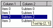
工具提示有时会很有用。如果您将鼠标光标悬停在项上,此处设置的文本将显示为工具提示。示例:
data->m_tooltip = _T("Tip: Hello world");
此处将显示 “Tip: Hello world”。
注意 1:要激活工具提示,您必须调用 EnableToolTips(TRUE)。
注意 2:如果您不使用此功能,可以定义 QUICKLIST_NOTOOLTIP 来减小应用程序的大小。
注意 3:不幸的是,在使用工具提示时存在一些问题。参见关注点。
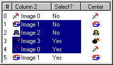
不绘制选中项

默认情况下,如果一个项被选中,它将被绘制为选中状态。但是,如果您希望即使项被选中也将其绘制为未选中状态,请执行以下操作:
data->m_noSelection = false;
现在,即使该项被选中,也不会被绘制为选中状态。但这有什么用呢?这似乎是一个无用的功能,但有时它会非常有用。例如,如果您在一个列表中有多个列,某些列可能被绘制为未选中状态。在图片中,即使第一列的所有项都被选中,它们也被绘制为未选中状态。
允许编辑
如果您希望允许编辑一个项,请执行以下操作:
data->m_allowEdit = true;
注意 1:您还需要处理一些消息才能实现编辑。我将在后面讨论。
注意 2:如果您不使用此功能,可以定义 QUICKLIST_NOEDIT 来减小应用程序的大小。
文本样式

有时,将文本绘制为粗体或斜体很有用。这很简单:
data->m_textStyle.bold = true;
data->m_textStyle.italic = true;
您还可以指定文本的绘制位置。示例:
//Left align text:
data->m_textStyle.m_textPosition =
    DT_LEFT | DT_VCENTER | DT_SINGLELINE | DT_END_ELLIPSIS;

//Center text:
data->m_textStyle.m_textPosition =
    DT_CENTER | DT_VCENTER | DT_SINGLELINE | DT_END_ELLIPSIS;
但是您可以进行比这更多的设置。请参见 MSDN 中的 CDC::DrawText。
注意:如果您不使用此功能,可以定义 QUICKLIST_NOTEXTSTYLE 来减小应用程序的大小。
图片
拥有图像很有用。如果您有一个与列表连接的图像列表(称为 SetImageList),您只需执行以下操作:
//Use image 2 in the list
data->m_image.m_imageID = 2;
然后将使用默认图像列表。但是,您可以指定要使用的图像列表,如下所示:
//Use another image list
data->m_image.m_imageList = &m_mySecondImagelist;
默认情况下,如果项被选中,图像*不会*被绘制为选中状态。但您可以更改此设置:
data->m_image.m_noSelection = false;
如图所示,选中项的蓝色比未选中项稍深一些。如果您不希望这样,可以更改 m_blend 设置:
//Don't "blend" the image:
data->m_image.m_blend = 0;
//Other possible values are ILD_BLEND25 and ILD_BLEND50 (default).
默认情况下,图像会绘制在左侧。但如果您除了图像没有其他内容,为什么不将其居中呢?
//Center image
data->m_image.m_center = true;
注意:如果您不使用此功能,可以定义 QUICKLIST_NOIMAGE 来减小应用程序的大小。
按钮

如果您想绘制复选框或单选按钮,可以使用 m_button 变量:
//We want to draw a button
data->m_button.m_draw = true;

//Check box, not checked:
data->m_button.m_style = DFCS_BUTTONCHECK
//Check box, checked:
data->m_button.m_style = DFCS_BUTTONCHECK|DFCS_CHECKED;

//Radio button, not checked:
data->m_button.m_style = DFCS_BUTTONRADIO
//Radio button, checked:
data->m_button.m_style = DFCS_BUTTONRADIO|DFCS_CHECKED;
与图像一样,按钮默认不会被绘制为选中状态。它们也可以居中:
//Draw as selected
data->m_button.m_noSelection = false;

//Center
data->m_button.m_center = true;
注意 1:默认情况下,XP 中的按钮*不会*根据主题进行绘制。要解决此问题,您应该调用 SetThemeManager()。在此处阅读。
注意 2:如果您不使用此功能,可以定义 QUICKLIST_NOBUTTON 来减小应用程序的大小。
进度条

进度条在列表控件中很少使用,但它们可能很有用。要使用它,首先指定最大值:
//Max value is 100
data->m_progressBar.m_maxvalue = 100;
最小值是 0。然后指定进度条的值:
//Fill half the progress bar:
data->m_progressBar.m_value = 50;
您还可以更改边框。边框的默认值是 EDGE_SUNKEN。如果您不希望有边框,请将其值设置为 0。
//No edge:
data->m_progressBar.m_edge = 0;
有关更多设置,请参见 MSDN 中的 CDC::DrawEdge。
您还可以指定使用的填充颜色和文本颜色。这些设置的默认值是 DEFAULTCOLOR,这意味着 Windows 应决定使用哪种颜色。
//Red fill color
data->m_progressBar.m_fillColor = RGB(255,0,0);
//White text color
data->m_progressBar.m_fillColor = RGB(255,255,255);
注意 1:如果您在 m_text 中指定了任何文本,该文本将绘制在进度条中。
注意 2:如果您不使用此功能,可以定义 QUICKLIST_NOPROGRESSBAR 来减小应用程序的大小。
颜色

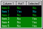
默认情况下将使用 Windows 颜色,但您可以使用 m_colors 进行更改:
//Green text
data->m_colors.m_textColor = RGB(0,255,0);

//Black background
data->m_colors.m_backColor = RGB(0,0,0);

//If the item is "hot", use purple color
data->m_colors.m_hotTextColor = RGB(0,255,255);

//If the item is selected, the text should
//be drawn in white color
data->m_colors.m_selectedTextColor = RGB(255,255,255);

//If the item is selected, the background should
//be drawn in green color
data->m_colors.m_selectedBackColor = RGB(0,128,0);

//If the item is selected but the list hasn't focus,
//the background should be drawn in gray color
data->m_colors.m_selectedBackColorNoFocus = RGB(64,64,64);

//If the item is "navigated", text will be drawn in red
data->m_colors.m_navigatedTextColor = RGB(255,0,0);

//If the item is "navigated", background will be drawn in blue
data->m_colors.m_navigatedBackColor = RGB(0,0,128);
设置背景颜色时,您可以使用 TRANSPARENTCOLOR 作为透明色。这在有背景图像时非常有用。
子项之间的导航

在普通列表中,您可以使用鼠标或键盘选择项。但无法选择子项,这有时可能非常有用。不过,在 CQuickList 中,这是可能的 :-)。要指定当前选中的列,请调用:
//Enable navigation (it is enabled as default)
m_list.EnableColumnNavigation(true);

//Set column 2 as "navigated".
m_list.SetNavigationColumn(2);
好的,这很简单。但是,假设您有三列,并且不希望可以导航到第 2 列。要解决此问题,请添加一个消息处理程序来处理 WM_QUICKLIST_NAVIGATIONTEST 消息(在头文件中添加一个函数,并在消息处理程序中连接它)。然后,像这样编写函数:
LRESULT CMyListCtrlDlg::OnNavigationTest(WPARAM wParam, LPARAM lParam)
{
    //Make sure message comes from list box
    ASSERT( (HWND)wParam == m_list.GetSafeHwnd() );

    CQuickList::CNavigationTest* test =
        (CQuickList::CNavigationTest*) lParam;

    //The previous column is in test->m_previousColumn.

    //Don't allow navigation to column 2
    if(test->m_newColumn == 2)
        test->m_allowChange = false;

    return 0;
}
现在,将无法导航到第 2 列。
注意:如果您不使用此功能,可以定义 QUICKLIST_NONAVIGATION 来减小应用程序的大小。
LVN_ODFINDITEM 消息
您可能知道,通过在列表中输入字符,可以查找列表中的项(此处有更多信息)。要在虚拟列表中实现此功能,您需要处理 LVN_GETDISPINFO 消息。但在使用 CQuickList 时,这并非必需,列表会自动为您处理。但是,您可以指定列表在尝试查找项时要搜索的列。示例:
//Search in column 1:
m_list.SetKeyfindColumn(1);
您可以使用 KEYFIND_CURRENTCOLUMN 在当前导航的列中搜索。如果您希望父窗口处理此消息,请使用 KEYFIND_DISABLED。
注意:如果您不使用此功能,可以定义 QUICKLIST_NOKEYFIND 来减小应用程序的大小。
点击图像/按钮
当您单击复选框时,您期望它会切换状态。但在虚拟列表中,列表无法更改值。为了解决这个问题,列表会向父窗口发送一条消息,由父窗口来完成工作。添加一个消息处理程序来处理 WM_QUICKLIST_CLICK 消息(在头文件中添加一个函数,并在消息处理程序中连接它)。然后,像这样编写函数:
LRESULT CMyListCtrlDlg::OnListClick(WPARAM wParam, LPARAM lParam)
{
    //Make sure message comes from list box
    ASSERT( (HWND)wParam == m_list.GetSafeHwnd() );

    CQuickList::CListHitInfo *hit=
        (CQuickList::CListHitInfo*) lParam;

    //Item:    hit->m_item
    //Subitem: hit->m_subitem

    //Hit button?
    if(hit->m_onButton)
    {
        //...toggle check box in the database...

        //Redraw check box
        m_list.RedrawCheckBoxs( hit->m_item,
                    hit->m_item,
                    hit->m_subitem);
    }
    else //Hit image?
    if(hit->m_onImage)
    {
        //... toggle image ...

        //Redraw image
        m_list.RedrawImages(hit->m_item,
                    hit->m_item,
                    hit->m_subitem);
    }

    return 0;
}
如您所见,可以得知是否点击了图像。
注意:解决此问题的另一种方法是处理 NM_LCLICK 消息。然后调用 CQuickList::HitTest 来查看是否点击了按钮或图像。
空列表

如果列表为空,显示一条小消息可能更友好。这很容易做到:
//Show "Hello world" is the list is empty
m_list.SetEmptyMessage(_T("Hello world"));
注意:如果您不使用此功能,可以定义 QUICKLIST_NOEMPTYMESSAGE 来减小应用程序的大小。
右键单击列标题

据我所知,在 CListCtrl 中没有简单的方法可以捕获列标题上的右键单击。这很可惜,因为这是一种向用户显示上下文菜单的好方法,例如,用户可以在其中隐藏菜单。在使用 CQuickList 时,当在列标题上发生右键单击时,列表会向父窗口发送 WM_QUICKLIST_HEADERRIGHTCLICK 消息。WPARAM 是列表的句柄,LPARAM 是指向 CQuickList::CHeaderRightClick 对象的指针。该对象包含鼠标位置(m_mousePos)和被点击的列(m_column)。
一个弹出菜单的函数可能如下所示:
LRESULT CMyListCtrlDlg::OnHeaderRightClick(WPARAM wParam, LPARAM lParam)
{
    //Make sure message comes from list box
    ASSERT( (HWND)wParam == m_list.GetSafeHwnd() );

    CQuickList::CHeaderRightClick *hit=
        (CQuickList::CHeaderRightClick*) lParam;

    //Load menu
    CMenu menu;
    VERIFY(menu.LoadMenu(IDR_HEADERMENU));

    //Pop up sub menu 0
    CMenu* popup = menu.GetSubMenu(0);

    popup->TrackPopupMenu( TPM_LEFTALIGN | TPM_RIGHTBUTTON,
                hit->m_mousePos.x,
                hit->m_mousePos.y,
                this);

    return 0;
}
编辑子项
在 CQuickList 中编辑子项与 CListCtrl 的区别不大。编辑开始前,会向父窗口发送 OnBeginlabeleditList 消息。除非您想指定比 m_text 中指定的文本不同的文本,否则您可以忽略此消息。编辑完成后,会发送 LVN_ENDLABELEDIT 消息。如果您想保存文本,必须为此消息添加处理程序。函数可能如下所示:
void CMyListCtrlDlg::OnEndlabeleditList(NMHDR* pNMHDR, LRESULT* pResult)
{
    LV_DISPINFO* pDispInfo = (LV_DISPINFO*)pNMHDR;

    // If pszText is NULL, editing was canceled
    if(pDispInfo->item.pszText != NULL)
    {
        //Item:    pDispInfo->item.iItem
        //Subitem: pDispInfo->item.iSubItem
        //... save the text ...
    }

    *pResult = 0;
}
您可以调用 CQuickList::GetLastEndEditKey 来查看编辑结束时按下了哪个键。例如,如果用户按了回车键(VK_RETURN),则可能需要开始编辑列表中的下一项。
当编辑框失去焦点时,它会被关闭。如果您调用 CQuickList::SetEndEditOnLostFocus(false),它将不会在失去焦点时关闭。相反,父窗口将收到 WM_QUICKLIST_EDITINGLOSTFOCUS 消息。(我猜这个功能很奇怪,但我的一个程序需要它,所以我就添加了 :-))。
通过按 F2 或 ENTER 键,或通过用户双击项,将开始编辑。您可以通过调用 SetEditOnEnter、SetEditOnF2 和 SetEditOnDblclk 函数来更改此行为。您还可以调用 EditSubItem 来开始编辑项。
XP 中的主题
CQuickList 支持 Windows XP 中的主题。主题用于绘制按钮(复选框、单选按钮等)。如果您不使用此功能,可以忽略。
要启用主题,您应该用指向 CTheme 对象的指针调用 SetThemeManager()。如果您不这样做,按钮将以传统方式绘制。
演示项目中有一个 CTheme 类。我参考了文章 “XP Style CBitmapButton (CHoverBitmapButton)” 来创建它。它的好处是程序可以在 Windows XP 以外的系统上正常运行。不幸的是,我们必须在主窗口中添加一些代码。请参见演示项目,了解如何操作。请确保在 StdAfx.h 中定义 “USEXPTHEMES”。您需要一个较新版本的 Platform SDK 才能编译支持主题的代码。
注意:如果您不使用此功能,可以定义 QUICKLIST_NOXPTHEME 来减小应用程序的大小。
致谢
由于我以前没有做过类似的工作,我很高兴有其他项目对我帮助很大。我查看过甚至复制过其他项目的一些代码。对我来说最有用的项目是 “XListCtrl - A custom-draw list control with subitem formatting”。但我也想感谢
- “Neat Stuff to do in List Controls Using Custom Draw”,Michael Dunn。
- “XListCtrl - A custom-draw list control with subitem formatting”,Hans Dietrich。
- “SuperGrid - Yet Another listview control”,Allan Nielsen。
- “Easy Navigation Through an Editable List View”,Lee Nowotny。
- “Time to Complete Progress Control”,Craig Henderson。
- “XP Style CBitmapButton (CHoverBitmapButton)”,Rail Jon Rogut。
- “Determining right click on the header control (Codeguru)”,Zafir Anjum。
另一个不错的控件是 Virtual Grid Control。它与 CQuickList 非常相似,值得一看。
待办事项
CQuickList 工作良好,但还有一些我想修复/实现的事情:
- 修复工具提示问题(参见关注点)。
- 我想在创建
CQuickList控件时设置LVS_OWNERDATA设置。但Create和OnCreate都未调用。有什么建议吗? - 指定项的高度。
- 当您在两个列之间的列标题中双击时,列宽应设置为最宽项的宽度。这并不完美,特别是当使用按钮或图像时。
- 支持拖放。我曾尝试创建一个拖动图像函数(
CreateDragImageEx),但完全不起作用。
关注点
CQuickList 主要设计为支持整行选择,但即使不使用它也能正常工作。然而,可能会有一些轻微的绘图问题,所以我的建议是使用整行选择。
我在 Windows XP 中使用带有清单文件的列表时遇到了一些问题。一个问题是当鼠标指针悬停在项上时,“热点”项发生了变化。解决方案是处理 LVN_HOTTRACK 消息。另一个问题是当鼠标指针移过列表时,列表会绘制在编辑框之上,我通过处理 WM_MOUSEMOVE 消息解决了这个问题。
XP 中另一个奇怪的行为是,在使用工具提示时存在一些绘图问题。使用工具提示时,您可能会注意到列表会轻微闪烁。问题出在 OnToolHitTest。此函数调用 ListView_SubItemHitTest,出于某种非常、非常奇怪的原因,这会强制列表进行一些重绘(可能只在第一列)。如果您将鼠标指针移到列标题上,标题会暂时消失,您会看到其下方的项,非常奇怪。我还没有弄清楚为什么会发生这种情况。如果您遇到此问题,最简单的解决方法是不使用工具提示。