
WPF 中自定义 TreeView 布局
5.00/5 (4投票s)
这是“WPF 中自定义 TreeView 布局”的替代方案。
引言
我需要绘制节点之间的线条,以及折叠/展开节点的功能。 结果发现折叠/展开的实现非常简单。
绘制线条稍微困难一些。
这个解决方案运行良好,但我相信一定有更简单的实现方法。 无论如何,如果有人需要解决方案,这个方案是可行的。
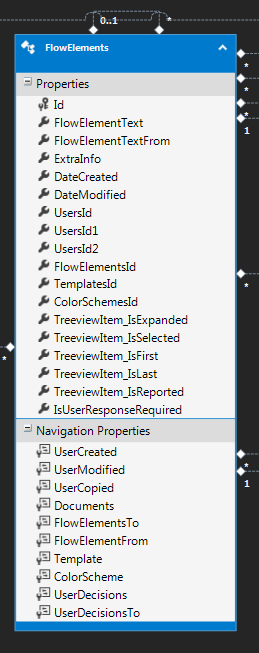
TreeView

Using the Code
以下是 ControlTemplate。
第一个 Grid 中有 3 行。
- 第一行用于水平线。
- 第二行用于
UserControl。 - 最后一行包含
ItemsPresenter。
<ControlTemplate TargetType="TreeViewItem">
                            <Grid>
                                <Grid.RowDefinitions>
                                    <RowDefinition Height="Auto" />
                                    <RowDefinition Height="Auto" />
                                    <RowDefinition Height="*" />
                                </Grid.RowDefinitions>
                                <Grid Grid.Row="0">
                                    <Grid.ColumnDefinitions>
                                        <ColumnDefinition Width="1*"></ColumnDefinition>
                                        <ColumnDefinition Width="1*"></ColumnDefinition>
                                    </Grid.ColumnDefinitions>
                                    <Line Grid.Column="0" SnapsToDevicePixels="True"
                                    Visibility="{Binding  ., UpdateSourceTrigger=PropertyChanged,
                                    Converter={c:IsFlowElementFrom_ToLeftLineVisiblility_Converter}}"
                                    Grid.Row="0" HorizontalAlignment="Stretch"
                                    VerticalAlignment="Bottom" Stroke="Black"
                                    X2="{Binding ActualWidth, RelativeSource={RelativeSource Self}}"
                                    StrokeThickness="2" />
                                    <Line Grid.Column="1" SnapsToDevicePixels="True"
                                    Visibility="{Binding  ., UpdateSourceTrigger=PropertyChanged,
                                    Converter={c:IsFlowElementFrom_ToRigthLineVisiblility_Converter}}"
                                    Grid.Row="0" HorizontalAlignment="Stretch"
                                    VerticalAlignment="Bottom" Stroke="Black"
                                    X2="{Binding ActualWidth, RelativeSource={RelativeSource Self}}"
                                    StrokeThickness="2" />
                                </Grid>
                                <StackPanel Grid.Row="1" Orientation="Vertical"
                                HorizontalAlignment="Center">
                                    <f:FlowElementControl FlowElementControl_IsReported_Event=
                                    "FlowElementControl_FlowElementControl_IsReported_Event"
                                                          FlowElementControl_IsSelected_Event=
                                                          "FlowElementControl_IsSelected_Event"
                                                          ButtonExpand_ClickEvent=
                                                          "FlowElementControl_ButtonExpand_ClickEvent"
                                                          ButtonExtraInfo_ClickEvent=
                                                          "FlowElementControl_ButtonExtraInfo_ClickEvent"
                                                          FlowElementControl_IsUserResponse_Event=
                                                          "FlowElementControl_FlowElementControl_IsUserResponse_Event"
                                                          Visibility="{Binding  .FlowElementFrom.TreeviewItem_IsExpanded,
                                                          UpdateSourceTrigger=PropertyChanged,
                                                          Converter={c:IsParentExpandedToVisibility_Converter}}"
                                                          Tag="{Binding .}"
                                                          HorizontalAlignment="Center">
                                    </f:FlowElementControl>
                                </StackPanel>
                                <ItemsPresenter Grid.Row="2">
                                </ItemsPresenter>
                            </Grid>
                        </ControlTemplate>
节点之间的水平线实际上是两条线。 它们都是第一个 Grid 的一半长度。 为了做到这一点,我们在第一行中放置一个新的 Grid,并给这个 Grid 两个等间距的列 (1*) (第一个 Grid 的宽度会根据下面的节点变化,因此不能使用线条的固定宽度)。
我们需要两条线,以便根据节点的位置隐藏或显示它们。
- 如果节点是最左边的,则隐藏左侧线条。(
TreeviewItem_IsFirst = true) - 如果节点是最右边的,则隐藏右侧线条。(
TreeviewItem_IsLast = true) - 如果节点既不是最左边的也不是最右边的,则显示两条线。(
TreeviewItem_IsFirst = false, TreeviewItem_IsLast = false)
第一个和最后一个节点是在数据库中设置的。
SetFirstAndLast()
每次添加、删除、复制或移动项目时,都需要这样做。
如果需要,可以添加排序顺序。
        private void RecursiveSetFirstLast(Database.FlowElements flowelement)
        {
            List<Database.FlowElements> toList = flowelement.FlowElementsTo.ToList();
            for (int i = 0; i < toList.Count; i++)
            {
                if (i == 0)
                    toList[i].TreeviewItem_IsFirst = true;
                else
                    toList[i].TreeviewItem_IsFirst = false;

                if (i == toList.Count - 1)
                    toList[i].TreeviewItem_IsLast = true;
                else
                    toList[i].TreeviewItem_IsLast = false;

                if (i != 0 & i != toList.Count - 1)
                {
                    toList[i].TreeviewItem_IsFirst = false;
                    toList[i].TreeviewItem_IsLast = false;
                }
                RecursiveSetFirstLast(toList[i]);
            }
        }
        private void SetFirstAndLast()
        {
            //set first and last, so we can draw the treelines properly
            foreach (Database.FlowElements f in flowElementsNotLinked) RecursiveSetFirstLast(f);
        }
flowElementsNotLinked = Currenttemplate.FlowElements.Where(f => f.FlowElementFrom == null).ToList();
接下来,我们需要设置线条的可见性。 这可以使用转换器完成:(你需要两个,分别用于左侧和右侧)
class IsFlowElementFrom_ToLeftLineVisiblility_Converter : System.Windows.Markup.MarkupExtension, IValueConverter
    {
        public IsFlowElementFrom_ToLeftLineVisiblility_Converter()
        {

        }
        public object Convert(object value, Type targetType, object parameter, System.Globalization.CultureInfo culture)
        {
            Database.FlowElements flowelement = (Database.FlowElements)value;
            //do not show the line if there are no elements above
            if (flowelement == null || flowelement.FlowElementFrom == null) return Visibility.Hidden;
            //don't show the left line if it is the first element
            if (flowelement.TreeviewItem_IsFirst) return Visibility.Hidden;
            return Visibility.Visible;
        }
        public object ConvertBack(object value, Type targetType, object parameter, System.Globalization.CultureInfo culture)
        {
            return true;
        }
        private static IsFlowElementFrom_ToLeftLineVisiblility_Converter instance;
        public override object ProvideValue(IServiceProvider serviceProvider)
        {
            if (instance == null)
                instance = new IsFlowElementFrom_ToLeftLineVisiblility_Converter();
            return instance;
        }
    }
最后要做的是在你的 usercontrol 中绘制两条短的垂直线(顶部和底部)。 并根据其上方的元素或下方的元素显示/隐藏它们。 你可以使用上述相同的原理。
最好用带有加号或减号的菜单项或按钮替换控件的底部线条,用于折叠和展开。
<Menu Background="Transparent" HorizontalAlignment="Center" VerticalAlignment="Center">
                <MenuItem x:Name="ButtonExpand" Tag="{Binding .}" Visibility="{Binding ., UpdateSourceTrigger=PropertyChanged, Converter={c:FlowelementsTo_ToButtonVisiblility_Converter}}" IsEnabled="True" Click="ButtonExpand_Click">
                    <MenuItem.Header>
                        <TextBlock FontSize="12" Text="{Binding  ., UpdateSourceTrigger=PropertyChanged, Converter={c:IsExpandedToTextBlockText_Converter}}" xml:space="preserve"></TextBlock>
                    </MenuItem.Header>
                    <MenuItem.Effect>
                        <DropShadowEffect Opacity="0.5" ShadowDepth="4" BlurRadius="8"/>
                    </MenuItem.Effect>
                    <MenuItem.ToolTip>
                        <TextBlock>
                              Collapse/Expand this flowelement.
                        </TextBlock>
                    </MenuItem.ToolTip>
                </MenuItem>
            </Menu>

关注点
我尝试了许多不同的方法,这是第一个有效的方法。 下一个尝试可能是直接在画布上绘制。
在测试期间,我给所有容器设置了不同的颜色和边距。 这向你展示了实际发生的情况,并且可能非常有帮助。
历史
- 2014 年 9 月 12 日:初始版本