
NetworkView:用于可视化和编辑网络、图表和流程图的WPF自定义控件
4.97/5 (174投票s)
本文研究了一个用于显示和编辑网络、图表和流程图的WPF自定义控件的用法和实现。
目录
引言
本文研究了一个用于显示和编辑网络、图表和流程图的WPF自定义控件的用法和实现。我将其命名为NetworkView,其灵感来源于标准WPF控件,并且与ItemsControl和TreeView等控件有许多相似之处。本文和示例代码展示了如何从XAML和C#代码中使用该控件。
本文主要分为两部分。
第一部分通过演练两个示例项目来探讨NetworkView的用法。如果您只想使用NetworkView,那么这一部分和参考部分就足够了。
第二部分详细介绍了实现细节。如果您想对NetworkView进行自己的修改,或者想了解我开发复杂WPF自定义控件的方法,那么这一部分将非常有用。
文章最后有一个参考部分,其中描述了NetworkView公开的公共属性、方法和命令。
在之前的文章中,我涵盖了许多WPF技术:使用修饰符、缩放和平移、绑定到UI元素位置以及最近的多项拖动选择。NetworkView和示例应用程序使用了所有这些技术。我不会在这里详细介绍这些技术。相反,我会在适当的时候引用之前的文章。
NetworkView旨在由应用程序特定的视图模型支持。虽然不推荐,但也可以不使用视图模型,而是以编程方式或在XAML中使用NetworkView。这与其他WPF控件(如TreeView)类似,您也可以在没有视图模型的情况下使用它们。使用视图模型是预期用法,因此我们将对此进行探讨。简单示例使用了一个简单的视图模型,而高级示例扩展了视图模型并添加了新功能。Josh Smith有一篇很棒的文章,展示了视图模型如何改善您使用WPF TreeView的体验。
屏幕截图
此屏幕截图显示了在高级示例中创建的一个简单图表。主窗口显示了图表的视口,下方是显示整个画布的概览窗口。

假设知识
我将假设您已经了解C#,并且至少对使用WPF和XAML有基本了解。对MVVM、WPF样式、控件模板和数据模板的理解也将有所帮助,尽管我会尽力在此过程中填补一些细节并提供学习资源的链接。
Josh Smith的WPF导览和Sacha Barber的WPF:入门指南是如果您想进行WPF入门学习的好起点。Christian Moser的WPF Tutorial.net充满了有趣的WPF信息片段,并有一些出色的图表可以帮助解释WPF概念。
Josh Smith还发表了关于MVVM的文章,如果您已经了解一些WPF和MVVM,我推荐阅读Gary Hall的书。我刚读完,发现它帮助我进步了MVVM知识和经验。
背景
我为需要图表编辑的爱好项目创建了NetworkView控件。我以前几乎没有使用过WPF,所以想借此机会学习。我认为使用WPF会比尝试在Windows Forms中实现更容易。在很多方面确实如此,尽管我花了很多时间才真正理解WPF的理念,这主要是关于理解WPF的设计哲学。
随着我不断学习,我意识到WPF很复杂,有时会让你头疼欲裂,但其中很多都是有道理的。WPF是一个复杂而强大的“野兽”,在我看来仍然需要许多改进,但到目前为止,它是我尝试过的开发UI的最佳方式。
我对NetworkView的第一次尝试是通过将UserControl与各种派生自FrameworkElement的自定义UI元素组合在一起实现的。本文的代码是我第二次尝试NetworkView,尽管它的开发已经持续了一段时间,并经历了大量的演进、重构和改进。
目标
NetworkView的目的是可视化和编辑图表、流程图和网络。不用说,您应该能够添加和删除节点,移动节点,创建节点之间的连接等等。我希望它具有高重用性,并能像其他WPF控件一样进行定制。这包括使用数据绑定、数据模板和样式来定制网络的内��。NetworkView API的目标是与标准WPF控件明显相似。然而,它在几个关键方面有所不同,但只要有可能,它都遵循既定的约定。
为了保持简单,我没有尝试实现任何UI虚拟化。不幸的是,这可能会限制可以加载到控件中的网络大小。
概念概述
本节介绍主要概念和组件。
网络是节点和连接的集合

节点是主要组件

节点通过连接相互连接

连接点是节点上用于连接的锚点。

一个节点可以有一个或多个连接点。每个连接都有两个端点,每个端点都可以锚定到一个连接点。然而,当用户拖动一个新连接时,只有一个端点锚定到连接点,另一个端点固定在鼠标光标的当前位置。
NetworkView本身不对连接的方向施加任何限制,但它会标记连接的端点为源和目标,但这些标签的含义由应用程序定义。
在两个示例项目中,源和目标标签具有以下含义

节点、连接点和连接都可以使用样式、控件模板和数据模板进行完全样式化。事实上,它们都没有默认的图形表示,因为这完全是应用程序特定的。
示例项目摘要
本节对解决方案中的示例项目进行摘要。解压NetworkViewSampleCode.zip并用Visual Studio打开NetworkViewSampleCode.2008.sln(我仍然使用VS 2008,但对于VS 2010,您可以使用NetworkViewSampleCode.2010.sln)。NetworkView、两个示例应用程序以及所有支持代码都在此解决方案中。

现在是时候构建和运行SimpleSample和AdvancedSample了。两个示例应用程序都会启动一个Readme!窗口,其中包含有关功能和输入绑定的说明。
以下是解决方案中项目的摘要(按字母顺序列出)
| AdornedControl | 包含AdornedControl,它在我关于修饰符的文章中进行了讨论。高级示例使用此控件来显示删除连接和删除节点的鼠标悬停按钮。 |
| AdvancedNetworkModel | AdvancedSample使用的视图模型。 |
| AdvancedSample | 高级示例应用程序。它构建在简单示例中介绍的功能之上,并增加了更多功能和改进的视觉效果。 |
| NetworkUI | 包含NetworkView和支持的UI元素类。 |
| SimpleNetworkModel | SimpleSample使用的视图模型。 |
| SimpleSample | 简单示例应用程序。它仅演示了基本功能和视觉效果的NetworkView用法。 |
| Utils | 其他项目使用的实用程序类和方法。 |
| ZoomAndPan | 包含ZoomAndPanControl,它在我关于缩放和平移的文章中进行了讨论。AdvancedSample使用它来为NetworkView添加缩放和平移功能。 |
主要UI元素概述
本节概述了NetworkUI项目中的主要类(借助StarUML)。
 |
|
 |
最终,
|
 |
|
第一部分 - 示例项目演练
本文的这一部分将探讨两个示例应用程序。
SimpleSample演示了一个简单的流程图或数据流图。视图模型向NetworkView提供数据,并使用样式和数据模板生成UI。每个节点最多有四个连接点,分布在节点的每个边缘。通过上下文菜单创建新节点。通过在两个连接点之间拖动连接来创建新连接。用户可以拖动现有节点来移动它们,也可以删除它们。节点、连接点和连接的视觉效果故意保持简单。
AdvancedSample使用更复杂的视图模型,增加了功能,并具有更令人印象深刻的视觉效果。现在有两种连接点:输入和输出。每个节点可以有任意数量的连接点。用户现在可以删除连接。我利用修饰符在用户将鼠标悬停在连接或节点上时显示删除连接和删除节点按钮。缩放和平移功能使我们能够轻松导航比可见区域更大的网络。
简单示例演练
如果您还没有这样做,请打开NetworkViewSampleCode.sln,确保SimpleSample在Startup Project中设置好,然后构建并运行应用程序。花一些时间探索该应用程序。
这次演练是使用NetworkView的第一个示例。在快速查看视图模型后,我们将了解如何在XAML中将视图模型数据绑定到NetworkView。在XAML之后,我们将转向代码,在那里我们将看到节点是如何创建和删除的。然后我们将研究连接是如何创建的。
这是一个简单示例网络的示例

最明显的是视觉效果很简单。此外,每个节点只有四个连接点,不多不少。创建连接时,不对连接点之间的连接施加任何限制,可以在任何两个连接点之间创建连接。
视图模型
此图显示了SimpleNetworkModel项目中的视图模型类。

|
您可能会注意到我在视图模型中使用的ImpObservableCollection类。这是我自己的ObservableCollection的改进版本,它添加了一些方便的功能和事件。尽管NetworkView不需要它,您可以使用任何派生自INotifyCollectionChanged的集合。
引用NetworkView程序集
与任何自定义控件一样,包含该控件的程序集必须导入到XAML文件中。在解决方案资源管理器中展开SimpleSample项目,然后打开MainWindow.xaml。在此文件开头附近,导入了NetworkUI命名空间。
<Window x:Class="SampleCode.MainWindow"
    ...
    xmlns:NetworkUI="clr-namespace:NetworkUI;assembly=NetworkUI"
    ...
    >
    <-- ... -->
</Window>
项目还必须引用NetworkUI项目。

主窗口视图模型
主窗口的视图模型在XAML中实例化。
<Window.DataContext>
    <local:MainWindowViewModel />
</Window.DataContext>
我的大多数类都位于同名文件中。因此,您可以在MainWindowViewModel.cs中找到MainWindowViewModel。MainWindowViewModel有一个NetworkViewModel实例。在两个示例项目中,MainWindowViewModel的构造函数都会调用PopulateWithTestData,该方法会用一个小示例数据集填充网络。
当然,还有其他实例化视图模型的方法,在其他情况下可能更合适。但是,对于本文,我认为在XAML中实例化视图模型并直接将其分配给主窗口的DataContext是最简单的。
视图模型通过数据绑定链接到NetworkView。
<NetworkUI:NetworkView
        x:Name="networkControl"
        ...
        NodesSource="{Binding Network.Nodes}"
        ConnectionsSource="{Binding Network.Connections}"
        ...
        />
NetworkView与视图模型之间的关系如图所示(感谢Cacoo)。

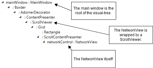
NetworkView被包装在一个ScrollViewer中,这在下面主窗口的视觉树图(感谢VS 2010可视化工具)中可以看到。
节点样式
NodeItem样式将其数据绑定到NodeViewModel。
<Style TargetType="{x:Type NetworkUI:NodeItem}">
    <Setter
        Property="X"
        Value="{Binding X}"
        />
    <Setter
        Property="Y"
        Value="{Binding Y}"
        />
    <Setter
        Property="IsSelected"
        Value="{Binding IsSelected}"
        />
</Style>
X、Y和IsSelected的数据绑定使我们能够通过视图模型控制每个节点的位置和选择状态。由于数据绑定,对视图模型的更改会自动更新UI。当然,要使其正常工作,视图模型类必须实现INotifyPropertyChanged。
节点数据模板
NodeViewModel数据模板定义了每个节点的大小、外观和布局。
<DataTemplate
    DataType="{x:Type NetworkModel:NodeViewModel}"
    >
    <Grid
        Width="120"
        Height="60"
        >

        <!-- This rectangle is the main visual for the node. -->
        <Rectangle
            Stroke="Black"
            Fill="White"
            RadiusX="4"
            RadiusY="4"
            />

        <!--
        This grid contains the node's name and connectors.
        The margin is negative so that the connectors overlap
        the body of the node and it's selection border.
        -->
        <Grid
            Margin="-8"
            >
            <Grid.ColumnDefinitions>
                <ColumnDefinition Width="Auto" />
                <ColumnDefinition Width="*" MinWidth="10" />
                <ColumnDefinition Width="Auto" />
            </Grid.ColumnDefinitions>
            <Grid.RowDefinitions>
                <RowDefinition Height="Auto" />
                <RowDefinition Height="*" />
                <RowDefinition Height="Auto" />
            </Grid.RowDefinitions>

            <!-- The name of the node. -->
            <TextBlock
                Grid.Column="1"
                Grid.Row="1"
                Text="{Binding Name}"
                HorizontalAlignment="Center"
                VerticalAlignment="Center"
                />

            <!-- ... Define the node's four connectors, one on each edge of the node. ... -->

        </Grid>
    </Grid>
</DataTemplate>
节点的视觉树由一个矩形和一个3x3网格叠加组成。该网格显示节点名称及其四个连接点。一个连接点放置在矩形的每个边缘。网格边距为负数纯粹是出于美观考虑,它使边缘的连接点与节点的边框很好地重叠。
ConnectorItem标识节点视觉树中的每个连接点。例如,这里是第一个连接点。
<NetworkUI:ConnectorItem
    Grid.Row="0"
    Grid.Column="1"
    DataContext="{Binding Connectors[0]}"
    />
DataContext数据绑定使用数组索引表示法绑定到Connectors集合的第一个元素。其他三个未显示的连接点通过数据绑定绑定到集合中的其他三个元素。
此图显示了节点视觉树在父NetworkView的视觉树中的位置。

连接点样式
ConnectorItem样式将连接点热点数据绑定到视图模型,并定义了一个控件模板。
<Style
    TargetType="{x:Type NetworkUI:ConnectorItem}"
    >

    <!--
    Data-binding for the connector hotspot.
    ConnectorItem automatically computes its center points and assings this value
    to the 'Hotspot' property.  This data-binding then 'pushes' the value into the application
    view-model.
    -->
    <Setter
        Property="Hotspot"
        Value="{Binding Hotspot, Mode=OneWayToSource}"
        />

    <!-- The visual template. -->
    <Setter Property="Template">
        <Setter.Value>
            <ControlTemplate
                TargetType="{x:Type NetworkUI:ConnectorItem}"
                >
                <Rectangle
                    Stroke="Black"
                    Fill="White"
                    Cursor="Hand"
                    Width="12"
                    Height="12"
                    RadiusX="1"
                    RadiusY="1"
                    />
            </ControlTemplate>
        </Setter.Value>
    </Setter>
</Style>
如图所示,连接点的视觉树非常简单。

Hotspot数据绑定将ConnectorItem计算出的连接点热点值推送到视图模型。正如我在绑定UI元素位置的文章中所讨论的,将Mode设置为OneWayToSource会将值从UI推送到视图模型,而不是反过来(更常见)。
此图说明了Hotspot数据绑定。

连接数据模板
ConnectionViewModel数据模板将连接可视化表示为带箭头的图形。
<DataTemplate
    DataType="{x:Type NetworkModel:ConnectionViewModel}"
    >

    <!-- The connection is represented by a simple arrow. -->
    <local:Arrow
        Stroke="Black"
        StrokeThickness="2"
        Fill="Black"
        Start="{Binding SourceConnectorHotspot}"
        End="{Binding DestConnectorHotspot}"
        IsHitTestVisible="False"
        />
</DataTemplate>
Arrow类派生自 Shape,是一个简单的应用程序特定视觉元素。如果您想从更简单的东西开始,可以使用标准的WPF Line。
<Line
    Stroke="Black"
    X1="{Binding SourceConnectorHotspot.X}"
    Y1="{Binding SourceConnectorHotspot.Y}"
    X2="{Binding DestConnectorHotspot.X}"
    Y2="{Binding DestConnectorHotspot.Y}"
    />
我没有详细介绍Arrow类,但我应该提到Charles Petzold一篇很棒的博客文章,它帮助我弄清楚了如何在WPF中制作箭头。
此图显示了视图模型如何提供箭头的起点和终点。

为了保持其SourceConnectorHotspot或DestConnectorHotspot属性的最新状态,ConnectionViewModel会监控其源和目标连接点,以获取连接点热点的变化。它通过处理ConnectorViewModel的HotspotUpdated事件来做到这一点。
请注意,Arrow的 IsHitTestVisible属性设置为False。使箭头对命中测试不可见意味着,当连接与下方的连接点重叠时,它不会干扰用户拖动新连接。
既然我们已经介绍了连接点和连接端点之间的同步的主要方面,我将展示以下图表作为总结。

代码
我们已经看完了XAML,现在是时候转到代码了。
由于我遵循良好的MVVM原则,您会发现MainWindow.xaml.cs中的代码量很少。这里的事件和命令处理程序将工作委托给视图模型。
通过ViewModel属性访问视图模型。
/// <summary>
/// Convenient accessor for the view-model.
/// </summary>
public MainWindowViewModel ViewModel
{
    get
    {
        return (MainWindowViewModel)this.DataContext;
    }
}
删除节点
当用户按下delete键并且选择了一个或多个节点时,将执行DeleteSelectedNodes命令。
命令被转发到视图模型。
private void DeleteSelectedNodes_Executed(object sender, ExecutedRoutedEventArgs e)
{
    this.ViewModel.DeleteSelectedNodes();
}
视图模型枚举所有节点并删除选中的节点。
public void DeleteSelectedNodes()
{
    // Take a copy of the nodes list so we can delete nodes while iterating.
    var nodesCopy = this.Network.Nodes.ToArray();

    foreach (var node in nodesCopy)
    {
        if (node.IsSelected)
        {
            DeleteNode(node);
        }
    }
}
正是像这样的函数,我们需要知道每个节点的选择状态,这就是为什么在NodeItem样式中有IsSelected数据绑定的原因。
删除节点不仅意味着将其从网络中移除,附加到该节点的所有连接也会被移除。
public void DeleteNode(NodeViewModel node)
{
    //
    // Remove all connections attached to the node.
    //
    this.Network.Connections.RemoveRange(node.AttachedConnections);

    //
    // Remove the node from the network.
    //
    this.Network.Nodes.Remove(node);
}
创建新节点
上下文菜单的Create Node调用CreateNode命令。
命令再次被转发到视图模型。
private void CreateNode_Executed(object sender, ExecutedRoutedEventArgs e)
{
    Point newNodeLocation = Mouse.GetPosition(networkControl);
    this.ViewModel.CreateNode("New Node!", newNodeLocation);
}
在这种情况下,命令处理程序会做一些少量的工作来确定鼠标光标的位置,然后将其传递给视图模型。
public NodeViewModel CreateNode(string name, Point nodeLocation)
{
    var node = new NodeViewModel(name);
    node.X = nodeLocation.X;
    node.Y = nodeLocation.Y;

    //
    // Create the default set of four connectors.
    //
    node.Connectors.Add(new ConnectorViewModel());
    node.Connectors.Add(new ConnectorViewModel());
    node.Connectors.Add(new ConnectorViewModel());
    node.Connectors.Add(new ConnectorViewModel());

    //
    // Add the new node to the view-model (and therefore to the UI).
    //
    this.Network.Nodes.Add(node);

    return node;
}
连接拖动事件
添加和删除节点相对简单。允许用户在节点之间创建连接稍微复杂一些。
要实现连接创建和拖动,必须处理以下事件。
<NetworkUI:NetworkView
    ...
    ConnectionDragStarted="networkControl_ConnectionDragStarted"
    ConnectionDragging="networkControl_ConnectionDragging"
    ConnectionDragCompleted="networkControl_ConnectionDragCompleted"
    />
NetworkView不了解视图模型的结构,因此它必须在关键时刻通过这些事件委托给应用程序,以便视图模型可以根据需要进行构造和转换。
要创建新连接,用户会拖出一个连接点。这将引发ConnectionDragStarted事件,提示应用程序在视图模型中创建并添加一个新连接。在简单示例中,连接的源被设置为拖出的连接点。
在拖动操作期间,ConnectionDragging事件会定期引发,提示应用程序更新连接的目标端。
当用户将连接的目标端拖放到另一个连接点或空白区域时,拖动操作结束。在这两种情况下,都会引发ConnectionDragCompleted事件,提示应用程序完成新连接或取消它。当连接完成时,它会将目标端锚定到放置的连接点。
ConnectionDragStarted
networkControl_ConnectionDragStarted在转发到视图模型之前会进行少量工作。
private void networkControl_ConnectionDragStarted(object sender, ConnectionDragStartedEventArgs e)
{
    var draggedOutConnector = (ConnectorViewModel)e.ConnectorDraggedOut;
    var curDragPoint = Mouse.GetPosition(networkControl);

    //
    // Delegate the real work to the view model.
    //
    var connection = this.ViewModel.ConnectionDragStarted(draggedOutConnector, curDragPoint);

    //
    // Must return the view-model object that represents the connection via the event args.
    // This is so that NetworkView can keep track of the object while it is being dragged.
    //
    e.Connection = connection;
}
拖出的连接点和当前鼠标位置会传递给ConnectionDragStarted,该方法首先会删除已附加到拖出的连接点的任何现有连接。
public ConnectionViewModel ConnectionDragStarted(ConnectorViewModel draggedOutConnector, Point curDragPoint)
{
    if (draggedOutConnector.AttachedConnection != null)
    {
        //
        // There is an existing connection attached to the connector that has been dragged out.
        // Remove the existing connection from the view-model.
        //
        this.Network.Connections.Remove(draggedOutConnector.AttachedConnection);
    }

    // ... rest of the method ...
}
接下来,会创建一个ConnectionViewModel实例,并将源连接点锚定到拖出的连接点。
public ConnectionViewModel ConnectionDragStarted(ConnectorViewModel draggedOutConnector, Point curDragPoint)
{
    // ... remove existing connection ...

    //
    // Create a new connection to add to the view-model.
    //
    var connection = new ConnectionViewModel();

    //
    // Link the source connector to the connector that was dragged out.
    //
    connection.SourceConnector = draggedOutConnector;

    // ... rest of the method ...
}
在ConnectionViewModel的SourceConnector设置器(以及DestConnector)中,会完成一些重要工作,并且需要一个简短的插曲来查看它。
/// <summary>
/// The source connector the connection is attached to.
/// </summary>
public ConnectorViewModel SourceConnector
{
    get
    {
        return sourceConnector;
    }
    set
    {
        if (sourceConnector == value)
        {
            return;
        }

        if (sourceConnector != null)
        {
            Trace.Assert(sourceConnector.AttachedConnection == this);

            sourceConnector.AttachedConnection = null;
            sourceConnector.HotspotUpdated -= new EventHandler<eventargs>(sourceConnector_HotspotUpdated);
        }

        sourceConnector = value;

        if (sourceConnector != null)
        {
            Trace.Assert(sourceConnector.AttachedConnection == null);

            sourceConnector.AttachedConnection = this;
            sourceConnector.HotspotUpdated += new EventHandler<eventargs>(sourceConnector_HotspotUpdated);
            this.SourceConnectorHotspot = sourceConnector.Hotspot;
        }

        OnPropertyChanged("SourceConnector");
    }
}
请注意,连接点热点值从源连接点的Hotspot属性复制到连接的SourceConnectorHotspot属性。回想一下连接数据模板,该属性已通过数据绑定到Arrow UI元素的起点。连接会挂钩HotspotUpdated事件,以便能够使SourceConnectorHotspot与连接点热点保持同步。
现在回到ConnectionDragStarted,源连接点已设置,但还没有目标连接点,直到用户完成连接拖动才会有一个。由于DestConnector尚未设置,DestConnectorHotspot也未设置,并且必须将其设置为当前鼠标位置。
public ConnectionViewModel ConnectionDragStarted(ConnectorViewModel draggedOutConnector, Point curDragPoint)
{
    // ... remove existing connection ...

    // ... create new connection and set source connector ...

    //
    // Set the position of destination connector to the current position of the mouse cursor.
    //
    connection.DestConnectorHotspot = curDragPoint;

    // ... rest of the method ...
}
最后,将新连接添加到视图模型,并将连接对象返回到主窗口的视图代码。
public ConnectionViewModel ConnectionDragStarted(ConnectorViewModel draggedOutConnector, Point curDragPoint)
{
    // ... remove existing connection ...

    // ... create new connection and set source connector ...

    // .. set DestConnectorHotspot from currnet mouse position ...

    //
    // Add the new connection to the view-model.
    //
    this.Network.Connections.Add(connection);

    return connection;
}
连接对象通过ConnectionDragStarted事件参数返回,NetworkView在拖动操作进行时会跟踪此对象。
此时,已创建新连接并已添加到视图模型。连接在源端锚定到拖出的连接点,目标端设置为当前鼠标位置。
ConnectionDragging
networkControl_ConnectionDragging会在拖动操作期间定期调用。它会转发到ConnectionDragging,后者只是将连接的目标端固定在当前鼠标位置。
public void ConnectionDragging(ConnectionViewModel connection, Point curDragPoint)
{
    //
    // Update the destination connector hotspot while the user is dragging the connection.
    //
    connection.DestConnectorHotspot = curDragPoint;
}
ConnectionDragCompleted
networkControl_ConnectionDragCompleted转发到ConnectionDragCompleted,该方法首先检查拖动操作是否已取消。如果是,则从视图模型中删除新连接,无需进一步操作。
public void ConnectionDragCompleted(ConnectionViewModel newConnection,
       ConnectorViewModel connectorDraggedOut, ConnectorViewModel connectorDraggedOver)
{
    if (connectorDraggedOver == null)
    {
        //
        // The connection was unsuccessful.
        // Maybe the user dragged it out and dropped it in empty space.
        //
        this.Network.Connections.Remove(newConnection);
        return;
    }

    // ... rest of the method ...
}
如果连接未被取消,则该方法继续执行,并删除已附加到目标连接点的任何现有连接。
public void ConnectionDragCompleted(ConnectionViewModel newConnection,
           ConnectorViewModel connectorDraggedOut, ConnectorViewModel connectorDraggedOver)
{
    // ... if connection creation is cancelled, remove the connection ...

    //
    // The user has dragged the connector on top of another valid connector.
    //

    var existingConnection = connectorDraggedOver.AttachedConnection;
    if (existingConnection != null)
    {
        //
        // There is already a connection attached to the connector that was dragged over.
        // Remove the existing connection from the view-model.
        //
        this.Network.Connections.Remove(existingConnection);
    }

    // ... rest of the method ...
}
最后,通过将连接的目标端锚定到放置的连接点来完成连接,并且从现在开始,DestConnectorHotspot将自动与目标连接点热点同步。
public void ConnectionDragCompleted(ConnectionViewModel newConnection,
          ConnectorViewModel connectorDraggedOut, ConnectorViewModel connectorDraggedOver)
{
    // ... if connection creation is canceled, remove the connection ...

    // ... remove existing connection ...

    //
    // Finalize the connection by attaching it to the connector
    // that the user dropped the connection on.
    //
    newConnection.DestConnector = connectorDraggedOver;
}
至此,我们完成了简单示例演练。我们已经涵盖了NetworkView使用的最重要方面,但仍有相当多的内容被一带而过或根本没有进行审查。这次演练应该是您自己检查代码的起点。没有比在关键位置设置断点并实际逐步执行代码更好的方法来理解代码了。
高级示例演练
您现在应该在NetworkViewSampleCode.sln中将AdvancedSample设置为Startup Project。如果您还没有这样做,请构建并运行应用程序,并花几分钟时间对其进行探索。
本文开头截图显示了正在运行的高级示例。
一眼就能看出,样式和模板更加有趣且视觉上复杂。高级示例使用了我为早期文章开发的控件和技术。事实上,这些文章是在本文的开发过程中完成的,而不是反之。
高级示例的主要变化总结如下:
- 视图模型现在是一种数据流图,每个节点都有输入和输出连接点。
- 现在对新连接的创建施加了一些限制。例如,输入只能连接到输出,反之亦然。尝试将输入连接到输入或输出连接到输出会导致显示错误的连接反馈图标。
- 节点现在具有任意数量的连接点,而不是固定的数量。
- 连接现在可以显式删除。将鼠标悬停在连接点上,会出现一个按钮,可以点击该按钮删除连接。我还使用同一种鼠标悬停按钮作为删除节点的替代方法。
- 使用ZoomAndPanControl实现了缩放和平移功能以及新的概览窗口。
- 一个视图模型由主窗口和概览窗口共享。
- 一些样式和数据模板使用资源字典在主窗口和概览窗口之间共享。
视图模型
此图显示了AdvancedNetworkModel项目中的视图模型类。由于它们与简单示例非常相似,我只会提到差异。

|
共享资源字典
共享的样式和数据模板包含在一个共享资源字典中,该字典被合并到主窗口的资源中。
<Window.Resources>

    <ResourceDictionary>
        <ResourceDictionary.MergedDictionaries>
            <!--
            Merge in the resource dictionary that is shared between the main window and the overview window.
            -->
            <ResourceDictionary
                Source="SharedVisualTemplates.xaml"
                />
        </ResourceDictionary.MergedDictionaries>

        <!-- ... other resources ... -->

    </ResourceDictionary>

<Window.Resources>
让我们看一下SharedVisualTemplates.xaml中的一些定义。
NodeItem样式
共享的NodeItem样式与简单示例中的几乎相同,所以我在这里不予重印。唯一的增加是新的ZIndex数据绑定,如上所述,它被包含为示例,但在此示例中并未实际使用。
连接点数据模板
高级示例引入了不同的连接点类型,因此它为每种类型都有不同的数据模板。输入和输出连接点分别定向到节点的左侧和右侧,因此它们的排列方式截然不同。
输入连接点的数据模板在其连接点视觉效果的右侧显示其名称。
<DataTemplate
    x:Key="inputConnectorTemplate"
    >
    <Grid
        Margin="0,2,0,0"
        >
        <Grid.ColumnDefinitions>
            <ColumnDefinition Width="Auto" />
            <ColumnDefinition Width="*" />
        </Grid.ColumnDefinitions>

        <!-- The 'ConnectorItem' or anchor point for the connector. -->
        <NetworkUI:ConnectorItem
            Grid.Column="0"
            Width="15"
            Height="15"
            Cursor="Hand"
            />

        <!-- The name of the connector. -->
        <TextBlock
            Grid.Column="1"
            Margin="5,0,0,0"
            Text="{Binding Name}"
            VerticalAlignment="Center"
            />
    </Grid>
</DataTemplate>
输出连接点的数据模板看起来非常相似,但却是反过来的,名称显示在连接点视觉效果的左侧。查看输出连接点数据模板,您会注意到当连接点附加连接时,会显示一个黑点。这是为了美观,因为我认为这使得连接看起来更好。这个黑点可以很容易地成为箭头视觉效果的一部分,但这效果不太好。高级示例中的连接需要处理鼠标输入(以显示删除连接鼠标悬停按钮),这意味着如果我们渲染连接的一部分(例如,如果黑点是连接的一部分)在下方的连接点上方,它会干扰用户拖出新连接的能力。因此,黑点是连接点的一部分,而不是连接的一部分。
现在,我们将继续查看MainWindow.xaml。这里的样式和数据模板用于主窗口中的交互式图形组件。OverviewWindow.xaml中存在类似的样式和数据模板,用于实现非交互式图形组件,因为您无法与概览窗口中的图形进行交互。
NetworkView定义
查看高级示例XAML中的NetworkView,您会发现它不仅包装在ScrollViewer中(如简单示例中),它现在包装在ScrollViewer、ZoomAndPanControl和AdornerDecorator中。
这里有一个概述。
<ScrollViewer
    ...
    >

    <ZoomAndPan:ZoomAndPanControl
        ...
        >
        <AdornerDecorator>
            <Grid
                ...
                >

                <NetworkUI:NetworkView
                    ...
                    />

                <Canvas
                    x:Name="dragZoomCanvas"
                    ...
                    >
                    <Border
                        ...
                        />
                </Canvas>

            </Grid>
        </AdornerDecorator>
    </ZoomAndPan:ZoomAndPanControl>
</ScrollViewer>
此图说明了主窗口的视觉树。

ZoomAndPanControl来自我之前的文章,我不会在此详细介绍。只需说它提供了缩放和平移NetworkView的功能。
AdornerDecorator在视觉树的ZoomAndPanControl下方创建了一个新的修饰层。修饰符用于显示删除连接和删除节点的鼠标悬停按钮以及反馈图标。如果没有AdornerDecorator,那么修饰符将显示在视觉树中位于ZoomAndPanControl上方的默认修饰层中。如果使用此修饰层而不是明确定义的修饰层,则意味着修饰符不会受到ZoomAndPanControl(通过其渲染转换)应用的缩放和平移转换的影响,因此不会与ZoomAndPanControl的内容在同一缩放级别上。
dragZoomCanvas(在NetworkView之后)用于渲染缩放矩形,该矩形允许用户拖出一个矩形进行缩放。这种技术在ZoomAndPanControl文章中有所描述。
NodeViewModel数据模板
NodeViewModel数据模板与简单示例版本类似,但使用AdornedControl和呈现节点任意数量的连接点使其更加复杂。
这里有一个概述。
<!-- Define a data-template for the 'NodeViewModel' class. -->
<DataTemplate
    DataType="{x:Type NetworkModel:NodeViewModel}"
    >

    <!--
    An adorned control is used, to represent the node.
    When the user hovers the mouse cursor over the node, the
    'delete node' adorner pops up and allows them to delete the node.
    -->
    <ac:AdornedControl
        ...
        IsMouseOverShowEnabled="{Binding ElementName=networkControl, Path=IsNotDragging}"
        >

        <!-- ... node visuals ... -->

        <ac:AdornedControl.AdornerContent>

            <!--
            This is the content for the 'delete node' adorner that pops up
            when the user hovers the mouse over the node.
            It displays a button that the user can click to delete the node.
            -->

            <!-- ... delete node mouse-hover button -->

        </ac:AdornedControl.AdornerContent>
    </ac:AdornedControl>
</DataTemplate>
使用修饰符来显示删除节点鼠标悬停按钮是我第一篇Code Project文章的原因。请注意,IsMouseOverShowEnabled数据绑定到NetworkView的IsNotDragging属性。这确保了在拖动节点或连接时,鼠标悬停按钮永远不会显示。
除了使用修饰符和呈现连接之外,节点的视觉效果与简单示例相似。
<Grid
    MinWidth="120"
    Margin="10,6,10,6"
    SizeChanged="Node_SizeChanged"
    >

    <!-- This rectangle is the main visual for the node. -->

    <Rectangle
        Stroke="{StaticResource nodeBorderBrush}"
        StrokeThickness="1.3"
        RadiusX="4"
        RadiusY="4"
        Fill="{StaticResource nodeFillBrush}"
        />

    <!--
    This grid contains the node's connectors.
    The margin is negative so that the connectors overlap the body of the node and it's selection border.
    -->
    <Grid
        Margin="-6,4,-6,4"
        >
        <Grid.ColumnDefinitions>
            <ColumnDefinition Width="Auto" />
            <ColumnDefinition Width="*" MinWidth="10" />
            <ColumnDefinition Width="Auto" />
        </Grid.ColumnDefinitions>
        <Grid.RowDefinitions>
            <RowDefinition Height="Auto" />
            <!-- spacer -->
            <RowDefinition Height="2" />
            <RowDefinition Height="Auto" />
        </Grid.RowDefinitions>

        <!-- The name of the node. -->
        <TextBlock
            Grid.Column="0"
            Grid.ColumnSpan="3"
            Grid.Row="0"
            Text="{Binding Name}"
            HorizontalAlignment="Center"
            VerticalAlignment="Center"
            />

            <!-- ... Visuals for connectors defined here ... -->

        </Grid>
</Grid>
处理节点的SizeChanged事件意味着节点的实际大小可以存储在视图模型中。通过访问大小,可以在创建新节点时将它们居中于鼠标位置。
由于节点现在具有任意数量的输入和输出连接点,因此这两种连接点都使用ItemsControl来呈现。
<!-- Displays the node's input connectors. -->
<ItemsControl
    Grid.Column="0"
    Grid.Row="2"
    ItemsSource="{Binding InputConnectors}"
    ItemTemplate="{StaticResource inputConnectorTemplate}"
    />

<!-- Displays the node's output connectors. -->
<ItemsControl
    Grid.Column="2"
    Grid.Row="2"
    ItemsSource="{Binding OutputConnectors}"
    ItemTemplate="{StaticResource outputConnectorTemplate}"
    />
每个ItemsControl的ItemsSource都通过数据绑定到节点视图模型的InputConnectors和OutputConnectors属性。输入连接点放置在节点左侧网格的第0列,输出连接点放置在右侧网格的第2列。
此图显示了节点及其连接在父NetworkView的视觉树中的视觉树。

删除节点鼠标悬停按钮
删除节点按钮是节点修饰符的内容。当用户将鼠标悬停在节点上时,按钮会出现在节点上方和右侧。
XAML定义本质上很简单。它是一个自定义按钮,放置在Canvas中,并且有一个Line连接按钮和节点。
<!--
This is the adorner that pops up when the user hovers the mouse over the node.
It displays a button that the user can click to delete the node.
-->
<Canvas
    x:Name="nodeAdornerCanvas"
    HorizontalAlignment="Right"
    VerticalAlignment="Top"
    Width="30"
    Height="30"
    >
    <Line
        X1="0"
        Y1="30"
        X2="15"
        Y2="15"
        Stroke="Black"
        StrokeThickness="1"
        />
    <Button
        x:Name="deleteNodeButton"
        Canvas.Left="10"
        Canvas.Top="0"
        Width="20"
        Height="20"
        Cursor="Hand"
        Focusable="False"
        Command="{StaticResource Commands.DeleteNode}"
        CommandParameter="{Binding}"
        Template="{StaticResource deleteButtonTemplate}"
        />
</Canvas>
按钮的控件模板在XAML的更早位置定义。点击按钮会调用DeleteNode命令,并且符号
CommandParameter="{Binding}"
将按钮的DataContext数据绑定到CommandParameter,因此当前节点的视图模型指定了要删除的节点。
ConnectorItem样式
ConnectorItem样式与简单示例中的几乎相同,所以我在这里不予重印。唯一的区别是连接现在以Ellipse而非Rectangle的形式进行视觉表示。OverviewWindow.xaml中也定义了一个相应的样式。这个样式不与主窗口和概览窗口共享,因为它只需要在MainWindow.xaml中进行Hotspot数据绑定,因为在两个视图中只有一个视图需要将计算出的连接点热点实际推送到视图模型。
ConnectionViewModel数据模板
ConnectionViewModel数据模板与简单示例相似,但由于实现了删除连接鼠标悬停按钮,因此更复杂。它的工作方式与删除节点按钮相同,它们甚至共享相同的控件模板。
我将首先展示OverviewWindow.xaml中更简单的非交互式数据模板。
<DataTemplate
    DataType="{x:Type NetworkModel:ConnectionViewModel}"
    >

    <!-- The connection is represented by a curved arrow. -->
    <local:CurvedArrow
        Stroke="{StaticResource connectionBrush}"
        StrokeThickness="2"
        Fill="{StaticResource connectionBrush}"
        Points="{Binding Points}"
        />
</DataTemplate>
高级示例使用贝塞尔曲线来视觉表示连接,Points属性提供了曲线的控制点。与简单示例中的Arrow一样,我不会讨论CurvedArrow类。查看ComputeConnectionPoints方法了解连接点的计算方法。
现在回到MainWindow.xaml,查看交互式且更复杂ConnectionViewModel数据模板。
这里有一个概述。
<DataTemplate
    DataType="{x:Type NetworkModel:ConnectionViewModel}"
    >

    <ac:AdornedControl
        ...
        >

        <!-- The connection is represented by a curved arrow. -->

        <local:CurvedArrow
            ...
            />

        <ac:AdornedControl.AdornerContent>

            <!-- ... The content of the adorner ... -->

        </ac:AdornedControl.AdornerContent>

    </ac:AdornedControl>

</DataTemplate>
修饰符内容与前面讨论的删除节点按钮的修饰符内容基本相同。点击删除连接按钮会调用DeleteConnection命令,并将当前连接的视图模型(指定要删除的连接)作为命令参数传递。
删除节点和连接
在简单示例中,delete键用于删除选定的节点。此外,现在还有一个删除节点按钮,用于调用DeleteNode命令。要删除的节点由命令参数指定,并转发到视图模型。
private void DeleteNode_Executed(object sender, ExecutedRoutedEventArgs e)
{
    var node = (NodeViewModel)e.Parameter;
    this.ViewModel.DeleteNode(node);
}
DeleteNode方法与我们在简单示例中已经看到的相同。由于删除连接的代码与上面删除节点的代码非常相似,我将不在此赘述。
连接拖动事件
是时候查看创建和拖动连接的代码了。查看XAML,我们看到一些与简单示例中使用的事件相同,但还有一个新事件称为QueryConnectionFeedback。
<NetworkUI:NetworkView
    ...

    ConnectionDragStarted="networkControl_ConnectionDragStarted"
    QueryConnectionFeedback="networkControl_QueryConnectionFeedback"
    ConnectionDragging="networkControl_ConnectionDragging"
    ConnectionDragCompleted="networkControl_ConnectionDragCompleted"

    ...
    />
我们在简单示例中已经讨论了ConnectionDragStarted、ConnectionDragging和ConnectionDragCompleted,但它们现在有点不同,所以我们需要再次回到它们。QueryConnectionFeedback在高级示例中是全新的,它允许应用程序提供有关两个连接点之间建议连接是否有效的反馈。
ConnectionDragStarted
当用户开始拖出新连接时调用此方法。在简单示例中,此方法以删除任何现有连接开头。现在不需要这样做,因为在高级示例中,多个连接可以锚定到单个连接点。另请注意方法中间的新if语句。
public ConnectionViewModel ConnectionDragStarted(ConnectorViewModel draggedOutConnector, Point curDragPoint)
{
    //
    // Create a new connection to add to the view-model.
    //
    var connection = new ConnectionViewModel();

    if (draggedOutConnector.Type == ConnectorType.Output)
    {
        //
        // The user is dragging out a source connector (an output) and will connect it to a destination connector (an input).
        //
        connection.SourceConnector = draggedOutConnector;
        connection.DestConnectorHotspot = curDragPoint;
    }
    else
    {
        //
        // The user is dragging out a destination connector (an input) and will connect it to a source connector (an output).
        //
        connection.DestConnector = draggedOutConnector;
        connection.SourceConnectorHotspot = curDragPoint;
    }

    //
    // Add the new connection to the view-model.
    //
    this.Network.Connections.Add(connection);

    return connection;
}
该if语句用于处理两种新的连接点类型:输入和输出。无论哪种类型的连接点都可以拖出以创建新连接,而新连接的配置取决于连接点的类型。简单示例假定拖出的连接点始终是源连接点,而放置的连接点始终是目标连接点。在高级示例中,无论拖出哪个连接点,输出连接点都被视为源连接点,输入连接点被视为目标连接点。if语句考虑了这一点,并根据情况设置SourceConnector或DestConnector。
ConnectionDragging
拖动进行时调用此方法,也类似于简单示例。这里我们看到另一个if语句,它根据连接的哪一端(源或目标)被拖动来设置DestConnectorHotspot或SourceConnectorHotspot。
public void ConnectionDragging(Point curDragPoint, ConnectionViewModel connection)
{
    if (connection.DestConnector == null)
    {
        connection.DestConnectorHotspot = curDragPoint;
    }
    else
    {
        connection.SourceConnectorHotspot = curDragPoint;
    }
}
ConnectionDragCompleted
连接拖动完成后调用此方法。同样,它与简单示例类似,但有一些变化。第一个区别是它检查建议的连接是否无效,如果是,则中止新连接的创建。
public void ConnectionDragCompleted(ConnectionViewModel newConnection,
       ConnectorViewModel connectorDraggedOut, ConnectorViewModel connectorDraggedOver)
{
    // ... if connection unsuccessful, remove it the from view-model and return ...

    //
    // Only allow connections from output connector to input connector (ie each
    // connector must have a different type).
    // Also only allocation from one node to another, never one node back to the same node.
    //
    bool connectionOk = connectorDraggedOut.ParentNode != connectorDraggedOver.ParentNode &&
                        connectorDraggedOut.Type != connectorDraggedOver.Type;

    if (!connectionOk)
    {
        //
        // Connections between connectors that have the same type,
        // eg input -> input or output -> output, are not allowed,
        // Remove the connection.
        //
        this.Network.Connections.Remove(newConnection);
        return;
    }

    // ... rest of the method ...
}
然后它检查并删除两个连接点之间的任何现有连接。
public void ConnectionDragCompleted(ConnectionViewModel newConnection,
       ConnectorViewModel connectorDraggedOut, ConnectorViewModel connectorDraggedOver)
{
    // ... if connection unsucessful, remove it the from view-model and return ...

    // ... check that connection is valid, if not valid remove it from the view-model and return ...

    //
    // The user has dragged the connection on top of another valid connector.
    //

    //
    // Remove any existing connection between the same two connectors.
    //
    var existingConnection = FindConnection(connectorDraggedOut, connectorDraggedOver);
    if (existingConnection != null)
    {
        this.Network.Connections.Remove(existingConnection);
    }

    // ... rest of the method ...
}
尽管高级示例允许将多个连接附加到单个连接点,但它不允许在同一对连接点之间存在多个连接。因此,我们必须搜索并删除任何此类连接。FindConnection是查找此类连接的方法。
最后,新连接被锚定到放置的连接点。这里我们看到一个if语句,根据情况设置DestConnector或SourceConnector。
public void ConnectionDragCompleted(ConnectionViewModel newConnection,
       ConnectorViewModel connectorDraggedOut, ConnectorViewModel connectorDraggedOver)
{
    // ... if connection unsucessful, remove it the from view-model and return ...

    // ... check that connection is valid, if not valid remove it from the view-model and return ...

    // ... remove any existing connection ...

    //
    // Finalize the connection by attaching it to the connector
    // that the user dragged the mouse over.
    //
    if (newConnection.DestConnector == null)
    {
        newConnection.DestConnector = connectorDraggedOver;
    }
    else
    {
        newConnection.SourceConnector = connectorDraggedOver;
    }
}
连接反馈图标
由于我们将要查看QueryConnectionFeedback事件,所以现在是时候简要回到XAML并查看一个定义反馈对象UI的数据模板。ConnectionBadIndicator数据模板显示一个红叉,表示建议的连接无效。
<DataTemplate DataType="{x:Type local:ConnectionBadIndicator}">
    <Grid
        Width="80"
        >
        <Image
            Width="32"
            Height="32"
            Source="Resources/block_16.png"
            HorizontalAlignment="Right"
            />
    </Grid>
</DataTemplate>
还有一个ConnectionOkIndicator数据模板,它非常相似,但显示一个绿勾,表示建议的连接有效。
QueryConnectionFeedback
这允许应用程序提供有关建议连接有效性的反馈。事件处理程序在将工作委托给视图模型之前和之后执行少量工作。
private void networkControl_QueryConnectionFeedback(object sender, QueryConnectionFeedbackEventArgs e)
{
    var draggedOutConnector = (ConnectorViewModel)e.ConnectorDraggedOut;
    var draggedOverConnector= (ConnectorViewModel)e.DraggedOverConnector;
    object feedbackIndicator = null;
    bool connectionOk = true;

    //
    // The view-model does the real work.
    //
    this.ViewModel.QueryConnnectionFeedback(draggedOutConnector,
            draggedOverConnector, out feedbackIndicator, out connectionOk);

    //
    // Return the feedback object to NetworkView.
    // The object combined with the data-template for it will be used to create a 'feedback icon' to
    // display (in an adorner) to the user.
    //
    e.FeedbackIndicator = feedbackIndicator;

    //
    // Let NetworkView know if the connection is ok or not ok.
    //
    e.ConnectionOk = connectionOk;
}
应用程序通过事件参数返回一个反馈对象,NetworkView将其显示为反馈图标修饰符的内容。通常的WPF数据模板查找规则适用,ConnectionOkIndicator和ConnectionBadIndicator数据模板生成反馈图标的UI。视图代码还将事件参数中的ConnectionOk设置为由视图模型返回的值(true或false),以指示连接的有效性。
视图模型中的QueryConnnectionFeedback确定新连接的有效性,创建适当的反馈对象,并通过输出参数connectionOk返回true或false,以允许或禁止连接。
public void QueryConnnectionFeedback(ConnectorViewModel draggedOutConnector,
       ConnectorViewModel draggedOverConnector, out object feedbackIndicator, out bool connectionOk)
{
    if (draggedOutConnector == draggedOverConnector)
    {
        //
        // Can't connect to self!
        // Provide feedback to indicate that this connection is not valid!
        //
        feedbackIndicator = new ConnectionBadIndicator();
        connectionOk = false;
    }
    else
    {
        var sourceConnector = draggedOutConnector;
        var destConnector = draggedOverConnector;

        //
        // Only allow connections from output connector to input connector (ie each
        // connector must have a different type).
        // Also only allocation from one node to another, never one node back to the same node.
        //
        connectionOk = sourceConnector.ParentNode != destConnector.ParentNode &&
                       sourceConnector.Type != destConnector.Type;

        if (connectionOk)
        {
            //
            // Yay, this is a valid connection!
            // Provide feedback to indicate that this connection is ok!
            //
            feedbackIndicator = new ConnectionOkIndicator();
        }
        else
        {
            //
            // Connectors with the same connector type (eg input & input, or output & output)
            // can't be connected.
            // Only connectors with separate connector type (eg input & output).
            // Provide feedback to indicate that this connection is not valid!
            //
            feedbackIndicator = new ConnectionBadIndicator();
        }
    }
}
这结束了示例项目的演练。与简单示例一样,我没有涵盖所有内容,这次演练应该作为您自己检查和理解代码的起点。现在我们转到第二部分,深入探讨NetworkView的实现。如果您对细节不感兴趣,请直接跳到结论或NetworkView参考。
第二部分 - NetworkView实现
本文的这一部分解释了NetworkView的实现以及我在创建它时所做的一些决定。
内部来看,这个控件很复杂,它无疑是我迄今为止最复杂的控件,尽管现在控件已经很复杂了,但在早期它甚至更复杂!随着我对WPF了解的深入,我能够简化NetworkView的各个部分。
NetworkUI类
在本文开头我们查看了NetworkUI项目中主要类的简单类图。下图扩展了原始类图,并显示了主要类之间的关系。实线表示继承,虚线表示用法。请注意,此图中的某些类和成员使用了internal关键字,并且仅在NetworkUI程序集内可访问。
 |
请注意,没有名为 |
默认样式设置
NetworkView及相关类的默认样式在Themes/Generic.xaml中。这就是WPF查找控件默认样式的��方。有关此文件的更多信息,您应该阅读Microsoft的控件创作概述。
为了让WPF找到默认样式,必须将以下代码添加到Properties\AssemblyInfo.cs中。
[assembly: ThemeInfo(
    ResourceDictionaryLocation.None,
    ResourceDictionaryLocation.SourceAssembly
)]
我们还必须为每个自定义控件类实现一个静态构造函数,并重写控件默认样式键的元数据。NetworkView、NodeItem和ConnectorItem都有一个静态构造函数。例如,查看NetworkView的静态构造函数。
static NetworkView()
{
    DefaultStyleKeyProperty.OverrideMetadata(typeof(NetworkView),
                  new FrameworkPropertyMetadata(typeof(NetworkView)));

    // ...
}
在正确设置的情况下,WPF会自动将默认样式应用于我们的自定义控件。
NetworkView类和默认样式
NetworkView显然是最重要的类。它呈现网络,并且是包含节点、连接点和连接的视觉树的根。
public partial class NetworkView : Control
{
    // ...
}
注意partial关键字的使用。NetworkView的定义分布在多个源文件中。主代码文件是NetworkView.cs。NetworkView的其余代码按功能分组,并分布在NetworkView_NodeDragging.cs、NetworkView_ConnectionDragging.cs和NetworkView_DragSelection.cs中。每个文件的目的可以从文件名中推断出来。
NetworkView派生自Control,这是所有WPF控件的基类,因此它可以拥有一个控件模板。这允许为控件定义XAML UI或皮肤,并且应用程序可以对其进行重新样式化。
虽然NetworkView仅派生自Control,但从概念上讲,它是一个容器控件。我的意思是它是一个包含其他UI元素的集合的控件。通常,WPF容器控件(如TreeView和ListBox)派生自ItemsControl,这是呈现集合的最基本控件。我确实考虑过将NetworkView派生自ItemsControl,但我没有这样做,因为NetworkView实际上是一个呈现两个独立UI项集合的控件:节点和连接,这意味着它与ItemsControl不太匹配。相反,NetworkView将项管理委托给视觉树中的两个单独的子控件。其中一个是NodeItemsControl的实例,它是ItemsControl的一个实现,满足NodeItem的特殊需求。另一个是常规ItemsControl的实例,因为每个连接仅由一个ContentPresenter表示,并且由于没有ConnectionItem类的特殊需求,因此也没有ConnectionItemsControl类的特殊需求。
NetworkView的默认样式定义了其控件模板和视觉树。
<Style
    TargetType="{x:Type local:NetworkView}"
    >

    <Setter
        Property="Template"
        >
        <Setter.Value>
            <ControlTemplate
                TargetType="{x:Type local:NetworkView}"
                >

                <!-- ... default visual template defined here ... -->

            </ControlTemplate>
        </Setter.Value>
    </Setter>
</Style>
控件模板由包装在Border中的多个命名部分组成。
<Border
    ...
    >
    <Grid>

        <!-- Control that presents the nodes. -->
        <local:NodeItemsControl
            x:Name="PART_NodeItemsControl"
            ...
            />

        <!-- Control that presents the connections between nodes. -->
        <ItemsControl
            x:Name="PART_ConnectionItemsControl"
            ...
            >
            <!-- ... -->
        </ItemsControl>

        <!-- This is used as a very simple way to render a drag selection rectangle. -->
        <Canvas
            x:Name="PART_DragSelectionCanvas"
            ...
            >
            <!-- ... -->
        </Canvas>
    </Grid>
</Border>
此图显示了NetworkView视觉树中的命名部分。

位于命名部分和Border之间的Grid允许节点、连接和拖动选择Canvas的视觉效果占据屏幕上的相同空间,彼此叠加。
在OnApplyTemplate中,命名部分从视觉树中提取并缓存。
public override void OnApplyTemplate()
{
    base.OnApplyTemplate();

    //
    // Cache the parts of the visual tree that we need access to later.
    //

    this.nodeItemsControl = (NodeItemsControl)this.Template.FindName("PART_NodeItemsControl", this);
    // ... error checking ...

    // ... other initialization dependent on this.nodeItemsControl.

    this.connectionItemsControl = (ItemsControl)this.Template.FindName("PART_ConnectionItemsControl", this);
    // ... error checking ...

    this.dragSelectionCanvas = (FrameworkElement)this.Template.FindName("PART_DragSelectionCanvas", this);
    // ... error checking ...

    this.dragSelectionBorder = (FrameworkElement)this.Template.FindName("PART_DragSelectionBorder", this);
    // ... error checking ...
}
OnApplyTemplate在视觉树构建完成后被调用,是执行依赖于视觉树的初始化的最佳位置。
Border的定义包含几个模板绑定。模板绑定将设置在模板化控件(在本例中为NetworkView)上的属性转发到视觉树中的控件。
<Border
    BorderBrush="{TemplateBinding BorderBrush}"
    BorderThickness="{TemplateBinding BorderThickness}"
    Background="{TemplateBinding Background}"
    >
    <Grid>

        <!-- ... -->

    </Grid>
</Border>
此图说明了NetworkView和Border之间的视觉树关系以及链接它们BorderBrush属性的模板绑定。

节点和连接的数据绑定支持
我们已经看过如何使用数据绑定来填充NetworkView的节点和连接。现在我们将检查NetworkView如何使NodesSource和ConnectionsSource与Nodes和Connections保持同步。采用了类似于ItemsControl使用的机制。NodeSource和ConnectionsSource对应于ItemsSource,而Nodes和Connections对应于Items。作为示例,我将仅讨论NodesSource和Nodes。相同关系也适用于ConnectionsSource和Connections,我所说的基本上适用于节点和连接。
当源节点集合实现INotifyCollectionChanged时,会处理CollectionChanged事件,并将更改从NodesSource传播到Nodes。
模板绑定将Nodes属性链接到NodeItemsControl的ItemsSource属性。
<local:NodeItemsControl
    x:Name="PART_NodeItemsControl"
    ItemsSource="{TemplateBinding Nodes}"
    ...
    />
此图说明了视图模型、NetworkView和NodeItemsControl之间的关系。

NodeSource属性实现为一个普通的IEnumerable类型的依赖属性。
public static readonly DependencyProperty NodesSourceProperty =
    DependencyProperty.Register("NodesSource", typeof(IEnumerable), typeof(NetworkView),
        new FrameworkPropertyMetadata(NodesSource_PropertyChanged));

// ...

public IEnumerable NodesSource
{
    get
    {
        return (IEnumerable)GetValue(NodesSourceProperty);
    }
    set
    {
        SetValue(NodesSourceProperty, value);
    }
}
当设置该属性时,会调用属性更改事件处理程序,该处理程序首先清除现有的Nodes集合。
private static void NodesSource_PropertyChanged(DependencyObject d, DependencyPropertyChangedEventArgs e)
{
    NetworkView c = (NetworkView)d;

    //
    // Clear 'Nodes'.
    //
    c.Nodes.Clear();

    // ... rest of the method ...
}
然后,它会解除与旧值的CollectionChanged事件的挂钩。
private static void NodesSource_PropertyChanged(DependencyObject d, DependencyPropertyChangedEventArgs e)
{
    // ... clear existing Nodes collection ...

    if (e.OldValue != null)
    {
        var notifyCollectionChanged = e.OldValue as INotifyCollectionChanged;
        if (notifyCollectionChanged != null)
        {
            //
            // Unhook events from previous collection.
            //
            notifyCollectionChanged.CollectionChanged -=
                  new NotifyCollectionChangedEventHandler(c.NodesSource_CollectionChanged);
        }
    }

    // ... rest of the method ...
}
然后,它枚举新集合,将每个对象添加到Nodes,最后,它挂钩CollectionChanged事件,以便监控源集合的未来更改。
private static void NodesSource_PropertyChanged(DependencyObject d, DependencyPropertyChangedEventArgs e)
{
    // ... clear existing Nodes collection ...

    // ... unhook old value CollectionChanged event ...

    if (e.NewValue != null)
    {
        var enumerable = e.NewValue as IEnumerable;
        if (enumerable != null)
        {
            //
            // Populate 'Nodes' from 'NodesSource'.
            //
            foreach (object obj in enumerable)
            {
                c.Nodes.Add(obj);
            }
        }

        var notifyCollectionChanged = e.NewValue as INotifyCollectionChanged;
        if (notifyCollectionChanged != null)
        {
            //
            // Hook events in new collection.
            //
            notifyCollectionChanged.CollectionChanged +=
               new NotifyCollectionChangedEventHandler(c.NodesSource_CollectionChanged);
        }
    }
}
Nodes和Connections属性是普通的.Net object的集合。这是因为NetworkView,像任何不错的自定义控件一样,不对应用程序使用的视图模型类做出任何假设。
CollectionChanged事件处理程序将更改从NodesSource传播到Nodes。
private void NodesSource_CollectionChanged(object sender, NotifyCollectionChangedEventArgs e)
{
    if (e.Action == NotifyCollectionChangedAction.Reset)
    {
        //
        // 'NodesSource' has been cleared, also clear 'Nodes'.
        //
        Nodes.Clear();
    }
    else
    {
        if (e.OldItems != null)
        {
            //
            // For each item that has been removed from 'NodesSource' also remove it from 'Nodes'.
            //
            foreach (object obj in e.OldItems)
            {
                Nodes.Remove(obj);
            }
        }

        if (e.NewItems != null)
        {
            //
            // For each item that has been added to 'NodesSource' also add it to 'Nodes'.
            //
            foreach (object obj in e.NewItems)
            {
                Nodes.Add(obj);
            }
        }
    }
}
Nodes属性实现为一个只读依赖属性,因此定义方式与NodesSource略有不同。
private static readonly DependencyPropertyKey NodesPropertyKey =
        DependencyProperty.RegisterReadOnly("Nodes",
        typeof(ImpObservableCollection<object>), typeof(NetworkView),
            new FrameworkPropertyMetadata());

public static readonly DependencyProperty NodesProperty = NodesPropertyKey.DependencyProperty;

// ...

public ImpObservableCollection<object> Nodes
{
    get
    {
        return (ImpObservableCollection<object>)GetValue(NodesProperty);
    }
    private set
    {
        SetValue(NodesPropertyKey, value);
    }
}
通过调用RegisterReadOnly而不是更常用的Register方法来创建只读依赖属性。从上面的私有set访问器可以看到,Nodes对外部代码来说是只读的,并且仍然可以在类内部设置。当然,这必须是这样,否则我们无法在构造函数中初始化它。
public NetworkView()
{
    //
    // Create a collection to contain nodes.
    //
    this.Nodes = new ImpObservableCollection<object>();

    ...
}
我讨论了更改如何从NodesSource传播到Nodes,以及Nodes如何与NodeItemsControl的ItemsSource进行模板绑定。大部分解释也适用于ConnectionsSource和Connections的同步。
不过,一个很大的不同之处在于,没有用于连接的特定 UI 元素,这意味着连接可以用标准的 ItemsControl 来呈现。以前并非如此,曾经有一个 ConnectionItem 类,它有一个专门的 ConnectionItemsControl 类。在重构和简化之后,这些类变得不再必要,我将它们移除了。
那么,ConnectionItem 最初为什么会存在呢?嗯,在我撰写关于数据绑定到 UI 元素位置的文章之前,ConnectionItem 负责在视觉树中搜索其每个源和目标连接器,然后计算它们的连接器热点。我采用的新解决方案允许每个连接器计算自己的连接器热点,并通过数据绑定将其传输到视图模型。这意味着 ConnectionItem 的目的已经消失了。
在移除 ConnectionItem 后,就不需要 ItemsControl 的派生版本了,ConnectionItemsControl 被替换成了我们现在在 NetworkView 的控件模板中看到的普通 ItemsControl。
<!-- Control that presents the connections between nodes. -->
<ItemsControl
    x:Name="PART_ConnectionItemsControl"
    ItemsSource="{TemplateBinding Connections}"
    ItemTemplate="{TemplateBinding ConnectionItemTemplate}"
    ItemTemplateSelector="{TemplateBinding ConnectionItemTemplateSelector}"
    ItemContainerStyle="{TemplateBinding ConnectionItemContainerStyle}"
    >
    <ItemsControl.ItemsPanel>
        <ItemsPanelTemplate>
            <!-- Connections are presented in a Canvas. -->
            <Canvas />
        </ItemsPanelTemplate>
    </ItemsControl.ItemsPanel>
</ItemsControl>
节点
NodeItem UI 元素派生自ListBoxItem。
public class NodeItem : ListBoxItem
{
    // ...
}
由于 ListBoxItem 派生自 ContentControl,它能够承载任意用户内容。
NodeItemsControl 是 ItemsControl 的一个专用版本,它针对节点进行了自定义,并派生自ListBox。
public class NodeItemsControl : ListBox
{
    // ...
}
我使用 ListBoxItem 和 ListBox 作为基类,以重用它们方便提供的项选择逻辑。由于 ListBox 派生自 ItemsControl,它赋予了 NodeItemsControl 承载 UI 元素集合的能力。关于 ItemsControl 我有很多可以说的,但我认为Dr WPF可能是学习它的最佳场所。
我们已经看到过 NodeItemsControl 的部分 XAML 代码片段,这里是完整版本。
<!-- Control that presents the nodes. -->
<local:NodeItemsControl
    x:Name="PART_NodeItemsControl"
    ItemsSource="{TemplateBinding Nodes}"
    SelectionMode="Extended"
    Style="{StaticResource noScrollViewerListBoxStyle}"
    ItemTemplate="{TemplateBinding NodeItemTemplate}"
    ItemTemplateSelector="{TemplateBinding Path=NodeItemTemplateSelector}"
    ItemContainerStyle="{TemplateBinding NodeItemContainerStyle}"
    />
模板绑定将 NetworkView 的属性 NodeItemTemplate、NodeItemTemplateSelector 和 NodeItemContainerStyle 链接到 NodeItemsControl 的属性:ItemTemplate、ItemTemplateSelector 和 ItemContainerStyle。类似的模板绑定也将 NetworkView 的属性 ConnectionItemTemplate、ConnectionItemTemplateSelector 和 ConnectionItemContainerStyle 链接到 ItemsControl 中连接器的相应属性。
NodeItemTemplate 和 ConnectionItemTemplate 允许应用程序显式提供数据模板,以生成节点和连接的 UI。当没有显式指定数据模板时,通常的 WPF 规则适用于查找和实例化数据模板。
NodeItemsControl 的样式设置为名为 noScrollViewerListBoxStyle 的资源。
<!--
Override the style of the ListBox to remove the ScrollViewer.
All we want is ListBox logic but based on a Canvas.
-->
<Style
    x:Key="noScrollViewerListBoxStyle"
    TargetType="ListBox"
    >
    <Setter
        Property="Template"
        >
        <Setter.Value>
            <ControlTemplate
                TargetType="ListBox"
                >
                <!--
                The ListBoxItems are presented in a Canvas.
                'IsItemsHost' is set to 'True' so that the ListBox
                uses the Canvas as the container for its items.
                -->
                <Canvas
                    IsItemsHost="True"
                    />
            </ControlTemplate>
        </Setter.Value>
    </Setter>
</Style>
我不得不替换 NodeItemsControl 的默认样式,以移除 ListBox 通常自带的滚动条。派生自 ListBox 提供了方便的选择逻辑,但我不想要它默认的 ScrollViewer,因为这将需要编写一些复杂的代码来保持节点和连接控件的视口同步。这也不可能实现,因为连接是由常规的 ItemsControl 呈现的,它没有内置的 ScrollViewer,因此甚至没有视口的概念。我真正想要的是能够将整个 NetworkView 控件与单个 ScrollViewer 以及我自己的ZoomAndPanControl 包装起来。因此,我决定由应用程序来完成这项工作,并用一个不包含 ScrollViewer 的样式替换了它。
请注意样式中将 Canvas 用作项宿主。事实上,我使用 Canvas 来承载节点和连接。这限制了 NetworkView 的潜力,因为理想情况下,应用程序应该能够以与 ItemsPanel 为 ItemsControl 允许的方式相同的方式插入自己的自定义面板类型。将来添加此功能以允许使用执行自定义图布局的面板将很有用。不幸的是,我没有时间实现它,更不用说测试和记录了。
这是 NodeItem 默认样式的概述。
<!-- Default style and control-template for 'NodeItem'. -->
<Style
    TargetType="{x:Type local:NodeItem}"
    >

    <!-- ... various data-bindings and setters for default values ... -->

    <!-- The control-template for the node. -->
    <Setter Property="Template">
        <Setter.Value>
            <ControlTemplate
                TargetType="{x:Type local:NodeItem}"
                >

                <!-- ... the nodes visuals are defined here ... -->

                <ControlTemplate.Triggers>

                    <!-- ... triggers defined here that enable/disable the selection border ... -->

                </ControlTemplate.Triggers>
            </ControlTemplate>
        </Setter.Value>
    </Setter>
</Style>
第一个 Setter 将父 NetworkView 进行数据绑定,以便 NodeItem 可以访问它。
<!-- Data-bind the parent NetworkView. -->
<Setter
    Property="ParentNetworkView"
    Value="{Binding RelativeSource={RelativeSource FindAncestor, AncestorType={x:Type local:NetworkView}}, Path=.}"
    />
数据绑定中的 RelativeSource 和 FindAncestor 的组合会向上搜索视觉树以找到父 NetworkView(或 WPF 中称为祖先),并将其分配给 ParentNetworkView 属性。NodeItem 需要访问其父项,以便在单击时它可以聚焦 NetworkView 并修改其选择。还有其他原因,包括将单击的节点带到其他节点的前面,以及确定相对于 NetworkView 的鼠标位置。应注意的是,ParentNetworkView 是 internal 的,因为它仅用于NetworkUI项目内部。
最初,我尝试了编写代码手动搜索视觉树的朴素解决方案。然后我发现了更优雅的数据绑定解决方案,它使得手动搜索视觉树变得多余,并减少了所需的代码量。
接下来的三个 setters 用于 Canvas 的 Canvas 附加属性。它们用于在画布内定位节点并设置其 Z 顺序。
<!-- Set the position of the node within the canvas. -->
<Setter
    Property="Canvas.Left"
    Value="{Binding X, RelativeSource={RelativeSource Self}, Mode=TwoWay}"
    />
<Setter
    Property="Canvas.Top"
    Value="{Binding Y, RelativeSource={RelativeSource Self}, Mode=TwoWay}"
    />

<!-- Set the z-order of the node within the canvas. -->
<Setter
    Property="Canvas.ZIndex"
    Value="{Binding ZIndex, RelativeSource={RelativeSource Self}, Mode=TwoWay}"
    />
RelativeSource Self 将数据绑定的源设置为样式所应用的 UI 元素。没有它,UI 元素的 DataContext(您也可以说是其视图模型)将成为数据绑定的源。有关 RelativeSource Self 用法的更多示例,请看这里。
接下来的几个 setters 并不那么有趣,但我会为了完整性而展示它们。它们设置了背景和边框的默认值。
<!-- Set defaults for background and border. -->
<Setter
    Property="Background"
    Value="Transparent"
    />
<Setter
    Property="BorderBrush"
    Value="Transparent"
    />
<Setter
    Property="BorderThickness"
    Value="1"
    />
最后一个 setter 是用于控件模板的。它其实很简单,尽管可以更简单。下面的示例展示了一个更简单的版本,仅使用了一个 ContentPresenter。
<ControlTemplate
    TargetType="{x:Type local:NodeItem}"
    >
    <!--
    User-defined node content is presented here.
    -->
    <ContentPresenter />
</ControlTemplate>
实际版本更复杂,因为它重新定义了节点的选择边框。
<ControlTemplate
    TargetType="{x:Type local:NodeItem}"
    >
    <Grid>

        <!--
        This border indicates that node is selected.
        Normally it is transparent, but when 'IsSelected' is set
        to 'true' the border brush becomes blue and its background
        becomds light blue.
        -->
        <Border
            x:Name="selectionBorder"
            Background="{TemplateBinding Background}"
            BorderBrush="{TemplateBinding BorderBrush}"
            BorderThickness="{TemplateBinding BorderThickness}"
            Margin="{TemplateBinding Margin}"
            Padding="{TemplateBinding Padding}"
            CornerRadius="2"
            >

            <!--
            User-defined node content is presented here.
            -->
            <ContentPresenter />

        </Border>

    </Grid>
    <ControlTemplate.Triggers>

        <!-- ... triggers defined here that enable/disable the selection border ... <!--

    </ControlTemplate.Triggers>
</ControlTemplate>
ContentPresenter 显示节点应用程序定义的视觉元素,并由一个实现选择边框的 Border 包裹。我决定重新定义选择边框,因为我对 ListBoxItem 的默认选择边框的外观或形状不满意。应用程序可以通过重新定义 NodeItem 样式和控件模板来创建自定义节点选择边框。这对于拥有形状不规则节点(如菱形、圆形和三角形)的应用程序会很有用。
默认情况下,选择边框是透明的。控件模板触发器用于在节点被选中时使选择边框可见。
<ControlTemplate.Triggers>
    <Trigger
        Property="IsSelected"
        Value="True"
        >

        <!-- When the node is selected, set the color of 'selectionBorder' to blue. -->
        <Setter
            TargetName="selectionBorder"
            Property="BorderBrush"
            Value="{StaticResource selectionBorderColor}"
            />
    </Trigger>

    <Trigger
        Property="IsSelected"
        Value="True"
        >

        <!-- When the node is selected, set the background of 'selectionBorder' to light blue. -->
        <Setter
            TargetName="selectionBorder"
            Property="Background"
            Value="{StaticResource selectionBorderBackgroundColor}"
            />
    </Trigger>
</ControlTemplate.Triggers>
连接器
ConnectorItem 是表示连接器的 UI 元素,它派生自 ContentControl。
public class ConnectorItem : ContentControl
{
    // ...
}
根据应用程序的不同,连接器的 UI 由数据模板指定,或者,就像我在示例应用程序中所做的那样,通过重新定义 ConnectorItem 样式并创建自定义控件模板来指定。
ConnectorItem 的默认样式设置了一些数据绑定和控件模板。
<!-- Default style and control-template for 'ConnectorItem'. -->
<Style
    TargetType="{x:Type local:ConnectorItem}"
    >

    <!-- Data-bind the parent NetworkView. -->
    <Setter
        Property="ParentNetworkView"
        Value="{Binding RelativeSource={RelativeSource FindAncestor, AncestorType={x:Type local:NetworkView}}, Path=.}"
        />

    <!-- Data-bind the parent NodeItem. -->
    <Setter
        Property="ParentNodeItem"
        Value="{Binding RelativeSource={RelativeSource FindAncestor, AncestorType={x:Type local:NodeItem}}, Path=.}"
        />

    <!-- The control-template for the connector. -->
    <Setter Property="Template">
        <Setter.Value>
            <ControlTemplate
                TargetType="{x:Type local:ConnectorItem}"
                >

                <!-- Application-defined connector content is presented here. -->
                <ContentPresenter />

            </ControlTemplate>
        </Setter.Value>
    </Setter>
</Style>
控件模板很简单,它由一个单独的 ContentPresenter 组成,该 ContentPresenter 显示应用程序定义的连接器视觉元素。
这里我们再次看到 NodeItem 样式使用的相同的 FindAncestor 数据绑定。在这种情况下,父 NetworkView 和父 NodeItem 都进行了数据绑定。当 ConnectorItem 被点击时,它会聚焦父 NetworkView,并使用父 NodeItem 来执行选择逻辑。
父 NetworkView 也用于计算连接器热点,我将在接下来的内容中讨论。
连接器热点
连接器热点是连接器自动计算的中心点,其坐标相对于父 NetworkView。当视觉树的布局发生变化时,ConnectorItem 使用 TransformToAncestor 将连接器的本地中心点转换到视觉树中较高处的 NetworkView 的坐标系。
视图模型使用连接器热点来定位连接的端点。我在我的文章A Simple Technique for Data-binding to the Position of a UI Element in WPF 中涵盖了这项技术。我将在本文中再次简要介绍。
LayoutUpdated 被处理作为视觉树布局已更改的通知。
public ConnectorItem()
{
    // ...

    //
    // Hook layout update to recompute 'Hotspot' when the layout changes.
    //
    this.LayoutUpdated += new EventHandler(ConnectorItem_LayoutUpdated);
}
事件处理程序调用 UpdateHotspot 来完成工作。
/// <summary>
/// Update the connector hotspot.
/// </summary>
private void UpdateHotspot()
{
    if (this.ParentNetworkView == null)
    {
        // No parent NetworkView is set.
        return;
    }

    if (this.ParentNetworkView.IsAncestorOf(this))
    {
        //
        // The parent NetworkView is no longer an ancestor of the connector.
        // This happens when the connector (and its parent node) has been removed from the network.
        // Reset the property null so we don't attempt to check again.
        //
        this.ParentNetworkView = null;
    }

    //
    // The parent NetworkView is still valid.
    // Compute the center point of the connector.
    //
    var centerPoint = new Point(this.ActualWidth / 2, this.ActualHeight / 2);

    //
    // Transform the center point so that it is relative to the parent NetworkView.
    // Then assign it to Hotspot.  Usually Hotspot will be data-bound to the application
    // view-model using OneWayToSource so that the value of the hotspot is then pushed through
    // to the view-model.
    //
    this.Hotspot = this.TransformToAncestor(this.ParentNetworkView).Transform(centerPoint);
}
连接器的中心点被转换到父 NetworkView 的坐标系,并分配给 Hotspot 依赖属性。回想一下,在演练中,Hotspot 使用 OneWayToSource 模式通过数据绑定到视图模型。数据绑定引擎会在连接器热点值重新计算后,自动将其推送到视图模型。
还有另一种情况需要重新计算连接器热点:当父 NetworkView 发生变化时。因此,ParentNetworkView_PropertyChanged 也调用 UpdateHotspot。然而,在实际应用中,这可能不是必需的。LayoutUpdated 似乎总是在 ParentNetworkView_PropertyChanged 之后引发。在示例应用程序中,ParentNetworkView_PropertyChanged 每个连接器只调用一次,因为每个连接器(及其父节点)只添加到单个 NetworkView 中。但是,如果您创建一个应用程序,其中一个节点从一个 NetworkView 中移除并添加到另一个 NetworkView 中,那么父节点就会改变,从 ParentNetworkView_PropertyChanged 调用 UpdateHotspot 可能会是必需的,尽管我从未测试过。
节点选择和拖动
我在上一篇文章Simple Drag Selection in WPF 中已经描述了一种选择和拖动的技术,所以在这里我将简要介绍。
NodeItem 处理自己的鼠标输入,并引发适当的事件,这些事件由父 NetworkView 处理。NetworkView 将这些事件翻译成节点拖动事件,这些事件可以由应用程序处理。
OnMouseDown 将节点带到 Z 顺序的前面(查看 BringToFront 方法了解其工作原理),它执行选择逻辑,它捕获鼠标,并设置变量来跟踪拖动操作的状态。这里使用的选择逻辑基于 Windows Explorer 的选择规则。
OnMouseMove 触发节点拖动操作,但前提是鼠标已经拖动超过了阈值距离。当拖动开始时,会引发 NodeDragStarted 事件。在拖动过程中,OnMouseMouse 执行不同的代码路径,该路径会定期引发 NodeDragging 事件。该事件由 NetworkView 处理,它会更新所有选定节点的位置。
OnMouseUp 完成拖动操作,释放鼠标捕获,并引发 NodeDragCompleted。
拖动连接
用户拖出一个连接器来创建一个新的连接,该连接固定在该连接器上。在连接拖动期间,连接的另一端固定在鼠标位置,我们已经看到了示例应用程序如何通过响应 ConnectionDragging 事件来做到这一点。
我在关于数据绑定到 UI 元素位置的文章中也触及了这个问题。在那篇文章中,我讨论了如何将连接的端点绑定到其他 UI 元素的位置。NetworkView 使用了相同的技术,并且需要应用程序的视图模型配合。应用程序使用事件和数据绑定来保持连接端点与源和目标连接器的连接器热点同步,并且在拖动连接时,一端固定在连接器上,另一端固定在当前鼠标位置。
拖出新连接的过程在很多方面与节点拖动代码相似,是鼠标事件处理程序完成工作。由于连接器实际上是节点的一部分,点击它会执行相同的选择逻辑,您可以看到 OnMouseDown 和 OnMouseUp 都委托给父 NodeItem 来执行此逻辑。
就像 NodeItem 引发 NodeDragStarted、NodeDragging 和 NodeDragCompleted 一样,ConnectorItem 也有自己的事件:ConnectorDragStarted、ConnectorDragging 和 ConnectorDragCompleted。NetworkView 处理连接器拖动事件,并将它们转换为应用程序可以处理的连接拖动事件:ConnectionDragStarted、ConnectionDragging 和 ConnectionDragCompleted。
NetworkView 还会定期引发 QueryConnectionFeedback,以便应用程序可以提供关于拟议连接有效性的反馈。作为响应,应用程序可以创建一个反馈对象,该对象将作为反馈图标装饰器的内容显示。
至此,我们已到达实现部分的结尾。我跳过了一些代码,但希望已经解决了最显著的要点。那里还有很多代码供您查看,并且注释清晰,有助于您的理解。
结论
本文探讨了 NetworkView,这是一个我为可视化和编辑图、网络和流程图而创建的可重用 WPF 自定义控件。
NetworkView 是为我自己的业余项目开发的,并且事实证明它是一个非常有用的控件。这些代码、文章以及最终的技术,希望对他人有所帮助,即使不是直接的,至少也能从中获得知识。
感谢您阅读到文章的最后!我现在要去度一个长假了 
更新
- 2011/04/16 - 首次发布。
NetworkView参考
NetworkView 依赖属性
节点 | 网络中显示的节点集合。 添加到此集合的 类似于 |
连接 | 网络中显示的连接集合。 添加到此集合的 UI 元素直接填充到视觉树中。或者,此集合可能包含视图模型对象,在这种情况下,会生成 类似于 |
NodesSource | 指定一个用于填充 类似于 |
ConnectionsSource | 指定一个用于填充 类似于 |
IsClearSelectionOnEmptySpaceClickEnabled | 设置为 默认为 |
EnableConnectionDragging | 设置为 这是一个只读属性。 默认为 |
IsDraggingConnection | 当用户当前正在拖动连接时设置为 这是一个只读属性。 |
IsNotDraggingConnection | 当用户当前未拖动连接时设置为 这是一个只读属性。 |
EnableNodeDragging | 设置为 这是一个只读属性。 默认为 |
IsDraggingNode | 当用户当前正在拖动节点时设置为 这是一个只读属性。 |
IsNotDraggingNode | 当用户当前未拖动节点时设置为 这是一个只读属性。 |
IsDragging | 当用户当前正在拖动连接或节点时设置为 这是一个只读属性。 |
IsNotDragging | 当用户当前未拖动连接或节点时设置为 这是一个只读属性。 |
NodeItemTemplate | 获取/设置用于显示每个节点的 `DataTemplate`。 类似于 |
NodeItemTemplateSelector | 获取/设置用于显示每个节点的自定义模板选择逻辑。 类似于 |
NodeItemContainerStyle | 获取/设置应用于为每个节点生成的容器元素( 类似于 |
ConnectionItemTemplate | 获取/设置用于显示每个连接的 `DataTemplate`。 类似于 |
ConnectionItemTemplateSelector | 获取/设置用于显示每个连接的自定义模板选择逻辑。 类似于 |
ConnectionItemContainerStyle | 获取/设置应用于为每个连接生成的容器元素的样式。 类似于 |
NetworkView CLR 属性
SelectedNode | 获取/设置当前选定节点中的第一个节点,如果选定集为空,则为 null。 类似于 |
SelectedNodes | 返回当前选定节点集合。 类似于 |
NetworkView 路由事件
NodeDragStarted | 当用户开始拖动节点时发生。 |
NodeDragging | 当用户拖动节点时周期性发生。 |
NodeDragCompleted | 当用户完成节点拖动时发生。 |
ConnectionDragStarted | 当用户拖出一个连接器以创建连接时发生。应用程序代码应实例化并初始化新连接,并将其添加到视图模型。 |
QueryConnectionFeedback | 当用户将新连接的末端拖到连接器上方时发生。应用程序代码可以检查拖出的连接器与拖到的连接器之间的连接有效性,并向用户提供反馈。 |
ConnectionDragging | 当用户拖动连接时周期性发生。 |
ConnectionDragCompleted | 当用户完成连接拖动时发生。事件参数要么指定拖到的连接器以指示应将连接附加到的连接器,要么指定 |
NetworkView CLR 事件
SelectionChanged | 当选定节点集合发生更改时发生。 |
NetworkView 命令
SelectAllCommand | 导致所有节点被选中。 |
SelectNoneCommand | 导致清除节点选择。 |
InvertSelectionCommand | 导致反转节点选择。每个节点的选择状态都会被切换。 |
CancelConnectionDraggingCommand | 导致连接拖动(如果正在进行)被取消。 |
NetworkView 方法
void BringSelectedNodesIntoView() | 将所有选定节点带入视图(如果节点能够适应视口)。 |
void BringNodesIntoView(ICollection nodes) | 将指定节点带入视图(如果节点能够适应视口)。 |
void SelectAll() | 与 |
void SelectNone() | 与 |
void InvertSelection() | 与 |
void CancelConnectionDragging() | 与 |
NodeItem 依赖属性
X | 节点在网络中的 X 坐标。 |
Y | 节点在网络中的 Y 坐标。 |
ZIndex | 节点的 Z 顺序索引。 |
ConnectorItem 依赖属性
Hotspot | 连接器热点。这会自动计算为连接器的中心点,并转换到父 应用程序应在 XAML 中对此进行数据绑定,以便值通过数据绑定推送到视图模型,供应用程序特定的代码使用。 |